
Kendo UI for Angular
What's New R1 2022
What's New HistoryAngular 13 Support
Upgrade to the latest version of Angular without worry. Kendo UI for Angular always strives for day-zero support of new Angular versions and has supported Angular 13 since its release in November 2021.

New Component Angular FlatColorPicker
The new Angular FlatColorPicker component gives you more flexibility in the way you layout your application by giving you a color picker that’s not hidden in a drop down. It renders directly one the page, is fully featured, and integrates into template-driven and reactive forms.
See the Angular FlatColorPicker demo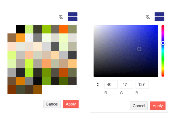
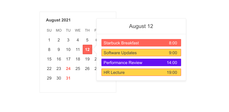
New Component: Angular Popover
The new Angular Popover component is a common and easy way to display additional information about an element on focus, click or hover. It is much like a tooltip but designed to show richer content. A common scenario is showing meeting details after hovering over a date.
New Component: Angular Filter
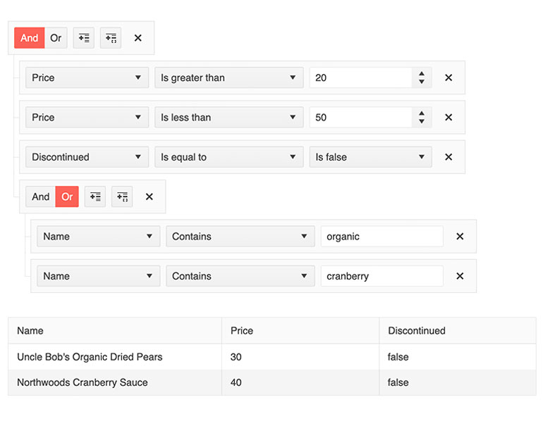
This component, often referred to as a query builder, helps users create complex data filter expression with a point-and-click UI. The filter expressions can be tied to any existing data collection within your Angular application and can connected to existing data-bound UI components like the Kendo UI for Angular Data Gid.
New Component: Angular QR Code
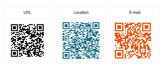
Create any type of QRCode as SVG or Canvas element with this new component. With support for encoding, error correction, custom logos, Swiss QR Code, PDF export, and PNG export, you will have everything you need.
New Component: Angular Barcode
Create all popular 1D types of barcodes customizable through various configuration options. Render them as SVG or Canvas elements and export in PNG or PDF.
See the Angular Barcode demo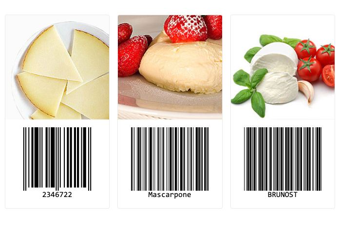
New Angular Grid Demo: Live Updating Data Table
For some time, the Angular Data Grid has had the ability to automatically update displayed data as it is changes from a streaming source. As this is a very popular feature, we have added documentation and a demo to ensure our users can easily implement such as data view.
See the Angular Data Grid Streaming Data demo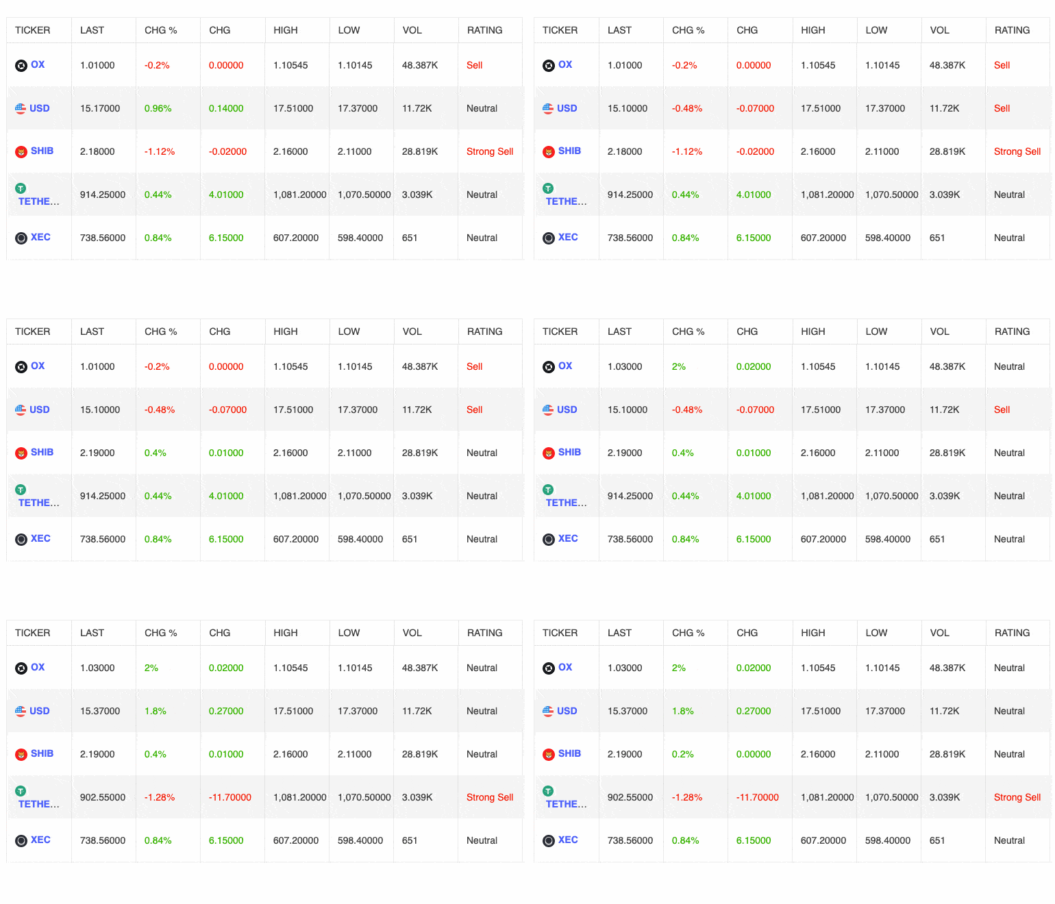
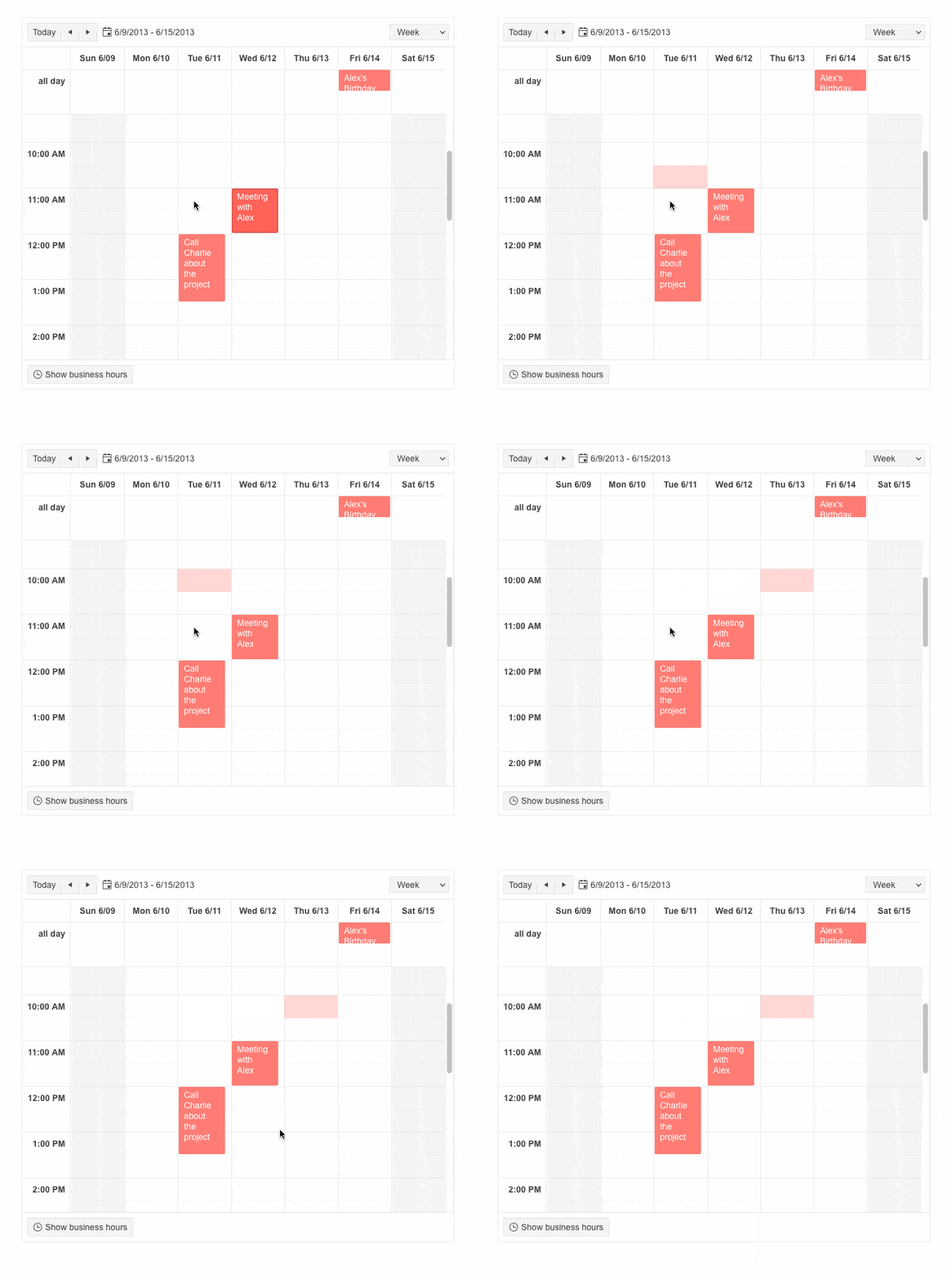
Angular Scheduler Enhancement: Slot Selection
Users can now select time slots rather than just events. This helps you provide a Microsoft Outlook-like experience, in which users can create events by selecting their time slot.
Angular Rich Text Editor Enhancement: Split and Merge Table Cells
Allow users to split and merge table cells without manually editing HTML code These new features are conveniently made available with familiar buttons easily added to the built-in toolbar.
See the Angular Editor Built-in Tools demo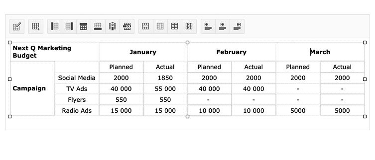
Angular Rich Text Editor Enhancement: Image Resizing
Allow users to resize images in the content area with familiar drag handles. This feature can also be disabled.
See the Angular Editor demo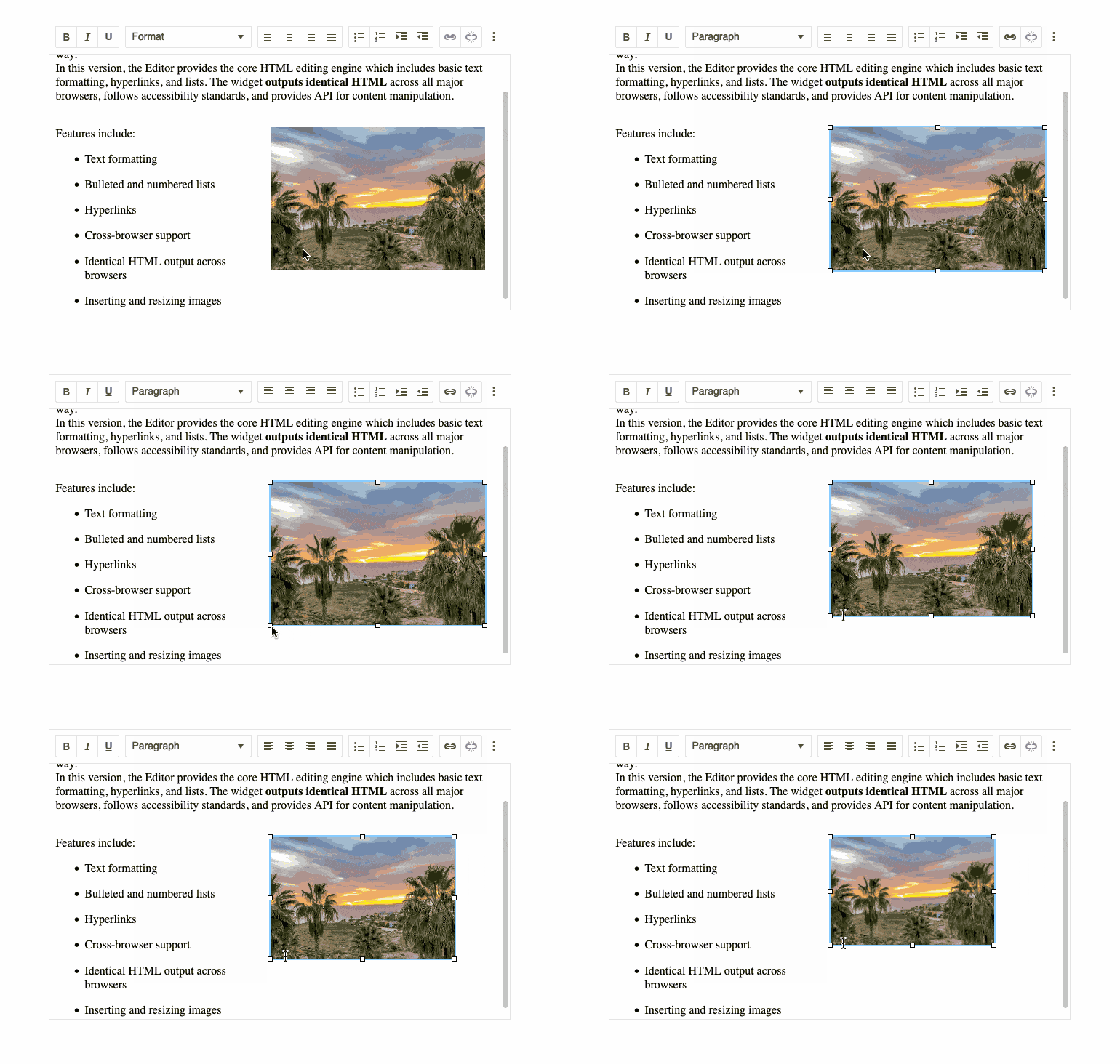
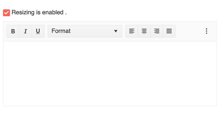
Angular Rich Text Editor Enhancement: Resizing
Until now, the Rich Text Editor could not be resized by the users, but there are cases where the work area needs to be bigger or smaller. For that case, all you need to do is set the resizable option to true. You can restrict the dimensions to keep the Editor in a particular space or set no limits at all.
See the Angular Rich Text Editor Resizable demo
Angular Rich Text Editor Enhancement: Retrieve Selected Text
For your convenience, the Angular Rich Text Editor includes a field, called selectionText, that automatically populates with any text the user selects. This is very useful when integrating the Editor with other components.
Angular Rich Text Editor Enhancements: Select All and Print Tools
The Editor already includes a large set of built-in tools that you can expose via toolbar. With this release, we have added Select All and Print buttons. The need for writing custom code for these items is now gone!
See the Angular Editor Toolbar Tools demo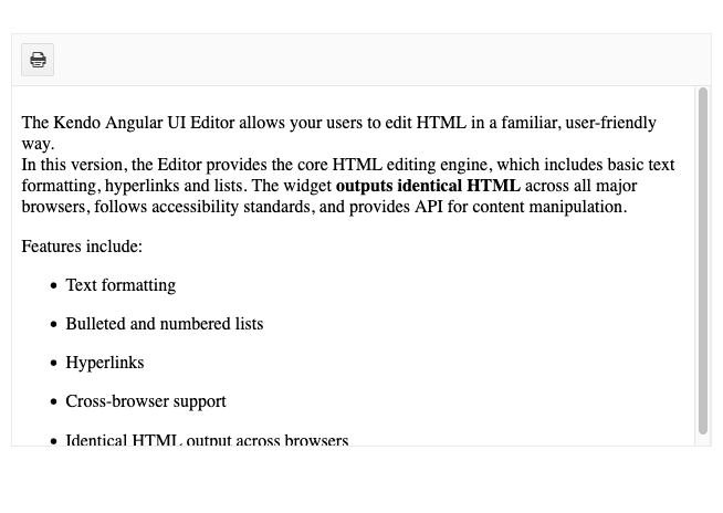
Angular Rich Text Editor Enhancement: Apply Commands to Words
You can now apply commands to an entire word in which a cursor is placed without the user needing to select the entire word. This is an update that will give your users the UX they expect.
See the Angular Editor Retrieve Text demoAngular Gantt Component Enhancement: Update Tasks and Connections via Drag and Resize
You can now give users a more interactive way to edit tasks and connections in either pane of the Gantt view. Creating new connections and updating task durations can now be done via drag and resize.
See the Angular Gantt Drag and Resize demo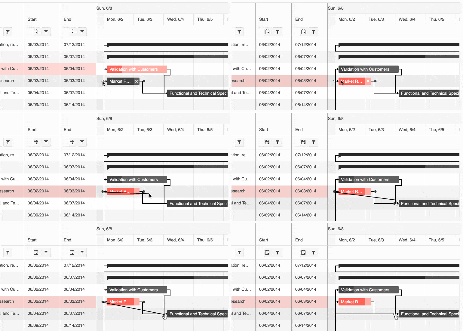
Angular Gantt Chart Enhancement Selection
Allow users to interact with and select single or multiple items in the task pane or items on the timeline.
See the Angular Gantt Selection Demo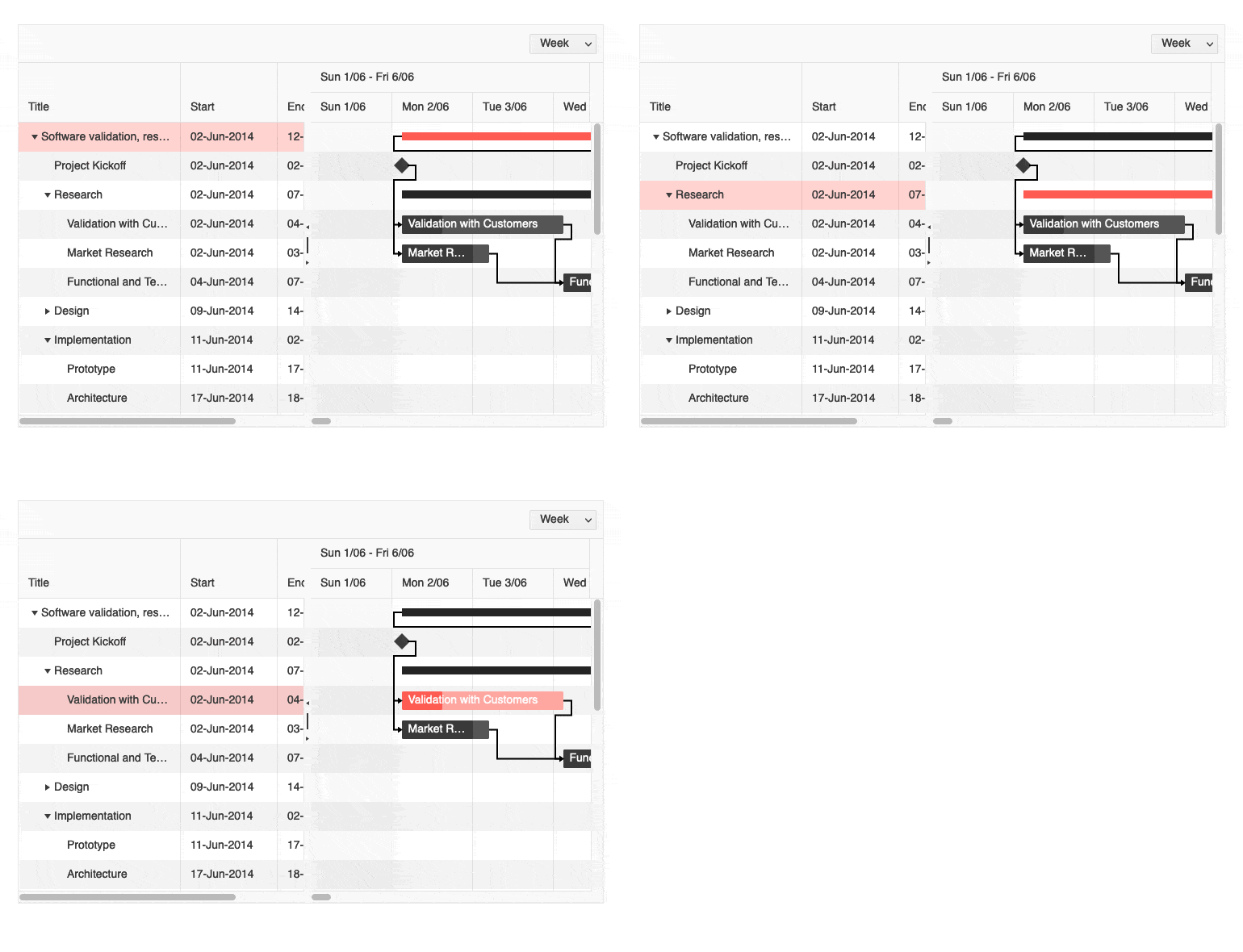
Angular Gantt Chart Enhancement: Editing
Choose to allow users to edit tasks listed in the TreeList in two ways. They can edit directly in cells or you can choose to implement the built-in dialog for a more full-featured experience.
See the Angular Gantt Editing demo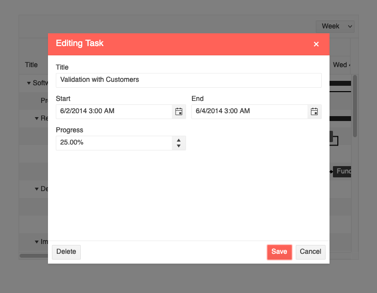
Angular Gantt Component Enhancement: Accessibility Updates
In keeping with our mission to provide fully accessible components, the Gantt chart now offers compliance with Section 508, WCAG 2.1, and WAI-ARIA standards.

Angular Chart Enhancement: Improved Pan and Zoom
As part of our mission to provide the best UX possible, we have made improvements to the behavior and performance of the Pan and Zoom interactions.
See the Angular Chart Pan and Zoom demo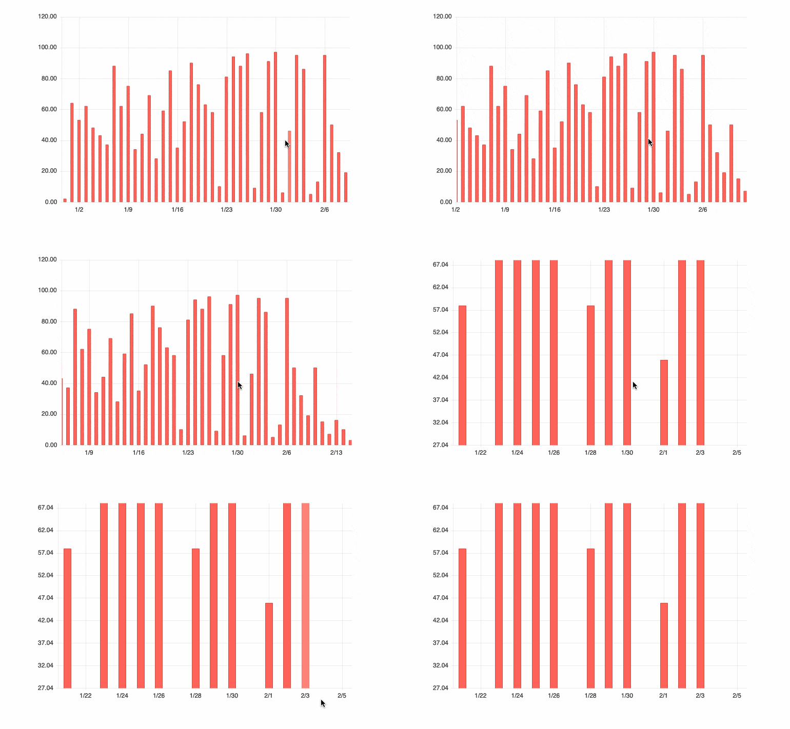
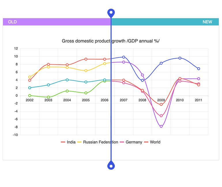
Angular Charts Enhancement: Updated Default Colors
When there is no color set for charts, Kendo UI for Angular uses a default color set for each series. Until now, that set was limited and if the limit was reached, colors would recycle. We have now expanded that color set, so that case will no longer exist. We have also updated the palette to make your Charts more modern.
Angular ColorPicker Enhancement: New Design
To ensure we are enabling you to deliver the most modern UI possible, we have updated the rendering of the ColorPicker component. This includes and embedded FlatColorPicker in the popup.
See the Angular ColorPicker demo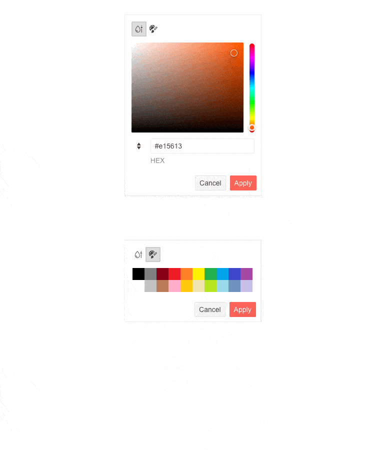
Angular PanelBar Enhancement: Updated Design
We strive to give you ready-to-use tools to build a modern and beautiful UI across all your products. To accomplish this, we strive for consistency in UI theming and rendering not only within the Kendo UI for Angular library, but also across all our products. We also aim to keep our component design fresh and this often comes in the form of small, but important changes. We recently updated the design of a few components and the PanelBar is one of them. You will see improved rendering of child items and expand and collapse arrows. These changes make your UI a touch more modern.
See the Angular PanelBar demo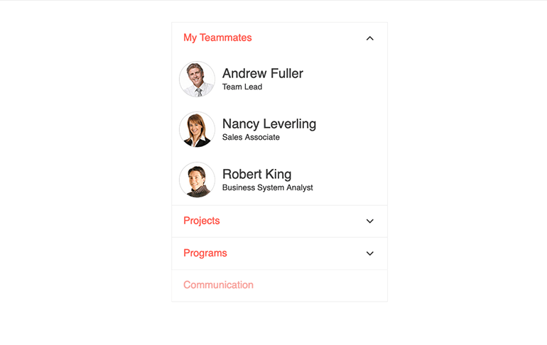
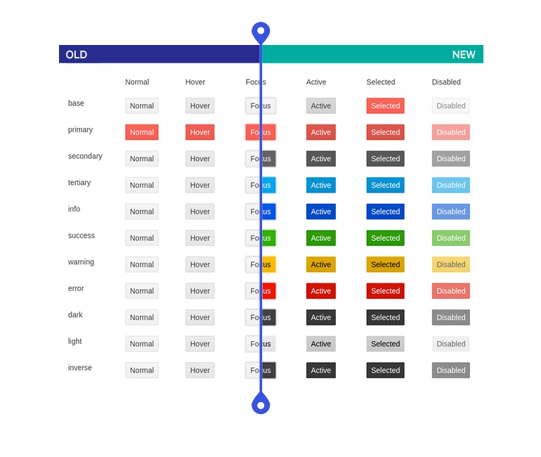
New Theme Rendering Options for Various Angular Components
As UI design requirements become more complex, our users need more customizability in our themes on the component level. Throughout 2022, we will be introducing enhancements to the way individual components work with themes to make it easier to use your own design system. These will be a set of common options that will help define the colors, size, and shape of individual components. This release delivers updates for the Button, Input, DateInput, and DropDown components.
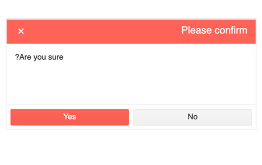
Angular Dialog Enhancements: Updated Behavior When Opened via Service
Developers now have improved control over when they are using the DialogService feature to open a dialog with two updates:
(1) Apply custom CSS classes
(2) Display content in RTL format
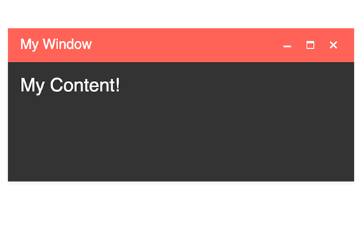
Angular Window Enhancements: Updated Behavior When Opened via Service
Developers now have improved control over when they are using the WindowService feature to open a dialog with two updates:
(1) Apply custom CSS classes
(2) Display content in RTL format
New Angular Scheduler Documentation: Current Time Marker
The Angular Scheduler boasts a feature in which a line is displayed across the calendar to show the current time (similar to Microsoft Outlook). We have added new detailed documentation to ensure you can easily implement it.
See the Angular Scheduler Current Time Marker demo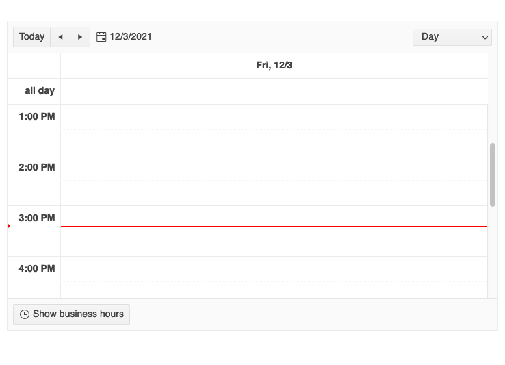
New Angular Switch Documentation: Custom Size and Long Labels
In some cases, the text displayed with the Angular Switch doesn’t fit into the area the component occupies. We have added documentation to assist with this scenario.
Read the Angular Switch Labels documentation
Kendo UI for Angular - R1 2022
- Angular 13 Support
- New Component Angular FlatColorPicker
- New Component: Angular Popover
- New Component: Angular Filter
- New Component: Angular QR Code
- New Component: Angular Barcode
- New Angular Grid Demo: Live Updating Data Table
- Angular Scheduler Enhancement: Slot Selection
- Angular Rich Text Editor Enhancement: Split and Merge Table Cells
- Angular Rich Text Editor Enhancement: Image Resizing
- Angular Rich Text Editor Enhancement: Resizing
- Angular Rich Text Editor Enhancement: Retrieve Selected Text
- Angular Rich Text Editor Enhancements: Select All and Print Tools
- Angular Rich Text Editor Enhancement: Apply Commands to Words
- Angular Gantt Component Enhancement: Update Tasks and Connections via Drag and Resize
- Angular Gantt Chart Enhancement Selection
- Angular Gantt Chart Enhancement: Editing
- Angular Gantt Component Enhancement: Accessibility Updates
- Angular Chart Enhancement: Improved Pan and Zoom
- Angular Charts Enhancement: Updated Default Colors
- Angular ColorPicker Enhancement: New Design
- Angular PanelBar Enhancement: Updated Design
- New Theme Rendering Options for Various Angular Components
- Angular Dialog Enhancements: Updated Behavior When Opened via Service
- Angular Window Enhancements: Updated Behavior When Opened via Service
- New Angular Scheduler Documentation: Current Time Marker
- New Angular Switch Documentation: Custom Size and Long Labels


