What’s New in Kendo UI for Angular with R1 2021

Summarize with AI:
The R1 2021 release of Kendo UI for Angular is here and it is jam-packed with new components and features including the DropDownTree, MultiColumnComboBox, and TileLayout components.
It’s always a great time whenever a new release of Kendo UI for Angular arrives, which is why I’m so excited to talk about today’s R1 2021 release. Let’s dive right in and see all the new components and features of the R1 2021 release of Kendo UI for Angular!
Angular 11 Support
Angular 11 was released on November 11th, 2020 (get it? 11 on 11/11! 🤯) and of course Kendo UI for Angular immediately released support on that very day. While this happened towards the end of last year, I still want to highlight this as a part of our R1 2021 release for the folks that haven’t had a chance to upgrade yet.
For more information about what Angular 11 has brought to the table you can check out Alyssa Nicoll’s blog post right here.
Dropping Support for Angular 6 & 7 and Breaking Changes
On the other side of the coin, the R1 2021 release also marks the removal of support for both Angular 6 and 7.
As you are aware, Kendo UI for Angular follows the same cadence of framework version support as the Angular framework itself. Angular 7 was officially dropped from LTS support on April 18th, 2020. We maintained support throughout most of 2020, but on December 16th, 2020 we officially dropped support for both of these editions of Angular.
As usual, for folks that still need Angular 6 and 7 you can still get access to previous versions that support these versions of Angular by using distribution tags like @ng6 and @ng7. These branches are frozen in time, so they will not receive updates, but you can still reference them for applications that aren’t ready to be upgraded to a new version of Angular quite yet. If you’re not familiar, this documentation section goes in to detail around how all of this works.
We have also implemented some breaking changes in various components that you should keep an eye out for. While individual changelogs for our packages will also mention this, we have the following GitHub issues that goes in to specifics.
New Angular Components
New Component: DropDownTree
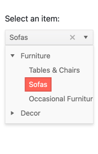
One of the most anticipated UI components for Kendo UI for Angular, the new Angular DropDownTree component provides the simplicity of a DropDown and the hierarchical list of items of a TreeView.
TreeViews can take up a lot of space within any web application and often they serve the purpose of letting users select a value from the available tree structure. Real estate is often an expensive resource in modern web applications, so “hiding” the Angular TreeView within a drop down and letting the selected value display within an input element saves a ton of space.
To see the Angular DropDownTree in action, and to see the available customization options, head on over to the Kendo UI for Angular DropDownTree documentation section.
New Component: MultiColumnComboBox
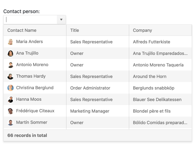
Continuing the trend of popular and highly requested drop downs, with R1 2021 we are also introducing the Kendo UI for Angular MultiColumnComboBox component. Outside of being tough to say fast ten times, this Angular UI component combines a DropDown element with a table structure for all internal items. So, rather than listing a single field of text in a long list you now have the option to display multiple fields for each items through columns for each field.
Just like with any DropDown, this lets users select a value within a list of other values without taking up precious space within the application. While by itself there may not be too much to displaying a simple table with values to select from, it certainly becomes very handy to hide this within a DropDown when this list is a part of a longer form.
To see how you can add in the Angular MultiColumnComboBox into your Angular applications today, head on over to the Kendo UI for Angular documentation!
New Component: TileLayout
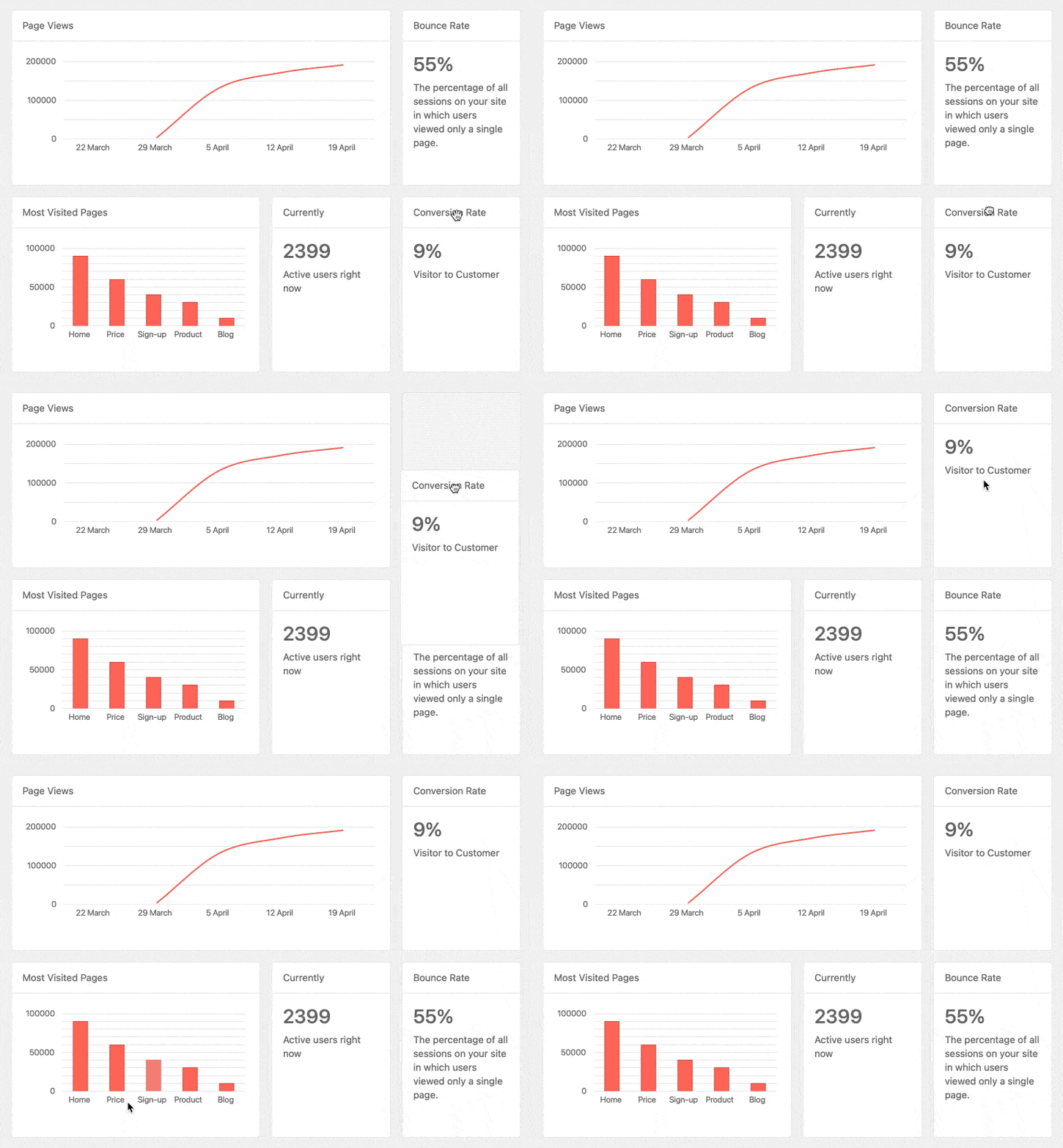
Another exciting component added with this release is the Kendo UI for Angular TileLayout component. Released based on feedback from developers looking to create an interactive dashboard with KPIs that can be moved around, the TileLayout component makes creating dynamic and interactive layouts a breeze. By just defining the number of columns available for the component the list of Tiles will automatically fill out the component and create a look and feel of columns and rows. Users can then freely drag and drop the tiles around, as well as resize them, in order to create their own custom layout.
There’s certainly a lot to unpack with this component and I can’t do it justice just in this blog post. So, head on over to the Kendo UI for Angular TileLayout documentation to see just how you can add this new component to your Angular apps today!
New Component: FloatingActionButton
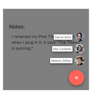
Popularized by desktop and mobile applications alike, the Floating Action Button is a big part of many applications following Material Design. Chances are you have used this at some point today, or at least fairly recently.
The Floating Action Button provides a simple “floating” button that does some particular action that is contextual to the content on the page. Beyond this function we have added the ability to create additional related action items that appear when the main button is interacted with. Often called a “speed dial,” the list of available actions can be customized to fit any scenario.
Each action button within the Angular Floating Action Button comes with configuration options like style and icon to ensure that the buttons provided make sense to the user.
For more information, as well as demos to play around with the component, head on over to the Kendo UI for Angular Floating Action Button documentation section.
New Component: ExpansionPanel
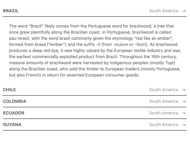
A layout component that has been requested by many of our developers is the new Kendo UI for Angular ExpansionPanel component.
This component provides a UI element with a title, also called a header, that can be interacted with to expand or collapse related content underneath it. Whatever is displayed in the header or content area can be customized using Angular templates so the Angular ExpansionPanel is extremely flexible and should be able to fit any Angular application.
Head on over to the Kendo UI for Angular ExpansionPanel documentation to learn more about this new component.
New Component: TextArea
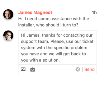
To wrap up the set of new UI components with R1 2021 we have also introduced the new Kendo UI for Angular TextArea component. This specifically introduces a more longform text input and is the Kendo UI for Angular equivalent of the native HTML TextArea element. The Kendo UI for Angular TextArea expands on the available components and directives which Kendo UI for Angular offers and helps achieve a consistent look and feel across any UI element in your Angular applications.
Previously only available through some CSS styling, we wanted to offer this as a standalone component to add additional features just like we did with the Kendo UI for Angular Textbox. This means features like adornments, which lets you add more elements before and after the TextArea, as well as validation icons are all available out of the box.
Here’s a quick link to the Kendo UI for Angular TextArea documentation for more information about this new component.
Expanded Component Features
Charts - Updated Series Highlighting
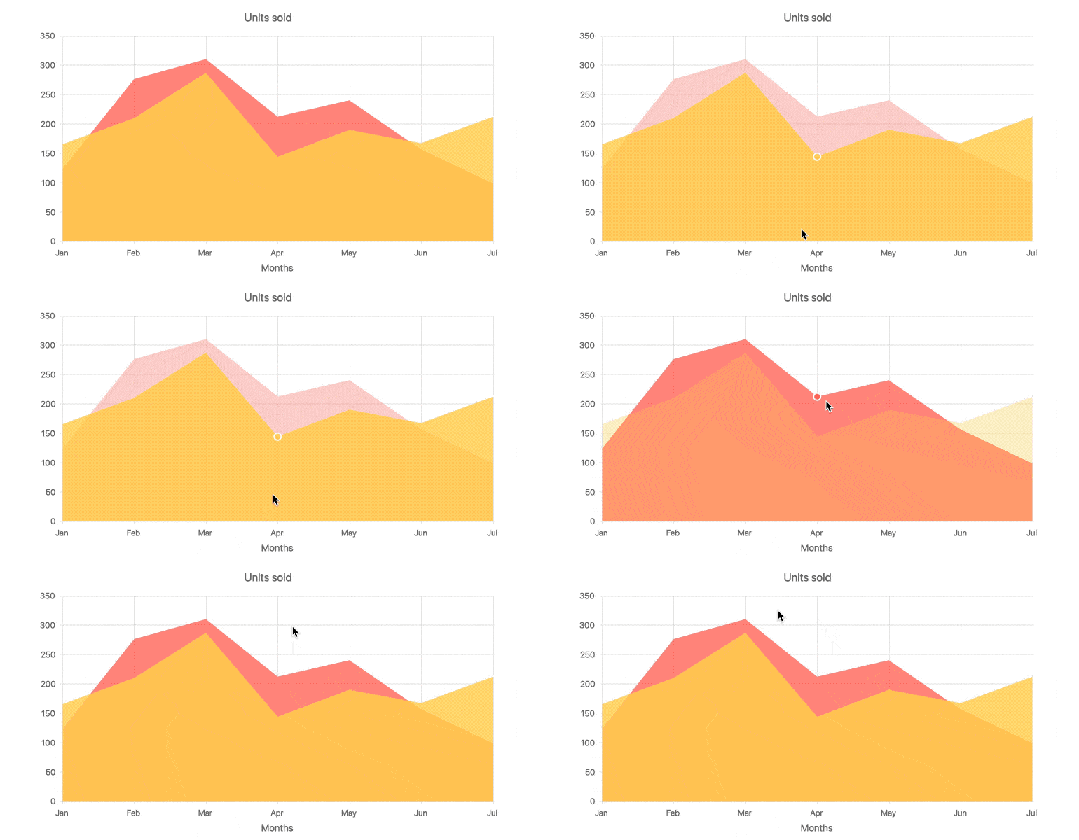
Throughout the last couple of releases we have improved various visual aspects of our Data Visualization library and this trend has continued with R1 2021. In this release we improved the way series highlighting is emphasized when you hover over different series in our various charts. As seen in the animation above, it becomes immediately clear which series is currently being focused while the other series becomes more deemphasized.
For a look at just how this new series highlighting works you can check out our Kendo UI for Angular Chart demos.
Grid & TreeList - Responsive Pager
With R1 2021 both the Kendo UI for Angular Data Grid and TreeList take advantage of our Angular Pager to ensure that their built-in paging experience is now automatically responsive. This means that UI elements within the pager will dynamically change according to the available viewport and size of the Grid or TreeList.
This is far easier to showcase by playing around with the components, so head on over to the Kendo UI for Angular Grid or the Angular TreeList documentation sections to see this in action!
ListView - Built-in Editing
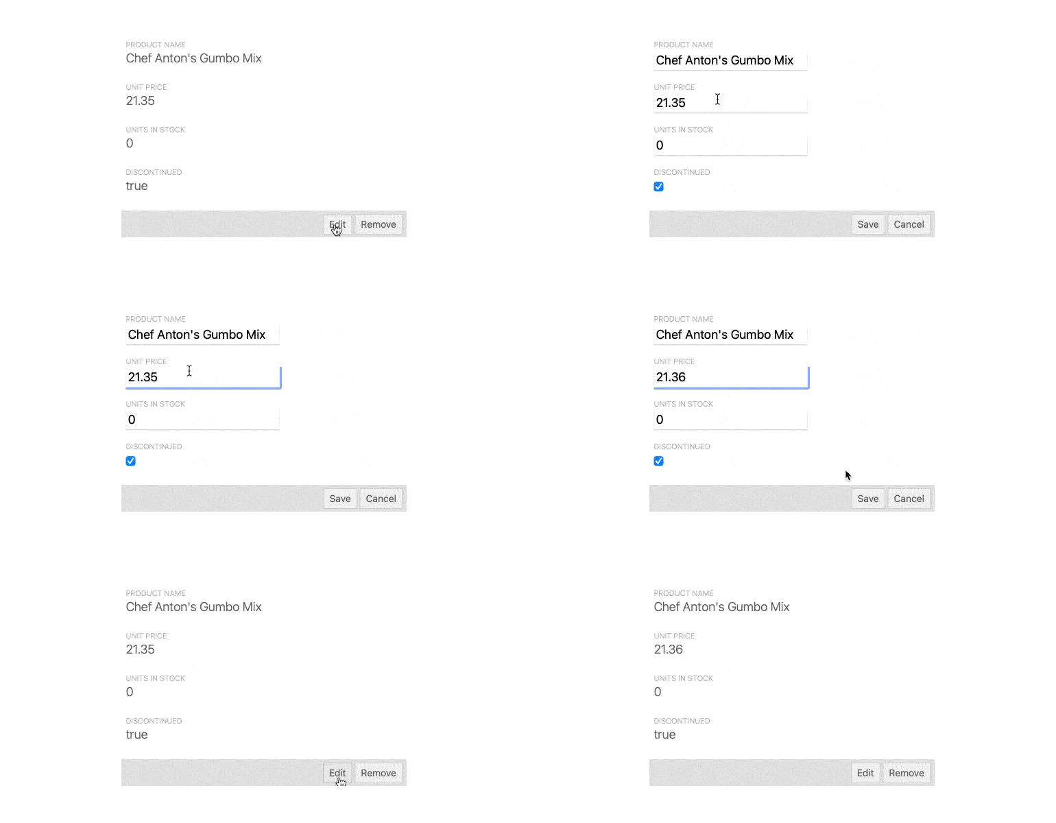
Introduced last year, with R1 2021 the Kendo UI for Angular ListView expands on its initial set of features by adding a built-in interface for editing items within the component. This moves the Angular ListView beyond just displaying data via provided templates and adds more interactivity and usability out of the box.
Check out the Angular ListView Editing demo for more information.
ListView - Keyboard Navigation & Accessibility Compliance
Accessibility is a big part of Kendo UI for Angular and the ListView component is no exception to this rule. Over the last couple of months, the Kendo UI for Angular team worked on adding built-in keyboard navigation, along with a few other improvements, to the Angular ListView in order to ensure that the ListView is compliant with WCAG 2.0, Section 508, and WAI-ARIA accessibility standards.
TreeView - Built-in Filtering
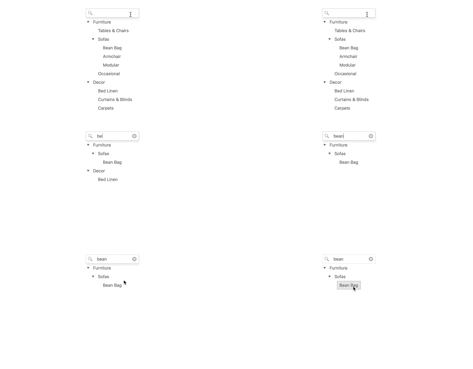
Adding to the already impressive list of features in the Kendo UI for Angular TreeView, with R1 2021 we have officially added in a built-in filtering mechanism and the ability to display a search textbox above the component. Previously only possible through developers providing their own custom code, the filtering mechanism can now be implemented through a simple set of configuration options.
This is one of the top-requested features for the Kendo UI for Angular TreeView, so I hope you are as excited as I am to see this feature added in!
To start filtering through all your TreeViews, jump on over to the Kendo UI for Angular TreeView documentation.
Editor - Support for More HTML Elements
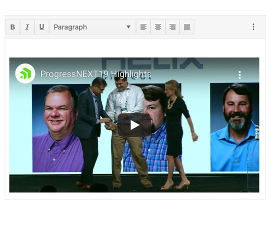
Expanding on the available features of the Kendo UI for Angular Text Editor, with R1 2021 we took a look at the underlying engine in order to expand the list of supported HTML elements which developers and end-users alike can add into the content of the Editor.
For a more thorough list of supported HTML elements you can head over to the Kendo UI for Angular Editor documentation.
Editor - Custom Schema Support
Related to the above feature, with R1 2021 the Kendo UI for Angular Editor now supports Custom Schemas. This is an important feature because it allows the Angular Editor to support custom elements within its content, letting Angular developers expand the available elements that users can add in their content—including something completely custom.
For a peek into how this actually works, head on over to the Kendo UI for Angular Editor documentation.
Calendar and MultiViewCalendar - Classic Rendering
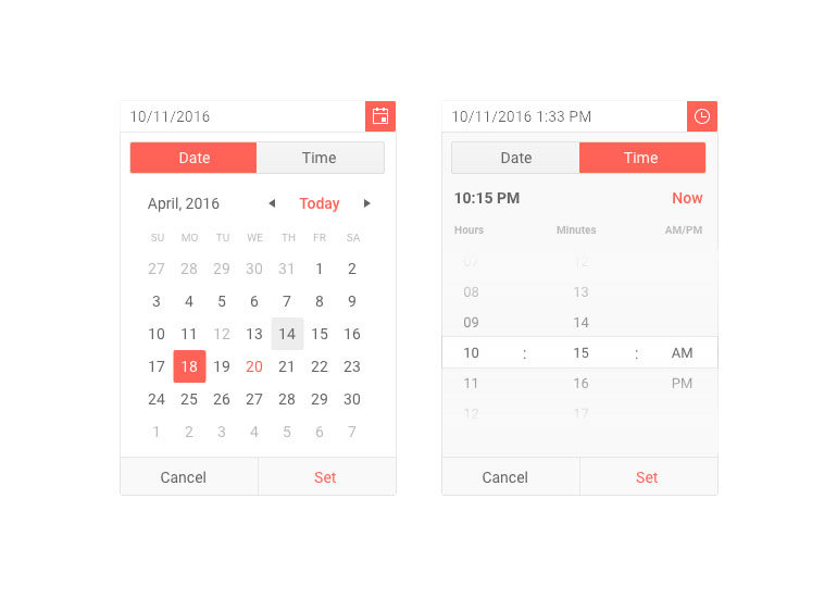
For those of you that may have migrated from jQuery, ASP.NET MVC, or ASP.NET Core you may have noticed that the Angular Calendar and MultiViewCalendar components have a different design. When we initially introduced Kendo UI for Angular we revisited the user experience for calendars and created a new overall design and user experience.
We know that folks migrating between these calendars, or teams that need to support multiple technologies with a single design, can run in to some issues around the new designs. So, in order to ensure that we cover everyone with our Angular Calendars we have introduced the “Classic Rendering” mode of the Angular Calendar and MultiViewCalendar components.
The two different ways to display the Angular Calendar components can be done with a single configuration option, allowing Angular developers to easily pick and chose between the two user experiences!
To see the new Calendar rendering in action, head on over to the Kendo UI for Angular Calendar component docs right here!
TimePicker & DateTimePicker - Millisecond Support
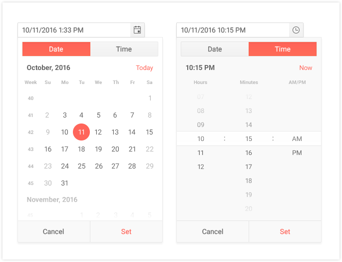
Last but not least, with R1 2021 both the Kendo UI for Angular DateTimePicker and TimePicker components now support milliseconds as a part of their inputs and drop down interfaces.
See the Kendo UI for Angular TimePicker documentation and the Angular DateTimePicker documentation to see what this looks like in each component.
We Want Your Feedback!
Did we miss an Angular component or feature that you need in your Angular projects? Feel free to add a comment in the comment section below or add your specific request in our Kendo UI for Angular feedback portal. All of the above features and components were requested by folks like you, so make sure that your voice is heard!
Register for our Live R1 2021 Webinar
Want to see these new features and components in more detail? Want to ask myself and the Angular team questions about the R1 2021 release or just anything Kendo UI for Angular related? Join us for the Kendo UI R1 2021 Release Webinar on Thursday, January 28th starting at 11:00 AM ET. For more details head on over to our R1 2021 Kendo UI release webinar page. Seats are limited so don’t forget to snag your spot today!
Join Us on Twitch
Looking for even more? You can also catch us on a special full-day Twitch session from 8am - 5pm ET on January 29th.

Carl Bergenhem
Carl Bergenhem was the Product Manager for Kendo UI.
