
Iconic Transformations: Redesigning Test Studio’s User Interface

Summarize with AI:
August 1—New Test Studio world, new icons! In the present-day digital world, icons have become an inseparable part of any UI. For Test Studio, we set off to a new look and feel with a modernized set of icons to bring a better experience for our users.
Meet the updated Test Studio—carefully crafted to enhance your user experience and revitalize your daily routines. Say “Hi” to our modernized interface, complete with a cool array of fresh, dynamic icons that breathe new life into your interactions. We’d like to make you a part of the evolution of our design journey and take you through the thought process behind the specially crafted new experience. Let’s welcome the new look and explore the revamped interface!
Since ancient times people have used symbols to convey ideas. The very first representations from the prehistoric era—“pictographs”—depicted humans, animals, plants or objects. The purpose of pictographs was to evoke a mental image of something, thus, later on, to pave the way toward a written language. As societies evolved, symbols diversified not only in terms of what they represented, but also in their ability to provide effective solutions to tasks.
Put simply, a symbol is something that stands for, represents or suggests another thing, especially an object used to illustrate something abstract, just like a heart is a symbol of love. Nowadays, we use the words “symbol” and “icon” interchangeably as both terms often portray other objects or concepts. Deriving from symbols, icons are helpful tools in a variety of contexts such as bridging language gaps, adding to the context of meaning, or smoothing differences in experience or culture. In fact, the word “icon” comes from the Greek eikōn, which means “to be like.”
In the modern digital era, icons have become an integral part of UI design, and in software interfaces they serve users to inform, represent functions, features or actions. The metaphor of meaning needs to be as simple as possible in order for the user to decode its purpose at a glance. When carefully selected to have meaning and relevance, icons can reduce cognitive load and be quite practical.
In a fast-paced digital world, UI designs are updated every few years, as new trends become available, and interfaces start to look outdated. In pursuit of a modern and up to date version for our product, Test Studio, Progress set out to define the app’s future look and feel. Client feedback, competitor research and analysis helped us identify the key challenges we needed to address.
A busy structure with distracting icons in the form of images in color, with too many elements of small size, seemed unpleasant to the eye (Fig. 1). The development team identified that the software currently utilized raster images (PNGs) as icons. In some cases, these raster icons appeared pixelated and were losing clarity when displayed on high-resolution screens or when scaled to larger sizes. The product also comes with two themes—light and dark. And for the dark theme, a white outline needed to be applied manually in order for the raster images to be visible. Considering all that, we saw a need to simplify our icon system and replace it with a modern, vector-based one.
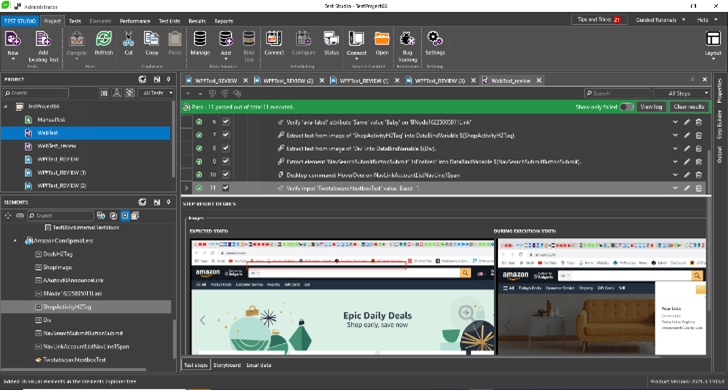
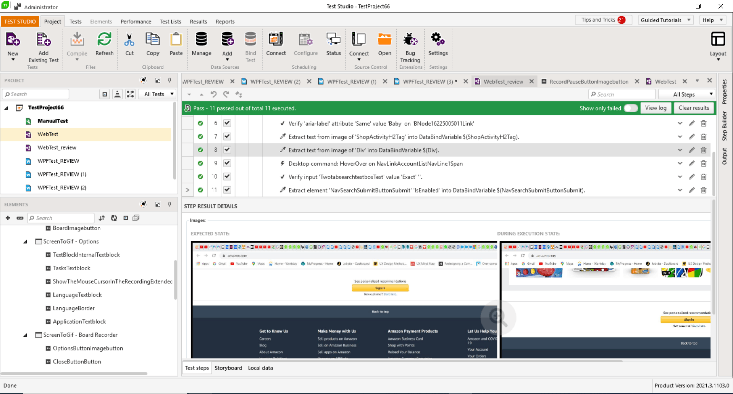
Fig. 1: Test Studio’s UI before the change
While software evolves and introduces new features, a vector icon library serves as a tool that streamlines the design process, enhances user experience and ultimately elevates the quality of the final product. Also, by replacing icons from raster images with vector graphics, we aimed at reducing load times, and ensuring seamless adaptation across various display resolutions and screen sizes.
The first step in achieving that was to find a comprehensive library of vector icons that align with Test Studio’s visual style and user interface guidelines. To put together a cohesive icon set, as part of Test Studio’s design system, we had to ensure that we could find an exact replacement for each existing icon. The metaphors they represented needed to be self-explanatory and still keep the meaning of the current functionality without disrupting the user experience and tasks. Font Awesome (FA) is a popular icon library that offers a wide range of scalable vector icons in 68 categories that can be easily used in web development and software applications (Fig. 2), and it seemed like a solution we could benefit from.
The points we examined were:
- Implementation ease: Font Awesome icons can be quickly added to projects using basic HTML or CSS classes, saving time and effort compared to developing custom icons.
- Scalability: They can be scaled to any size without losing sharpness or quality, making them appropriate for different screen resolutions and devices.
- Consistency: Font Awesome provides a comprehensive and well-designed icon library, ensuring a consistent visual style and enhancing the overall aesthetics of the application.
- Kits: FA allows for custom-made icons to be uploaded and stored in a kit to be used together with the rest of their icons without difference in quality.
- Lightweight: Compared to images-based icons, FA icons typically have smaller file sizes, resulting in faster page load times and reduced data usage.
- Accessibility: FA supports accessibility features like screen readers, allowing users with visual impairments to understand the icon’s context and purpose.
- Easy Styling: Font Awesome icons can be easily styled using CSS properties like color, size and other effects, providing design flexibility and customization options.
- Regular Updates: FA regularly adds new icons and updates existing ones, ensuring a constantly growing and up-to-date icon library.
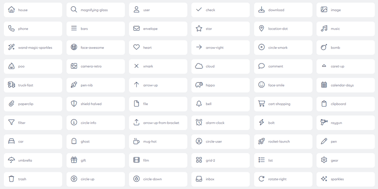
Fig. 2 FontAwesome Classic Light style library
Despite the many advantages to using font icons, we still had to consider the fact, that with a vast library of icons, it can be overwhelming to select the most appropriate ones for specific use cases, leading to potential overuse or inconsistency. We had to make sure that the new icons were an exact match in meaning to the previous ones in order to avoid confusion and frustration for the user.
As Test Studio is a complex tool for functional UI, load, performance and API testing for web, WPF and desktop applications, some of the icons we used before were non-existent in FA library. For those we created a specialized custom-made kit—more than 80 custom icons were created and collected in a kit to be used together with the ready-made ones.
Another challenge we faced was the application of icon colors on top of Test Studio’s light and dark themes. For our project, we chose the Classic font family with the Light style as those were the best fit in appearance, size and style. To ensure that users could navigate while still enjoying the new icon style, we largely maintained the current metaphors for the icons (Fig.3).
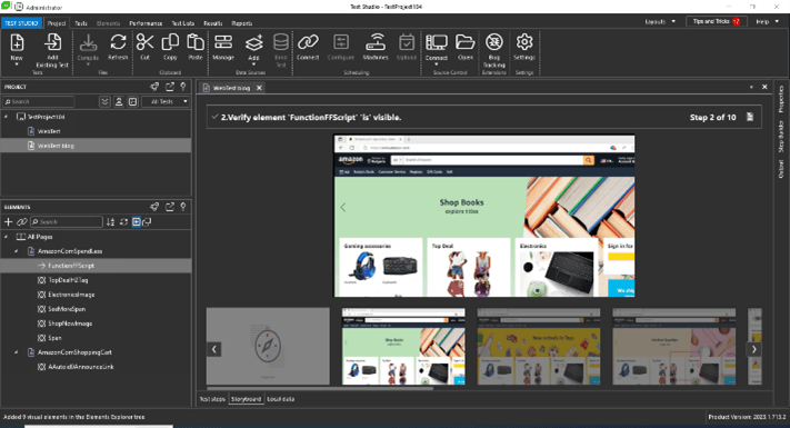
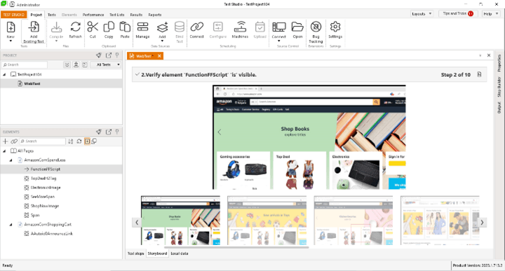
Fig. 3 The updatedTest Studio UI
Overall, with our approach we moved away from realistic and sophisticated icons as current design trends circle around flat, modern-looking outline icons. In fact, enterprises like Google incorporated simple shapes for their icons Material Symbols, while icons in Spectrum, Adobe’s design system, are monochromatic where the icon color “varies only depending on the interactive state (e.g., default, hover, disabled) and the color theme.”
Part of the reason for the outline icons’ popularity is that this icon style is universal—it works equally well anywhere on any background type. Each icon is easy to see and understand at virtually any size. The new UI look of the Test Studio app is clean and neutral, where the outline icon style adds just the right amount of detail. The new icons can act as a guide for users, directing them to perform specific actions or navigate through the application with ease.
And, just like any other product, a design system is constantly evolving. Icons are essential in software applications because they improve the user experience, facilitate task completion, optimize screen space and contribute to brand identity. By employing properly crafted icons, we create more user-friendly, accessible and visually appealing applications that promote user engagement and satisfaction. Through the use of Font Awesome’s well-designed icons, Test Studio is bringing an elevated user experience, enhancing the overall aesthetics of the application, delivering a visually refreshed and elegant product to our users.
Happy testing!

Jasmina Stoyanova
Jasmina Stoyanova is a Senior UX Designer at Progress. With more than 15 years of experience, a doctoral degree and a solid graphic design background, her latest work is focused on bridging the gaps between design, engineering and business. Author of various publications on user experience, product design and psychology, she is also enthusiastic about the worlds of Augmented and Virtual Realities. Follow her on LinkedIn.
Related Posts
Comments
All articles
Topics
Web MobileMobile
Desktop
Design
Productivity
People
