
Get Started with Telerik Charts for .NET MAUI—Visualize Your Data 15 Ways

Summarize with AI:
The Telerik UI for .NET MAUI Charts allow you to visualize your data as Pie 🍰, Bars 📊, Line 📈, Area, Candlestick or 10 more shapes. Take a look.

Progress Telerik UI for .NET MAUI is a full and rich suite which contains all the components needed to build good-looking cross-platform UI in no time. This post will focus on the major components in the suite for visualizing data—Telerik Charts for .NET MAUI.
In short what you will get is:
- 15 different series of charts
- Financial data display and financial indicators
- Selection
- Tooltip, TrackBall and Legend
- Cartesian annotations and grid
- Custom palettes
- Null values support
Get Started—Prerequisites
The first steps for using Telerik Charts for .NET MAUI are the same that we need to do when adding any other component part of Telerik UI for .NET MAUI to a .NET MAUI application:
- Download and Install Telerik UI for .NET MAUI.
- Call
UseTelerik()method inside the MauiProgram.cs file of your .NET MAUI project. This is needed to register all built-in or additionally created handlers of Telerik UI components.
Then, of course, you need to prepare your data that will be visualized.
For the demo purposes of this post, I’ll use the following ViewModel:
public class CategoricalData
{
  public object Category { get; set; }
  public double Value { get; set; }
}
public class ViewModel
{
  this.Data = new ObservableCollection<CategoryItem>()
    {
      new CategoricalData { Category = "A", Value = 101 },
      new CategoricalData { Category = "B", Value = 45 },
      new CategoricalData { Category = "C", Value = 77 },
      new CategoricalData { Category = "D", Value = 15 },
      new CategoricalData { Category = "E", Value = 56 },
    };
}
Once you have the data, you need to choose the type of chart that is best to visualize it before continuing with the definition:
Choose Your Type
You can choose between dozens of different charts that are part of Telerik UI for .NET MAUI, but choosing the right one depends first on the coordinate system that should be used. The chart can use the Cartesian coordinate system to plot the data points or the radial coordinate system.
Choosing the Cartestian coordinate system and Cartesian chart is the most used scenario, so let’s start there and dig deeper:
Cartesian Charts—The Way to Display Bar, Line, Spline, Area, Points or Any Financial Data
First we need to define an instance of RadCartesianChart and set its BindingContext like this:
XAML
<telerik:RadCartesianChart  x:Name="chart"  AutomationId="chart">
  <telerik:RadCartesianChart.BindingContext>
    <local:ViewModel  />
  </telerik:RadCartesianChart.BindingContext>
</telerik:RadCartesianChart>
or
C#
var chart =  new  RadCartesianChart
{
  BindingContext  =  new  ViewModel()
};
Then it is time to define the horizontal and vertical axes by choosing the most suitable axes for that. We can choose from:
- Numerical Axis
- Categorical Axis
- Date-Time Continuous Axis
For the purpose of this post, I’ll use Categorical and Numerical axes like this:
<telerik:RadCartesianChart  x:Name="chart"  AutomationId="chart">
  <telerik:RadCartesianChart.BindingContext>
    <local:ViewModel  />
  </telerik:RadCartesianChart.BindingContext>
  <telerik:RadCartesianChart.HorizontalAxis>
    <telerik:CategoricalAxis  />
  </telerik:RadCartesianChart.HorizontalAxis>
  <telerik:RadCartesianChart.VerticalAxis>
    <telerik:NumericalAxis  />
  </telerik:RadCartesianChart.VerticalAxis>
</telerik:RadCartesianChart>
Finally, we need to choose a series to display the right type of Cartesian chart.
For this demo I’ll choose Bar Series, but you can choose from 15 different Cartesian charts from the table below.
XAML
<telerik:BarSeries  CategoryBinding="Category"
  ValueBinding="Value"
  ItemsSource="{Binding Data}"  />
C#
var series =  new  BarSeries();
series.SetBinding(ChartSeries.ItemsSourceProperty,  new  Binding("Data"));
series.ValueBinding  =  new  PropertyNameDataPointBinding  {  PropertyName  =  "Value"  };
series.CategoryBinding  =  new  PropertyNameDataPointBinding  {  PropertyName  =  "Category"  };
chart.Series.Add(series);
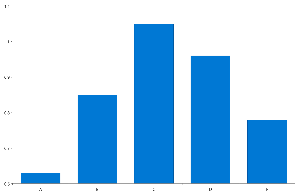
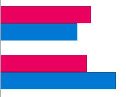
So, after adding the bar series the full definition will look like this:
<telerik:RadCartesianChart x:Name="chart" AutomationId="chart">
  <telerik:RadCartesianChart.BindingContext>
   <local:ViewModel />
  </telerik:RadCartesianChart.BindingContext>
  <telerik:RadCartesianChart.HorizontalAxis>
    <telerik:CategoricalAxis />
  </telerik:RadCartesianChart.HorizontalAxis>
  <telerik:RadCartesianChart.VerticalAxis>
    <telerik:NumericalAxis />
  </telerik:RadCartesianChart.VerticalAxis>
    <telerik:RadCartesianChart.Series>
      <telerik:BarSeries CategoryBinding="Category"
        ValueBinding="Value"
        ItemsSource="{Binding Data}" />
  </telerik:RadCartesianChart.Series>
</telerik:RadCartesianChart>
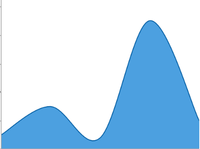
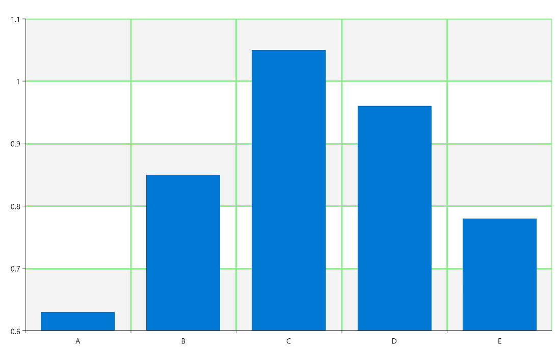
And the result:
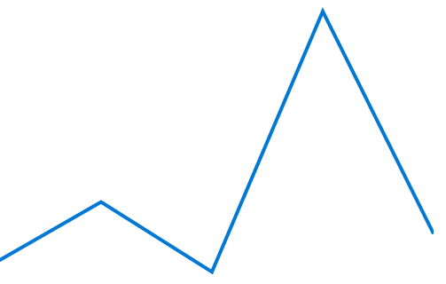
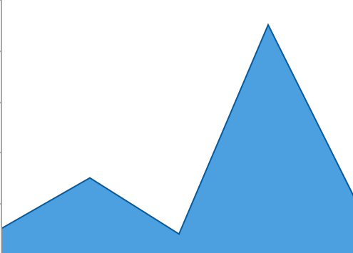
Styles of Charts
These 15 styles of charts are available for you to use:


Enable Chart Annotations & Cartesian Chart Grid
So far, so good, but let’s do more to improve the way the data can be read by the end user by rendering some more visual hints such as Annotations and Grid.
To enable them you can define CartesianPlotLinecAnnotation or CartesianPlotBandAnnotation to the chart’s Annotations collection like this:
<telerik:RadCartesianChart.Annotations>
  <telerik:CartesianPlotBandAnnotation  StrokeThickness="2"
    Stroke="Green"
    Fill="#2F66FF33"
    Axis="{x:Reference verticalAxis}"
    From="0.6"
    To="0.9"  />
</telerik:RadCartesianChart.Annotations>
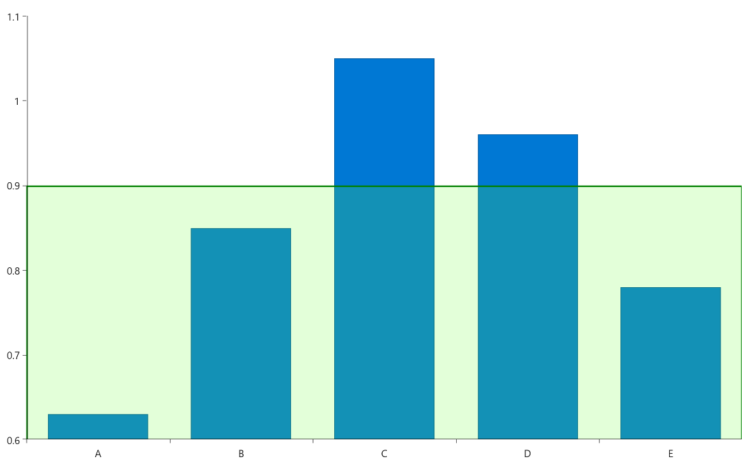
Or show a CartesianChartGrid like this:
<telerik:RadCartesianChart.Grid>
  <telerik:CartesianChartGrid  StripLinesVisibility="Y"
    MajorLinesVisibility="XY"
    MajorLineColor="LightGreen"
    MajorLineThickness="3"  />
</telerik:RadCartesianChart.Grid>
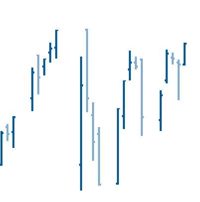
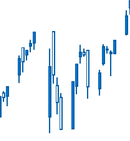
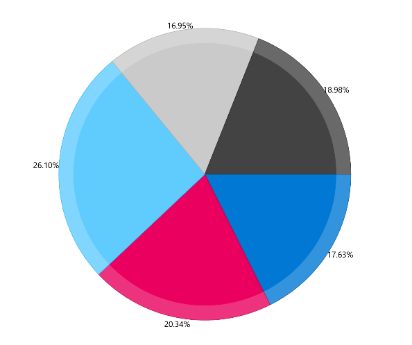
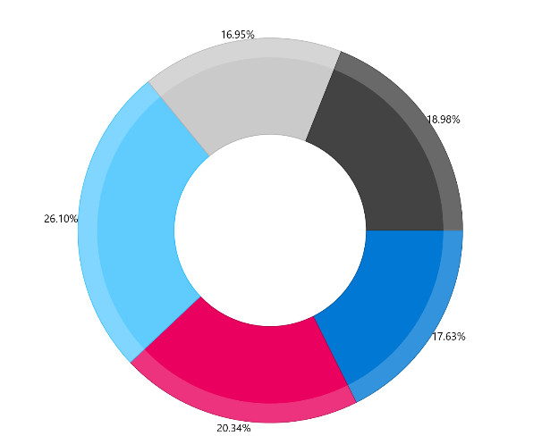
Financial Indicators You Can Choose from: Pie or Donut 🍰🍩?
In case you prefer to display the data as a round shape, the first thing to do is to define an instance of RadPieChart and then choose between Pie or Donut series.
The important properties when adding such a series are:
- ValueBinding – which property of the business object will be visualized
- ItemsSource – the data that will be displayed
- RadiusFactor – control the radius of the shape
- ShowLabel – Boolean property to display a label
Note: We can also use a LabelFormatter to format the label as shown below.
A full definition of donut is shown below:
<telerikChart:RadPieChart.Series>
  <telerikChart:PieSeries  ItemsSource="{Binding Data}">
    <telerik:DonutSeries ShowLabels="True"
      RadiusFactor="0.8"
      ValueBinding="Value"
      ItemsSource="{Binding Data}">
    <telerik:PieSeries.LabelFormatter>
      <local:PercentageLabelFormatter BindingContext="{Binding BindingContext, Source={x:Reference chart}}"
        Total="{Binding Total}" />
    </telerik:PieSeries.LabelFormatter>
  </telerikChart:PieSeries>
</telerikChart:RadPieChart.Series>
Cartesian or Pie—More to Configure
No matter what type of chart you need, there are more features that can enhance your UI.
Legend
Adding a legend around the chart helps to better understand the data visualization of the slices and makes the UI of your app more accessible. A label with the value of every series will display next to a color indicator.
Let’s see how:
- To add the legend feature in your application, you need to initialize a new type of object RadLegend.
- The most important property you need to set is the LegendProvider. It will point to the concrete chart object whose series will be included in the legend.
- Then we can use the properties LegendItemFontSize (double), LegendItemFontColor (Color), LegendItemIconSize (Size) and Orientation (LegendOrientation) to customize its look.
For example we can add the following legend to our bar chart:
<telerik:RadLegend  HeightRequest="200"
  LegendItemFontColor="DarkGreen"
  LegendItemFontSize="20"
  LegendProvider="{x:Reference Name=pieChart}"/>
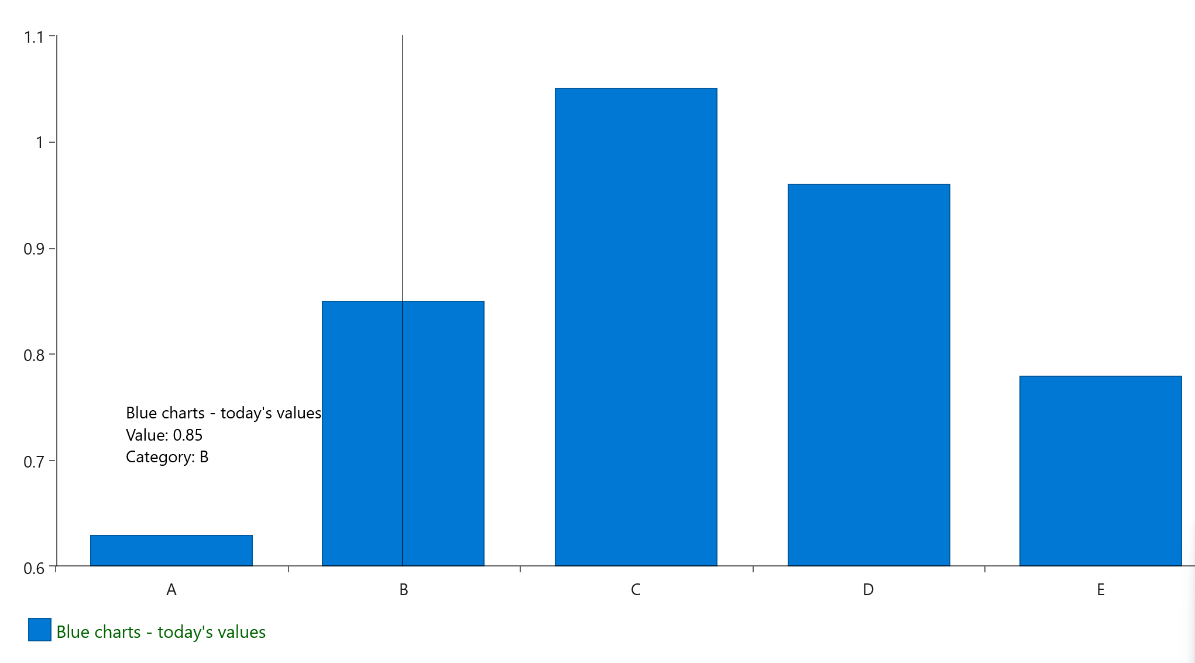
TrackBall
The TrackBall is another way to give better UX to our application allowing the values for several data points to display in a small pop up. To enable it we can use:
- ShowTrackInfo (bool) – determines whether the visual information for all the closest data points will be displayed
- ShowIntersectionPoints (bool) – defines a value indicating whether visual information for all the closest data points will be displayed.
<telerik:RadCartesianChart.ChartBehaviors>
  <telerik:ChartTrackBallBehavior  ShowIntersectionPoints="True"
    ShowTrackInfo="True"  />
</telerik:RadCartesianChart.ChartBehaviors>
Tooltip
By setting ChartTooltipBehavior, you can enable the chart to display a tooltip, but you can also choose when this will happen on Tap or on Hold setting the TriggerMode property like this:
<telerik:RadCartesianChart.ChartBehaviors>
  <telerik:ChartTooltipBehavior  TriggerMode="Tap"  />
</telerik:RadCartesianChart.ChartBehaviors>
A bar chart with enabled tooltip, trackball and legend:
Pan & Zoom
The Pan and Zoom behavior of the Chart handles the drag, pinch open and pinch close gestures which respectively cause panning, zooming in and zooming out of the associated chart plot area.
ZoomMode and PanMode can be set to any of the following values:
- None
- Horizontal
- Vertical
- Both
<telerik:RadCartesianChart.ChartBehaviors>
  <telerik:ChartPanAndZoomBehavior  ZoomMode="Horizontal"
    PanMode="Horizontal"/>
</telerik:RadCartesianChart.ChartBehaviors>
Configure the Selection
Visualizing data is great, but sometimes we need to select and do something else with this data. This can be done by defining a Selection behavior for Telerik Chart.
The Selection behavior can be configured with the two properties DataPointSelectionMode and SeriesSelectionMode:
- None
- Single
- Multiple
But if this is not enough and you need to handle more advanced scenarios during selection, Telerik Charts offer SelectedPoints and SelectedSeries properties, ClearSelection() method, SelectionChanged event and Command support.
A simple example:
<telerik:RadCartesianChart.ChartBehaviors>
  <telerik:ChartSelectionBehavior  DataPointSelectionMode="Single"
    Command="{Binding IsSelectionChangedCommand}"
    SeriesSelectionMode="None"  />
</telerik:RadCartesianChart.ChartBehaviors>
For more detailed info about Selection, you can refer to Telerik documentation Selection article.
Customize the Colors—Palettes!
Telerik Charts for .NET MAUI come with different pallets corresponding to the default look and feel for every OS.
And this is something that can easily be customized to meet the exact styling. You can do it with the help of two properties of type ChartPalette:
- Palette – defines the default appearance of the Chart series/data points
- SelectionPalette – defines the appearance of the Chart series/data points when selected
Here is an example that will use the Palette Entries for every one of the three series of a bar chart:
<telerik:RadCartesianChart.Palette>
  <telerik:ChartPalette>
    <telerik:ChartPalette.Entries>
      <telerik:PaletteEntry FillColor="#4FB6E7"  StrokeColor="#4FB6E7"  />
      <telerik:PaletteEntry  FillColor="#A666CE"  StrokeColor="#A666CE"  />
      <telerik:PaletteEntry  FillColor="#9DCC00"  StrokeColor="#9DCC00"  />
    </telerik:ChartPalette.Entries>
  </telerik:ChartPalette>
</telerik:RadCartesianChart.Palette>
Null Value Support
In many scenarios, some of the data points that are visualized in the Chart contain empty or null values. These are cases when data is not available for some records from the used dataset.
In case of Cartesian Series that require X and Y axes (Line, Area, Bar and so on), the Chart represents null data points with an empty space or gap. In the case of other chart types (Pie or Donut), these data points are not visualized.
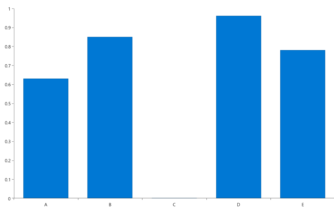
Here is how our bar chart will look if we remove the Value of one of the items:
More Resources
Full examples illustrating the power of Telerik Charts for .NET MAUI in different scenarios can be found in Telerik SDK and Telerik Controls Samples.
More details about the API can be found in Toolbar Documentation.
Try It and Share Your Feedback
Telerik Charts for .NET MAUI are only part of the UI components that you can use to speed your cross-platform development for iOS, Android, MacOs and Windows. Telerik UI for .NET MAUI is a developer toolbox that also contains Grid, Pickers, Inputs, TreeView and many other useful tools. Learn more in the .NET MAUI documentation.
Give it a try and in case you come up with any feedback, please feel free to share it on the Telerik UI for .NET MAUI Feedback Portal or post a comment.

Rossitza Fakalieva
Rossitza Fakalieva is a Technical Manager, Microsoft MVP in Developer Technologies and a Director of the Bulgarian chapter of the global Women Who Code organization. She previously worked on the Telerik engineering team and defines herself as .NET enthusiast. She loves to empower others to grow in their career and in the tech field—by teaching, by delivering courses and presentations, and as part of her daily job.
Related Posts
Comments
All articles
Topics
Web MobileMobile
Desktop
Design
Productivity
People
