
Telerik UI for .NET MAUI Calendar is Now Here: Easy to Use, Feature-Rich and Customizable

Summarize with AI:
Explore the RadCalendar, new to Telerik UI for .NET MAUI in R2 2023. This intuitive and feature-rich component will speed up your development time!
With the latest R2 2023 release, Progress Telerik UI for .NET MAUI grew with six new powerful UI components—RadCalendar, RadChat, RadPdfViewer, RadRichTextEditor, RadSlideView and RadTreeView. In this article, we will review the RadCalendar, its features and usage. Stay tuned for the rest. 😎
If you are already a Progress Telerik customer, you know that our products are designed to boost your development process and save you weeks, if not months, of development time. That is why our team strives to make the migration of Xamarin.Forms apps to .NET MAUI smooth and easy by transforming Telerik UI components from Xamarin to .NET MAUI with minimum API changes.
However, we also know when such change is needed in order to provide you with more valuable UI components. And developing the new .NET MAUI Calendar component for .NET MAUI was one such case where an API was necessary.
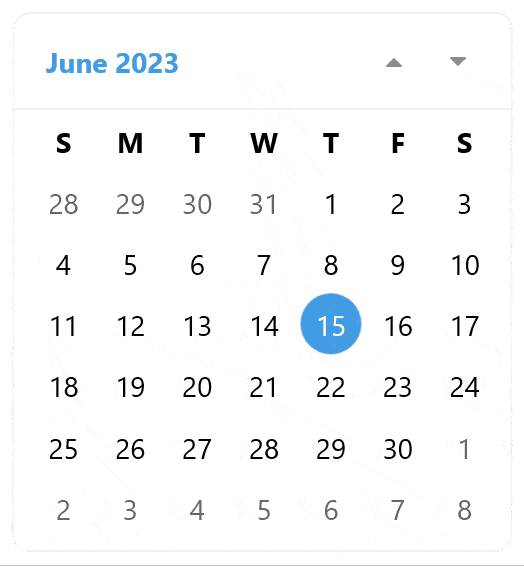
.NET MAUI is no longer a mobile-first platform but a cross-platform technology, and the new Telerik Calendar is optimized for cross-platform experience, too. The Progress Telerik team leaned on their experience of creating calendars for mobile and desktop and created a brand-new Calendar component. With its modern look and super customizable interface, it will allow your end users to select single or multiple dates by easily navigating between the decade, year and month views.
Basic Usage
As the rest of the components included in Telerik UI for .NET MAUI, you need to download and install a trial version of the suite to test it out.
Note! Call UseTelerik();
Do not forget to call the UseTelerik() method inside the MauiProgram.cs file of your .NET MAUI project. This is needed for all Telerik UI for .NET MAUI components. UseTelerik() registers
all built-in or additionally created handlers to Telerik components.
Once your .NET MAUI application has been set up, you are ready to define a Telerik control to your page with XAML or C#:
XAML
xmlns:telerik="http://schemas.telerik.com/2022/xaml/maui"
<telerik:RadCalendar />
C#
using Telerik.Maui;
using Telerik.Maui.Controls;
var calendar = new RadCalendar();
Let’s dive into the features!
View Modes
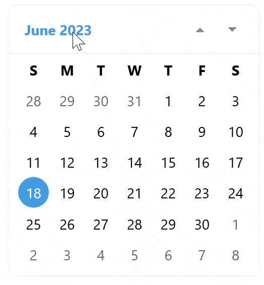
The Calendar component offers four built-in display modes controlled by the DisplayMode property:
- Month
- Year
- Decade
- Century
The default view is MonthView, but it can be easily changed using the DisplayMode property.
For example, let’s set it to Decade:
<telerik:RadCalendar DisplayMode="Decade"/>
Two more properties come in handy when you need to limit end-user interactions with the views. In our test case, we do not want users to be able to navigate from Decade to Year, and MinDisplayMode and MaxDisplayMode will reflect that:
<telerik:RadCalendar  DisplayMode="Decade"
  MinDisplayMode="Year"
  MaxDisplayMode="Decade"/>
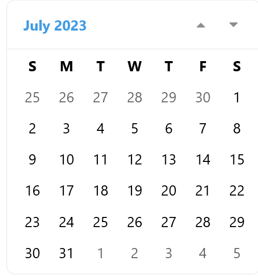
Display Date Settings
You can control the displayed time period using the DisplayDate, MinDate and MaxDate properties like this:
<VerticalStackLayout>
  <telerik:RadCalendar  DisplayDate="8/22/2023"
    MinDate="1/1/2022"
    MaxDate="12/31/2024"  />
</VerticalStackLayout>
Disable or Hide Days
It is very easy to disallow user interaction on some date cells using the BlackOutDates collection of DateTime objects. Just set the dates that you want to appear as disabled and that will prevent end-users from interacting with the dates.
<telerik:RadCalendar  BlackoutDates="{Binding BlackoutDates}"/>

where

public  ObservableCollection<DateTime>  BlackoutDates
  {
    get =>  this.blackoutDates;
    set  =>  this.UpdateValue(ref  this.blackoutDates, value);
  }
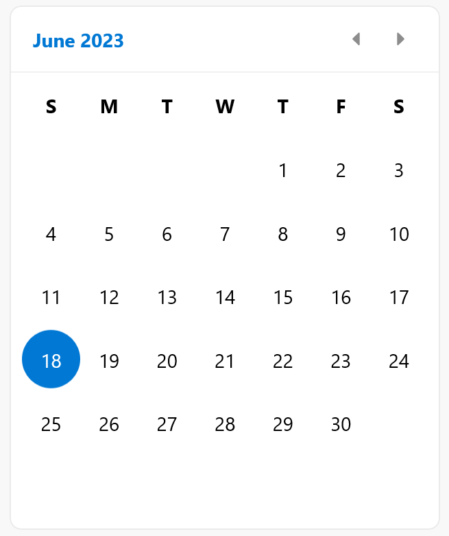
You can also hide the days from previous months in the MonthView using the IsOutOfScopeVisible property:
<telerik:RadCalendar IsOutOfScopeVisible="False"/>
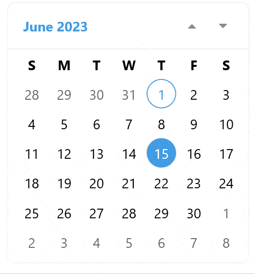
Selection
There are four available values to choose from when you need to configure the SelectionMode.
- Single
- Multiple
- Range
- None
Single
Multiple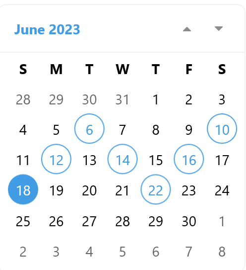
Range
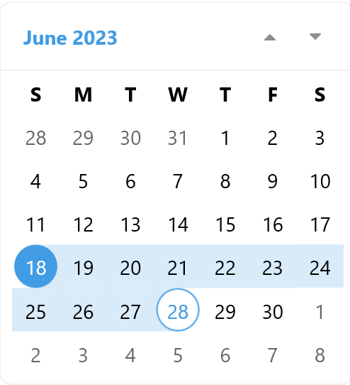
None
The SelectedDate and SelectedDates properties tell us what dates users have selected, or alternatively, we can use the SelectionChanged event, which is invoked when selection is performed.
You can read more about calendar selection here.
Customizable End-User Navigation
Navigation between modes is done through a Pan gesture as well as navigation buttons.
- You can define the direction of the navigation via this property:
NavigationDirection="Vertical"
- Or disable it with:
InteractionMode="None"
The navigation is also accessible through four commands that you can use to build your own navigation UI:
- NavigateToNextViewCommand
- NavigateToPreviousViewCommand
- NavigateToLowerViewCommand
- NavigateToUpperViewCommand
Read more about navigation in this Navigation article.
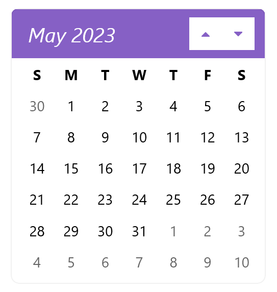
Styling & Customization API
Although the Telerik Calendar has a lot of properties to enable its configuration, sometimes what we really need is unique, custom styling. With the help of the rich Telerik API, you can create your own style and apply it to the component to have it meet your design requirements. The full API is listed here, but now let’s review some common scenarios:
Customizable Headers
There are two headers: one displaying the dates that can be manipulated with the formatting options and templates and one displaying the days of the weeks in a month view.
Format the Date Header
Format the way the date information is displayed in the Header using the following format properties:
<telerik:RadCalendar MonthHeaderTextFormat="{}{0:yy MMMM}"
  YearHeaderTextFormat="{}{0:yy} year"
  DecadeHeaderTextFormat="{}from {0:yy} to {1:yy}"
  CenturyHeaderTextFormat="{}from {0:yy} to {1:yy}"/>
You can also use the HeaderBorderStyle and HeaderLabelStyle to change the way headers looks and to control the buttons with the NavigateToPreviousViewButtonStyle and NavigateToPreviousViewButtonStyle properties.
For example, the code to make the header purple and the area around the buttons white is:
<Style TargetType="Label" x:Key="HeaderLabelStyle">
  <Setter Property="TextColor" Value="#8660C5" />
  <Setter Property="FontSize" Value="20" />
  <Setter Property="FontAttributes" Value="Italic" />
</Style>
<Style TargetType="telerik:RadBorder" x:Key="HeaderBorderStyle">
  <Setter Property="BackgroundColor" Value="White" />
  <Setter Property="BorderBrush" Value="#8660C5" />
  <Setter Property="BorderThickness" Value="1" />
</Style>
<Style TargetType="Button" x:Key="NavigateToViewButtonStyle">
  <Setter Property="TextColor" Value="#8660C5" />
  <Setter Property="BackgroundColor" Value="White" />
</Style>
<telerik:RadCalendar HeaderBorderStyle="{StaticResource HeaderBorderStyle}"
  HeaderLabelStyle="{StaticResource HeaderLabelStyle}"
  NavigateToPreviousViewButtonStyle="{StaticResource NavigateToViewButtonStyle}"
  NavigateToNextViewButtonStyle="{StaticResource NavigateToViewButtonStyle}" />
Note: To hide the header, you can use the same style again/ the HeaderBorderStyle again and set isVisible to false:
<Style TargetType="telerik:RadBorder" x:Key="HeaderBorderStyle">
  <Setter Property="BackgroundColor" Value="#8660C5" />
  <Setter Property="IsVisible" Value="false"/>
</Style>
Hide the Day Names Header
This is very easy to achieve, using a simple AreDayNamesVisible Boolean property:
<telerik:RadCalendar AreDayNamesVisible="False"/>
Customizing the Date Cells
You have full control over the way dates, months and decades are displayed using Templates, Style and Style Selectors:
Using DayTemplate, MonthTemplate, YearTemplate and DecadeTemplate, you can change the content of the cells.
By default, the cells are a special optimized telerik:CalendarBorderLabel element, so if you want to just to change style properties, such as colors, fonts or borders, there is great API to do that: DayStyleSelector,
MonthStyleSelector, YearStyleSelector and DecadeStyleSelectors. These properties will apply the styles that you define for the cells.
To do that, it is necessary to define your own style selector inheriting from the CalendarStyleSelector class and override the SelectStyle method. There, you have full control over the data object
CalendarNode, which holds all the information about the date.
In my case, as I want to mark the weekends only in MonthView, I’ll use DayStyleSelector which I’ll define in XAML like this:
public class CustomCalendarStyleSelector : CalendarStyleSelector
{
  public override Style SelectStyle(object item, BindableObject container)
  {
    var node = (CalendarNode)item;
    var date = node.Date;
    if (SundayLabelStyle != null && date != null && date.Value.DayOfWeek == DayOfWeek.Sunday)
    {
      return SundayLabelStyle;
    }

    if (node.IsToday || !node.IsEnabled)
    {
      return base.SelectStyle(item, container);
    }

    return this.NormalLabelStyle;
  }
  public Style SundayLabelStyle { get; set; }
}
<local:CustomCalendarStyleSelector x:Key="DayStyleSelector">
  <local:CustomCalendarStyleSelector.SundayLabelStyle>
    <Style TargetType="telerik:CalendarBorderLabel">
      <Setter Property="TextColor" Value="White" />
      <Setter Property="FontSize" Value="16" />
      <Setter Property="SecondaryBorderBackgroundColor" Value="#8660C5" />
    </Style>
  </local:CustomCalendarStyleSelector.SundayLabelStyle>
</local:CustomCalendarStyleSelector>
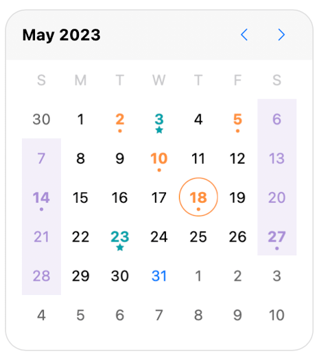
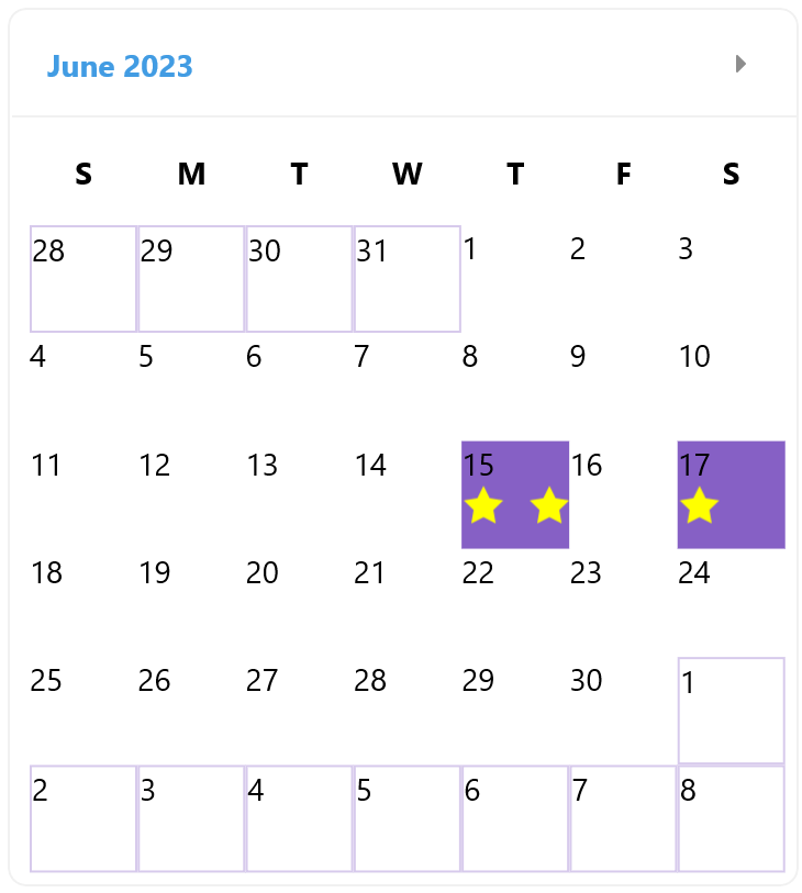
However, if I want to display the number of appointments for a certain day, I need to add a new UI element. So, I’ll use a combination between DayTemplate and DayStyleSelector:
- Setting the DayTemplate that will contain a RadShapeRating control to display an abstraction of appointments:
<DataTemplate x:Key="DayLabelTemplate">
  <telerik:RadBorder >
    <VerticalStackLayout>
      <Label  Text="{Binding Text}"/>
      <telerik:RadShapeRating />
    </VerticalStackLayout>
  </telerik:RadBorder>
</DataTemplate>
- Defining a custom DayStyleSelector like this:
XAML
<local:BusyDaysCalendarStyleSelector x:Key="DayStyleSelector>
  <local:BusyDaysCalendarStyleSelector.CustomNormalDayStyle>
    <Style TargetType="telerik:RadBorder">
      <Setter Property="BackgroundColor" Value="White" />
    </Style>
  </local:BusyDaysCalendarStyleSelector.CustomNormalDayStyle>
  <local:BusyDaysCalendarStyleSelector.BusyDayStyle>
    <Style TargetType="telerik:RadBorder">
      <Setter Property="BackgroundColor" Value="#8660C5" />
    </Style>
  </local:BusyDaysCalendarStyleSelector.BusyDayStyle>
</local:BusyDaysCalendarStyleSelector>
C#
public class BusyDaysCalendarStyleSelector : CalendarStyleSelector
{
  public override Style SelectStyle(object item, BindableObject container)
  {
    var node = (CalendarNode)item;
    var date = node.Date;
    var appointmentsCount = DayStyleSelector.Appointments.Where(a => a.StartDate.Date == date).Count();
    if (appointmentsCount > 0)
      {
      var rating = ((container as RadBorder).Children[0] as VerticalStackLayout).Children[1] as RadShapeRating;
      if (rating != null)
        {
        rating.ItemsCount = appointmentsCount;
        rating.ItemFill = Colors.Yellow;
        }
        return BusyDayStyle
      }
      return CustomNormalDayStyle;
  }
...
public  static ObservableCollection<Appointment> Appointments { get; set; }
Localization & Globalization
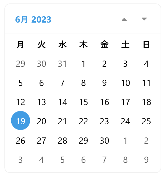
The Culture property of the Calendar component is used to set the country locale. You can have multiple calendars displayed with different cultures. To set the calendar to display dates in Japanese, the culture code will look like this:
this.calendar.Culture = new System.Globalization.CultureInfo("ja-JP");
Another useful property is FirstDayOfWeek, which will configure the start of the week for example to Monday.
Calendar in Japanese culture and FirstDayOfWeek="Monday"
Telerik Calendar for Xamarin vs. Telerik Calendar for .NET MAUI
These are two completely different components. The Telerik UI for Xamarin Calendar was optimized for mobile development, including scheduling functionality.
The Telerik Calendar for .NET MAUI is a powerful component targeting desktop and mobile scenarios with focus on providing easy navigation and intuitive UX for date selection.
Of course, scheduling functionality is also coming but as a separate powerful component. Stay tuned for the Telerik UI for .NET MAUI RadScheduler, as it will be released in the next couple of months. Meanwhile, try the new Telerik Calendar for .NET MAUI now and share your feedback.
More Resources
The Telerik UI for .NET MAUI Calendar is an intuitive and powerful component designed to speed up the development of .NET MAUI applications. Detailed examples of the Calendar features can be found in Telerik Controls Samples, developer-focused examples and Telerik documentation.

Rossitza Fakalieva
Rossitza Fakalieva is a Technical Manager, Microsoft MVP in Developer Technologies and a Director of the Bulgarian chapter of the global Women Who Code organization. She previously worked on the Telerik engineering team and defines herself as .NET enthusiast. She loves to empower others to grow in their career and in the tech field—by teaching, by delivering courses and presentations, and as part of her daily job.
Related Posts
Comments
All articles
Topics
Web MobileMobile
Desktop
Design
Productivity
People
