
5 .NET MAUI Components That Will Ensure You Never Ask ‘How Do I Build That’

Summarize with AI:
Stop asking yourself, “How Do I Build That?” Create a real-life sales dashboard .NET MAUI app from scratch in no time using these five .NET MAUI Components—DataGrid, Chart, ComboBox, ProgressBar and TabView.
Lucky for us, today’s market is full of tools and products aiming to make life better, easier and happier. That is exactly the case with the Progress Telerik UI for .NET MAUI suite. I believe you have already heard of it. It is the most extensive UI suite on the market that delivers controls for building modern and professional-looking mobile and desktop apps for cross-platform implementation targeting Android, iOS, macOS and Windows from a single shared codebase.
Having a magic wand in your hands is pointless without knowing how to use it and what it is capable of. Mine is well trained to integrate the .NET MAUI DataGrid, Chart, ComboBox, ProgressBar and TabView to build a real-life sales dashboard from scratch in no time.
Let me tell you the story of my dashboard and the role of these fantastic five in it.
Brief Intro
My dashboard is logically separated into three parts—overview, detailed information and, of course, statistics. In the next sections, I will show you around each and explain how I built it.
I promise not to flood you with large code snippets, essential parts only. And still, I will not be that mean to not give you the entire solution at the end of this blog, so read on.
Oh, you might want to check out the outcome first so that you do not need to leave things to your imagination. 😅 Voilà!
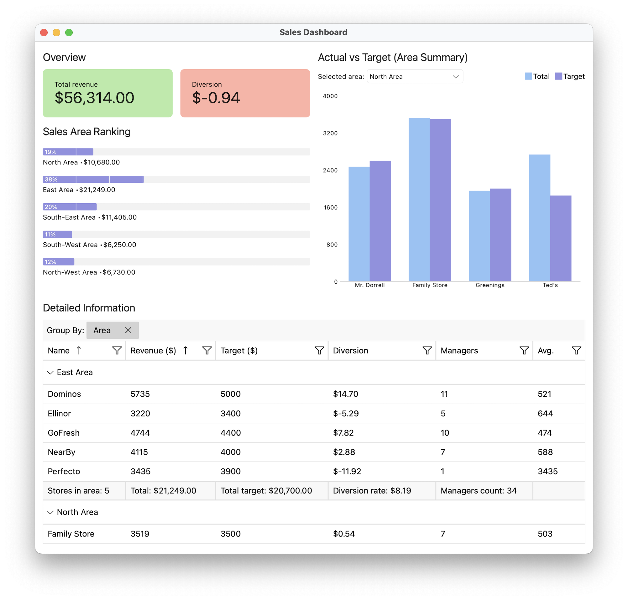
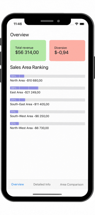
Overview Part
Since it is an overview, I wanted this part to contain a brief but essential introduction. Nothing more than to be able to see the total revenue, the diversion rate and performance of the sub-areas of my sales area.
And here you can see the first one of my fantastic five—the .NET MAUI ProgressBar component. Want to track the progress your sales areas are making? Well, the progress bar is perfect for this!
It has everything I need and even more. I wanted to display the sales progress an area is making as percent from the range from minimum to maximum—that is why I set the ValueDisplayMode of the ProgressBar to Percent. I also thought it would be fancier to divide it into segments. The SegmentCount I chose is 8. And lastly, I needed the label indicating the progress to be one of the first things my eyes see, so instead displaying it at the end of the ProgressBar, I used the LabelHorizontalOptions to place it at the start.
<telerik:RadLinearProgressBar
    Minimum="0"
    Maximum="{Binding BindingContext.Selection.TotalRevenue, Source={x:Reference itemsView}}"
    SegmentCount="8"
    Value="{Binding Total}"
    ValueDisplayMode="Percent"
    LabelHorizontalOptions="Start"
    ProgressFill="{StaticResource AccentColor2}"
    VerticalOptions="Center" />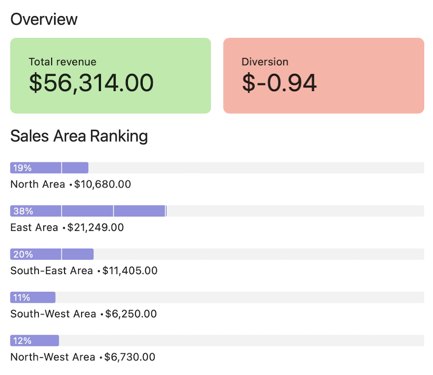
Moving on to the part at the right of the overview—the statistics. In the meantime, if you are intrigued by the tiny, yet advanced .NET MAUI ProgressBar, be sure to check the useful links that follow.
Learn more:
- Getting Started with the .NET MAUI ProgressBar control – Official documentation starting point
- Keep Progressing with the Telerik .NET MAUI ProgressBar – More in-depth walk-through with an advanced example
- .NET MAUI ProgressBar Control | Telerik UI for .NET MAUI – Explore the features of the component
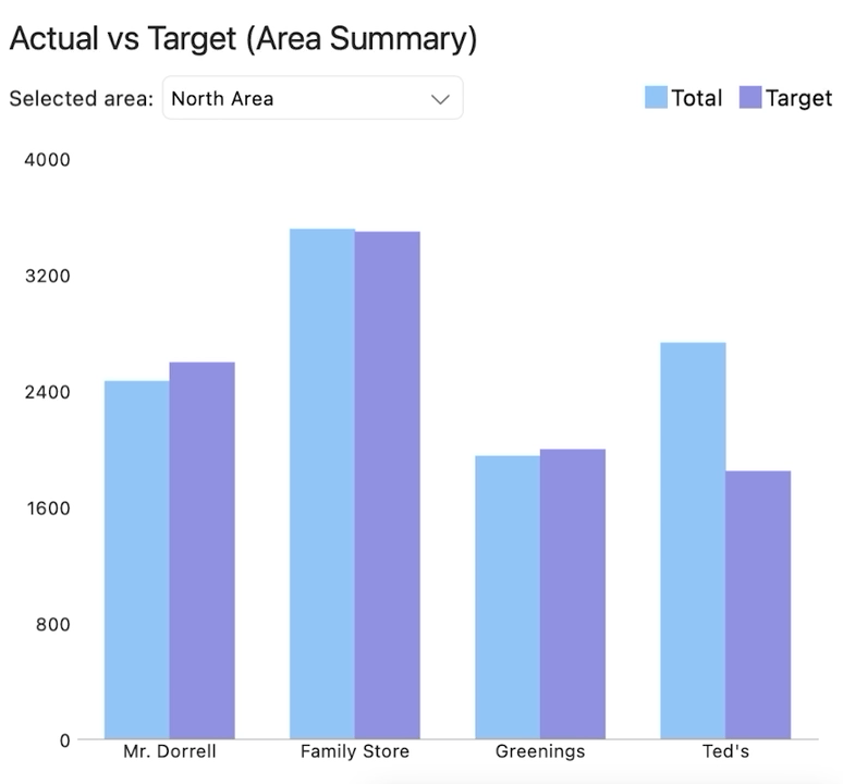
Statistics Part
Can you guess which of the fantastic five is the star of this section? It is hard to mess this one. It is the .NET MAUI Chart! Three words that describe this data visualization component best—feature-rich, intuitive and easy-to-use. I was torn over what kind of chart to pick for my dashboard, but I figured that for comparing the actual vs. target numbers for a sales area, the .NET MAUI Cartesian Chart is my best option.
The Cartesian Chart uses the Cartesian coordinate system to plot the data points in its chart series. The X and Y axes define how the coordinates of each point in the plot area are calculated. And since I chose to visualize the data points as bars, the .NET MAUI Chart Bar Series is what you see at the picture I showed you earlier.
What is special about my chart series is that it unlocks a few additional drawing strategies. I chose Cluster among the available combine modes so the series are combined next to each other:

Oh wait, what is that at the very top right in the above picture? It is another legendary feature of the .NET MAUI Chart—with which you and I both can know which bar represents the total, and which the target. I am talking about the legend feature of the chart.
I almost forgot. The TrackBall behavior is also added to my chart. In my dashboard, it is responsible for rendering information about the data points representing the actual and the target in a small popup which displays over them.
Learn more:
- Getting Started with the .NET MAUI Chart – Official documentation starting point
- .NET MAUI Charts | Telerik UI for .NET MAUI – Explore the various chart series and their features
ComboBox
Those of you who have trained eyes and like to pay attention to details can see that there is one more star in this section. Did you folks spot the .NET MAUI ComboBox at the top left of the chart?
There is hardly a .NET MAUI application that does not contain a combo box. My sales dashboard is no exception. It is a shame I only use a tiny bit of its variety of features.
I did not need to allow the end user to type into the input area, so I chose the non-editable mode of the .NET MAUI ComboBox. My combo box is data bound to the sales areas and displays the name of each in its dropdown using the DisplayMemberPath property.
It also lacks the clear button since I did not want to enable the end user to clear the selected area and end up with an empty chart. I did that using the IsClearButtonVisible property.
And the last modification I made was to set a custom DropDownHeight since I know the count of my areas and the height of each item by platform. 😎
Notice how with each section I become increasingly generous. 😄 This time I am giving you the complete XAML of the statistics view:
<Grid RowDefinitions="Auto, Auto, *">
    <Label Text="Actual vs Target (Area Summary)" Style="{StaticResource SectionLabelStyle}" />
    <Grid Grid.Row="1" ColumnDefinitions="Auto, *">
        <HorizontalStackLayout Spacing="5">
            <Label Text="Selected area:" VerticalOptions="Center" IsVisible="{OnIdiom Default=True, Phone=False}" />
            <telerik:RadComboBox x:Name="areasCombo" ItemsSource="{Binding Areas}" DisplayMemberPath="Name" SelectedIndex="0" IsClearButtonVisible="False" DropDownHeight="{OnPlatform Android=170, iOS=180, MacCatalyst=110, WinUI=200}" WidthRequest="200" />
        </HorizontalStackLayout>
        <telerik:RadLegend Grid.Column="1" LegendProvider="{x:Reference chart}" Orientation="Horizontal" VerticalOptions="Center" HorizontalOptions="End" />
    </Grid>
    <telerik:RadCartesianChart x:Name="chart" Grid.Row="2" BindingContext="{Binding Source={x:Reference areasCombo}, Path=SelectedItem}" Palette="{StaticResource DashboardChartPalette}" Margin="0, 16, 0, 0">
        <telerik:RadCartesianChart.HorizontalAxis>
            <telerik:CategoricalAxis />
        </telerik:RadCartesianChart.HorizontalAxis>
        <telerik:RadCartesianChart.VerticalAxis>
            <telerik:NumericalAxis />
        </telerik:RadCartesianChart.VerticalAxis>
        <telerik:RadCartesianChart.Series>
            <telerik:BarSeries ItemsSource="{Binding Stores}" CombineMode="Cluster" DisplayName="Total  " ValueBinding="Total" CategoryBinding="Name" />
            <telerik:BarSeries ItemsSource="{Binding Stores}" CombineMode="Cluster" DisplayName="Target" ValueBinding="Target" CategoryBinding="Name" />
        </telerik:RadCartesianChart.Series>
        <telerik:RadCartesianChart.ChartBehaviors>
            <telerik:ChartTrackBallBehavior ShowTrackInfo="True" />
        </telerik:RadCartesianChart.ChartBehaviors>
    </telerik:RadCartesianChart>
</Grid>
And a bonus GIF!
Ready to move on to the detailed info view? Almost.
Learn more:
- Getting Started with the .NET MAUI ComboBox – Official documentation starting point
- .NET MAUI ComboBox Control | Telerik UI for .NET MAUI – Explore the features of the component
Now we are ready.
It Is All About the Data
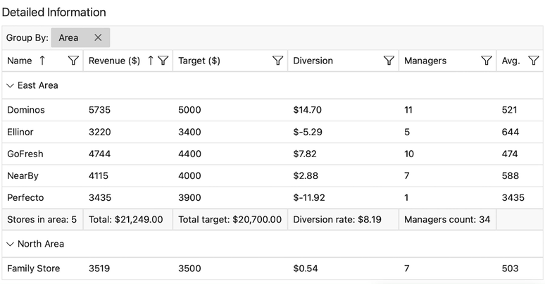
When you hear “data” and need to figure out the best way to display it, what component do you think of? Do I hear a table? Tables are great at comparing detailed information about several related items at once. What a coincidence (or not 🤣)! My dashboard needs to display details about each store of a sales area. And I know just the best Telerik UI for .NET MAUI component—DataGrid.
The .NET MAUI DataGrid is extremely powerful when it comes to easily displaying data in tabular format in your .NET MAUI applications. It can be populated from various data sources and includes out-of-the-box support for operations such as editing, sorting, filtering, grouping and much more.
In my case, the DataGrid is grouped by sales area as you may have already guessed. It is sorted by the name of the respective store, as well as its revenue. A hint here—sorting by multiple columns requires a multiple UserSortMode to be set to the grid:
<telerik:RadDataGrid
    Grid.Row="1"
    ItemsSource="{Binding Stores}"
    AutoGenerateColumns="False"
    UserEditMode="None"
    UserGroupMode="Enabled"
    UserSortMode="Multiple"
    ShowGroupFooters="True">
    <telerik:RadDataGrid.GroupDescriptors>
        <telerik:PropertyGroupDescriptor PropertyName="Area" />
    </telerik:RadDataGrid.GroupDescriptors>
    <telerik:RadDataGrid.SortDescriptors>
        <telerik:PropertySortDescriptor PropertyName="Name" />
        <telerik:PropertySortDescriptor PropertyName="Total" />
    </telerik:RadDataGrid.SortDescriptors>
    <telerik:RadDataGrid.Columns>
        <!-- Columns definition is skipped to not flood you with code here. -->
    </telerik:RadDataGrid.Columns>
</telerik:RadDataGrid>
The approach I chose regarding the definition of my columns is surprisingly the manual one, although I really enjoy the automatic generation ability. For my dashboard, the AutoGenerateColumns property of the DataGrid is set to false, as my data is not ordered the way I want it.
The other reason behind my decision is the desire to display aggregates for specific columns only. I picked the PropertyAggregateDescriptor approach, which allows me to define a property and a function that are applied over the property values of the DataGrid, which accumulates an aggregated result based on the component data. And it supports a set of known functions that I can just use without writing them myself!
Examples based on my sales dashboard include the total count of my stores by area, the sum of their revenue and their targets, etc.:
<telerik:RadDataGrid.Columns>
    <telerik:DataGridTextColumn PropertyName="Name" HeaderText="Name">
        <telerik:DataGridTextColumn.AggregateDescriptors>
            <telerik:PropertyAggregateDescriptor PropertyName="Name" Function="Count" Caption="Stores in area:" />
        </telerik:DataGridTextColumn.AggregateDescriptors>
    </telerik:DataGridTextColumn>
    <telerik:DataGridNumericalColumn PropertyName="Total" HeaderText="Revenue ($)">
        <telerik:DataGridNumericalColumn.AggregateDescriptors>
            <telerik:PropertyAggregateDescriptor PropertyName="Total" Function="Sum" Caption="Total:" Format="C" />
        </telerik:DataGridNumericalColumn.AggregateDescriptors>
    </telerik:DataGridNumericalColumn>
    <telerik:DataGridNumericalColumn PropertyName="Target" HeaderText="Target ($)">
        <telerik:DataGridNumericalColumn.AggregateDescriptors>
            <telerik:PropertyAggregateDescriptor PropertyName="Target" Function="Sum" Caption="Total target:" Format="C" />
        </telerik:DataGridNumericalColumn.AggregateDescriptors>
    </telerik:DataGridNumericalColumn>
    <telerik:DataGridNumericalColumn PropertyName="Diversion" HeaderText="Diversion" CellContentFormat="${0:N2}">
        <telerik:DataGridNumericalColumn.AggregateDescriptors>
            <telerik:PropertyAggregateDescriptor PropertyName="Diversion" Function="Sum" Caption="Diversion rate:" Format="C" />
        </telerik:DataGridNumericalColumn.AggregateDescriptors>
    </telerik:DataGridNumericalColumn>
    <telerik:DataGridNumericalColumn PropertyName="Managers" HeaderText="Managers">
        <telerik:DataGridNumericalColumn.AggregateDescriptors>
            <telerik:PropertyAggregateDescriptor PropertyName="Managers" Function="Sum" Caption="Managers count:" Format="N0" />
        </telerik:DataGridNumericalColumn.AggregateDescriptors>
    </telerik:DataGridNumericalColumn>
    <telerik:DataGridNumericalColumn PropertyName="Avg" HeaderText="Avg." />
</telerik:RadDataGrid.Columns>
Did you notice that I set the ShowGroupFooters of my data grid to true in the first code snippet? Since I have grouping by area applied to the DataGrid, I can display the aggregate results for the groups data in the group footer. The group footer is divided into cells which are aligned with the respective columns and show the aggregate results for the respective column.
The .NET MAUI DataGrid is about as big as the solar system and what you saw in my dashboard is a star rather than a planet of it. And I only got a tiny jar of ink for this blog post, so we should jump to the next section.
Learn more:
- Getting Started with the .NET MAUI DataGrid – Official documentation starting point
- .NET MAUI Challenge 4: Telerik DataGrid – Essential part of the .NET MAUI challenges which focus on simple but specific important topics that help developers learn something new in minutes
- .NET MAUI DataGrid Control | Telerik UI for .NET MAUI – Explore the features of the component
Adapting the Layout
I am not messing with you. If you counted, I know you only saw the fantastic four and I promised five. I intentionally kept the last one for dessert.
Its power in my sales dashboard is special and oriented to adapting the layout of it for mobile devices. I wanted to separate the logical parts of the dashboard in a tabbed manner to be able to concentrate on one at a time. I did not need to spend much time on searching for or developing one myself—I got the .NET MAUI TabView. A flexible and fully customizable navigation control that allows me to build a tabbed interface with ease.
<telerik:RadTabView HeaderPosition="Bottom">
    <telerik:TabViewItem HeaderText="Overview">
        <views:OverviewView />
    </telerik:TabViewItem>
    <telerik:TabViewItem HeaderText="Detailed Info">
        <views:DetailedInfoView />
    </telerik:TabViewItem>
    <telerik:TabViewItem HeaderText="Area Comparison">
        <views:AreaComparisonView />
    </telerik:TabViewItem>
</telerik:RadTabView>
Did you set a timer for me? Sorry if you tried to, as this was faster than aiming for the Start button.
You can see I chose the bottom HeaderPosition as it is more intuitive in terms of mobile UI for me. I enjoy it nearly as much as the content swiping ability. Changing the selected item using swipe gestures is so neat!
I only now realize that it would have been even better if I added icons/images inside the header instead of or in addition to the text. It is as easy as providing an ImageSource to the TabViewItem in case you have the perfect ones at your fingertips (as opposed to me 🤫). Not to mention the ability to control the position of the image and the spacing between it and the header text.
Learn more:
- Getting Started with the .NET MAUI TabView – Official documentation starting point
- .NET MAUI TabView Control | Telerik UI for .NET MAUI – Explore the features of the component
Get up and Try
There you have it—all the fantastic five .NET MAUI components that can help you build an entire sales dashboard. I hope that there are some of them (or parts of them) that you might not have known about, so that you are even more eager to get up and try now!
After all, the Telerik UI for .NET MAUI family keeps growing and now delivers 60+ controls to meet all cross-platform app requirements for data handling, performance, UX, design and so much more. If by some chance you aren’t already using the .NET MAUI library, you can try it out completely free for 30 days! Give it a shot and enjoy just how easy and fast it makes it to develop stunning Maui apps.
And stay tuned as the best is yet to come. 🤩
Almost forgot—here is the promised dashboard solution.

Viktoria Grozdancheva
Viktoria is a Senior Front-end Developer with 5+ years of experience designing and building modern UI for desktop and mobile platforms on Microsoft/Telerik technology stacks. Her spare time is dedicated to friends and family and discovering new pieces of the world. Find her on Twitter and LinkedIn.
Related Posts
Comments
All articles
Topics
Web MobileMobile
Desktop
Design
Productivity
People
