
Keep Progressing with the Telerik .NET MAUI ProgressBar

Summarize with AI:
Indicate the progress of a long-running operation in your desktop or mobile applications with the .NET MAUI ProgressBar component. Choose the best form of showing your progress, pick the right operation mode and configure it to perfection with the flexible customization API.
Awareness of the progress you are making would not be possible without keeping track of it. That’s why I am more than thrilled to offer you the best way to do this—by using the freshest arrival of the R1 2023 Release. More specifically, the .NET MAUI ProgressBar component. Welcome to its meet-and-greet! 🥳
Here are a few things you need to know in advance. The .NET MAUI ProgressBar is:
- Super easy to be put into practice
- Packed up with a lot of perks
- Extra flexible in terms of customization
Now that I’ve built such strong expectations, it is time to prove them.
Progress Brought into Play
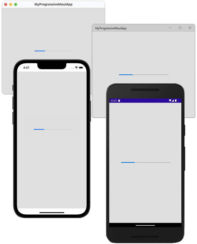
Bringing the ProgressBar component into the playing field is surely as brief as a single line of code considering you already have a fresh MAUI app and the Telerik.UI.for.Maui NuGet. XAML or code-behind? It is up to you:
<telerik:RadLinearProgressBar Value="28" VerticalOptions="Center" />RadLinearProgressBar pb = new RadLinearProgressBar() { Value = 28 };P.S. Hope you did not forget to register the required handlers inside your MauiProgram class.
Feature-Richness
This tiny thing is so feature-full! 🤩
Should I mention the value-controlling props? Better pop the awesome .NET MAUI ProgressBar Configuration section of the control’s online documentation.
I believe the more exciting configuration options are always the extra ones—such as the support for segments, the ability to visualize indeterminate mode, and the possibility to choose from different animation options. And if you are guessing that all of this is accompanied by useful Events for tracking the progress process, you guessed right.
Of all the perks, the ValueDisplayMode and Segments are my total favs. Why? Because when I set the ValueDisplayMode to None (which is the default one), I surely can cover tons of user scenarios. And the segments, well, they simply make everything cooler!
Oooh, I almost forgot the cherry on the cake! 🍒 You can also define a rounding to the corners of the progress indicator and the track using the ProgressCornerRadius and the TrackCornerRadius properties.
Beneath the Surface
In the previous section, I gently touched the top of the .NET MAUI ProgressBar. I wanted to devote this section to something beneath the surface—the ways of showing the different progress states and when it is best to use which.
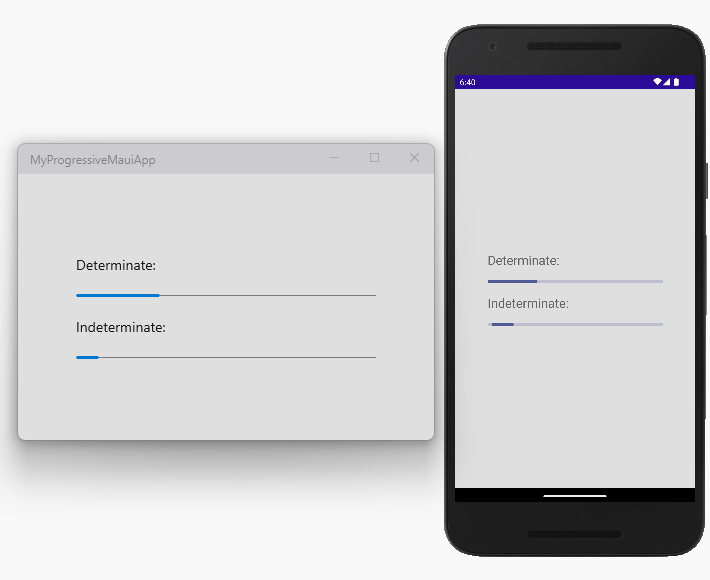
Determinate
Determinate linear indicators fill the track with color, as the indicator moves from the minimum to the maximum specified value (or from 0 to 100%). They display how long a process will take and are recommended to be used when the process completion rate can be detected.
Indeterminate
Indeterminate linear indicators move along a fixed track indefinitely. They express an unspecified amount of wait time and are recommended to be used when the progress isn’t detectable, or if it’s not necessary to indicate how long an activity will take.
This mode can be activated by setting the IsIndeterminate property of the .NET MAUI ProgressBar to True.
Both determinate and indeterminate modes are animated and come with the ability to customize the respective animation. You can learn how to do it in the Animations section of the online documentation. In the meantime, I will show you how the control looks by default while operating in both modes.
Segmented
RadLinearProgressBar allows you to split the progress track into multiple segments. Here, the SegmentCount property determines the amount. And you are also empowered to control the thickness (or density) of the segments through the SegmentSeparatorThickness property. Oh, and of course you can color them as desired with the SegmentSeparatorFill property.
Leveling up
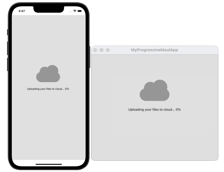
It’s time for some out-of-the-box and up-to-the-clouds fun. So, come join me.
Before I start, I want you to not get me wrong—I like the tiny bar I am seeing but thought that it would be cool to break out of it just a little.
The first thing that I decided to do is make it fill from bottom to top instead from left to right, which I achieved by rotating it. Then I applied a clipping in the form of a cloud and finally added a decent loading message to match the idea I envisioned:
<Grid BackgroundColor="#DFDFDF"
      Padding="20"
      RowDefinitions="*, *">
    <Grid BackgroundColor="#989898"
          HorizontalOptions="Center"
          VerticalOptions="End"
          WidthRequest="144"
          HeightRequest="144"
          Clip="M94.5,27C98.8,27.0,102.8,27.8,106.7,29.4C110.5,31.1,113.9,33.3,116.7,36.2C119.6,39.0,121.8,42.4,123.5,46.2C125.1,50.1,125.9,54.1,126,58.5C125.9,60.2,125.8,61.9,125.5,63.6C125.2,65.2,124.8,66.8,124.3,68.4C127.5,71.0,130.1,74.1,132.1,77.8C134.0,81.5,135,85.5,135,90C135,97.5,132.3,103.8,127.0,109.1C121.7,114.3,115.4,117,108,117L36,117C28.5,117,22.2,114.3,16.9,109.0C11.6,103.7,9,97.4,9,90C9,84.0,10.7,78.8,14.1,74.1C17.5,69.5,21.8,66.3,27.1,64.5C27.1,64.2,27.1,63.9,27.1,63.7C27.1,63.4,27.1,63.1,27.1,63C27.1,55.5,29.7,49.1,35.0,43.8C40.2,38.6,46.5,36.0,54,36C56.7,36.0,59.3,36.3,61.8,37.1C64.2,37.8,66.6,38.9,68.7,40.3C71.5,36.3,75.2,33.0,79.7,30.6C84.2,28.2,89.1,27.0,94.5,27z">
        <telerik:RadLinearProgressBar x:Name="progressBar"
                                      Rotation="-90"
                                      HeightRequest="128"
                                      WidthRequest="90"
                                      HorizontalOptions="Center"
                                      VerticalOptions="Center"
                                      TrackFill="Transparent"
                                      ProgressAnimationDuration="20" />
        <Label x:Name="tick"
               Scale="0"
               FontFamily="{x:Static telerik:TelerikFont.Name}"
               FontSize="32"
               Text="{x:Static telerik:TelerikFont.IconTick}"
               TextColor="#FFFFFF"
               HorizontalOptions="Center"
               VerticalOptions="Center" />
    </Grid>
    <Label Grid.Row="1"
           Text="{Binding Value, Source={x:Reference progressBar}, StringFormat='Uploading your files to cloud... {0}%'}"
           HorizontalOptions="Center"
           VerticalOptions="Start" />
</Grid>
public MainPage()
{
this.InitializeComponent();
var timer = this.Dispatcher.CreateTimer();
timer.Interval = TimeSpan.FromMilliseconds(20);
timer.Tick += (s, e) =>
{
this.progressBar.Value++;
};
this.Dispatcher.DispatchDelayed(TimeSpan.FromSeconds(2), timer.Start);
this.progressBar.ProgressCompleted += (s, e) =>
{
timer.Stop();
this.tick.ScaleTo(1);
};
}Here is my humble creation running on iOS and MacOS simultaneously. 🙈
Signing up for a Trial
I already know you are interested in experimenting with .NET MAUI, or that you’re already actively working with it to develop outstanding applications. Otherwise, you wouldn’t land on here and take the time to read my blog, for which I am beyond thankful! What I can do as a gesture of gratitude is to strongly encourage you to check out the other Telerik UI for .NET MAUI components as well.
To get the bits, you just need to sign up for our free 30-day trial, which gives you access to the components as well as our legendary technical support at zero cost. Just head to the Telerik UI for .NET MAUI overview page or click the button below to sign up for a trial today!
You will thank me later. 😜
Sharing Is Caring
I am certain that the new .NET MAUI ProgressBar component is a great fit for your mobile and desktop .NET MAUI applications. Once it finds a place in them, don’t forget to share your opinion and ideas either in the comment section below or by visiting the Telerik UI for .NET MAUI’s Feedback Portal.
Never forget that you are a crucial part of the future of Telerik UI for MAUI. Your input matters. 😊

Viktoria Grozdancheva
Viktoria is a Senior Front-end Developer with 5+ years of experience designing and building modern UI for desktop and mobile platforms on Microsoft/Telerik technology stacks. Her spare time is dedicated to friends and family and discovering new pieces of the world. Find her on Twitter and LinkedIn.
Related Posts
Comments
All articles
Topics
Web MobileMobile
Desktop
Design
Productivity
People
