
What’s New in Telerik Desktop & Mobile with R1 2023
 by Yoan Krumov

Summarize with AI:
We’re excited to share about our R1 2023 release update for our Progress Telerik products for mobile and desktop. Keep reading!
Telerik UI for WinForms
Hey, hey, hey! WinForms is here! With the R1 2023 release, our Telerik UI for WinForms suite grows stronger—from two new controls and a new theme to new functionalities. We are also happy to share that with this official release of Telerik UI for WinForms, .NET 7 is fully supported. Cool, right?
Now, let’s bring more light to the new goodies which come with R1 2023 release. With the current release, the team targets one of the most important obstacles every developer must overcome: designing a functional interface.
We will start with the new controls, which I think will bring a smile to your face.
Windows 11 Theme
New year, new controls, new look. To be up to date with the latest fashion trends and to look shiny as hell, let’s welcome Windows 11 theme to the Telerik UI for WinForms suite. To see how cool it looks, you can check it out in our Theme Viewer tool, where you can also see all other themes included in Telerik UI for WinForms package.

ToolbarForm
Saving space in large applications is crucial for being user-friendly and staying competitive in the market. The RadToolbarForm extends its non-client area and allows adding various UI elements: buttons, dropdown menus, text boxes and more. The title bar is separated into three sections which can be populated with different controls per your requirements. You can use this form to create modern apps like Visual Studio, Microsoft Word or Excel, Outlook, etc.

TaskbarButton
Let me share a secret with you. You can use the taskbar for more than seeing your apps and checking the time.
The RadTaskbarButton component allows you to interact with the Windows Taskbar and gives developers the proper API to define the style for their application’s taskbar button.
By utilizing the taskbar, you can give the end user a shortcut to your application’s internal commands or show a loading indicator when the application is loading or a long running task is currently in progress.
There are other functionalities like showing a badge on the taskbar icon to show the current status of the application, modifying the jump list by adding shortcuts to other related applications, etc.
These functionalities are only part of the API which you can use. I think you know where you can read more about them, but still I will give you a hint: In our RadTaskbarButton Online Documentation.

Don’t leave your taskbar application icon hanging on the screen like you don’t know what to do with it. Show them that they are wrong!
If you think that is all, let us check some of the other perks.
SyntaxEditor: Word Wrapping
SyntaxEditor control is a great text editor tool which provides built-in syntax highlighting and code editing experience for popular languages. What was missing so far was word wrapping functionality. What is a text editor without word-wrap?
This release, we add this functionality to the control. When the feature is enabled, the horizontal scroll bar is removed, and all the text is horizontally fit in the available space.
We have also included an additional margin that holds the icons and can be removed if needed. I’m sure you have seen this view mode in many editors and IDEs, so I hope it will make your WinForms applications which use our RadSyntaxEditor more useful and user friendly.

To see how to use this functionality, please check the Word Wrap article from the SyntaxEditor help documentation.
.NET 7 Support
During the last year, we’ve implemented and shipped support for the various preview versions of .NET 7. With this release, we are shipping support for the official version of .NET 7. This is the first major release which fully supports .NET 7.
Also, we have removed the .NET 5 support with the .NET 7 introduction, so please consider upgrading your .NET 5 applications to newer .NET. With the R1 2023 release, DLLs targeting .NET 5 will not be available for download from your account nor the NuGet package for .NET 5.
Revamped Icons
The new release and the new theme brought a new glyph font—the TelerikFluentIcons. It contains a similar set of icons to the TelerikWebUI but with a different visual appearance to better match the Windows 11 iconography. The glyphs have been redesigned to embrace a softer geometry and more modern metaphors.
WinUI
Find out what’s new in Telerik UI for WinUI 2.4.0!
Calculator
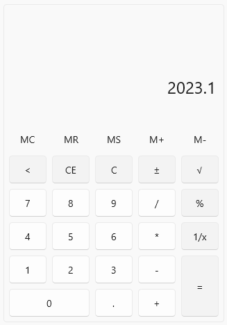
Announcing the brand-new Calculator control for WinUI! I guess there is no need to explain in detail what Calculator is?! However, let’s say couple words about it. RadCalculator is a useful component that enables your users to perform calculations directly in the WinUI application, without navigating to a different app. The control has an easy-to-use interface providing all basic calculations such as addition, subtraction, multiplication and division, as well as some more complicated ones—reciprocal, square root, negate. Furthermore, all the Memory and Clear features are exposed as well.
Check out the key features below:
- Basic calculations — addition, subtraction, multiplication, division
- Additional calculations — negate, square root, reciprocal
- Memory functionality
- Clear entry, clear all, delete functionality
- Customized functions
- UI automation support
For more information about the control, make sure to check out the Calculator section in our online help documentation.
CalculatorPicker
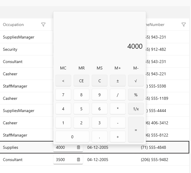
RadCalculatorPicker is an additional component that provides a quick way to show and use RadCalculator in scenarios where saving space is important. One very useful use case would be to use the Calculator as editor of the cell value of DataGrid (as seen in the screenshot above). I’m sure you will make good use of it! For more details, check out the CalculatorPicker article in our help documentation.
.NET 6 and Windows App Sdk 1.2 Support
With this release we are removing the .NET 5 support and adding .NET 6 with Windows App SDK 1.2 support. So, if you are still on .NET 5, make sure to migrate to .NET 6. And if you have any issues with migration, do not hesitate to contact us. 😊
Check out the Detailed Release Notes
We have a lot more! To get an overview of all the latest features and improvements we’ve made, check out the Telerik UI for WinUI (Release Notes).
Telerik UI for WPF
Let’s take a look at what’s new in Telerik UI for WPF with R1 2023.
OfficeNavigationBar

Our brand new OfficeNavigationBar component is inspired by the MS Outlook Navigation Bar. It allows you to easily navigate between different views and offers the ability to quicky access a minimalistic subset of a view within a popup window.
Here are some of the features it provides:
- DisplayModes – compact or full mode
- Navigation Options Window – allows controlling the order and maximum number of visible items, switching between display modes
- Peek Window – displays a callout over the selected item (or item under mouse) which can host additional info or UserControls (views) associated with the item
For more information about the control, make sure to check out its online help docs.
Map: Vector Tiles Support
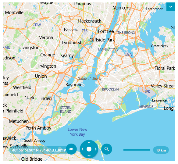
We are glad to announce that the most voted Map feature in the latest years—support for vector tiles—is now here!
Vector data consists of mainly geometry and text definitions which is rendered on the client. All data is separated in layers and every layer can be styled with style definition located in JSON file referenced in your application. This brings a new level of flexibility and customization options, allowing users to create various map appearances.
The new map feature consists of several new providers allowing connection to online vector tile services or rendering local vector data:
- MapBoxMapProvider – connects to online MapBox vector tile service via access token
- MbTilesMapProvider – renders local mbtiles data (sql archives which may contain both vector and raster tile layers)
- UriVectorTileMapProvider – renders data from local pbf/mvt vector tile files
- VectorTileMapProvider, VectorTileMapSource, IMapStreamProvider – base public classes / interfaces for developing custom vector providers
Vector tiles are generally a great opportunity to enrich, customize and provide a modern look to your mapping applications, so we would love to hear any feedback you may have on the matter. Please drop us a line about how it goes when you integrate them.
ScheduleView: Improve Performance with a Lot of Resources
This release, we added a highly requested improvement in the rendering of the resource group headers. They are now virtualized, and this enables a smooth user experience, especially when resources come in hundreds or thousands.
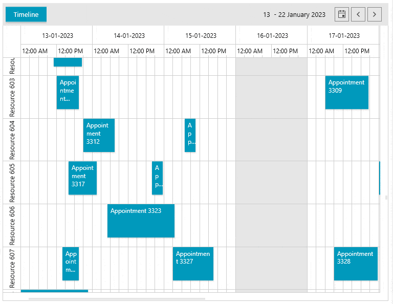
You can enable the feature by setting the IsGroupHeadersVirtualizationEnabled property to true.
Previously such heavy UI resulted in thousands of UI elements rendered on load, but now only the resources, special slots and appointments visible in the viewport are generated, allowing smoother scrolling experience.
To get into more details regarding this feature, you can visit its documentation article.
RichTextBox: New Selection Mode
The new selection mode allows you to select whole words similarly to Microsoft Word. It can be enabled by setting the IsAdvancedSelectionEnabled property. The following GIF shows how this works.
PivotGrid: Load Data from OLAP Cube on Demand (Lazy Loading)
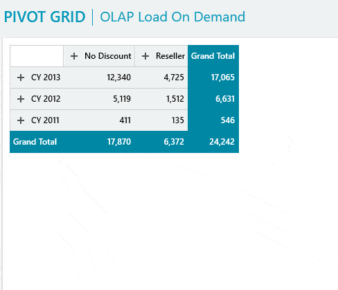
The new load on demand feature will increase the performance of your OLAP-based PivotGrid scenarios. It allows you to fetch the needed data only when the associated group gets expanded.
By default, the OLAP data providers (XmlaDataProvider and AdomdDataProvider) will pre-load all the data from the associated cube and display it in the PivotGrid.
To change this behavior, set the EnableLoadOnDemand property
of the data provider to true.
ChartView: Create Histogram Charts with ScatterRangeBarSeries and ChartHistogramSource
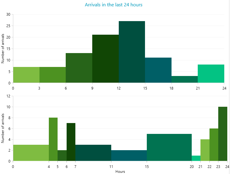
With the new ScatterRangeBarSeries and the ChartHistogramSource, you can now create histogram charts. These types of charts are generally used to visualize continuous data, measured in two directions (values). It is, however, just a use case of the ScatterRangeBarSeries which can handle non-continuous data sets too. Here is a quick set up of a sample scatter range bar chart:
First, we give some data via ScatterBarInfo instances:
public MyUserControl()
{
    InitializeComponent();

    var source = new ObservableCollection<ScatterBarInfo>();
    source.Add(new ScatterBarInfo(0, 4, 8, 10));
    source.Add(new ScatterBarInfo(6, 10, 1, 6));
    source.Add(new ScatterBarInfo(1, 1.5, 1, 6.5));
    source.Add(new ScatterBarInfo(3, 3.5, 4, 5));
    source.Add(new ScatterBarInfo(8, 11, 7, 11));
    this.scatterRangeBarSeries.ItemsSource = source;
}
Then we bind the data via four major range-definition properties:
<telerik:ScatterRangeBarSeries x:Name="scatterRangeBarSeries"
               		   HorizontalLowBinding="HorizontalLow"
                               HorizontalHighBinding="HorizontalHigh"
                               VerticalLowBinding="VerticalLow"
                               VerticalHighBinding="VerticalHigh"
               ItemsSource="{Binding}" />
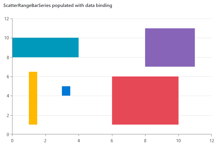
Please follow the databinding help section to get into more details on how to populate the scatter range bars with data in a MVVM way.
End of .NET 5 Support
As you may know, since May 2022 .NET 5 is out of Microsoft support. Being up to date with the current technology trends, from this release on, we will no longer support .NET 5. This includes assemblies, NuGet packages VS extensions. We generally encourage you to switch your apps to .NET 6 and .NET 7 (you know we have Day-Zero, support for .Net7, right ?) in the near future.
However, if this sounds pressing to you, you can consider using .NET Core 3.1 which we will still ship for several releases (until .NET 8 is released).
Other Features
- Common: Added ValidationErrorTemplateHelper.DisplayMode supporting different kind of visualizations of the error message.
- ChartView: Added API for showing empty content between the axis when there is no data.
- ComboBox: Added option to select partial matches.
- Diagrams: Exposed constant to control minimum distance for which snapping next to shapes is enabled during connection manipulation.
- GridView: Added GridViewAlternateRowStyle which can be used for setting an alternating row background.
- GridView: Implemented an option to change the default number of distinct values shown by setting the DefaultDistinctValuesCount property.
- RichTextBox: Introduced support for East Asian Font attribute when exporting Run fonts.
- TabControl: Added option to allow inverting the scroll direction when using the mouse wheel over the tab strip panel.
Check out the Detailed Release Notes
We have a lot more! To get an overview of all the latest features and improvements we’ve made, check out the release notes for the products below:
Telerik UI for WPF (Release Notes)
Telerik UI for Silverlight (Release Notes)
Telerik Document Processing Libraries
The R1 2023 release brings numerous improvements across the entire suite. Here are some of the highlights of the Telerik Document Processing Libraries:
New Encryption Mode Supported in RadPdfProcessing Library
We have added support for the Encryption Algorithm 5 with AES-256, which was one of the most demanded features. Here are the currently supported algorithms:
- Supported encryption algorithms for import : RC4 (V2), AES-128 (AESV2), AES-256 (AESV3)
- Supported encryption algorithms for export: RC4 (V2), AES-256 (AESV3)
The encryption algorithm is controlled by the EncryptionType property of the export settings. Detailed information is available here: Export settings.
New Search API in the RadPdfProcessing Library
The new search API allows to search for a specific text in the PDF files. It has many methods that allow you to customize the search criteria and even search with regular expressions. The search result returns the page and the location of the searched text. Here is a small example that shows this:
var search =  new  TextSearch(document);
var result = search.FindAll("Lorem",  TextSearchOptions.Default);
Detailed information about this functionality is available in our documentation: Search.
New Fields in RadWordsProcessing
We have added table of contents fields TOC and TC, which allow you to dynamically add a table of contents to your documents using various switches.
The table of authorities fields—TOA and TA—are now supported as well. These fields allow you to add a table of authorities to your document.
In order to make the TOC and TOA fields work, we have added the Sequence field as well.
Our demo application now has an example of these fields.
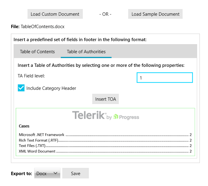
You can see all supported fields in our documentation as well: Fields Overview.
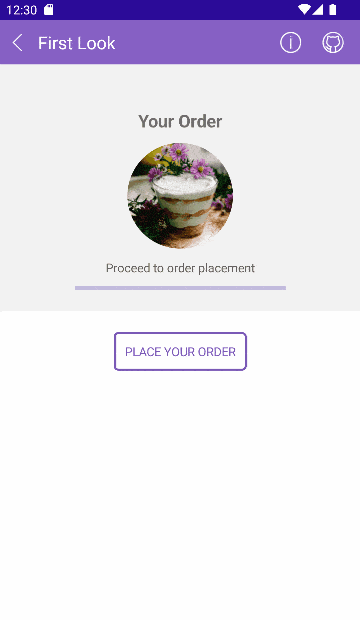
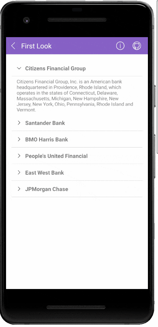
Telerik UI for .NET MAUI
R1 2023 brings exciting updates to Telerik UI for .NET MAUI, including five brand-new controls—ToolBar, ImageEditor, SignaturePad, ProgressBar and Accordion. We’ve also added some enhancements to our powerful DataGrid control. Let’s have a sneak peek at the most interesting stuff we have for you in this release.
New .NET MAUI ToolBar Control
In today’s world of mobile and desktop apps, it’s important to have a clear and easy-to-use navigation system. That’s why we’re excited to introduce our new Toolbar component for .NET MAUI! This powerful and versatile component allows you to easily create a sleek and professional navigation experience for your app. It can mimic the functionality and behavior of the Visual Studio toolbar with its Strip and Overflow areas.
Here are some of the key features you get in the new ToolBar control:
- Rich collection of toolbar items: navigation button, split button, slider, listpicker, radio buttons and more.
- Support for adding text and image to the toolbar item.
- Horizontal or vertical orientation: RadToolbar supports both horizontal and vertical orientation.
- Overflow menu: when the toolbar items cannot fit in the available space, an overflow button is displayed. The items are added in the overflow menu. You can display them using the different modes of the overflow menu.
- Panning and scrolling through the Toolbar items.
- Options to separate the toolbar items through UI element part of the toolbar items—SeparatorToolbarItem.
- Options to group the toolbar items.
Visit our product documentation for more information on getting started with the Telerik UI for .NET MAUI ToolBar control.
.NET MAUI ImageEditor
You can now easily visualize and edit images in different file formats in your mobile and desktop application with our new ImageEditor control for .NET MAUI. The component comes with convenient image interactions such as zoom and pan, flip and rotate, resize and crop.
It is also packed with a variety of filters which allows you to perform various color adjustments to the image such as adjusting the Hue, Saturation, Brightness and Contrast. If your users are unhappy with an image interaction or the set of interactions, they can go back and forth because the ImageEditor has History support.
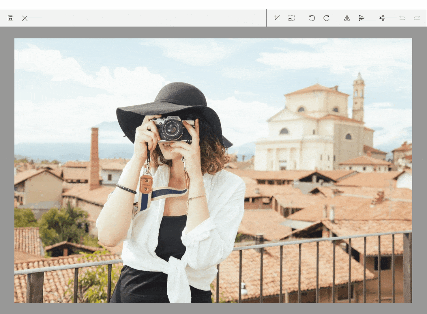
Here are some of the key features you get in the new ImageEditor:
- Importing and exporting images: The control allows you to import different image formats such as JPEG, PNG, GIF, BMP, and export images in JPEG, PNG, GIF, BMP formats.
- Various image source options: Load images from a Stream, File (as embedded resource, or image located on the device) and URI.
- Support for undo/redo and reset: RadImageEditor has a history stack with the changes applied to the image. This means that you can reverse and re-apply actions.
- Support for Interactive Pan and Zoom: The control has built-in pan and zoom functionality that will help you interact with the image and display it in a convenient way.
- Built-in Toolbar: the control comes with a ready-to-use toolbar pre-populated with all the items needed to manipulate images.
- Custom Toolbar: RadImageEditor’s Toolbar can be fully customized. You could populate the toolbar with the ToolbarItems needed for editing the image.
- Commands support: The control provides built-in commands and interactive commands. In addition, there are Toolbar commands.
- Support for Image Transformations:
◦ Crop
◦ Resize
◦ Rotate—Left and Right
◦ Flip—Horizontal and Vertical - Built-in Filters:
◦ Hue
◦ Saturation
◦ Brightness
◦ Contrast
◦ Blur
◦ Sharpen
Visit our product documentation for more information on getting started with the Telerik UI for .NET MAUI ImageEditor control.
New SignaturePad Control for .NET MAUI
The Telerik SignaturePad control for .NET MAUI is a user-friendly component that allows you to capture and save signatures within your native mobile and desktop applications.
Upon interacting with it, the component displays the signature path, ensuring that your end user feels a natural pen effect. You can easily customize signature’s stroke and color and save the signature as PNG or JPEG.
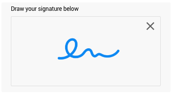
Here are some of the key features of the SignaturePad control:
- Configure the stroke thickness and stroke color of the signature to achieve the desired look.
- Exhaustive number of events that are raised when a new stroke is started, completed and an event fired when the surface is cleared.
- Commands Support: Easily clear the signature from the surface using the exposed command.
Visit our product documentation for more information on getting started with the Telerik UI for .NET MAUI SignaturePad control.
RadProgressBar for .NET MAUI
If you need to indicate the progress of a long-running operation in your desktop or mobile application, then our RadProgressBar comes in handy. It can also show multiple forms of progress, such as data loading or a multi-step user action, in which you can visualize how much has been completed and what remains.
Here are some of the key features you get in the new ProgressBar component:
- Value and Progress: Used to set and report the progress of a task inside the ProgressBar control.
- Value range: Define value ranges by setting the minimum and maximum values.
- Different value display modes: The label that shows the current state of the progress can be set to absolute value, percent, text or fully hidden.
- Segments support: RadProgressBar can be divided in segments.
- Indeterminate mode support: A mode that displays an animation indicating an unspecified amount of waiting time.
- Different animations: You can apply different animation easing and animation duration while changing the value of the ProgressBar.
- Flexible styling API: For customizing the progress fill, track fill, indeterminate fill, label text color, font size and more.
Please visit our product documentation for more information on getting started with the Telerik UI for .NET MAUI ProgressBar control.
UI for .NET MAUI Accordion
RadAccordion is a powerful and versatile component that allows you to easily organize and present large amounts of content in a small space. With its intuitive and user-friendly interface, you can quickly and easily expand and collapse sections to view the information you need.
- Collapsed/expanded states: RadAccordion consists of AccordionItems that can host any content. The end users could show or hide this content by interacting with the headers of the control.
- Collapse All Items: You can allow your app users to collapse all items of the RadAccordion.
- Highly customizable items: You have full control over the visual appearance of the Accordion items—you can customize the border style of each item, the border style of items’ headers, as well as the indicator text, font, size, location and color.
- Animation while expanding/collapsing: RadAccordion provides slick customizable animation played while the expandable content is expanded/collapsed.
Visit our product documentation for more information on getting started with the Telerik UI for .NET MAUI Accordion control.
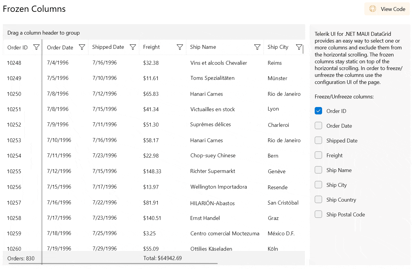
New Feature in DataGrid—Frozen Columns
This powerful feature allows you to “freeze” or “pin” certain columns of your DataGrid so that they remain visible and in place even as the user scrolls through the rest of the columns. This is particularly useful when working with large and complex datasets, as it allows users to easily reference important information while scrolling through the rest of the data.
Telerik UI for Xamarin
With R1 2023 our main focus was on Telerik UI for .NET MAUI; however, we were able to deliver two of the most requested features for UI for Xamarin.
Xamarin DataGrid Enchantment: Support for Scrolling to a Specific Item
Our DataGrid for Xamarin just got a new API that enables you to programmatically scroll a DataGrid so that a specific item is visible on the screen, thus bringing a smoother user experience into your Telerik UI for Xamarin app.
Here is an example of how to scroll to the last item in the DataGrid by using the new ScrollItemIntoView method (the code executes on a button click):
private void Button_Clicked(object sender, System.EventArgs e)
{
    var item = this.vm.Clubs[this.vm.Clubs.Count - 1];
    this.grid.ScrollItemIntoView(item);
}
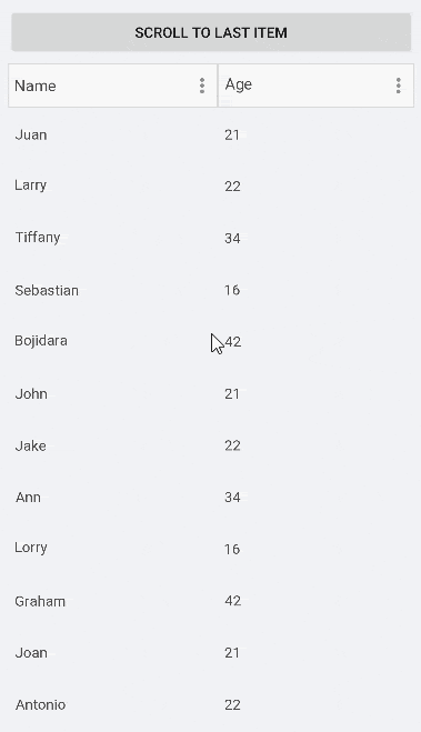
Visit our product documentation for more information on the Telerik UI for Xamarin DataGrid control ScrollItemIntoView method.
New Functionality in our SideDrawer Component for Xamarin
By default, the SideDrawer Drawer Content area closes when user clicks/taps outside of it. With R1 2023, you can control that behavior by setting using the TapOutsideToClose boolean property. Its default value is True, but when setting it to False, the drawer content area of the component remains open if the end user taps/clicks outside of it and the main content area remains active. Here is it in action:
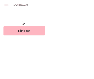
Visit our product documentation for more information on the Telerik UI for Xamarin SideDrawer control TapOutsideToClose property.
Try Them Out & Share Your Feedback
Head over to the Telerik page and download a free trial. If you are an active license holder you can grab the latest and greatest from the “Your Account” page or update your NuGet package reference to the latest version directly in your .NET solutions.
Share your thoughts with us on our feedback portal and help us shape the future of Telerik UI!
Join Us for Release Webinar (and More)
Progress Telerik .NET Web, Desktop & Mobile Products R1 2023 Release Webinar | January 26

Discover all updates across Telerik UI for Blazor, UI for ASP.NET Core, UI for ASP.NET MVC, UI for ASP.NET AJAX, UI for WPF, UI for WinForms, UI for WinUI, UI for .NET MAUI and UI for Xamarin and ThemeBuilder.
Join Us on Twitch

If you can’t wait until the webinar to unpack the new release, join the Livestream Release Party on January 19, 10 a.m. – 11:30 a.m. ET to hear the release highlights across the entire Progress Developer Tools portfolio and hang out with friends.
And for those of you who will be at NDC London on January 25-27, you are welcome at the Progress booth where we can talk about all product developments and the latest release.
Progress Kendo UI R1 2023 Release Webinar | January 31

Discover all updates across KendoReact and Kendo UI for Angular, Vue and jQuery, as well as ThemeBuilder.
Progress Telerik Reporting, Mocking and Debugging Tools R1 2023 Release Webinar | February 2
Discover all updates across Telerik Reporting, JustMock, Fiddler Everywhere and Fiddler Jam.
Yoan Krumov
Yoan has 10+ years of experience at Progress Telerik. During these years he passed through different positions in the company, including being a developer for the WPF and WinUI team, and he is now the Product Manager for Desktop & Mobile suites—UI for .NET MAUI and UI for WPF/WinForms. Outside of his professional endeavors, Yoan is passionate about keeping up with technology trends through tech blogs, chilling and exploring the world.
Related Posts
Comments
All articles
Topics
Web MobileMobile
Desktop
Design
Productivity
People
