6 Handy Properties of .NET MAUI’s Entry Control

Summarize with AI:
Let’s take a look at some of the lesser known properties in the Entry control that help us build a great user experience in our .NET MAUI app.
The Entry control is an important component of .NET MAUI. Here are six useful properties of this control that can simplify your app development.
We frequently use the Text, Placeholder or FontSize properties, but there are also many other super useful properties that are not as well-known. For instance, did you know that you can enable a clear button on an Entry while typing? Or that you can disable spell-checking? 🤔
This article will guide you through a quick implementation of six properties, as summarized below.
- Clearing your entry
- Enabling spellcheck
- Enabling text prediction
- Customizing the keyboard
- Setting the cursor position
- Establishing the selection length
1. Clearing your Entry
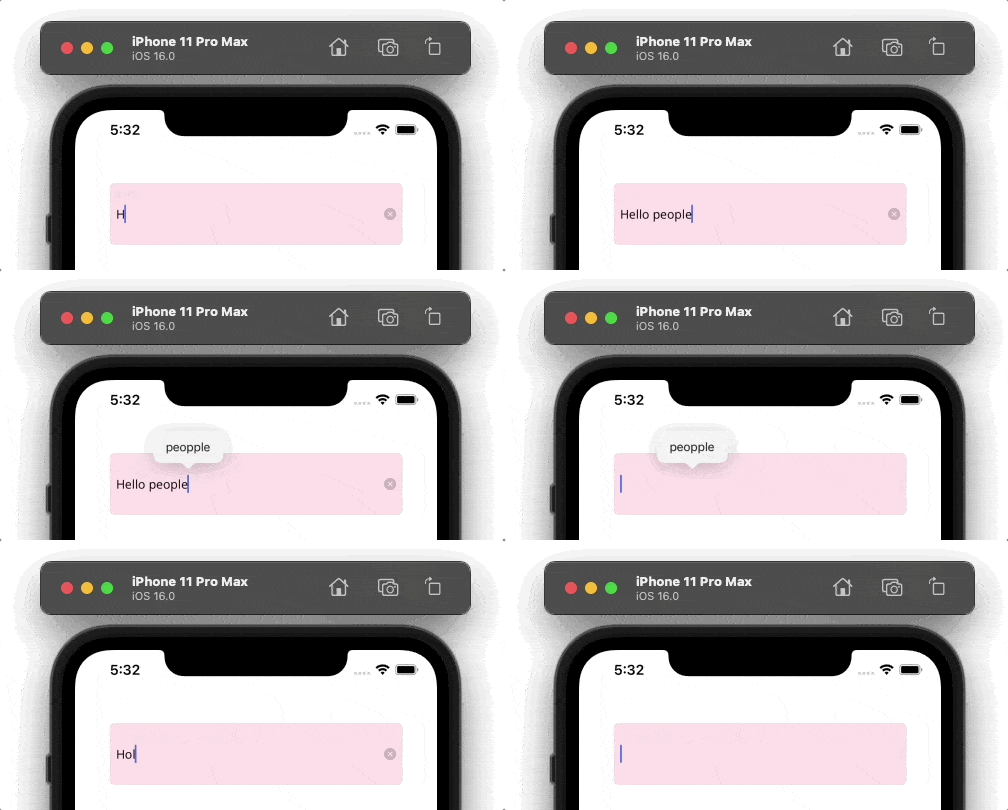
We can enhance the functionality of an Entry by enabling the clear button. This allows the user to delete the complete text of the Entry while typing.
You can accomplish this using the ClearButtonVisibility property, which accepts the following values:
- WhileEditing: It’s responsible for displaying the clear button in the Entry while it has focus and text.
- Never: It’s responsible for keeping the button hidden to clear the text. (Default value.)
Let’s see how to do it in code:
<Entry ClearButtonVisibility="WhileEditing"/>
2. Enabling Spell Checking
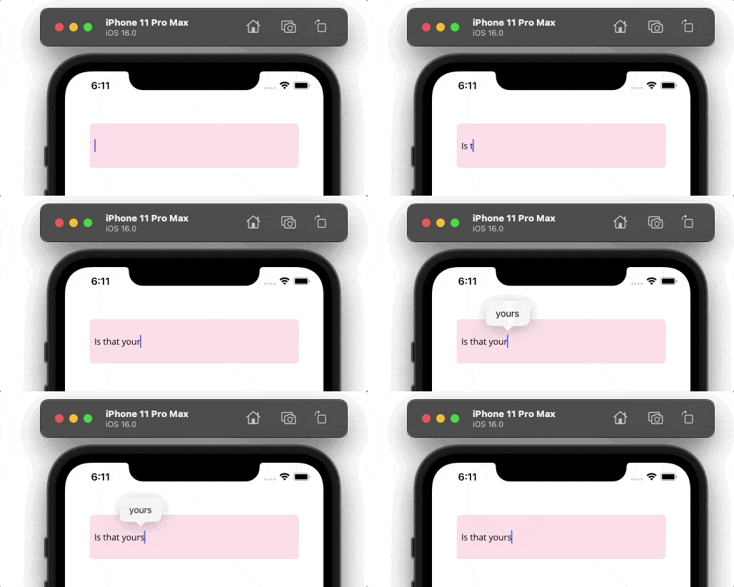
By default, the Entry has the IsSpellCheckEnabled property enabled, which checks for spelling errors in real time while the user is typing and launches a text suggestion. Sometimes, this can be a bit annoying, but the
good news is that we have the option to disable it.
To disable this property, set it to False as shown in the following code:
<Entry IsSpellCheckEnabled="False"/>
3. Enabling Text Prediction
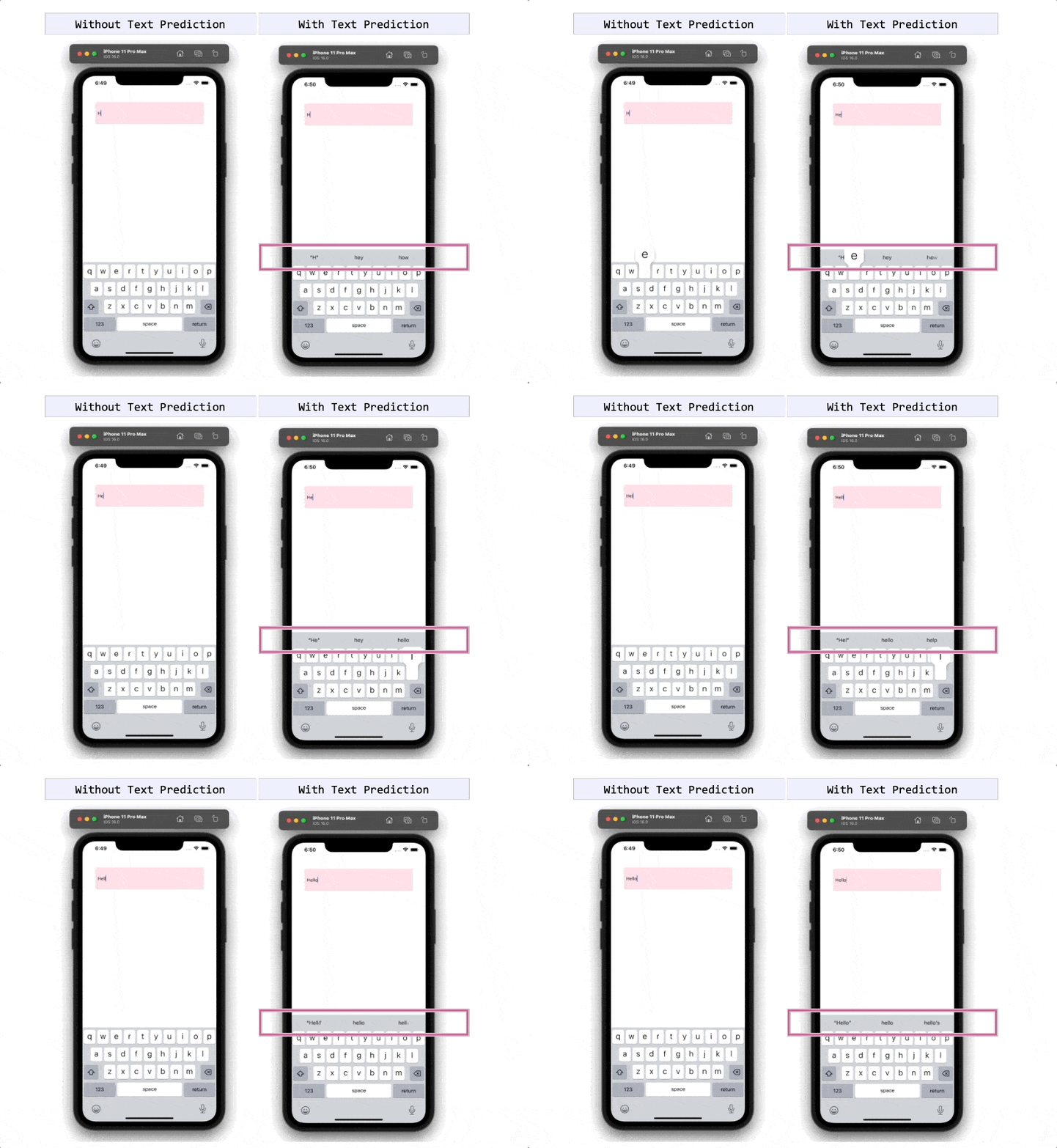
The IsTextPredictionEnabled property automatically predicts and corrects the Entry text as the user types. By default, this property’s value is True.
If you don’t need this feature, you can disable it by setting the property’s value to False as shown in the following example:
<Entry IsTextPredictionEnabled="False"/>
4. Customizing the Keyboard
We can customize the keyboard on our device to meet our needs using the Keyboard property. The property has different default values, which we will outline below:
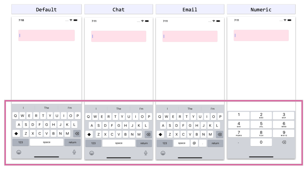
- Default: The default keyboard.
- Chat: Allows you to send text and emojis.
- Email: Typically used when entering email addresses.
- Numeric: Used when entering numbers.
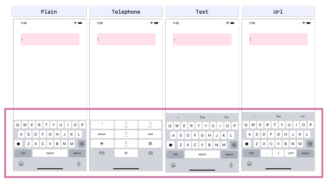
- Plain: Allows you to enter text without specifying any KeyboardFlags.
- Telephone: Used when entering telephone numbers.
- Text: Used when entering text.
- Url: Allows us to enter file paths and web addresses.
Let’s see how to do it in code:
<Entry Keyboard="Chat" />
5. Setting the Cursor Position
The CursorPosition property lets you indicate the position of the insertion point in the text contained within the Entry control. It takes an integer value.
In the example below, the CursorPosition property is set with 2 as a value in the first image, while in the second image it has a value of 10. (The default value is 0.)

Let’s see how to do it in code:
<Entry Text="Hello people!"
  CursorPosition="10" />
6. Establishing the Selection Length
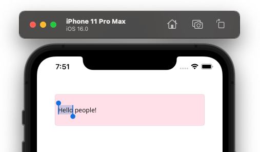
Finally, we have the SelectionLength property, which allows us to highlight a specific number of characters in the Entry.
To set the number of characters to be highlighted, simply send an integer value, as shown below:
<Entry Text="Hello people!"
  SelectionLength="5" />
Conclusion
I hope this list of helpful properties was beneficial to you! I encourage you to implement them into your daily life and continue exploring others! 💚💕
See you next time! 💁♀️
References
This article was based on the official documentation:
Use a component library in sync with .NET MAUI’s release cadence. Try Telerik UI for .NET MAUI for free.

Leomaris Reyes
Leomaris Reyes is a software engineer from the Dominican Republic specializing in mobile development. She is a 7-time Microsoft MVP and actively builds mobile applications while sharing practical knowledge through technical articles and developer-focused content.
Through her work, she explains programming concepts, developer tools and real-world development practices to help developers grow in their careers.
You can follow her on Instagram and TikTok at @leomarisreyes.dev, read her articles on AskXammy, and connect with her on LinkedIn, where she shares tutorials, insights and resources for developers.

