
Replicating a Dating Profile UI in .NET MAUI

Summarize with AI:
Learning XAML may be a lot easier than you think. To prove it, we’ll build a dating profile UI in three simple steps.
One of the comments that I usually hear or read when working with XAML in Xamarin Forms or .NET MAUI is: XAML is difficult or complicated to learn. In this article, I’ll show you that it’s really the opposite—we will see how easy XAML is to handle when making your favorite UIs!
We will be replicating a dating profile UI step by step, inspired by a Dribbble design.
Let’s Start! 😎
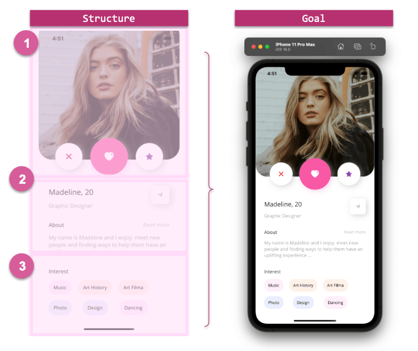
First of all, it’s important that you are clear about how to start. I recommend that you do it in a set of steps to maintain organization. That is why we will divide our UI into steps, which compose the structure that we are going to develop during the explanation.
In the image shown below, you will see a set of numbers. Each number is a “step” and we will explain it in detail.
Let’s see the structure:
Starting with the Code: Selecting the Main Layout
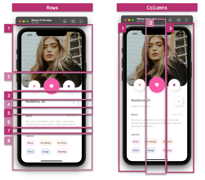
To build our screen, we need to add the main layout that will help us place the visual elements of the page. This time, let’s select the Grid, on which we will define three columns and eight rows.
How can I know the correct number of columns and rows to define in my Grid?
Let’s see it in a graphic explanation:
Now let’s see how to translate it to XAML:
<ScrollView Margin="0,-90,0,-40" VerticalScrollBarVisibility="Never">
  <Grid RowDefinitions="Auto,Auto,Auto,Auto,Auto,Auto,Auto,Auto" RowSpacing="15" Margin="30,0,30,30"
  ColumnDefinitions="*,*,*">
      <!-- Add the code from steps one here -- >
      <!-- Add the code from steps two here -- >
      <!-- Add the code from steps three here -- >
    </Grid>
</ScrollView>
📋 We also added a ScrollView so that the design can be scrolled to any size device. If you want to know more information about the Grid, you can access it here. If you want to practice, I also recommend the .NET MAUI Challenge 1: Simple Grid in .NET MAUI.
Now let’s continue with the development of each step of the UI structure presented above.
 Main Image
and Floating Buttons
Main Image
and Floating Buttons
We will divide the explanation into substeps:
Main Image
As you can see, the main image has rounded bottom edges. How do we do that? We have two options which are the following:
- Borders: You can use Borders in .NET MAUI. If you want to know more information about Borders, you can enter here.
- Frame: You can also use the Frame to adapt the image to its shape. The key points to round off here are setting the IsClippedToBounds property to True, Padding to 0, and adding a value for the CornerRadius property.
In this case, we will use the Frame. The code looks as follows:
<!-- Rounded main picture-->
<Frame Grid.Column="0" Grid.Row="0" Grid.ColumnSpan="3" Margin="-30,-25,-30,-30" CornerRadius="40" IsClippedToBounds="True" Padding="0">
  <Image Aspect="AspectFill" Source="model.jpeg" HorizontalOptions="FillAndExpand" HeightRequest="410" />
</Frame>
<!-- Add the code explained in the next step here -->
Floating Buttons
Here we have three floating buttons. Let’s see which factors are important to highlight:
- Make the Button float: To get this effect, I used the Margin property. Setting the top value to Negative causes the effect of overlapping with the main image.
- Shadows: The buttons also have shadows. This helps so that even though the start and end buttons have the same background color than the screen, they can be differentiated. You can see more information about Shadows here.
Now let’s convert this to code:
<!-- Floating Buttons-->

<!-- Delete Button-->
<Button Grid.Column="0" Grid.Row="1" Margin="0,-50,0,0" HeightRequest="80" WidthRequest="80" CornerRadius="40" ImageSource="delete" BackgroundColor="White">
  <Button.Shadow>
     <Shadow Brush="#bcbcbc"
   Offset="5,5"
   Opacity="0.6"/>
  </Button.Shadow>
</Button>

<!-- Like Button-->
<Button Grid.Column="1" Grid.Row="1" Margin="0,-50,0,0" HeightRequest="110" WidthRequest="110" CornerRadius="55" ImageSource="heartt" BackgroundColor="#f858a4">
  <Button.Shadow>
    <Shadow Brush="#f8bcd9"
    Offset="5,5"
    Opacity="0.6"/>
  </Button.Shadow>
</Button>

<!-- Rate Button-->
<Button Grid.Column="2" Grid.Row="1" Margin="0,-50,0,0" HeightRequest="80" WidthRequest="80" CornerRadius="40" ImageSource="star" BackgroundColor="White">
  <Button.Shadow>
    <Shadow Brush="#bcbcbc"
    Offset="5,5"
    Opacity="0.6"/>
  </Button.Shadow>
</Button>

<!-- Add the code explained in the next step here -->
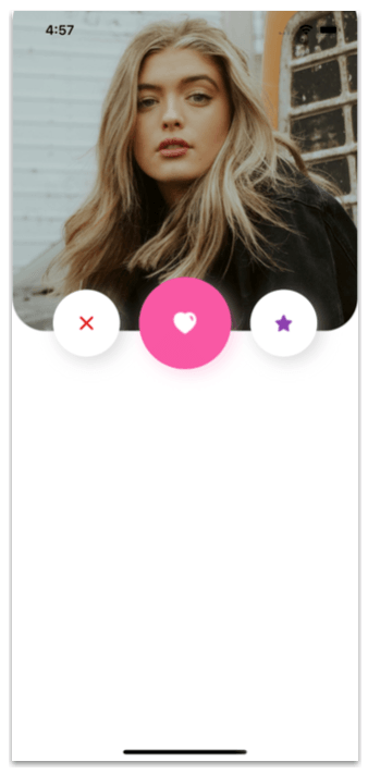
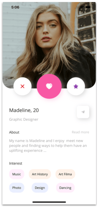
Now let’s see the result of this first step:
 Details
This step is composed of the following elements:
Name & Role Description and Telegram Button
For the name and role description, we will use a simple Label. And for the Telegram button, we will also use shadows to highlight the button.
<!-- Details-->

<Label Grid.Column="0" Grid.ColumnSpan="2" Grid.Row="2" Text="Madeline, 20" FontAttributes="Bold" Margin="0,20,0,0" FontSize="22"/>

<Label Grid.Column="0" Grid.ColumnSpan="2" Grid.Row="3" Text="Graphic Designer" FontAttributes="Bold" FontSize="16" TextColor="#a3a3a3"/>

<Button Grid.Column="2" Grid.Row="2" Grid.RowSpan="2" HorizontalOptions="End" VerticalOptions="Center" HeightRequest="55" WidthRequest="55" CornerRadius="10" ImageSource="telegram" BackgroundColor="White">
  <Button.Shadow>
    <Shadow Brush="#bcbcbc"
    Offset="5,5"
    Opacity="0.6"/>
  </Button.Shadow>
</Button>

<!-- Add the code explained in the next step here -->
About: Title & Description and Read More Text
<Label Grid.Column="0" Grid.ColumnSpan="2" Grid.Row="4" Text="About" FontAttributes="Bold" FontSize="16" Margin="0,20,0,0"/>

<Label Grid.Column="2" Grid.Row="4" Text="Read more" FontAttributes="Bold" FontSize="15" TextColor="#c0bebe" HorizontalTextAlignment="End" Margin="0,20,0,0"/>

<Label Grid.Column="0" Grid.ColumnSpan="4" Grid.Row="5" Text="My name is Madeline and I enjoy meet new people and finding ways to help them have an uplifting experience ..." FontAttributes="Bold" FontSize="16" TextColor="#a3a3a3"/>

<!-- Add the code explained in the next step here -->
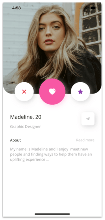
Now let’s see the result of this second step:
 Interest
List
Interest
List
Finally, let’s add a label for the title and a CollectionView to present the different interests of the profile.
<!-- Interests list-->

<!-- Title-->
<Label Grid.Column="0" Grid.ColumnSpan="2" Grid.Row="6" Text="Interest" FontAttributes="Bold" FontSize="16" Margin="0,20,0,0"/>

<!-- List -->
<CollectionView Grid.Column="0" Grid.ColumnSpan="3" Grid.Row="7" HorizontalScrollBarVisibility="Never"
  ItemsSource="{Binding profile}"
  HeightRequest="120"
  VerticalOptions="FillAndExpand">
    <CollectionView.ItemsLayout>
      <GridItemsLayout Orientation="Horizontal"
      Span="2" />
    </CollectionView.ItemsLayout>
  <CollectionView.ItemTemplate>
    <DataTemplate>
      <StackLayout Padding="0,0,20,0">
        <Button Text="{Binding Description}" TextColor="Black" BackgroundColor="{Binding BgColor}" HorizontalOptions="StartAndExpand" CornerRadius="20" />
      </StackLayout>
    </DataTemplate>
  </CollectionView.ItemTemplate>
</CollectionView>
Let’s see the result:
Conclusion
And done! Our dating profile UI is ready! 💚
If you want to see the complete code, you can go to the GitHub repository.
Thanks for reading! 💚💕
Use a component library in sync with .NET MAUI’s release cadence. Try Telerik UI for .NET MAUI for free.

Leomaris Reyes
Leomaris Reyes is a software engineer from the Dominican Republic specializing in mobile development. She is a 7-time Microsoft MVP and actively builds mobile applications while sharing practical knowledge through technical articles and developer-focused content.
Through her work, she explains programming concepts, developer tools and real-world development practices to help developers grow in their careers.
You can follow her on Instagram and TikTok at @leomarisreyes.dev, read her articles on AskXammy, and connect with her on LinkedIn, where she shares tutorials, insights and resources for developers.
Related Posts
Comments
All articles
Topics
Web MobileMobile
Desktop
Design
Productivity
People
