
Elevate .NET MAUI Apps with Powerful Grid
 by Sam Basu

Summarize with AI:
A feature-rich DataGrid can shorten development time for .NET MAUI apps and elevate the user experience.
.NET MAUI is the evolution of .NET cross-platform development—a single shared codebase can power apps on mobile or desktop form factors. While .NET MAUI provides a solid foundational framework and stable tooling, real-world app development often demands a lot from developers—some UI empowerment is welcome.
Most modern apps need showing a list of things—tabular data needs proper UI visualization and users need lots of features to work with the data. A data grid is often the UI component of choice, yet a grid can make or break an app.
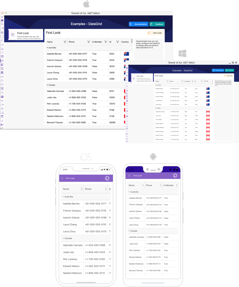
The Telerik DataGrid
Progress Telerik UI for .NET MAUI is a comprehensive UI component library, aimed at making .NET MAUI developers more productive—a set of polished performant UI components for cross-platform mobile and desktop apps. Arguably the most popular UI component in Telerik UI for .NET MAUI is the ubiquitous DataGrid—a thoroughly engineered rich data grid that is ready to light up apps with full functionality.
With Telerik UI for .NET MAUI, developers for the first time have a Telerik DataGrid UI that works seamlessly across mobile and desktop form factors—and this is not a light statement to make. The same UI component caters to different user experiences based on target platform—touch-first on iOS/Android and mouse-keyboard first on Windows/macOS.
The Telerik DataGrid is feature-rich and performs pixel-perfect rendering across platforms, so developers can light up rich data experiences quickly in .NET MAUI apps. While developers can read through good documentation or tinker themselves, let’s try to win over any skeptics with a list of prominent features in the Telerik .NET MAUI DataGrid—an elevator pitch of what the DataGrid brings to the table out of the box. Prepare to see the results of solid engineering.
Column Types
Columns in the Telerik DataGrid represent the complexity and variety of data types in the underlying data—there is understandably lot of developer flexibility engineered into columns.
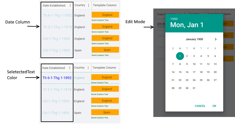
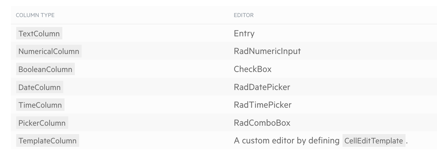
DataGrid columns can be added in three ways—automatic, manual or mixed—and the selected column types have a big impact when the DataGrid goes into edit mode. With the goal of best matching the bound data collection, the Telerik DataGrid offers a variety of built-in column types—Text, Numerical, Boolean, Date, Time, ComboBox and custom Template. All types of columns inherit from the DataGridColumn class, which offers a vast API so developers can completely customize the look and functionality of each DataGrid column.
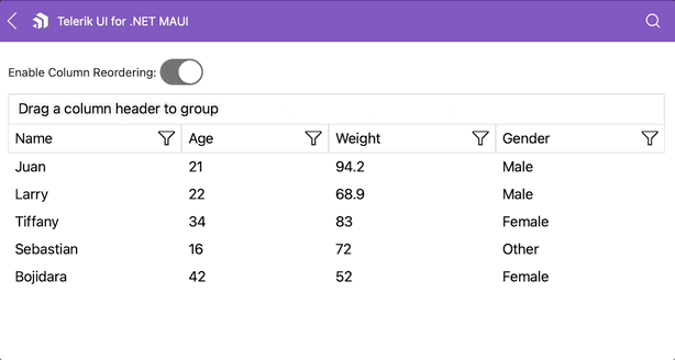
Column Reorder
DataGrid end users should feel empowered—be able to visualize data however desired. One way to achieve this is when a DataGrid’s columns offer reordering functionality—users should be able to move columns and see the things that matter to them in a given order. The Telerik DataGrid exposes an easy reordering feature, allowing the user to drag and drop columns to change up their order. With an easy API, the Telerik Grid’s column reordering works seamlessly with touch gestures on mobile and mouse movements on desktop.
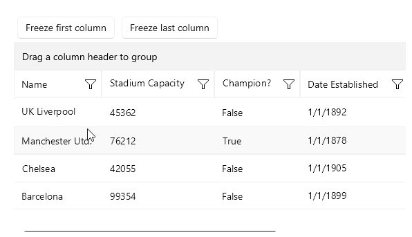
Frozen Columns
Not all data presented in a DataGrid is the same to users—some are way more important to not lose sight of. The Telerik DataGrid offers a nifty Frozen Columns feature that enables users to freeze and always see what’s most important to them. A single column or a collection of columns can be frozen—they stay pinned to the left with a splitter than can be custom styled, while the user can navigate/scroll through all the data/columns on the right.
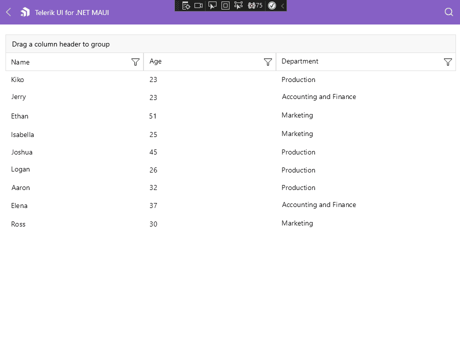
Grouping
Often the best way to make sense of large amounts of data is by grouping things together—putting common entities together helps add perspective to the rest of the data. The Telerik DataGrid comes with robust built-in Grouping functionality with clear UX, driven either manually through the Grouping UI or programmatically through Property/Delegate group descriptors.
The DataGrid Grouping UI is enabled by design on desktop and disabled on mobile—it allows the user to group the DataGrid data by dragging and dropping column headers at the top. With programmatic grouping, control over expand/collapse and styling APIs, the Telerik DataGrid takes out headaches for developers—grouping is ready out of the box.
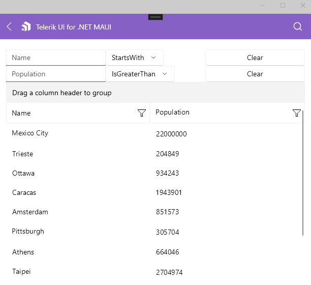
Filtering
A lot of data can get overwhelming—filtering down to exact needs is often the only path to sanity. Telerik UI for .NET MAUI DataGrid has advanced support for filtering operations—either through the Filtering UI or programmatically. Filtering UI works for each DataGrid column and offers data-bound choices to drill down to specific occurrences in data, along with various ways find matches. Filter descriptors, on the other hand, offer the same granularity of filtering programmatically.
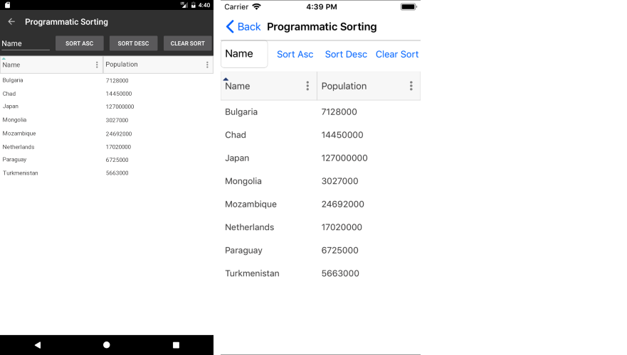
Sorting
Ordering of data is key—users need to be able to see data in a grid in the order of things that are important. The Telerik UI for .NET MAUI DataGrid provides a robust built-in sorting functionality, which allows users to order the view of presented data—this can be controlled through UI or programatically. Sorting order can be controlled by single/multiple columns or custom keys in ascending or descending order.
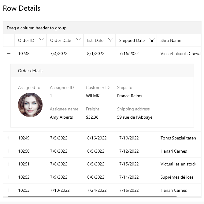
Row Details
DataGrids often visualize complicated data—there may be relationships and hierarchies involved given a selected row of DataGrid data. To try to help, the Telerik UI for .NET MAUI DataGrid is capable of presenting additional information through the Row Details functionality. RowDetails is a Data Template defined on the DataGrid or row level—used for displaying additional data without affecting the dimensions of the row and cells within it. With the RowDetails template, every selected/non-selected row of the DataGrid can display additional information—this is essentially a container to visualize contextual information that is styled appropriately.
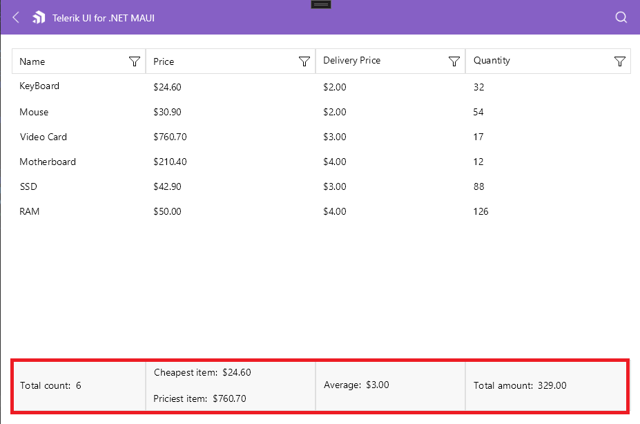
Aggregates
Summarization of data is important to make sense of big amounts of information. Thankfully, the Telerik .NET MAUI DataGrid exposes flexible Aggregates APIs with common aggregate actions over bound data collections—this can be done to data properties or custom delegates. Aggregate values can be displayed in headers/footers and work with grouped data as well.
Between property/delegate aggregate descriptors, developers can enable users to see a variety of aggregate functions over data—like totals, minimum, maximum, average, standard deviation, variance and more.
Editing
What good is data without the ability to manipulate it? The Telerik UI for .NET MAUI DataGrid provides powerful built-in editing capabilities, which allow users to easily modify the data presented in the Grid. Developers do not need to create any editing UI—each DataGrid column type provides different editors, so that the content can be edited in a convenient manner according to its value type. With support for custom editors, edit lifecycle events, persistence modes and styling APIs, the Telerik DataGrid takes the hard work out of data edits.
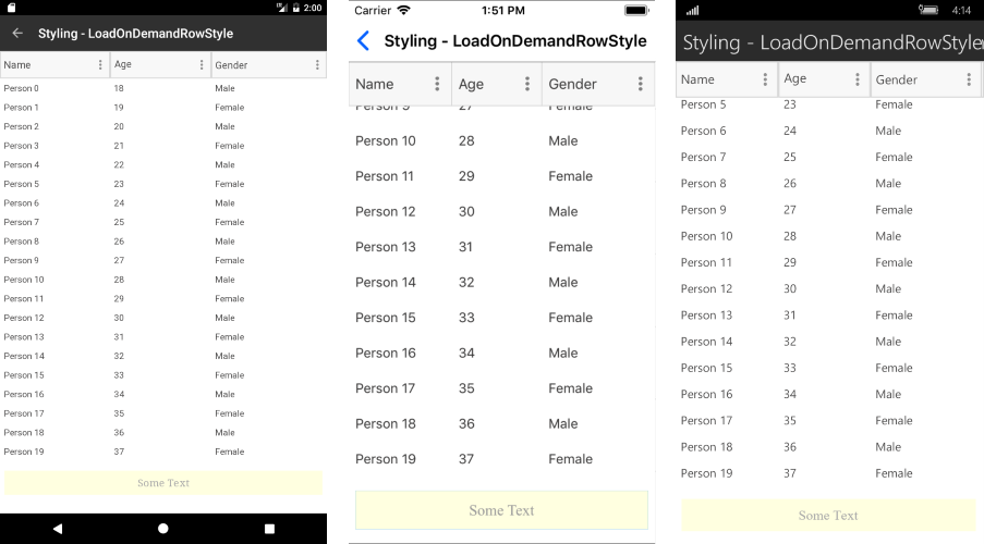
Load on Demand
While not recommended, developers may often bind DataGrids to very large collection of data on the client side—users still expect DataGrids to be smooth scrolling and performant. The engineering trick is virtualization or load on demand—even though bound to a large collection, have the rendered UI be bound to a smaller data sets and have the DataGrid bind to next sets as the user scrolls/interacts.
The Telerik UI for .NET MAUI DataGrid has virtualization baked in—it supports load on demand to perform incremental data loading when items need to be visualized. Loading on demand for the Telerik DataGrid can happen in two modes—automatic or manual—with virtualization done through a smart data collections or triggered through event/command.
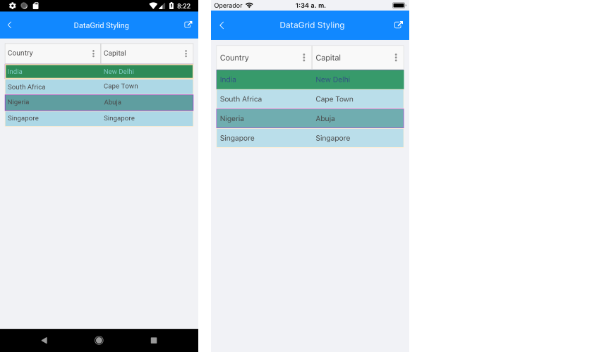
Styling APIs
Developers using DataGrids in apps often seek consistency—grid UI should match the aesthetics, style and UX of the rest of the app. There might be existing design systems that apps need to align to and being able to style a DataGrid with complete flexibility is important.
The Telerik UI for .NET MAUI DataGrid enables developers to customize its look and feel completely, through available style configuration options. Custom styling can apply to rows, columns, cells, header and footer. DataGrid styling can be applied for alternate rows, current/selected rows/cells, sort/filter indicators, mouse hover, as well as when special defined data conditions are met. Developers and designers can collaborate to make the Telerik UI for .NET MAUI DataGrid look exactly how it should—styling APIs offer full customizability.
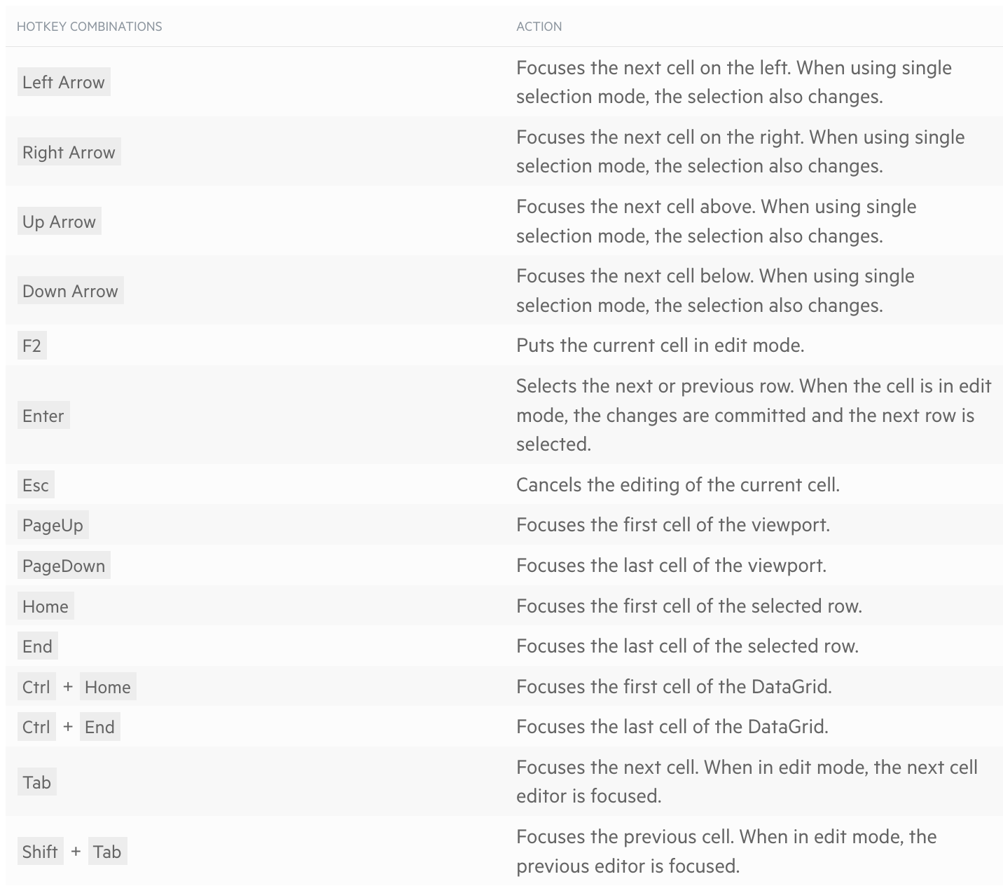
Keyboard Navigation
.NET MAUI allows developers to reach mobile and desktop from a single shared codebase, but the UX should be different on varying form factors. DataGrid users on mobile interact through touch, while desktop users are more demanding with mouse/keyboard. Developers should not have to do additional work to make both possible.
In addition to touch/mouse support, the Telerik UI for .NET MAUI DataGrid now sports robust keyboard support—for both Windows through WinUI or macOS through MacCatalyst. With intuitive mapping for keyboard keys, the Telerik DataGrid elevates UX for desktop users with advanced navigation needs.
Conclusion
You may be building the next awesome cross-platform mobile app with .NET MAUI. You may be empowering enterprise workflows with a robust desktop app. If your app deals with a lot of data, a data grid is likely your UI component of choice.
You don’t need to spends years of engineering building all the feaures—the Telerik UI for .NET MAUI DataGrid has your back! It is feature-rich and performant, and it works seamlessly across mobile or desktop with appropriate UX. Go change the world with your app!
Sam Basu
Sam Basu is a technologist, author, speaker, Microsoft MVP and gadget lover. With a long developer background, he also worked as a Developer Advocacy Manager for advocating modern web/mobile/cloud development platforms on Microsoft/Telerik/Kendo UI technology stacks. His spare times call for travel, fast cars, cricket and culinary adventures with the family.
Related Posts
Comments
All articles
Topics
Web MobileMobile
Desktop
Design
Productivity
People
