
Telerik UI for .NET MAUI Chat: The Face 🤖 of Chatbot Service for Natural Human Conversation

Summarize with AI:
Chatbots are here to support human needs and so is Telerik UI for .NET MAUI Chat—to deliver a natural conversational flow. This post illustrates the control’s features in more detail.
The era of AI and automation is here, and chatbots are part of our daily lives. As such, they’re becoming a must-have feature for any customer-facing application.
But let’s not forget the reason for their existence—chatbots are here to help and support human needs and “profoundly augment human intelligence to make all of these outcomes of intelligence—and many others, from the creation of new medicines to ways to solve climate change to technologies to reach the stars—much, much better from here,” as Marc Andreessen recently said.
One of the things that defines us as humans is the way we communicate and process information. When it comes to applications, it is very important to have a human-like UI in front of us that can mimic a natural conversation flow.
That is why the Progress Telerik UI for .NET MAUI team created the Chat control—to provide you with intuitive, good-looking and customizable UI to pair with the chatbot service and help you deliver the experience your customers expect.
Defining the Component
The Chat component is part of Telerik UI for .NET MAUI—the most comprehensive UI suite for cross-platform development. So, a prerequisite to add the chat to your app is to download and install a free trial version of the suite.
Note! Call UseTelerik();
Do not forget to call the UseTelerik() method inside the MauiProgram.cs file of your .NET MAUI project. This is needed for all Telerik UI for .NET MAUI components. UseTelerik() registers
all built-in or additionally created handlers to Telerik components.
Once your .NET MAUI application has been set up, you are ready to define a Telerik control to your page in XAML or C#:
XAML
<telerik:RadChat x:Name="chat"/>
Then, in code-behind, we can set up the bot as an Author and start a chat conversation.
C#
var bot = new Author() { Name = "bot", Avatar = "SampleAvatar.png" };
Variety of Messages
The Telerik Chat (Conversational UI) supports various types of messages that have one thing in common—their base type is ChatItem.
To display a message (send), all you have to do is initiate the message, add an Author and add the message to the Items collection of the control.
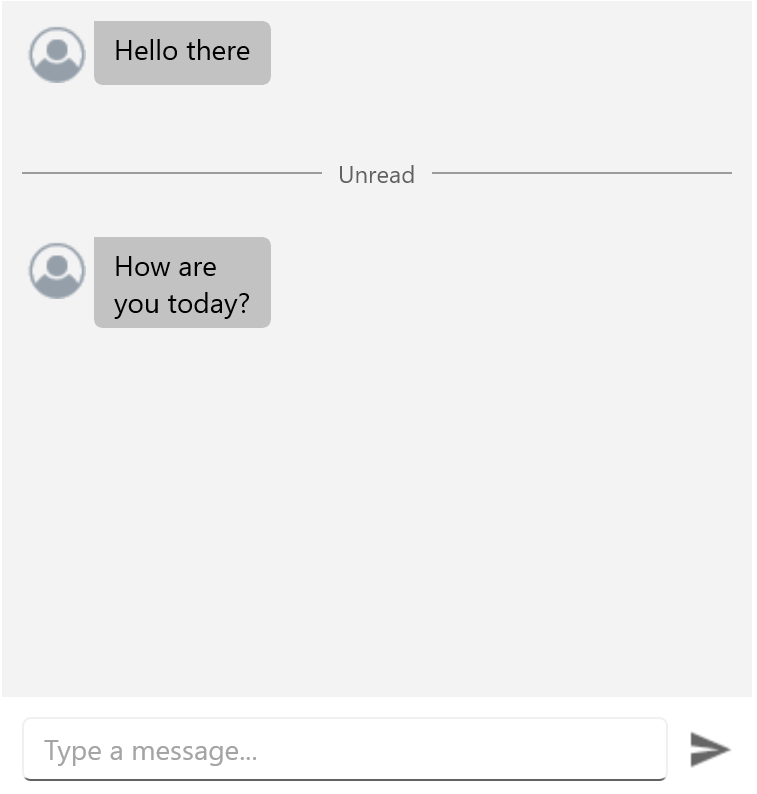
Simple Text Messages
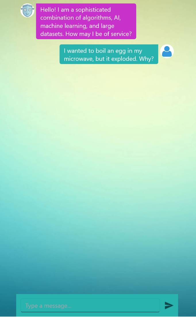
The type of message most used in every conversation is a text message, right? So, let’s start with it:
The TextMessage type is very easy to use. Just set the Author and the text to be displayed like this:
chat.Items.Add(new TextMessage { Author = bot, Text = "Hello there" });
TimeBreaks
This type of chat item gives us the opportunity to visually separate the messages. As its name suggests, it is used in various scenarios where you need a separation by a period of time. For example, we can separate the unread messages like this:
chat.Items.Add(new  TimeBreak()  {  Text  =  "Unread"  });
chat.Items.Add(new  TextMessage()  {  Author  = bot,  Text  =  "How are you today?"  });
Calendar, Clock, Cards, Display Needs: Meet the ChatPicker
Sometimes, to speed up the conversation flow and make the customer experience smoother, it is better to provide macros (or pre-written options) instead of giving the user the ability to type the information themselves.
The Telerik Chat control offers a RadChatPicker UI component that you can use in such cases.
To use it, you need to initiate it, assign the right “data context” to it and add it to the Items collection.
Depending on the information that needs to be presented to the user and the choice that should be made, the RadChatPicker allows developers to render one of the following types:
- DatePicker UI using the DatePickerContext
- TimePicker UI using the TimePickerContext
- Customizable list of items using the ItemPickerContext
- Cards using the CardPickerContext
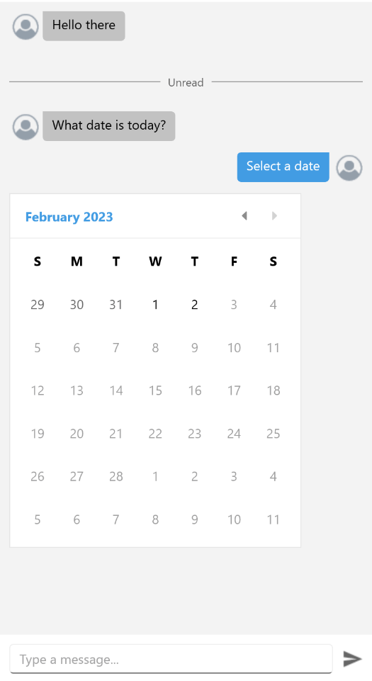
Overlay Support
The picker items can be used as chat messages and also as a separate UI for entering data outside the conversation or even outside the Chat control itself.
To display it as overlay, all you have to do is to assign the pickers to the Picker property of RadChat instead if the Items collection:
<telerik:RadChat  x:Name="chat">
  <telerik:RadChat.Picker>
    <telerik:RadChatPicker  x:Name="picker"
      IsOkButtonVisible="False"
      IsCancelButtonVisible="False"
      BackgroundColor="LightGray"  />
  </telerik:RadChat.Picker>
</telerik:RadChat>
DatePicker displayed as overlay
DatePicker displayed as inline message
For more details, you can see the Pickers documentation article. Now, let’s explore the most common usage:
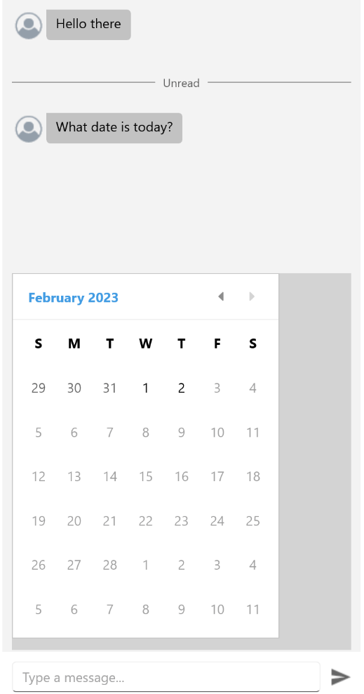
Date and Time Messages—DatePicker and TimePicker
Do your chatbot users need to pick a time to continue the conversation?
The ChatPicker control provides a DatePickerContext /TimePickerContext that displays a UI to select a date or a time:
The usage is simple:
DatePickerContext context =  new  DatePickerContext
{
  MinDate  =  new  DateTime(2023,  1,  1),
  MaxDate  =  new  DateTime(2023,  2,  2),
  SelectedDate  =  new  DateTime(2023,  1,  16)
};
PickerItem pickerItem =  new  PickerItem  {  Context  = context };
chat.Items.Add(new  TextMessage  {  Text  =  "Select a date",  Author  = chat.Author  });
chat.Items.Add(pickerItem);
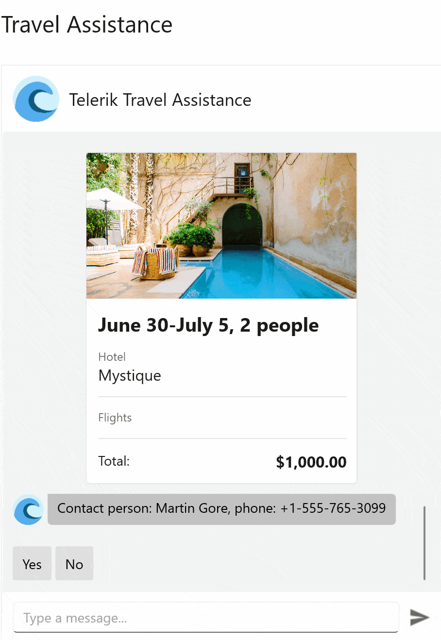
Cards: CardPicker
Some messages need to display more information, and this is where the “Cards” chat messages come in handy. To display such type of messages, you have to initiate an instance of CardPickerContext and populate its Cards collection.
The Telerik RadChat offers two base types to use directly or to extend them and create new card types:
- BasicCardContext – For displaying a card with Title, Subtitle and Description
- ImageCardContext – With an additional Image property
Here is an example of displaying card:
- Initiate an instance of picker
- Initiate CardPicker context
- Initiate ImageCardContext to the Cards collection
var cardsContext =  new  CardPickerContext  {
  Cards  =  new  List<CardContext>()
  {
    new  ImageCardContext()  {
        Title  ="Rome,
      Subtitle  ="Italy",
      Description  ="Italy’s capital is one of the world’s most romantic and inspiring cities",
      Image  =  "RomeCard.png"
  }};
(chat.Picker  as  RadChatPicker).Context  = cardsContext;

For more details on cards, you can refer to the Cards article.
List of Choices: ItemPicker
When you need to present a simple list of options to the user, you can rely on ltemPickerContext. The helpful properties to specify specific behavior are ItemsSource, SelectionMode, SelectedItems and SelectedItem.
The following example shows how to use the ItemPicker:
ItemPickerContext context =  new  ItemPickerContext
{
  ItemsSource  =  new  List<string>()  {  "2 days",  "5 days",  "7 days",  "Another period"  }
};
PickerItem pickerItem =  new  PickerItem  {  Context  = context,  HeaderText  =  "Select an item"  };

chat.Items.Add(pickerItem);
Suggested Actions
Leaving the user with an open question can lead the conversation in a direction your chatbot is not prepared to handle. Humans react and behave unexpectedly, and the best thing you can do is give the client choices instead of leaving the answer to their imagination.
That is why the RadChat control for .NET MAUI offers you one more way to do it—SuggestedActionItem type.
These are types of items that hold a collection of predefined text messages with the respective commands executed when the user selects them.
For example, if we want to suggest an action to the user:
- Initiate an SuggestionActionItem object:
var suggestedActionsItem = new SuggestedActionsItem();
- Initiate the SuggestionAction objects:
var actions =  new  List<SuggestedAction>();
actions.Add(new  SuggestedAction
  {
    Text  =  "Action0”,
    Command  =  new  Command(()  =>
    {
      //example of an action that can be executed:
      this.chat.Items.Remove(suggestedActionsItem);
      this.chat.Items.Add(new  TextMessage  {  Author  =  this.chat.Author,  Text  =  "Action "  +  actionIndex});
    }),
  });
- Add the suggested actions to the Actions collections of the suggestedActionItem:
SuggestedActionsItem.Actions = actions;
- Add the suggestedActionItem to the Items collection of the chat:
this.chat.Items.Add(suggestedActionsItem);
Typing Indicator
The TypingIndicator functionality of the RadChat component allows you to indicate that other Chat participants are currently typing:

<telerik:RadChat  x:Name="chat">
  <telerik:RadChat.TypingIndicator>
    <telerik:TypingIndicator  x:Name="typingIndicator"  IsVisible="true"  />
  </telerik:RadChat.TypingIndicator>
</telerik:RadChat>
Binding its ItemsSource property to the chat’s Authors collection will display all parties typing at the same time.
Localization
The RadChat component provides language localization. This allows you to translate the phrases used across the Chat control as “the empty message.” The key for this phrase is called Chat_EntryPlaceholder. Details about how to translate it can be found in the Localization article.
With this functionality inviting the user to type in other languages, you can easily adapt your app to different regions.
DataBinding and MVVM Support: Load Conversation History
Instead of adding the messages to the Items collection on demand, you can bind the ItemsSource property directly.
This is helpful when, for example, you need to display the conversation history. You can find more details about this scenario in the MVVM documentation article.
Chatbot Customization
The RadChat control exposes a rich API to customize the appearance of its items (messages).
Using the BackgroundColor, InputAreaBackgroundColor and SendMessageButtonImage gives you control over the chat component.
An ItemTemplateSelector property lets you apply different templates to each Chat item depending on a specific condition.
More Resources
Examples of the full list of customization options and a detailed description of the Chat’s API can be found in Telerik SDK, Telerik Controls Samples and Telerik Documentation.
Migration from Xamarin
Telerik UI for .NET MAUI Chat is a component that offers you a smooth transition from Telerik Conversational for Xamarin.Forms with no API changes.
Try It Now
So, what are you waiting for? There isn’t any better way the explore the Chat UI capabilities than trying it yourself. Go ahead, download a free 30-day trial and add chat UI to your app.
If you have any questions or suggestions, don’t hesitate to contact us. You can post on the Telerik Forum, share ideas in Telerik the Feedback Portal or comment below. 😊

Rossitza Fakalieva
Rossitza Fakalieva is a Technical Manager, Microsoft MVP in Developer Technologies and a Director of the Bulgarian chapter of the global Women Who Code organization. She previously worked on the Telerik engineering team and defines herself as .NET enthusiast. She loves to empower others to grow in their career and in the tech field—by teaching, by delivering courses and presentations, and as part of her daily job.
Related Posts
Comments
All articles
Topics
Web MobileMobile
Desktop
Design
Productivity
People
