
Kendo UI for Vue
What's New R1 2023
What's New HistoryNew Vue Component: ExpansionPanel
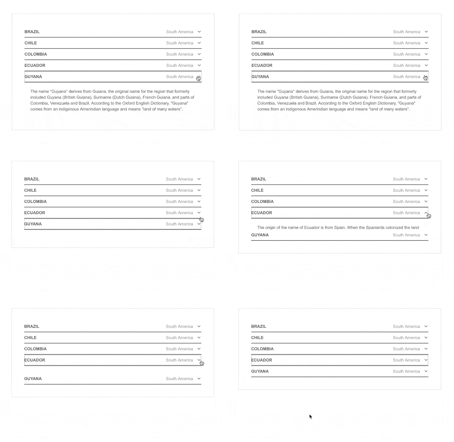
The Vue ExpansionPanel organizes any content into a UI element consisting of a title bar and expandable/collapsible content. The content can be as simple as text or as complex as another Vue component, such as the data grid. This fundamental UI layout tool supports complex content, animations, custom icons, and much more.
See the Vue ExpansionPanel demo
New Vue Component: ListView
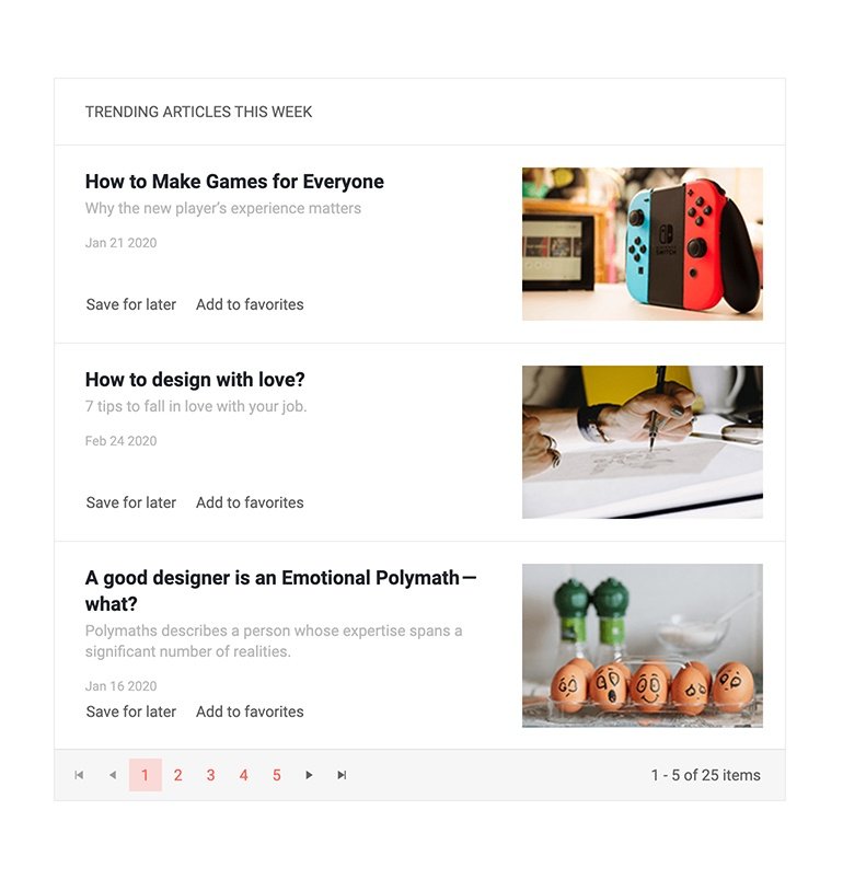
The Vue ListView component is a flexible component that enables the display of items in a list with a template that determines how each item is rendered. Think of results lists like those seen in search engines, tweets from Twitter and inbox items in email clients, etc.
New Vue Component: Signature
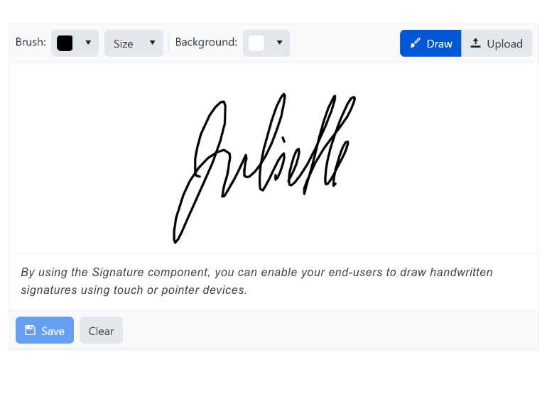
The Vue Signature component enables end-users to digitally sign documents by touch, mouse, or image import. The Signature component can be used as part of a standalone signature application, a web form, and in combination with a PDF export. Key features include a popup for entry, line smoothing for clean signatures, and control over import and export resolution.
See the Vue Signature component demo
Vue Data Grid Enhancement: State Management Example
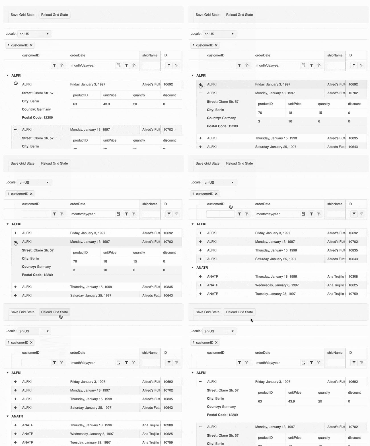
Persisting sate is an important user experience element and it is supported in the Vue Data Grid demo. To help with implementation, we have added a detailed example of how to persist Data Grid state in your Vue applications. The updated demo includes sample code how to save the DataGrid's current state, including its data, columns, applied filters, groupings, expanded rows, etc., and restore it precisely the same way when the user returns to the same page.
See the Vue DataGrid Persist State demo
New Vue Component: AppBar
The new Kendo UI for Vue AppBar component is the perfect UI element to use as a navigation for any Vue application. Built with flexibility in mind, the Vue AppBar offers building blocks for designing menus and navigations that can contain text links, search bars, icons that contain drop-down menus and much, much more. Additionally, the Vue AppBar can be configured to be displayed at the top of the page and disappear upon scrolling down, or constantly remain at the top of the page while users scroll.

Vue TreeList Enhancement: Column Operations
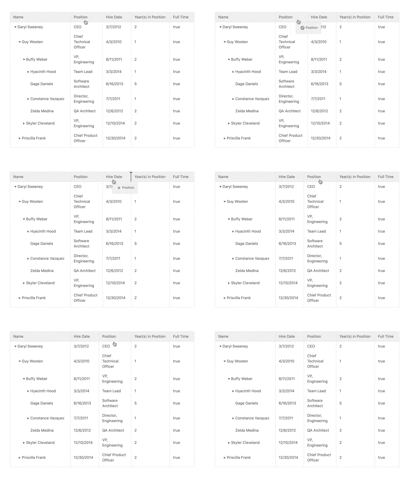
Much like the Vue Data Grid, the TreeList makes various column operation features available to end-users. You can configure which are available.
- Column Resizing – Resize the width of a column using built-in handles
- Reordering – Rearrange the order of the displayed columns
- Column Menu – Use a dropdown menu to take action for each column, such as showing or hiding a column, filtering, sorting, and much more
- Multi-Column Headers – Allows developers to define headers that span multiple columns which can be useful to group related columns and fields
- Locked Columns – (Also known as frozen columns) Lock columns to either side of the TreeList as users scroll
- Column Virtualization – Improves performance for scenarios where a TreeList contains a large collection of columns and optimizes when and how to display columns for a smooth scrolling experience
Vue TreeList: Row Drag & Drop
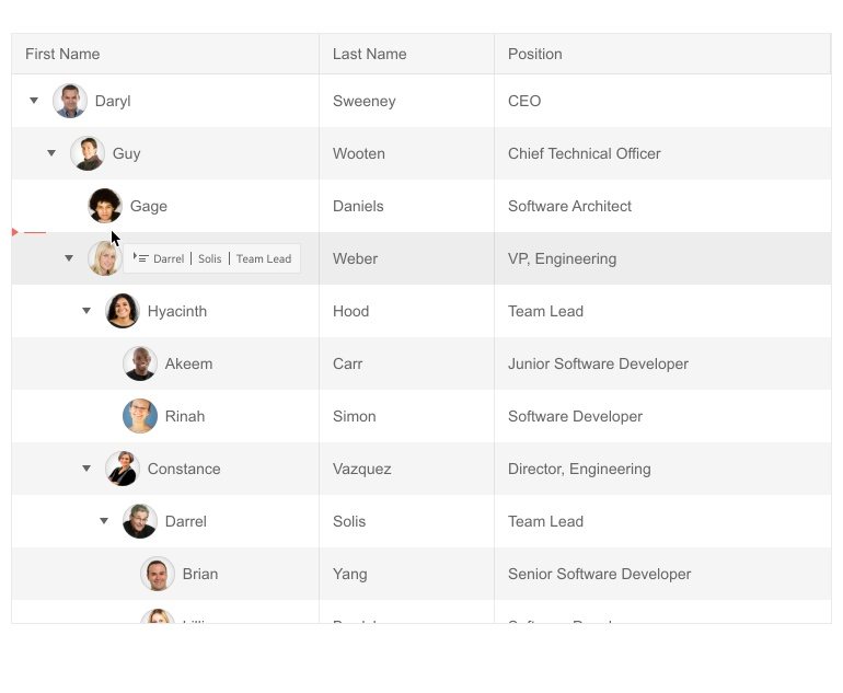
The Vue TreeList allows users to rearrange rows through the drag-and-drop feature. This functionality can also be used to rearrange the hierarchy within the Vue TreeList, letting child rows be dragged to the parent level or even all the way to the root level if needed.
See the Vue TreeList Row Drag & Drop demo
New Vue Component: ListBox
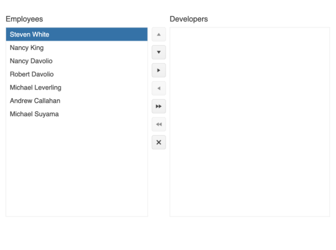
The Vue ListBox is a common way to select, reorder, and move items. Combine multiple ListBox components to move items between lists with drag and drop and/or toolbar buttons. This is a common way to help users move items between two or more lists.
New Vue Component: ChunkProgressBar
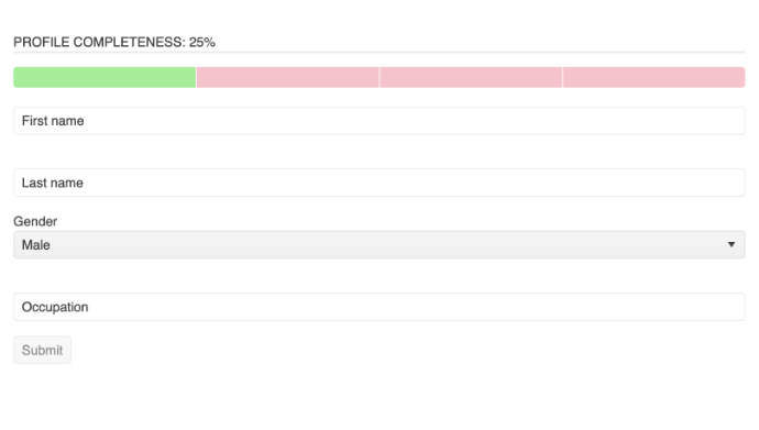
The Vue ChunkProgressBar displays and tracks the progress of a task or process in your application through a predefined number of chunks. The component supports both horizontal and vertical rendering modes and has styling options built in.
See the Vue ChunkProgressBar demo
Vue Documentation Enhancement: Getting Started with Nuxt 3
The official release of Nuxt 3 is here and Kendo UI for Vue supports it. To help you get started as quickly and easily as possible, we have published a getting started article.
Read the Get Started with Nuxt 3 article

Vue TreeList Enhancement: PDF Export
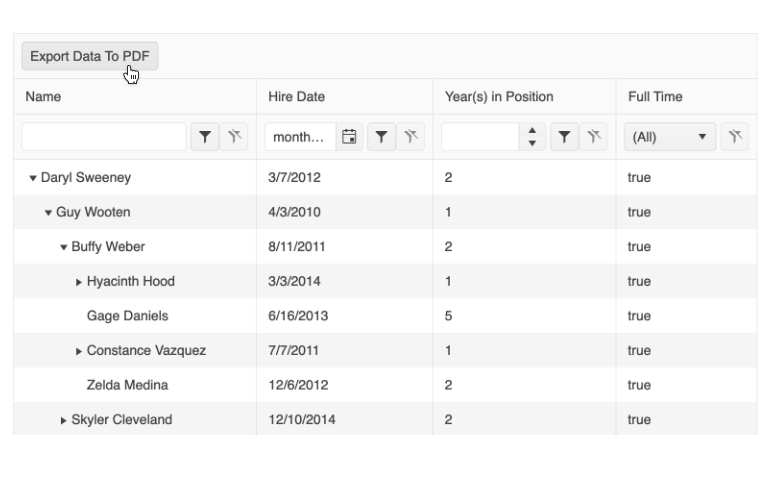
The Vue TreeList includes a built-in PDF export feature. When enabled, the component will display a toolbar with an “Export to PDF” button at the top of the component. The output can be configured to only export the currently displayed data, or the entire data set. Additionally, each PDF file can add additional PDF content as well as customized paper sizes (including margin and padding settings) to ensure the generated PDF can fulfill any requirements.
See the Vue TreeList PDF Export demo
Vue Data Grid Enhancement: Compact Grid
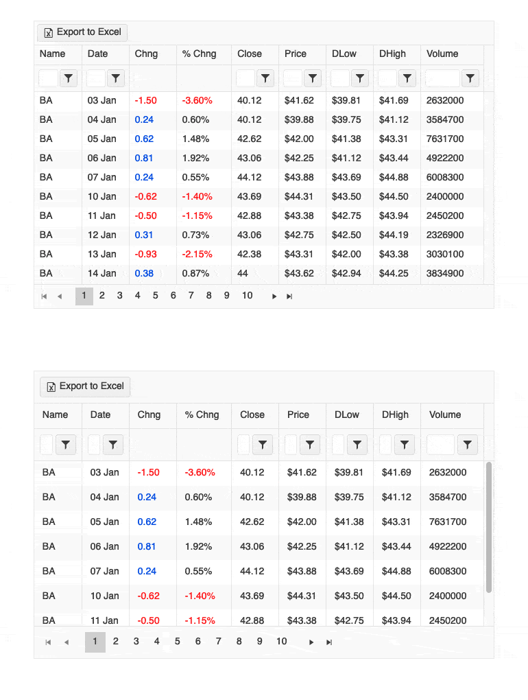
Small screens are a primary channel for app delivery and developers are challenged with presenting data grid views in ways that device users can understand. To help solve this need, the Vue Data Grid now has a compact rendering mode. In this mode, cell padding will automatically be decreased regardless of the built-in theme used (Kendo Default, Material, Fluent, Bootstrap).
New Vue Component: TileLayout
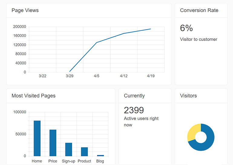
The Vue TileLayout component is great for organizing information into dashboard-like views. It displays and aligns a collection of tiles into columns and rows. The tiles can contain static information or other Kendo UI components and are highly customizable. The TileLayout component also allows end-users to rearrange and resize any of the tiles while giving the developer full control over the flow of the component during these events.
New Vue Component: BottomNavigation
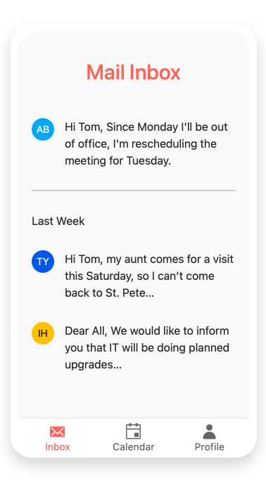
The Vue BottomNavigation component is perfect for adding a convenient way for users to navigate between primary screens on touch devices. Typically used in responsive applications and Progressive Web Applications, bottom navigation places three to five items, consisting of text and an optional image, across the bottom of the screen where they are easily accessible.
See the Vue BottomNavigation demo
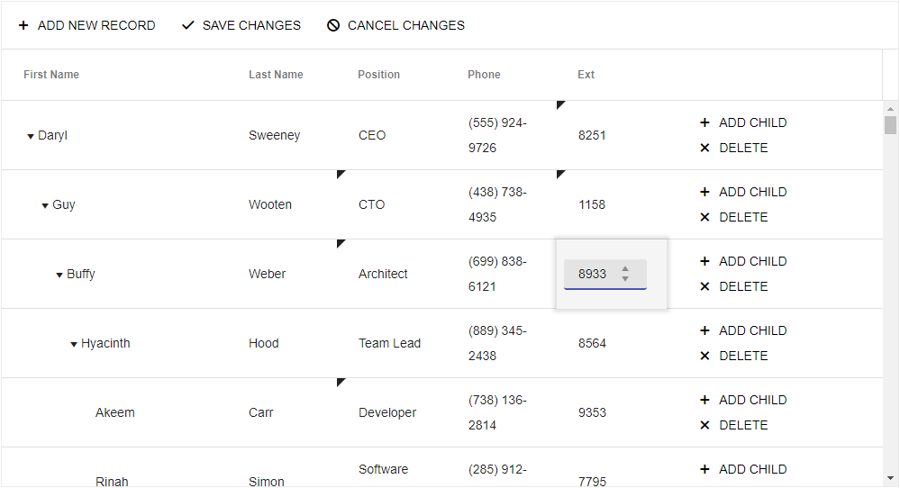
Vue TreeList Enhancement: Editing
Users can add, edit, or delete data displayed in the Vue TreeList in a variety of modes. You determine which to make available to them.
- Basic mode: A row enters edit mode when clicked.
- Inline mode: A row enters edit mode when a button is clicked.
- In-cell mode: Only the cell clicked enters edit mode.
- Form mode: Editing is done in a form that appears over the component.
See the Vue TreeList Editing demos
Kendo UI for Vue - R1 2023
- New Vue Component: ExpansionPanel
- New Vue Component: ListView
- New Vue Component: Signature
- Vue Data Grid Enhancement: State Management Example
- New Vue Component: AppBar
- Vue TreeList Enhancement: Column Operations
- Vue TreeList: Row Drag & Drop
- New Vue Component: ListBox
- New Vue Component: ChunkProgressBar
- Vue Documentation Enhancement: Getting Started with Nuxt 3
- Vue TreeList Enhancement: PDF Export
- Vue Data Grid Enhancement: Compact Grid
- New Vue Component: TileLayout
- New Vue Component: BottomNavigation
- Vue TreeList Enhancement: Editing


