What’s New in KendoReact with R2 2020

Summarize with AI:
The R2 2020 release of KendoReact is here! This release covers a ton of new components and features in existing components, as well as a new resource to help React developers build gorgeous forms. Let’s dive in and go through what is new with KendoReact with R2 2020!
Form Design Guidelines
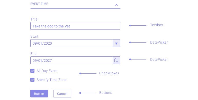
Building forms is more than just adding UI components to a form element. There are tons of things to think about like the proper flow of the form, types of inputs to use, and how to handle validation that need to be taken into consideration.
The new Design Guidelines from KendoReact provide best practices for building forms in React and goes beyond what UI components to use. We think that all React developers can take advantage of this guide, regardless of UI component library they may be using, and we hope you find it useful!
Here’s a quick link to the Form Design Guidelines from KendoReact.
New Components
New Component: ListView
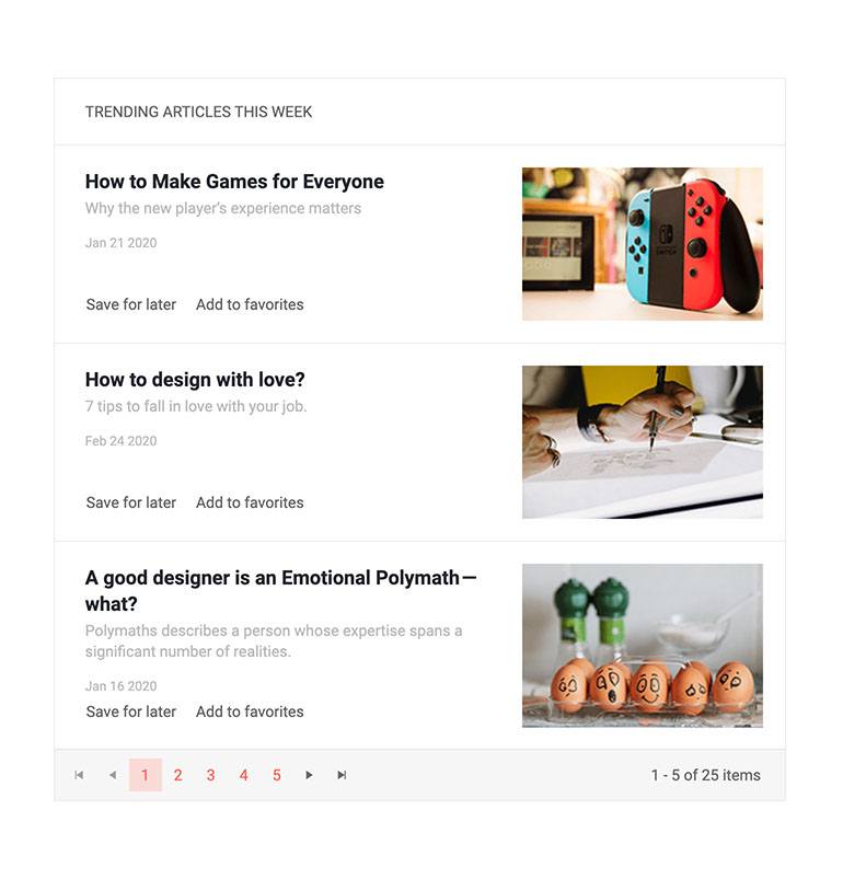
The new KendoReact ListView is perfect for any scenario that calls for a scrollable list of items. With a built-in pager and endless scrolling, the list of data items can be quite long while retaining the high level of performance that developers have come to expect from KendoReact. What’s more, this component can easily be integrated with other KendoReact components like the Filter to help filter down the data in the Listview.
For a full look at what you can do with the KendoReact ListView, head on over to this docs & demos sessions.
New Component: Progress Bar & Chunk Progress Bar

These new additions to the KendoReact UI library help with indicating progress within your React applications. Both Progress Bars help showcase how far along a particular process may be (let’s say, a range from 0-100) and both can be rendered in a horizontal or vertical fashion.
The main difference between the two components (as seen in the image above) is that the Progress Bar is one unified bar, while the Chunk Progress Bar is split up in to blocks that will fill in one block at a time.
To look at examples for how to use the Progress Bar you can check out these demos, and Chunk Progress Bar has its examples right here.
New Component: Stepper

The new Stepper component is a modern, sleek way of showing progress through a sequence of steps or workflows. The component has built-in styling for all past and completed views, the current view, as well as future views. Every step has its own content template which means you have full control over what to display when as your users walk through your predefined workflow one step at a time.
The Stepper can also be used for navigation, and interacting with the component highlights the sleek animations that truly make this component pop on a page.
To play around with the new KendoReact Stepper component, check out these demos.
New Components: Label, Floating Label, Hint, and Error

With R2 2020 we have added several types of Label components to KendoReact, which includes:
- Label - a standalone component to help with implementing labels in React
- Floating Labels - popularized by Material Design, floating labels are now featured in several design languages and have become a popular way to highlight placeholders and make them transition to labels. With this in mind, KendoReact now has a generic Floating Label component that can be integrated to any input element.
- Hint & Error - These components assist with providing appropriate styling and imagery to a label whenever a hint or an error should be displayed.
For a full list of docs and demos for all the label components you can click on this link.
New Components: Radio Button and Radio Group

Radio Buttons, or a larger Radio Group, are very popular HTML elements for selecting a value out of a list of options. With R2 2020 we are introducing the KendoReact Radio Button and Radio Group components in order to ensure that the KendoReact library can satisfy any requirements around building forms in React. These components also come with the same styling as all other KendoReact components to help maintain a common look and feel across your entire application.
To see the KendoReact Radio Button in action check out this link, and here's a quick link to the KendoReact Radio Group component.
New Component: Range Slider

Expanding on the already existing Slider component, the new KendoReact Range Slider can be used for any scenario that requires a user to select a range of values (rather than a single value). With its intuitive design, defining where a range starts, ends, or how wide the range is can easily be changed by using two drag handles.
New Component: Forms - FormElement & FieldWrapper
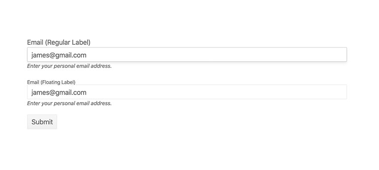
Continuing to ensure that React developers using KendoReact have everything they need when it comes to building forms, the FormElement and FieldWrapper components expand upon the already powerful KendoReact Form component.
While these are a bit specific to folks creating Forms, at a high level the FormElement represents the HTML Form element when configuring a KendoReact Form and the FieldWrapper is designed to wrap around a single collection of a field editor (aka the input element), label, hint, and error components to assist with structuring and styling each individual field.
These components are all a part of the KendoReact Form package, so head on over to the Form docs and demos section to see how you can start using the Form component today.
Expanded Component Features
TreeList - Row Virtualization
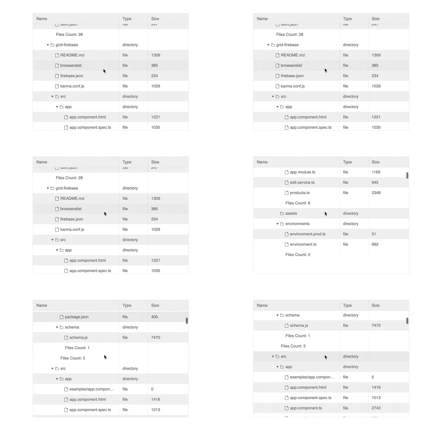
Virtualization is one of the biggest performance boosting features of any UI component, and with R2 2020 I’m excited to reveal that we have added row virtualization with the KendoReact TreeList. Combine this with the existing column virtualization feature and you can toss huge sets of data at the TreeList and still have a buttery smooth scrolling experience.
A note to make here is that the data bound to the KendoReact TreeList will have to be loaded on the client.
To see the KendoReact TreeList with row virtualization check out this docs & demos page.
TreeList - Pager
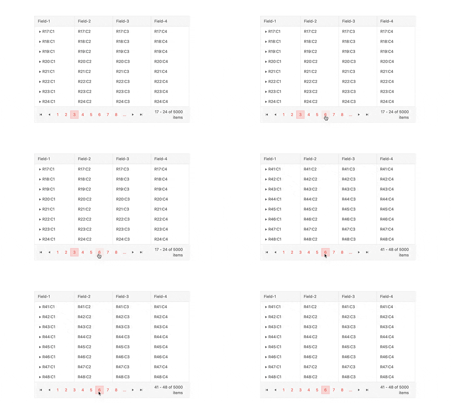
A central part of the KendoReact Grid, which covers a lot of similar features to the TreeList, the pager is an important feature in any data-bound component. This is why we added a Pager to the KendoReact TreeList with R2 2020. Now there are even more options for navigating through the data found within the TreeList, ensuring that the component can cover any desired scenarios.
Here’s a quick demo showcasing the KendoReact TreeList with paging enabled.
TreeList - Drag & Drop
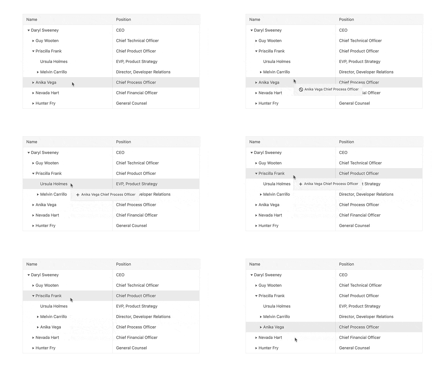
With R2 2020, the KendoReact TreeList component allows you to rearrange its data items within the tree grid structure by dragging and dropping rows. This allows end-users to drag a node (including any children it may have) and drop it anywhere within the TreeList hierarchy.
Here’s a demo of the drag & drop feature of the KendoReact TreeList in action.
TreeList - Aggregates
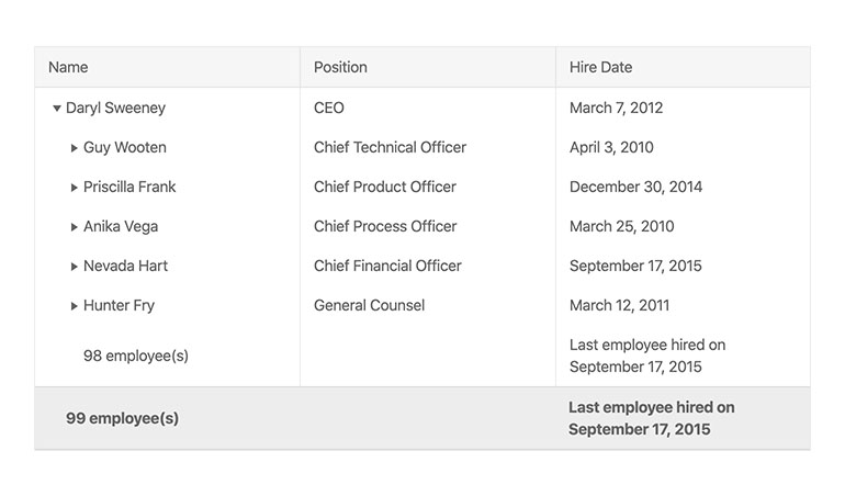
With the new aggregates feature, the KendoReact TreeList will allow React developers to display aggregate information based on data bound to the TreeList. This includes calculations like sum, count, and others, along with the ability to inject your own rendering.
To see the KendoReact TreeList with Aggregates enabled, head on over to this docs & demos page.
TreeList - Column Menu
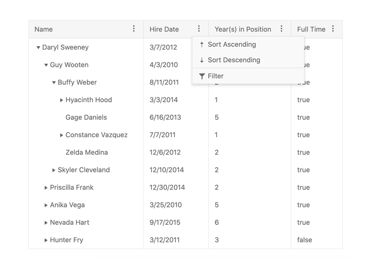
The Column Menu within the KendoReact TreeList enables you to show a menu with quick actions for each column within the TreeList. The available options in the column menu can be customized and this feature could be used to provide filtering options, or showing and hiding certain columns.
To see more about the Column Menu in the KendoReact TreeList check out this page right here.
TreeList - Export to PDF and Excel
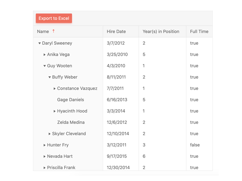
With R2 2020 the KendoReact TreeList now sports the ability to export the contents of the component to PDF or Excel! This feature allows users to export the content of the TreeList to either file format with a single button click. The exported content can also be customized to add extra information or
change styling (and more).
To see how to export the KendoReact TreeList to Excel you can refer to this demo, while the KendoReact TreeList PDF export is highlighted right here.
Grid - Checkbox Filter
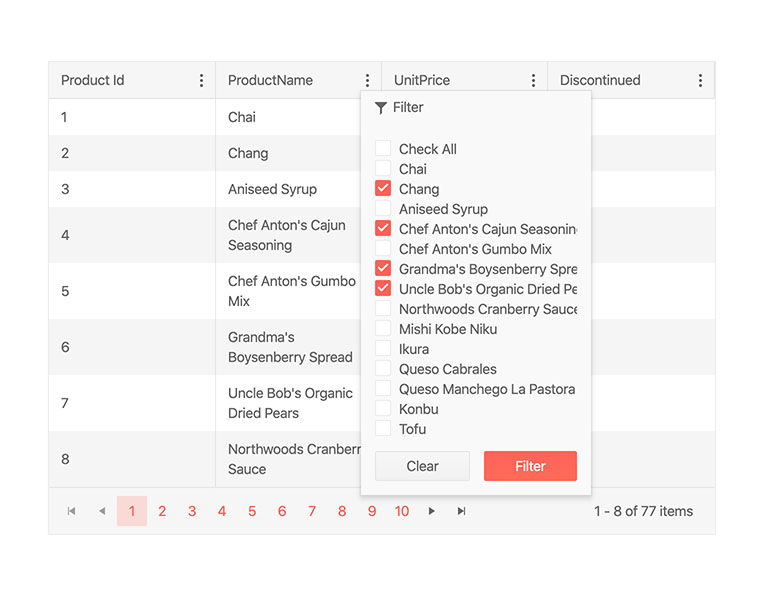
With the new Checkbox Filter option in the KendoReact Data Grid all unique values available within a column will be displayed in a filter menu. From this, end users can select what values they want or do not want to see within the Grid.
Scheduler - Header & Footer Custom Rendering
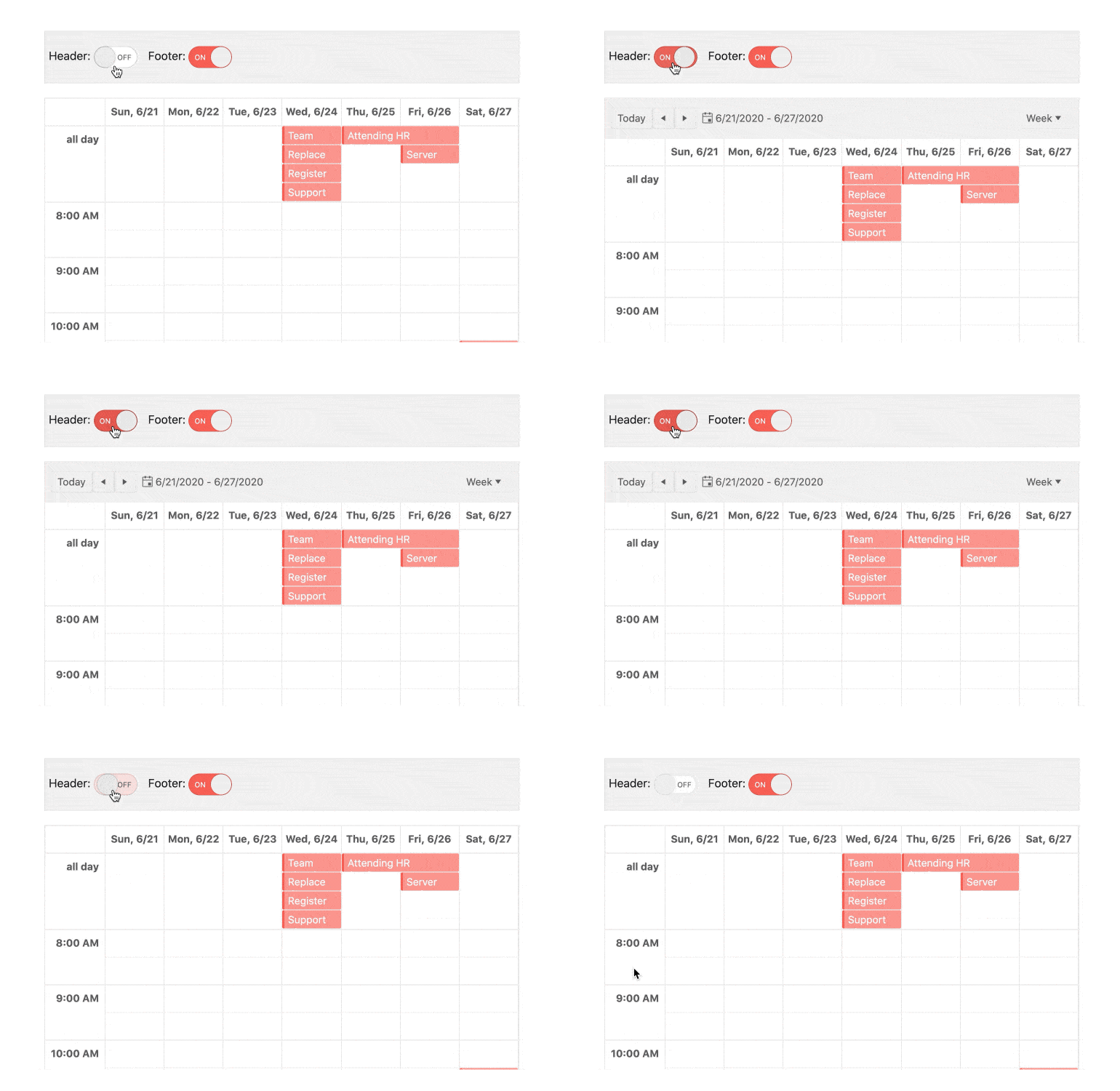
Continuing to expand the available custom renderers within the KendoReact Scheduler with R2 2020 the component can be passed a custom renderer for both the header and the footer elements of the Scheduler. This allows developers to take even more control over the look and feel of the Scheduler.
Form - Form-level Validation, FieldArray
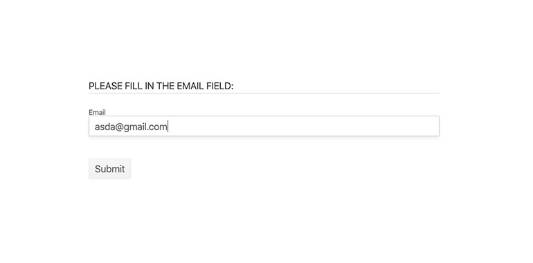
Based on feedback from KendoReact users working with the KendoReact Form component we have added additional features to this already powerful tool for building forms. With R2 2020 we have introduced Form-level validation to help with validating the entire form when the submit button is pressed and introduced the FieldArray to help with common array and list manipulations within a Form element.
For more information around these components and how they can all come together to help create forms within React, head on over to the KendoReact Form demo section.
Drawer - Custom Rendering
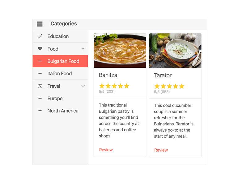
With the new Custom Rendering feature of the KendoReact Drawer developers can pass custom renderers for the Drawer’s items. This allows for custom layouts within each item, ensuring that the Drawer can fit any application requirements.
Head on over to this docs & demo page for the KendoReact Drawer to learn more.
New Sample Application: Coffee Warehouse App
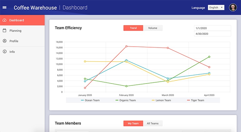
We often get requests from users to see more of the KendoReact UI components working together within an application. While we already have an extensive list of sample applications, with R2 2020 we cooked up a new React app and it is hot of the presses!
The Coffee Warehouse app showcases KendoReact UI components like the Drawer, Grid, Charts, and more all in one single dashboard. If you’re looking for an educational resource for using KendoReact in applications, or a starting point for your own dashboards, I definitely recommend heading over to either the live Coffee Warehouse application, or check out the source code for the application here on GitHub.
Got Feedback?
Did we miss a particular component or feature that you’d like to see added to KendoReact? Let us know by submitting feedback in the KendoReact public feedback portal! All features and components we released with R2 2020 comes from feedback offered by our users and this is a great way to ensure that your opinion is heard.
Join Us For a Live Webinar!
If you want to see what we brought up in this blog post live and in action then you should join myself and my Developer Advocate colleagues for our live Kendo UI Webinar on Tuesday, May 19th at 11:00 AM ET! We are covering all products within the Kendo UI bundle, and the KendoReact specific session starts at 12:00 PM ET. We have limited seats for this webinar so make sure you head over and register to reserve your seat today!

Carl Bergenhem
Carl Bergenhem was the Product Manager for Kendo UI.
