Telerik UI for Blazor 2.20.0—Notification, Toolbar, Radar Chart Series and More!

Summarize with AI:
In the latest release of Telerik UI for Blazor, we're excited to share we now provide 60+ native Blazor components! Read all about what's new, including Notification and Toolbar components, Radar Charts and more.
Hey Developer Folks, more exciting Blazor news as we just shipped the Telerik UI for Blazor 2.20.0 with several new components and features—Notification and Toolbar components, three Radar Chart Series, Grid export to CSV, TreeView drag and drop and more! In addition to the compatibility of Telerik UI for Blazor with .NET 5.0 official release that we announced two weeks ago, we are happy to share with you another huge milestone of 60+ truly native Blazor components!
Let’s deep dive in the 2.20.0 release content and see in detail the new components and features you can incorporate in your Blazor Server and WebAssembly apps!
Blazor Notification Component
Notification Component Overview
The Telerik Blazor Notification component provides multiple options to display messages to users in Blazor apps—status updates, warnings, prompts or any custom type of information. The Notification control comes with multiple built-in parameters, properties and templates that let you fully customize its appearance, including position, animation, size, color, custom content and more.
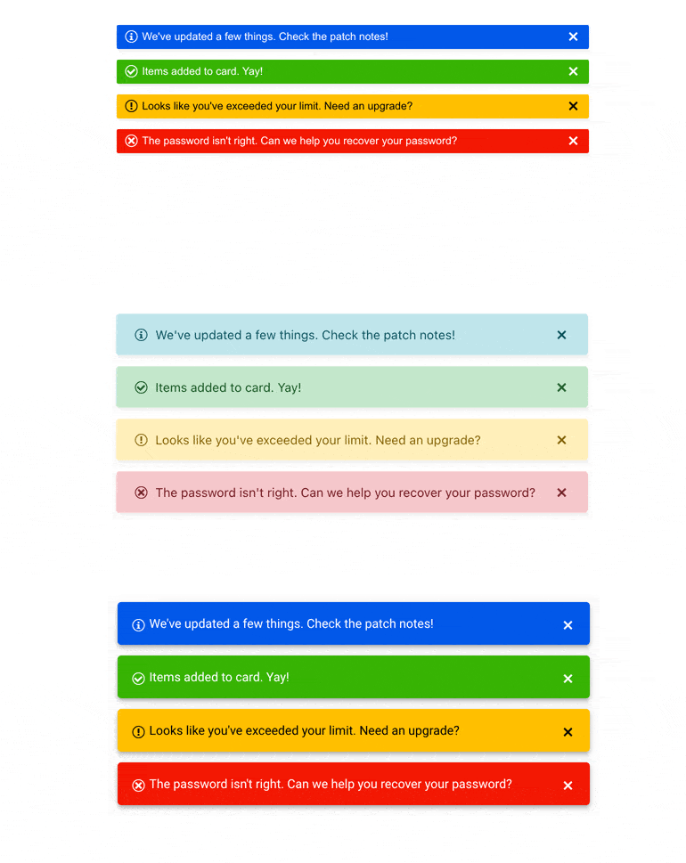
Telerik UI for Blazor Notification Component Themes
Notification Component Animations
The Notification component appearance can be animated by setting the AnymationType parameter to one of the many available options: Fade(default), PushUp, PushDown, SlideIn, ZoomIn and more. You can further control the animation duration by setting its AnimationDuration parameter.
Notification Component Predefined Colors
There are multiple predefined color options you can apply to your Blazor notifications via the ThemeColor parameter: Primary, Secondary, Tertiary, Success, Info, Warning, Error, Dark, Light and Inverse.
You can also define your own custom colors and styling to match design requirements, themes and personal preferences.
Notification Component Positions
The Notification position can be adjusted using the VerticalPosition and HorizontalPosition properties. The vertical position can be set to bottom (default) or top, and the horizontal position can be set to right (default), left and center.
Notification Component Templates
Using the template feature of the Notification component you can customize the markup of HTML elements rendered inside your notifications. More examples of customizing notifications rendered content in Blazor applications are available in the online product documentation.
Show and Hide Notifications
The Notification component can be opened/shown by using the Show method of its reference. For hiding notifications, you have two options at hand:
- Automatically closing a notification (default) – by defining the time it stays visible via the CloseAfter setting.
- Manually closing a notification – alternatively, you can provide the user with the option to choose when to close a notification by using a closing button. For this case you need to set the Closable setting to true (its default value). If you also set CloseAfter to 0, the notification will stay visible until the user dismisses it explicitly.
Blazor ToolBar Component
ToolBar Component Overview
The Telerik Blazor ToolBar UI component represents a container for buttons, toggle buttons, button groups and toolbar template items that can contain custom rendered HTML and components. We are already using the ToolBar component in our own Telerik Blazor Editor component and now you can use it too!

Telerik UI for Blazor ToolBar Component
ToolBar Supported Tools
The supported tools within the ToolBar control include: ToolbarButton, ToolbarToggleButton, ToolbarButtonGroup, ToolbarTemplateItem as well as ToolBarSpacer and ToolbarSeparator that let you better organize the toolbar layout.

Telerik UI for Blazor ToolBar Component – Supported Tools
ToolBar Built-In Keyboard Navigation
The ToolBar component comes with out of the box keyboard navigation, which enables easy navigation through its contained items by using just the keyboard.
Blazor Radar Chart Series
The Telerik Blazor Radar Chart series allows visualizing multivariable data—each variable has its own axis, all axes are joined in the center of the Radar (also known as spider chart). Useful when you need to compare different entities in one visual, also useful if you need to compare the change of combination of variables. Radar charts are useful for cases when you need to perform comparison between two or more items over a range of characteristics—product comparison, skills analysis of employees etc.
With the 2.20 release we included three radar chart series—Radar Line, Radar Area and Radar Column. Like all other chart types included in the Telerik UI for Blazor suite, the new Radar charts are data-bound, include options for visualizing a tooltip when hovering on data points, have support for canvas/SVG rendering modes and come with built-in globalization.
Radar Line Chart
The Blazor Radar Line Chart series are represented as lines which are connected by data points on the different axes. It is useful for analyzing different metrics of multiple entities in one visual.
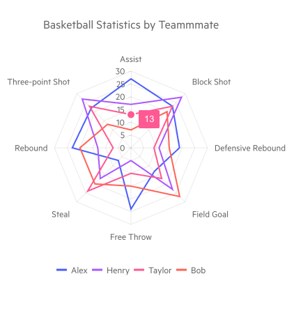
Telerik UI for Blazor Radar Line Chart Series
Radar Area Chart
In the Blazor Radar Area Chart series the data points are connected with straight line segments that enclose a filled area. In the example below, the color-coding area for each employee helps to visually correlate and contrast the ranks for each employee skill.
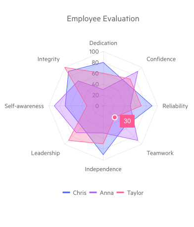
Telerik UI for Blazor Radar Area Chart Series
Radar Column Chart
The Blazor Radar Column Chart series are represented on the chart as data columns whose height varies according to their value. The nearest the column of the particular variable is to the edge of the chart, the higher its value is, and the vice versa—the closer the column of the particular variable is to the center of the chart, the lower its value is.
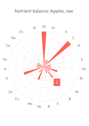
Telerik UI for Blazor Radar Column Chart Series
Blazor Grid Export to CSV
In addition to the Grid export to Excel, with the current release we added the capability to export grid data in Blazor applications to CSV format with a click of a button. You can choose to export the current grid page or all of the grid data, while preserving the applied data operations over the grid—column order, sorting, filtering or grouping.
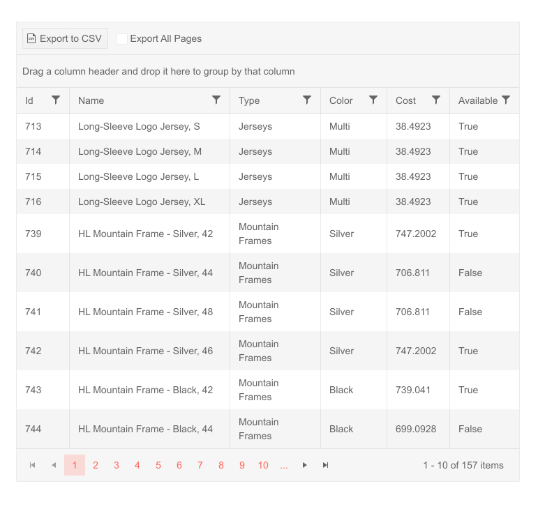
Telerik UI for Blazor – Export Grid to CSV
If you want to learn more about the Telerik UI for Blazor Grid, visit our documentation, demos and overview Grid page.
Blazor TreeView Drag & Drop
The TreeView component now supports Drag and Drop functionality, which allows you to move a node within the same TreeView or between different Telerik TreeView component instances. The Telerik Blazor TreeView drag and drop feature can be easily turned on by setting the Draggable parameter to true and utilizing the OnDrop event to handle the drag & drop operations and data source modifications.
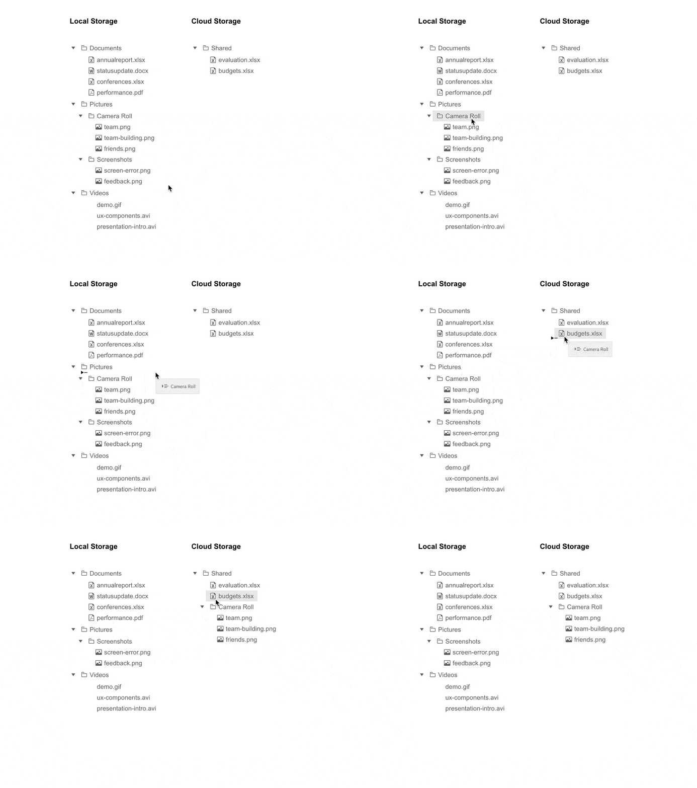
Telerik UI for Blazor TreeView Drag and Drop
Chart Legend Custom Title
You can now apply multiple customization options to the Telerik Blazor Chart legend title. You have full control over the chart legend title border, position, alignment, padding, background color and more!
Editor Keyboard Navigation
The Telerik UI for Blazor Editor now supports out of the box keyboard navigation that enables easy navigation through the toolbar and content area using just keyboard.
Download Telerik UI for Blazor 2.20.0
Download a free trial of Telerik UI for Blazor 2.20.0 from the Telerik UI for Blazor page, or if you are an active license holder you can grab the latest and greatest from the “Your Account” page or update your NuGet Telerik.UI.for.Blazor package reference to version 2.20.0. directly in your Blazor solutions.
Thank You!
Thanks as always from the Telerik UI for Blazor Team at Progress. Please be sure to leave us your feedback at our dedicated Blazor feedback portal or in the comment section below!

Maria Ivanova
Maria Ivanova is a Manager of Product Management at Progress, for Telerik and Kendo UI components and developer tooling. She joined the company in 2019 as a Product Manager for Telerik UI web components and is passionate about developing impactful and innovative software products. Maria believes that to create great products, it's important to challenge the status quo, closely collaborate with customers, and embrace a spirit of experimentation.
