
The Importance of Testing the Responsiveness of Your Website

Summarize with AI:
It’s more important than ever to ensure your websites display correctly—no matter the size of your device’s screen. Learn why website responsiveness matters and how to test your websites so your customers can have a smooth experience.
It wasn’t that long ago when we had limited choices for accessing the internet. If you didn’t mind text-only interactions like sending emails or reading some news articles, you could maybe handle that through a mid-2000s cell phone with its limited screen real estate. For any other online activity, like doing some shopping or having the sudden urge to update your MySpace profile page, the only choice you really had was to get in front of a desktop or laptop computer.
That hasn’t been the case for the past 15 years. With the widespread usage of smartphones, tablets and other internet-ready devices, you can access any website in a seemingly infinite number of ways. You might begin doing something online in front of your laptop at home and pick things up later from your phone while commuting to work. For consumers, having internet access anywhere, anytime, is exceptionally convenient. However, for online businesses and web developers, this convenience comes at the cost of additional work.
For any company building a website nowadays, it’s not enough to check that your site works on a single device. Given all the ways potential customers can use to reach you online, you need to ensure that your website is usable regardless of how it’s accessed. This approach is known as website responsiveness, and it’s become crucial to creating a high-quality online experience.
What Is Website Responsiveness?
Website responsiveness refers to the practice of optimally rendering your site according to the device where viewed, without needing to create multiple versions of the same pages (also known as adaptive web design). It’s about making your websites and web applications look great on all screen sizes using the same HTML and stylesheets and providing an excellent user experience regardless of where your customers access the site.
When talking about website responsiveness, most developers think it’s only about handling how your website renders on different screen resolutions by arranging page elements to accommodate the viewport or resizing images to fit. That’s part of handling responsiveness, but it goes beyond the website’s underlying code. It also requires a shift in how we think about the design of our sites.
Designing a modern website requires thinking about structuring both the visual and functional portions so that consumers don’t have any problems using your site with any device. It’s common to have someone log in to a website using a desktop computer with a large screen and later go to the same site using their small smartphone screen. A truly responsive website will have a unified design that feels the same, even if the visuals are different. Let’s see an example using the online shop for PetSmart, a well-known pet supply chain in the United States.
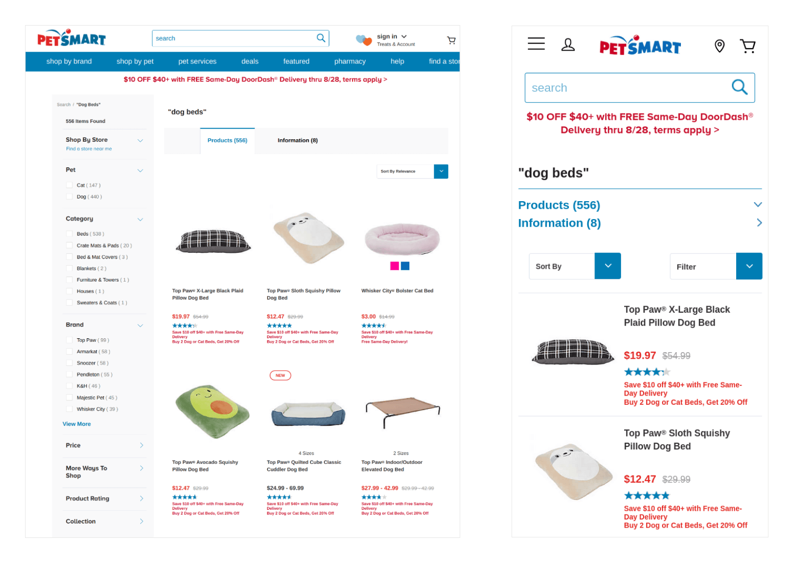
On the left side of this image, the large screen of a desktop PC allows the site to accommodate plenty of information to help shoppers—dozens of products, a sidebar containing filtering options, a search bar and so on. On the right, we see the same site on a smartphone containing some of the same elements. But the page gets modified to make the site easier to use on the smaller screen—you’ll see fewer products simultaneously, and the sidebar options get placed under a menu. The responsive design won’t sacrifice usability despite showing less information on a smartphone.
Why Is Website Responsiveness Important?
As mentioned, most internet users nowadays go online using different devices, each with different screen sizes and resolutions. You risk losing customers if your website’s content isn’t usable across the board.
Recent surveys found that over half of the world’s internet access happens on mobile devices. Without properly handling responsiveness on smaller screens, you’re providing an inferior experience to the majority of people who land on your website.
Another essential element for providing accessible content on desktop computers and mobile devices is search engine optimization (also known as SEO). Google and other wide used search engines consider accessibility and responsiveness for mobile devices when indexing your content. That means if your site isn’t mobile-friendly and doesn’t work in a way that’s ideal for users accessing your site through these devices, your search engine rankings will tank, making your business impossible to reach through organic traffic.
Another SEO-related factor that affects your search rankings is bounce rate. This number is the percentage of users that land on your website and leave quickly without doing anything. Bounce rates play heavily on Google’s algorithms for ranking your site—the higher the bounce rate, the lower you’ll rank. Website responsiveness plays a significant role in your site’s bounce rate. A 2015 study by Adobe found that over 80% of users would abandon a website that’s difficult to access across multiple devices. For unoptimized websites, that means a large chunk of visitors won’t stick around for long.
The global landscape for people’s internet usage is rapidly changing, and your organization must adapt to these changes. A website that doesn’t handle multiple devices or screen sizes effectively will likely receive less traffic than a fully responsive one, and the traffic you do get won’t probably stick around for long. These studies clearly indicate how vital website responsiveness is for your business.
How Bugs Surface in Your Responsive Website
Bugs can appear in different ways when it comes to responsive design issues. Most bugs related to responsiveness are relatively minor. Typically, they appear in the form of text and images that cut off from the screen, content that looks out of place on a different system, text that’s too small to read correctly on a portable device, or links that are difficult for users to tap on a touch screen.
However, the worst bugs related to website responsiveness happen when your website has significantly impaired usability on specific screens. For instance, a website might shift some elements to fit on a small screen, but it also hides essential actions like an “Add to Cart” button on an ecommerce site. It’s one thing to have your website have cut-off text and images that require users to scroll. But it’s a showstopper when poor responsive design blocks people from being able to use the primary functionality of the site altogether and the kind of issues that makes potential customers abandon your website forever.
Beyond the visual aspects of website responsiveness, some issues can also hide underneath the surface. One area to consider is limiting the resources necessary to display the site on different screens. An example is handling responsive images. On a large screen, you’ll want to use high-resolution files which have a larger file size, but on smaller screens, you can load a different image with much smaller file sizes. That way, you can reduce the performance impact between a powerful desktop or laptop computer and the limited processing power of a smartphone or tablet.
Your organization can quickly resolve most of these issues with little effort. However, you first need to detect and uncover responsiveness problems early. To achieve this, you must dedicate time to performing responsive testing.
What Is Responsive Testing?
Responsive testing is the process of validating the pages of a website on different screen sizes to ensure they’re well-optimized, no matter which device accesses the page. This type of testing can occur through automated and manual verification, such as:
- Checking that the website can adjust the design according to screen size to look and feel great for the customer.
- Ensuring the page remains accessible regardless of where someone views the site.
- Adjusting resources on the page to account for less-powerful devices like serving smaller images or fewer unnecessary scripts.
These tasks can be considered the basics of responsive testing. Depending on the complexity of your website’s design and business needs, you can include others forms of testing. For instance, if you know most users access your site through a tablet device, you should explore areas such as how the site looks in portrait and landscape mode and that any essential calls to action are easily clickable.
When a designer or developer goes through building a website, it’s essential to keep responsiveness in mind. Although going through a set of responsive tests sounds quick and simple, establishing the routine of frequent testing is the key to ensuring that you’re making the most out of the process. Performing these tests regularly will help you smoke out these seemingly insignificant yet potentially harmful scenarios that can drive customers away.
How To Test Your Website’s Responsiveness
The typical way most organizations test for website responsiveness is through manual testing. Essentially, testers go through the website to ensure that the site looks and works as expected regardless of screen resolutions, similar to verifying cross browser compatibility. Most browsers have dedicated modes to display a website using different screen sizes, like Google Chrome’s Device Mode and Mozilla Firefox’s Responsive Design Mode. Testers can quickly verify a website at any screen size using these integrated tools.
However, manually testing for responsiveness is a repetitive and tedious task prone to human error, especially on larger web applications that span dozens or even hundreds of different pages. Thankfully, these days we have tools that allow us to automate testing for website responsiveness easily. These tools help you create tests that go through different screen sizes and resolutions to ensure your website continues working as expected in every important scenario for your business.
An excellent testing tool for creating robust automated tests for website responsiveness is Telerik Test Studio. With Test Studio, you can create dedicated responsive web tests for your application using Google Chrome’s Device Mode. In each test, you can specify the screen width and height you want to verify, record the steps you wish to validate for that specific resolution, and save it to run at any time like through a continuous integration service. Test Studio also provides a list to instantly set a predefined screen size for many most popular devices like the Apple iPhone, Apple iPad or Google Pixel.
To learn more about how simple Telerik Test Studio makes creating automated tests for verifying website responsiveness, check out their website and the official documentation.
Summary
Working on your website’s responsiveness, which can adjust to any screen without sacrificing usability or functionality to your users, is necessary for today’s increased mobile usage environment. Search engines now pay close attention to how your website works on desktop and mobile devices and will rank responsiveness higher than a page that doesn’t look well across different screens. Also, if you provide a poor user experience due to a website not managing responsiveness well, you’ll risk losing customers and business, negatively affecting your search rankings.
Testing website responsiveness often happens through manual testing, where a tester verifies how your site behaves using different screen resolutions. You can skip repetitive manual validation with test automation tools like Telerik Test Studio. These tools allow testers to set up scenarios specifically for checking website responsiveness, which teams can execute at any time. Automation tools like Telerik Test Studio significantly increase test coverage around website responsiveness at a fraction of the time compared to manual testing.
Verifying website responsiveness can become somewhat challenging, but with more people going online with devices with all kinds of screen sizes, it’s a critical part of developing a high-quality experience. Any organization that relies on having a remarkable online presence must ensure their websites work anywhere at any time.

Dennis Martinez
Dennis Martinez is a freelance automation tester and DevOps engineer living in Osaka, Japan. He has over 19 years of professional experience working at startups in New York City, San Francisco, and Tokyo. Dennis also maintains Dev Tester, writing about automated testing and test automation to help you become a better tester. You can also find him on LinkedIn and his website.
Related Posts
Comments
All articles
Topics
Web MobileMobile
Desktop
Design
Productivity
People
