When to Use ListView vs. DataGrid in Real-World Projects

Summarize with AI:
Depending on the type of user, the number of fields and the tasks being performed, does your Blazor app need a DataGrid or a ListView?
Displaying data to users is common in web applications. One question you may ask, and which doesn’t always have the same answer, is how to choose the right component to do it.
Would it be appropriate to show a table with all the columns? Or would a card gallery like those used in mobile apps be better?
For that reason, in this article we will analyze the components Blazor ListView and Blazor DataGrid from the Progress Telerik UI library, comparing their features. Let’s go!
The Problem of Choosing the Wrong Component
How we choose to display information in our web application depends on several variables:
- The type of user: A user who requires detailed information about an item is not the same as someone who only needs to see general information.
- The amount of fields to display: Quickly viewing information is not the same as analyzing and comparing data.
- The task to perform with the data: You may need to perform complex operations like grouping, applying filters or making comparisons between them, or you may not.
Not being clear about the purpose of using the information could lead to poor user experiences or make it difficult to work with the data.
Getting to Know the Blazor DataGrid Component
The Blazor DataGrid component allows viewing data in a tabular form. The idea of the component is to display many records in a table format with all the necessary tools for a user to analyze them.
It is a quite robust and flexible component, which in its latest versions incorporates AI features for better data understanding. Among its main capabilities we can find:
- Sorting by one or multiple columns
- Filtering on each column
- Grouping by dragging headers
- Paging with traditional pagination or virtual scrolling
- Inline or popup editing of records
- Resizable, reorderable and lockable columns
- Exporting to Excel and PDF
- Single or multiple selection
- Customization using templates
- Drag & drop support
- Smart AI features that work with natural language queries
From the characteristics described, you can notice that we are talking about a component that should be used when users want to see many rows and fields at the same time and be able to manipulate them.
Some ideal use cases for this component are administrative panels, ERPs, support dashboards, internal tools or any interface where data takes priority over aesthetics.
The Blazor ListView Component
The Blazor ListView component can be considered a freer component than the Blazor Grid. Instead of a tabular structure, the data is provided to you as a context that you can render as you wish. This means you can customize the UI to create cards, timelines, custom rows or any Razor structure you want.
Some of the component’s main features include:
- Customizable built-in paging
- On-demand loading
- Handling of CUD operations through built-in commands
- Custom data source operations
- Fully customizable templates
This component is ideal when the data is not tabular or when the layout needs to adapt to multiple screen styles. Some examples of when to use this component are news feeds, visual catalogs, item galleries, among others.
When to Use a Grid vs. a ListView?
In addition to the analysis we’ve done for each component, I’d like to share some comparative points about when to use a Grid and when to use a ListView.
It’s advisable to use a Grid when:
- You need the user to be able to compare values across rows
- Each record has many fields to be analyzed
- Screen space is not an issue
- You require complex operations such as sorting, filtering or grouping
- You need to edit data in bulk
- You need to export table data
On the other hand, it’s advisable to use a ListView when:
- Records have few fields or are ideal for visually rich interfaces
- User interaction involves viewing items one at a time, not analyzing them
- You need full control over the layout of each item
- You are building some type of app that includes a card-like component or similar
Let’s see how both views look in a real example.
Creating a Blazor Project with ListView and Grid
To demonstrate the difference between the two components and see when it’s convenient to use one over the other, let’s create a component that loads 50 orders and allows switching the view between a ListView-style and a Grid-style.
To achieve this, start by creating a project with the Blazor Web App template, selecting Interactive render mode in Server and Interactivity location in Global. Then, you can follow the official installation guide for Telerik UI for Blazor to install the Telerik components in your project.
Defining the App Data Model
Once the Telerik components are installed in the project, the next step will be to create the data model that represents a sales order in the system. For this, we will use a record type as follows:
public record SalesOrder(
    int OrderId,
    string Customer,
    string Product,
    string Category,
    int Quantity,
    decimal UnitPrice,
    DateTime OrderDate,
    string Status)
{
    public decimal Total => Quantity * UnitPrice;
}
Now, let’s create a service that will generate the fictitious orders.
Creating a Data Service
Let’s create a service class that will be used to generate the fictitious orders. For this, let’s add an interface and its corresponding implementation:
public interface ISalesService
{
    IReadOnlyList<SalesOrder> GetOrders();
}

public class SalesService : ISalesService
{
    private static readonly string[] Customers =
    [
        "Contoso", "Fabrikam", "Adventure Works",
        "Northwind Traders", "Telerik"
    ];

    private static readonly (string Product, string Category, decimal Price)[] Catalog =
    [
        ("Laptop Pro 15",      "Electronics", 1299.99m),
        ("Wireless Mouse",     "Electronics",   45.00m),
        ("4K Monitor",         "Electronics",  399.50m),
        ("Mechanical Keyboard","Electronics",  129.99m),
        ("Running Shoes",      "Clothing",      89.95m),
        ("Winter Jacket",      "Clothing",     159.99m),
        ("Organic Coffee",     "Food",          24.50m),
        ("Premium Tea Box",    "Food",          18.75m),
        ("Office Chair",       "Furniture",    249.00m),
        ("Standing Desk",      "Furniture",    599.00m)
    ];

    private static readonly string[] Statuses =
        ["Pending", "Shipped", "Delivered", "Cancelled"];

    public IReadOnlyList<SalesOrder> GetOrders()
    {
        var random = new Random(42);
        var orders = new List<SalesOrder>();

        for (int i = 1; i <= 50; i++)
        {
            var item = Catalog[random.Next(Catalog.Length)];
            orders.Add(new SalesOrder(
                OrderId: 1000 + i,
                Customer: Customers[random.Next(Customers.Length)],
                Product: item.Product,
                Category: item.Category,
                Quantity: random.Next(1, 10),
                UnitPrice: item.Price,
                OrderDate: DateTime.Today.AddDays(-random.Next(0, 60)),
                Status: Statuses[random.Next(Statuses.Length)]
            ));
        }

        return orders;
    }
}
The code is simple, defining arrays with information that will simulate a business dataset, as well as generating 50 orders by randomly combining the arrays.
To be able to inject the service, we will go to Program.cs, where we will add it as Singleton:
var builder = WebApplication.CreateBuilder(args);
...
builder.Services.AddSingleton<ISalesService, SalesService>();

var app = builder.Build();
With the service ready, we can start with the visual tests.
Preparing the Orders Page
In the Components\Pages folder we will create a new component called SalesOrders.razor, which will look as follows:
@page "/sales-orders"
@using SalesOrderListGridDemo.Services
@using SalesOrderListGridDemo.Models
@rendermode InteractiveServer
@inject ISalesService SalesService

<PageTitle>Sales Orders</PageTitle>

<h1>Sales Orders</h1>

<p>
    Switch between the <strong>ListView</strong> and the
    <strong>DataGrid</strong> using the toggle below.
</p>

<div class="sales-toolbar">
    <TelerikButtonGroup SelectionMode="@ButtonGroupSelectionMode.Single">
        <ButtonGroupToggleButton Selected="@(currentView == ViewMode.ListView)"
                                 SelectedChanged="@(_ => SetView(ViewMode.ListView))">
            ListView
        </ButtonGroupToggleButton>
        <ButtonGroupToggleButton Selected="@(currentView == ViewMode.Grid)"
                                 SelectedChanged="@(_ => SetView(ViewMode.Grid))">
            DataGrid
        </ButtonGroupToggleButton>
    </TelerikButtonGroup>

    <span class="text-muted">@orders.Count orders loaded</span>
</div>

@code {
    private enum ViewMode { ListView, Grid }

    private List<SalesOrder> orders = new();
    private ViewMode currentView = ViewMode.ListView;

    protected override void OnInitialized()
    {
        orders = SalesService.GetOrders().ToList();
    }

    private void SetView(ViewMode view) => currentView = view;
}
In the code of the previous page, you can notice a few things:
- We have created a
enumwith the optionsListViewandGrid, which will allow us to switch between views. - We load the orders into
OnInitialized. - The method
SetViewallows changing the view. - We use a Blazor Button Group component, ideal for handling multiple grouped buttons. In this case, we implement it to activate one view or the other through the assignment of a state with
Selected. Also, when a button is clicked,SelectedChangedis fired, which invokes the methodSetView.
With the options section ready, let’s render the ListView component.
Rendering a Blazor ListView
The next step will be to render the ListView. To do this, we will add a conditional block and use the component TelerikListView:
@if (currentView == ViewMode.ListView)
{
    <TelerikListView Data="@orders"
                     Pageable="true"
                     PageSize="9">
        <Template Context="order">
            <div class="order-card">
                <div class="order-card-header">
                    <span class="order-card-id">#@order.OrderId</span>
                    <span class="status-badge status-@order.Status">@order.Status</span>
                </div>
                <div class="order-card-product">@order.Product</div>
                <div class="order-card-meta">@order.Customer   @order.Category</div>
                <div class="order-card-meta">@order.OrderDate.ToString("MMM dd, yyyy")</div>
                <div class="order-card-footer">
                    <span class="text-muted">@order.Quantity   @order.UnitPrice.ToString("C")</span>
                    <span class="order-total">@order.Total.ToString("C")</span>
                </div>
            </div>
        </Template>
    </TelerikListView>
}
In the previous code, the property Data binds to the service’s list. We configure some additional properties such as paging (Pageable) and number of items per page (PageSize). Also, we use a Template to define a custom view, highlighting only the most important data such as product, customer, category, date, total, etc.
To make the layout look correct, we will add some visual styles in wwwroot/app.css:
.sales-toolbar {
    display: flex;
    align-items: center;
    gap: 1rem;
    margin-bottom: 1rem;
    flex-wrap: wrap;
}

.order-card {
    border: 1px solid #e2e8f0;
    border-radius: 0.5rem;
    padding: 1rem;
    background: #fff;
    box-shadow: 0 1px 2px rgba(0,0,0,0.04);
    display: flex;
    flex-direction: column;
    gap: 0.5rem;
    height: 100%;
}

.order-card-header,
.order-card-footer {
    display: flex;
    justify-content: space-between;
    align-items: center;
}

.order-card-product {
    font-size: 1.1rem;
    font-weight: 600;
    color: #0f172a;
}

.order-card-meta {
    color: #64748b;
    font-size: 0.9rem;
}

.order-total {
    font-weight: 700;
    color: #0f172a;
}

.status-badge {
    display: inline-block;
    padding: 0.15rem 0.6rem;
    border-radius: 999px;
    font-size: 0.75rem;
    font-weight: 600;
    text-transform: uppercase;
}

.status-Pending   { background: #fef3c7; color: #92400e; }
.status-Shipped   { background: #dbeafe; color: #1e40af; }
.status-Delivered { background: #dcfce7; color: #166534; }
.status-Cancelled { background: #fee2e2; color: #991b1b; }
When running the application, we can see the layout we created using the ListView:
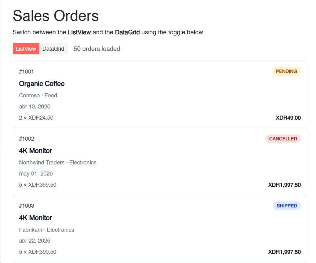
In the image above, you can notice that there is no comparison between orders; rather, there is navigation between the list items. If users wanted to group items, filter them or perform complex operations, this would not be the right component. Let’s now see how to implement a Grid.
Adding a Grid Component to the App
Let’s see how a Grid component looks, completing the else branch of the conditional in the code to add a TelerikGrid:
else
{
    <TelerikGrid Data="@orders"
                 Pageable="true"
                 PageSize="15"
                 Sortable="true"
                 FilterMode="@GridFilterMode.FilterRow"
                 Groupable="true"
                 Resizable="true"
                 Reorderable="true">
        <GridColumns>
            <GridColumn Field="@nameof(SalesOrder.OrderId)" Title="Order #" Width="110px" />
            <GridColumn Field="@nameof(SalesOrder.Customer)" Title="Customer" />
            <GridColumn Field="@nameof(SalesOrder.Product)" Title="Product" />
            <GridColumn Field="@nameof(SalesOrder.Category)" Title="Category" Width="140px" />
            <GridColumn Field="@nameof(SalesOrder.Quantity)" Title="Qty" Width="90px" />
            <GridColumn Field="@nameof(SalesOrder.UnitPrice)" Title="Unit Price" Width="130px" DisplayFormat="{0:C}" />
            <GridColumn Field="@nameof(SalesOrder.Total)" Title="Total" Width="130px" DisplayFormat="{0:C}" />
            <GridColumn Field="@nameof(SalesOrder.OrderDate)" Title="Date" Width="140px" DisplayFormat="{0:d}" />
            <GridColumn Field="@nameof(SalesOrder.Status)" Title="Status" Width="130px" />
        </GridColumns>
    </TelerikGrid>
}
In the previous code we can see the notable difference between the two components:
- It has parameters like
Sortable,Groupable,Resizable,Reorderable, etc., which enable capabilities a user expects in a table-like format. - The number of items shown per page is set to 15, because each row takes up less space.
- If needed, we could customize the columns to display custom content.
When running the application, we will have a result like the following:
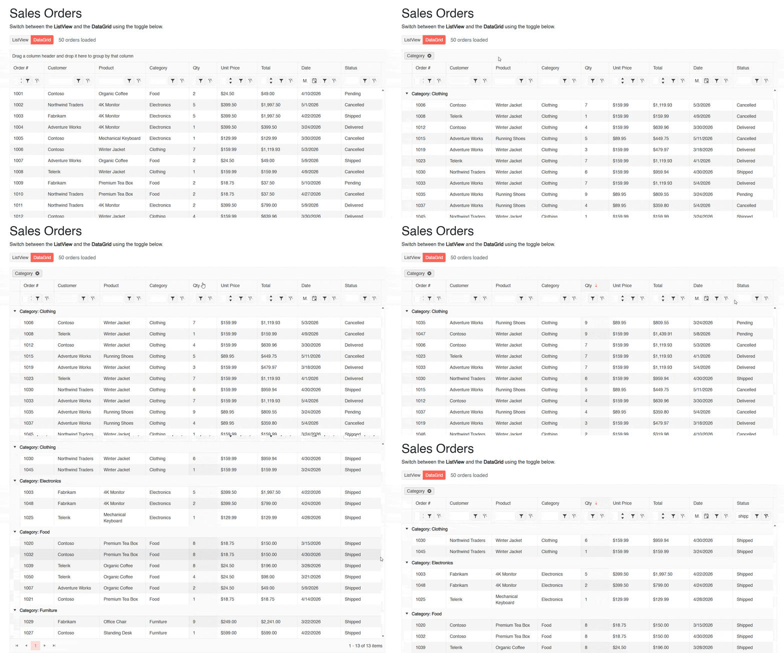
In the image above, you can see that we perform operations such as grouping, sorting and filtering rows.
Final Comparison Between Components
Once we have the application assembled and have seen how each component looks, we can reach the following conclusion:
- Use a ListView when you want to treat each record as an individual entity, customizing its visual hierarchy. It is a component intended to be consumed by users.
- Use a DataGrid when you want a spreadsheet-like experience, with operations such as sorting, grouping, filtering, etc. It is a component intended to be operated by users.
Each of the views has a different purpose, although it is possible to combine their use to create mixed experiences.
Conclusion
Throughout this article we have examined the ListView and Grid components from Progress Telerik UI for Blazor. We have discussed the best scenarios for using each of them, as well as the implementation code to use them.
We can conclude that you should use a ListView when the information is intended for end users, requires a high degree of customization and offers a unique exploratory experience.
On the other hand, a DataGrid can be used to display multiple records in a tabular form when operations that enable analysis are needed, such as grouping, sorting, filtering, etc.
Now I invite you to create spectacular experiences using both components. The whole Telerik UI for Blazor library is available in the free 30-day trial, including the ListView and the DataGrid.

Héctor Pérez
Héctor Pérez is a Microsoft MVP with more than 10 years of experience in software development. He is an independent consultant, working with business and government clients to achieve their goals. Additionally, he is an author of books and an instructor at El Camino Dev and Devs School.
Related Posts
Comments
All articles
Topics
Web MobileMobile
Desktop
Design
Productivity
People