Simplify Hierarchical Selection in Blazor with the Telerik DropDownTree
 by Ivan Danchev

Summarize with AI:
The Blazor DropDownTree allows you to show hierarchy for data like product searches or organization and department structures down to individual employees, with options for expansion and collapse and breadcrumb displays.
Hierarchical data is everywhere. Product catalogs, organizational structures, file systems, geographical regions and permission models all rely on parent-child relationships to help users understand and navigate information.
The challenge appears when users need to select something from that hierarchy.
A traditional dropdown works well for flat lists, but once the number of items grows, users lose important context. A product category called “Gaming Laptops” means much more when users can see that it belongs under “Electronics → Computers → Laptops.”
A TreeView solves the navigation problem, but it is not always the right fit inside a form. Keeping a large hierarchy permanently visible can consume valuable screen space.
This is where the Progress Telerik UI for Blazor DropDownTree comes in.
The DropDownTree combines the compact experience of a dropdown with the navigation capabilities of a TreeView, allowing users to browse, search and select hierarchical data without overwhelming the UI.
In this article, we will explore how to use the DropDownTree to:
- Display hierarchical data
- Help users quickly find items
- Make working with hierarchical data more intuitive
- Customize the appearance of nodes
- Customize the selected value display
Why Choose a DropDownTree?
When working with hierarchical data, choosing the right component can make a significant difference in the user experience.
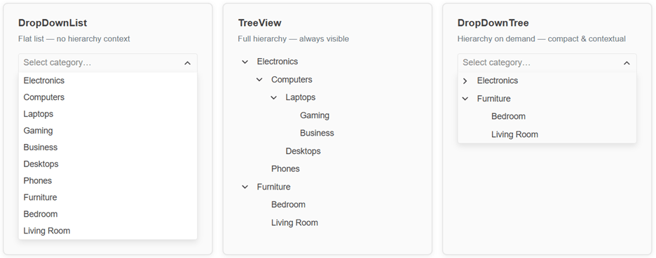
A standard dropdown or ComboBox is ideal for flat data, but it does not provide context about how items relate to each other. A TreeView preserves the hierarchy, but it is always visible and may not fit well inside forms where space is limited.
The DropDownTree combines the best of both approaches.
| Component | Best For |
|---|---|
| DropDownList | Selecting from a small flat list |
| ComboBox | Searching and selecting from large flat datasets |
| TreeView | Browsing and managing visible hierarchies |
| DropDownTree | Selecting items from hierarchical data in a compact UI |
If your users need to select something from a hierarchy but don’t need the hierarchy visible all the time, the DropDownTree is often the right choice.
How Can You Display Hierarchical Data?
Let’s start with a common scenario: a product catalog.
Imagine an inventory application with categories like:
Electronics
  Computers
    Laptops
      Gaming
      Business
    Phones
Furniture
  Bedroom
  Living Room
Displaying this structure in a flat dropdown would quickly become difficult to use. The DropDownTree allows you to bind directly to hierarchical data, including data that comes from a database through a service.
The Data Model
The component works with a recursive DTO where each node holds its own children:
public class HierarchicalTreeItemDto
{
    public int TreeItemId { get; set; }
    public string Text { get; set; }
    public bool HasChildren => Items?.Count > 0;
    public List<HierarchicalTreeItemDto> Items { get; set; } = new();
}
HasChildren is computed from Items.Count, so it never goes out of sync with the actual data.
The Component and Binding
@inject HierarchicalTreeItemService HierarchicalTreeItemService

<TelerikDropDownTree Data="@DropDownTreeData"
                     @bind-Value="@DropDownTreeValue"
                     @bind-ExpandedItems="@DropDownTreeExpandedItems"
                     ValueField="TreeItemId"
                     Filterable="true"
                     FilterOperator="@StringFilterOperator.Contains"
                     FilterPlaceholder="Search by name">

    <DropDownTreeBindings>
        <DropDownTreeBinding TextField="Text" ItemsField="Items" />
    </DropDownTreeBindings>

</TelerikDropDownTree>

@code {
    private List<HierarchicalTreeItemDto> DropDownTreeData { get; set; }
    private int DropDownTreeValue { get; set; }
    private IEnumerable<object> DropDownTreeExpandedItems { get; set; } = new List<object>();

    protected override void OnInitialized()
    {
        DropDownTreeData = HierarchicalTreeItemService.GetHierarchicalTreeItems().ToList();
        DropDownTreeExpandedItems = DropDownTreeData.Where(x => x.HasChildren).ToList<object>();
    }
}
Data– The root-level collection. The component recursively readsItemsFieldto build the full tree; it never calls the service itself.@bind-Value– Two-way binding for the selected node’s key. UpdatesDropDownTreeValuewith the chosenTreeItemId.@bind-ExpandedItems– Controls which nodes are open. Prepopulating it with the root nodes that have children means users see the top-level structure the moment they open the dropdown.DropDownTreeBinding– Tells the component which property is the display label (TextField) and which holds the children (ItemsField). These match the DTO property names exactly.
GetHierarchicalTreeItems() is where your data-access logic lives. It queries the database and maps the results into the HierarchicalTreeItemDto hierarchy. The component receives a ready-made tree; it has no knowledge of where the data came from.
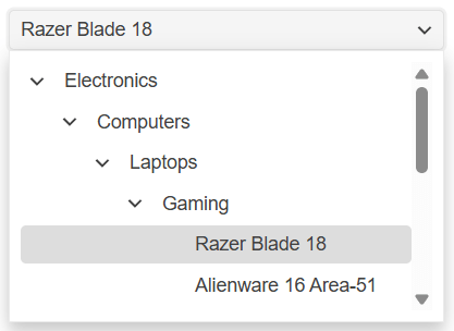
An exemplary Product category hierarchy displayed inside the DropDownTree:
💡 Tip: If your application already uses hierarchical DTOs, you can often bind them directly without flattening or restructuring your data.
How Can Users Find Items Faster?
Large hierarchies can quickly become difficult to navigate manually. Imagine a catalog containing thousands of products organized across multiple category levels.
Instead of expanding nodes one by one, users can search directly. Filtering is enabled with a single parameter:
<TelerikDropDownTree Data="@CatalogData"
                     @bind-Value="@SelectedValue"
                     @bind-ExpandedItems="@ExpandedItems"
                     ValueField="@nameof(CategoryItem.Id)"
                     Filterable="true"
                     FilterOperator="@StringFilterOperator.Contains"
                     FilterPlaceholder="Search by name…">
    <DropDownTreeBindings>
        <DropDownTreeBinding TextField="@nameof(CategoryItem.Name)"
                             ItemsField="@nameof(CategoryItem.Children)" />
    </DropDownTreeBindings>
</TelerikDropDownTree>
Setting Filterable="true" adds a search box at the top of the popup. FilterOperator controls the matching strategy. Contains is the most user-friendly choice. FilterPlaceholder sets the hint text inside the search field.
Now users can quickly locate deeply nested items. For example, searching for a specific laptop brand, e.g., “Asus,” can immediately reveal:
 Electronics
  Computers
   Laptops
    Gaming
     Asus ROG Strix G16

How Can You Make Navigation More Intuitive?
Sometimes the best experience is to show users the available structure immediately. Displaying top-level product categories expanded when the popup opens makes it easier to understand what options are available.
The DropDownTree lets you control which nodes are expanded through @bind-ExpandedItems. You can initialize the expanded set programmatically in OnInitialized:
protected override void OnInitialized()
{
    // Expand all root-level categories on load
    ExpandedItems = CatalogData
        .Where(item => item.Children?.Count > 0)
        .Cast<object>()
        .ToList();
}
You can also include buttons that let users expand or collapse all nodes at once:
<TelerikButton OnClick="@ExpandRoots" ThemeColor="@ThemeConstants.Button.ThemeColor.Primary">
    Expand Root Categories
</TelerikButton>
<TelerikButton OnClick="@CollapseAll">
    Collapse All
</TelerikButton>
private void ExpandRoots()
{
    ExpandedItems = CatalogData
        .Where(item => item.Children?.Count > 0)
        .Cast<object>()
        .ToList();
}

private void CollapseAll()
{
    ExpandedItems = new List<object>();
}
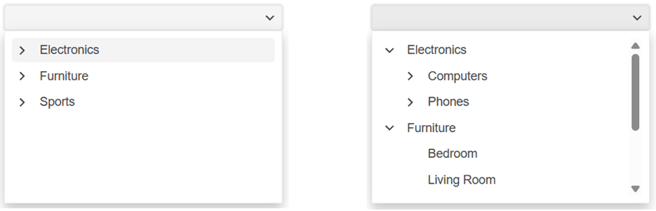
This gives users immediate context while keeping the dropdown compact.
All nodes collapsed vs. expanded root nodes:
How Can You Make Hierarchies Easier to Scan?
Hierarchical data often contains different types of items. A department may contain employees. A folder may contain documents. A product category may contain products.
Displaying everything as plain text makes the hierarchy harder to understand.
The DropDownTree supports ItemTemplate inside DropDownTreeBinding, allowing you to fully customize how each node renders. The template receives the data item as context.
Start with an enriched data model that carries everything the template needs:
public class OrgNode
{
    public int Id { get; set; }
    public string Name { get; set; } = string.Empty;
    public string Role { get; set; } = string.Empty;
    public EmployeeStatus Status { get; set; } = EmployeeStatus.Available;
    public ISvgIcon? Icon { get; set; }
    public List<OrgNode>? Children { get; set; }
}

public enum EmployeeStatus { Available, Busy, Away }
Each department gets a contextual icon—a gear for Engineering, a dollar sign for Finance and so on. Each employee carries a job title and an availability status.
Wire up the template:
<TelerikDropDownTree Data="@OrgData"
@bind-Value="@SelectedValue"
@bind-ExpandedItems="@ExpandedItems"
ValueField="@nameof(OrgNode.Id)"
Width="340px">
<DropDownTreeBindings>
<DropDownTreeBinding TextField="@nameof(OrgNode.Name)"
ItemsField="@nameof(OrgNode.Children)">
<ItemTemplate>
@{
var node = (OrgNode)context;
var isLeaf = !(node.Children?.Count > 0);
}
@if (!isLeaf)
{
<!-- Department node: contextual icon + name -->
<TelerikSvgIcon Icon="@node.Icon" />
<span> @node.Name</span>
}
else
{
<!-- Employee node: status dot + person icon + name and role -->
<span class="node-status node-status--@node.Status.ToString().ToLower()"></span>
<TelerikSvgIcon Icon="@SvgIcon.User" />
<span class="node-employee">
<span class="node-employee-name">@node.Name</span>
<span class="node-employee-role">@node.Role</span>
</span>
}
</ItemTemplate>
</DropDownTreeBinding>
</DropDownTreeBindings>
</TelerikDropDownTree>
A few CSS rules complete the effect:
.node-status {
    display: inline-block;
    width: 8px;
    height: 8px;
    border-radius: 50%;
    margin-right: 5px;
}

.node-status--available { background: #4caf50; }
.node-status--busy      { background: #ff9800; }
.node-status--away      { background: #9e9e9e; }

.node-employee {
    display: inline-flex;
    flex-direction: column;
    line-height: 1.2;
    vertical-align: middle;
}

.node-employee-name { font-size: 0.875rem; }
.node-employee-role { font-size: 0.75rem; color: #6c757d; }
The result: department nodes render with their domain icon, while employees show a colored availability dot, their name and their role—all inside the same compact dropdown:

How Can You Customize the Selected Value Display?
By default the DropDownTree shows the selected item’s text in the input. With ValueTemplate you can replace that with any markup you like.
A useful pattern is showing the selected item together with its breadcrumb path, giving users instant context about where the selection sits in the hierarchy:
<TelerikDropDownTree Data="@CatalogData"
@bind-Value="@SelectedValue"
@bind-ExpandedItems="@ExpandedItems"
ValueField="@nameof(CategoryItem.Id)"
Width="380px">
<DropDownTreeBindings>
<DropDownTreeBinding TextField="@nameof(CategoryItem.Name)"
ItemsField="@nameof(CategoryItem.Children)" />
</DropDownTreeBindings>
<ValueTemplate>
@{
// context is the selected data item
var item = context as CategoryItem;
var breadcrumb = item != null ? GetBreadcrumb(item.Id) : string.Empty;
var isCategory = item?.Children?.Count > 0;
}
<span title="@breadcrumb">
<TelerikSvgIcon Icon="@(isCategory ? SvgIcon.Folder : SvgIcon.Star)" />
<strong>@item?.Name</strong>
@if (!string.IsNullOrEmpty(breadcrumb))
{
<span style="font-size:0.85em; color:#6c757d;">
— @breadcrumb
</span>
}
</span>
</ValueTemplate>
</TelerikDropDownTree>
The GetBreadcrumb helper walks the tree and builds the ancestor path:
private string GetBreadcrumb(int id)
{
    var path = new List<string>();
    BuildPath(CatalogData, id, path);
    if (path.Count > 1) path.RemoveAt(path.Count - 1); // remove leaf, keep ancestors
    return string.Join(" › ", path);
}

private bool BuildPath(List<CategoryItem> nodes, int id, List<string> path)
{
    foreach (var node in nodes)
    {
        path.Add(node.Name);
        if (node.Id == id) return true;
        if (node.Children != null && BuildPath(node.Children, id, path)) return true;
        path.RemoveAt(path.Count - 1);
    }
    return false;
}
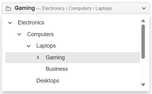
Selecting “Gaming” now shows 📁Gaming — Electronics › Computers › Laptops in the input, making the choice self-explanatory without any extra UI:
When Should You Use a DropDownTree?
The DropDownTree is useful whenever users need to select items from nested data.
Common scenarios include:
- Product catalogs – Browse categories and subcategories while preserving their relationships.
- Organization structures – Select employees, teams or departments.
- Document management – Choose folders and files from nested structures.
- Geographic selection – Navigate countries, regions, cities and locations.
- Permission management – Assign roles or resources organized into security hierarchies.
- Content management – Select pages, sections or navigation items.
Whenever hierarchy provides useful context, the DropDownTree helps users make better selections.
Try the Telerik UI for Blazor DropDownTree Today
The DropDownTree brings a long-requested hierarchical selection experience to Telerik UI for Blazor applications.
With built-in filtering, flexible data binding, templates, adaptive rendering, and accessibility support, it provides everything needed to create intuitive hierarchical selection workflows.
Explore these resources to learn more:
- REPL Examples – Experiment with the code directly in your browser
- Live Demos – See the component in action
- Documentation – Explore configuration options and API
Whether you are building an inventory system, HR portal, document manager or administrative application, the Telerik UI for Blazor DropDownTree can help users find and select hierarchical data quickly and naturally.
Ivan Danchev
Ivan Danchev is a Product Owner at Progress for the Telerik UI for ASP.NET MVC components. He joined the company in 2015 as a Technical Support Engineer in the AJAX team. Outside work, fast cars are one of Ivan’s greatest passions. As a devoted car enthusiast, he craves the adrenaline that racing and spirited driving generate.
Related Posts
Comments
All articles
Topics
Web MobileMobile
Desktop
Design
Productivity
People