
Choosing the Right Telerik UI for Blazor Chart

Summarize with AI:
Which type of chart is best for your data set? Explore the different types of Blazor charts and get a guide of which to use in certain use cases.
In data-driven applications, it is common to want to display information dynamically and visually. However, there are times when we have doubts about which type of chart to use in our applications.
Choosing the wrong type of chart can cause users to become confused or even distort the information by displaying it incompletely or with a layout that doesn’t make much sense.
That is why this article is a roundup of the types of charts available in the Progress Telerik UI suite for Blazor and when to use each. Let’s get to it!
Chart Types in Telerik UI for Blazor
Let’s analyze the different types of charts available in Telerik UI for Blazor, as well as when to use them.
Column Chart
The first type of chart, column, is perhaps the simplest. With this chart we can display vertical bars in which the height represents the value of each category. It’s a quite versatile chart type, which is why it’s very common to see it in applications and elsewhere. The chart looks like the following:
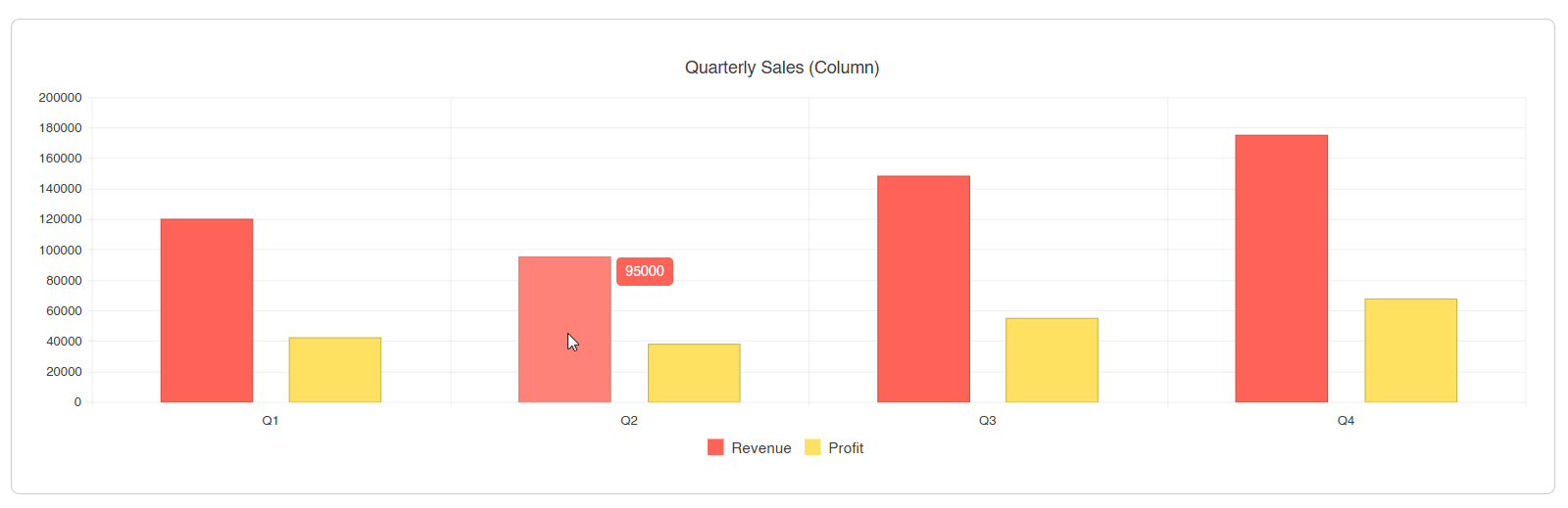
This type of chart is useful when we want to compare values across categories, show rankings or classifications, and visualize data where order does matter.
Bar Chart
The bar chart is the equivalent of the column chart but in a horizontal format. In the Telerik component ChartSeriesType.Bar is used and the category axis is on the vertical axis instead of horizontal:
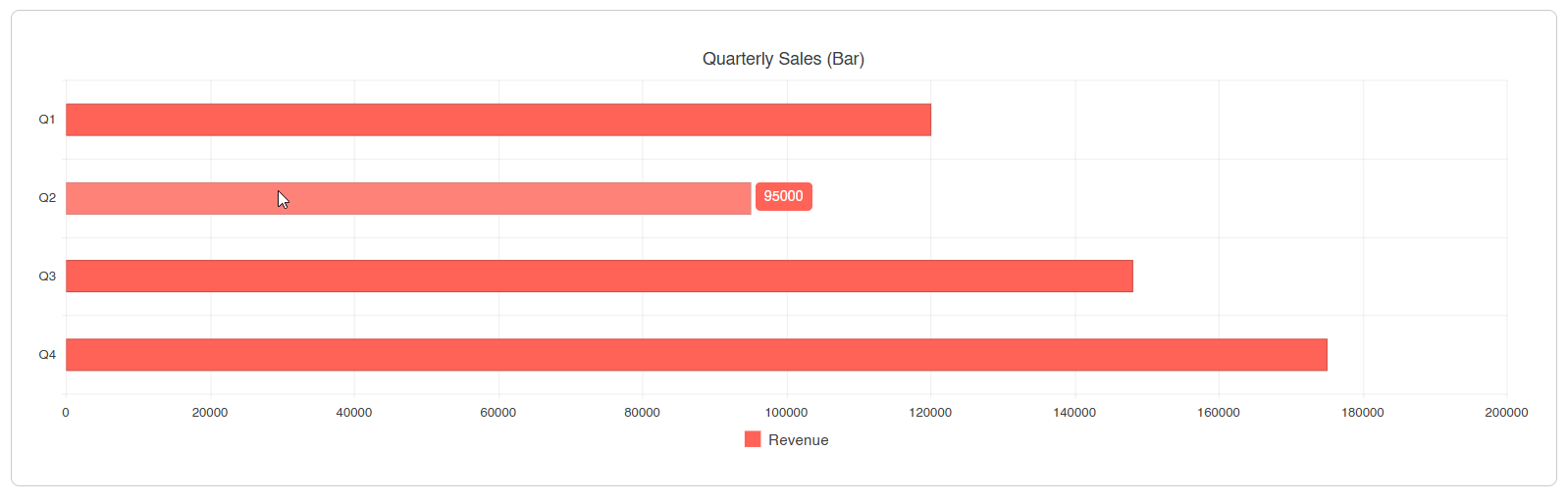
This chart can be used when category names are long and you need more space to display them, when you want to show a horizontal comparison between values, and when you want to emphasize the difference in values between categories.
Line Chart
The line chart displays a graph with connected points, which makes this chart ideal for showing trends over time. In the Telerik component it supports normal, step and smooth lines:
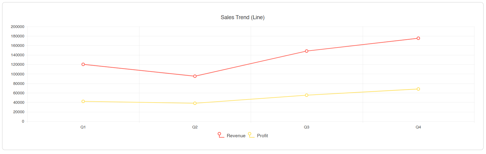
This chart is suitable when we want to visualize temporal trends, compare different evolutions within the same period and when continuity between data points is relevant.
Area Chart
This type of chart is similar to the line chart, with the difference that the space beneath the lines is filled with a semi-transparent color. This gives greater emphasis to the volume or magnitude of the data. In the Telerik component we can control the opacity using the Opacity property.
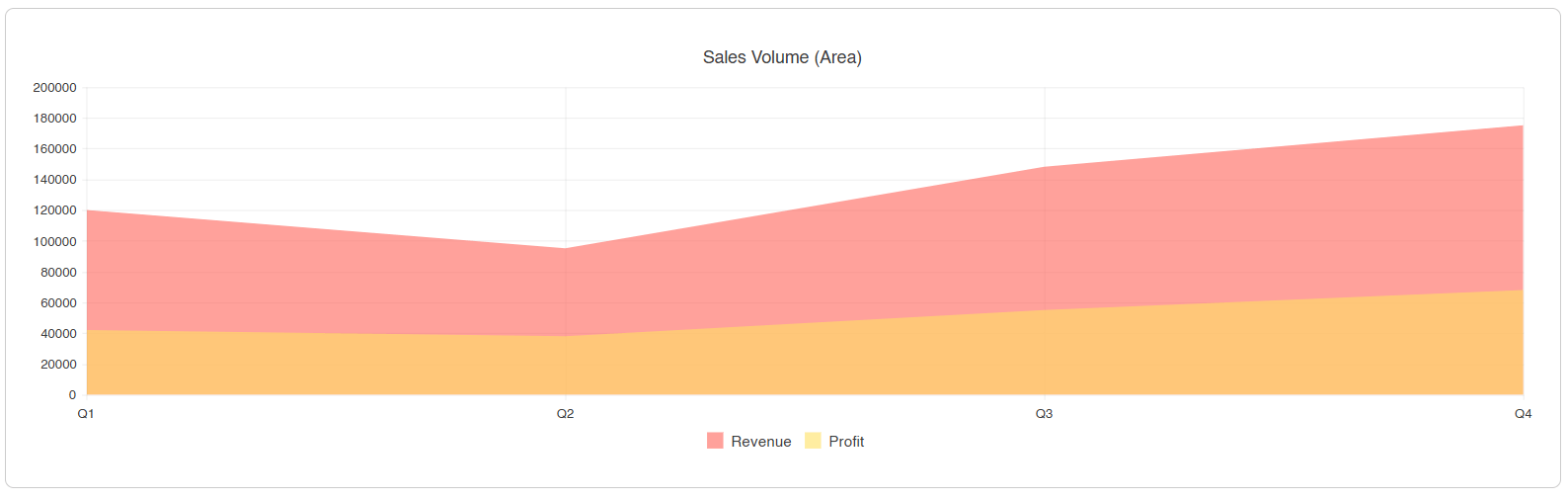
You can use this chart when you want to emphasize the volume of the data, their trend or when you want to show how different series overlap.
Pie Chart
The pie chart displays a circle divided into proportional slices for each value specified in the category. It only supports a single series, which makes it an ideal chart for showing the composition of a whole:

Some examples of when to use this type of chart are when you want to show a percentage distribution of data, while being mindful of the maximum number of slices so as not to overcrowd the chart. Likewise, when you want users to quickly understand portions of a whole and when you require the values to add up to 100%.
Donut Chart
This type of chart is similar to a pie chart but with a hole in the center. This hole can be used to display a highlighted data point or, as the Progress Telerik team has done, allow multiple series to be shown:
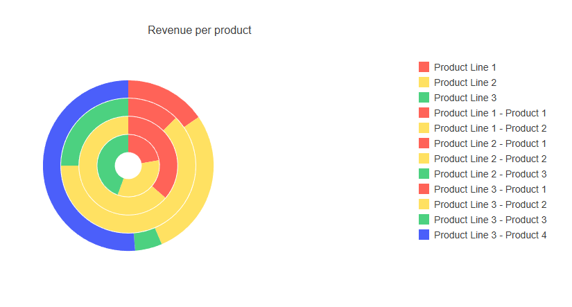
This chart is recommended for showing, in addition to the pie-chart scenarios, hierarchical relationships between data sets.
Scatter Chart
The scatter chart displays a series of points defined by the x and y axes, with these being numeric data:
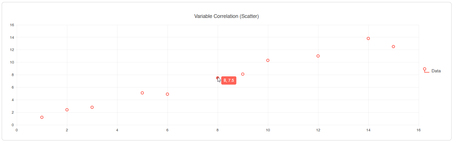
This type of chart is ideal when you want to show a correlation between two numeric variables, such as the relationship between users connected in an application and a website’s load time. It is also useful for identifying patterns, clusters, scientific data, among others.
Bubble Chart
This chart is similar to the scatter chart in how it works, but adds a third dimension, which is the size of the bubble:
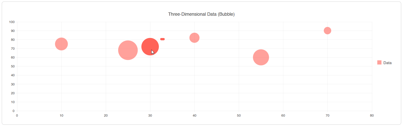
The third dimension is useful for comparing entities with multiple metrics simultaneously.
Scatter Line Chart
The scatter line chart is similar to the scatter chart, except that in this case the points are connected by lines:
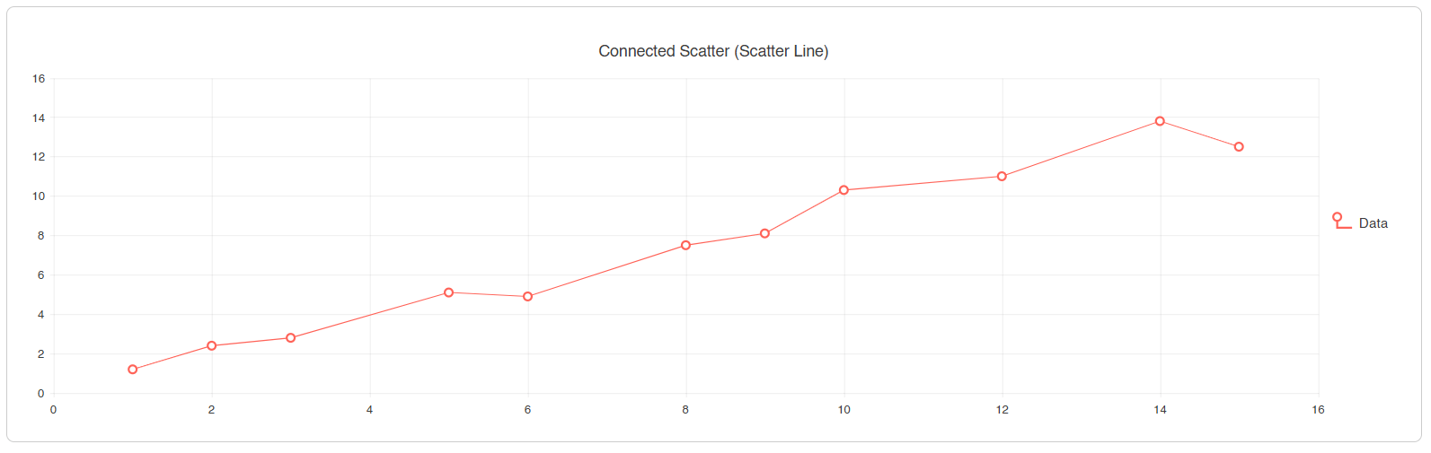
This chart is convenient to use when you want to show the relationship between two variables while maintaining continuity in the data or trend.
Candlestick Chart
This candlestick-style chart is widely used in the financial sector, as it allows showing four values for a period: open, close, high and low. If we are talking about stocks in the securities market, the body of the candle represents the price from open to close, while the wicks, which are the thin lines above and below, show the period’s high and low:
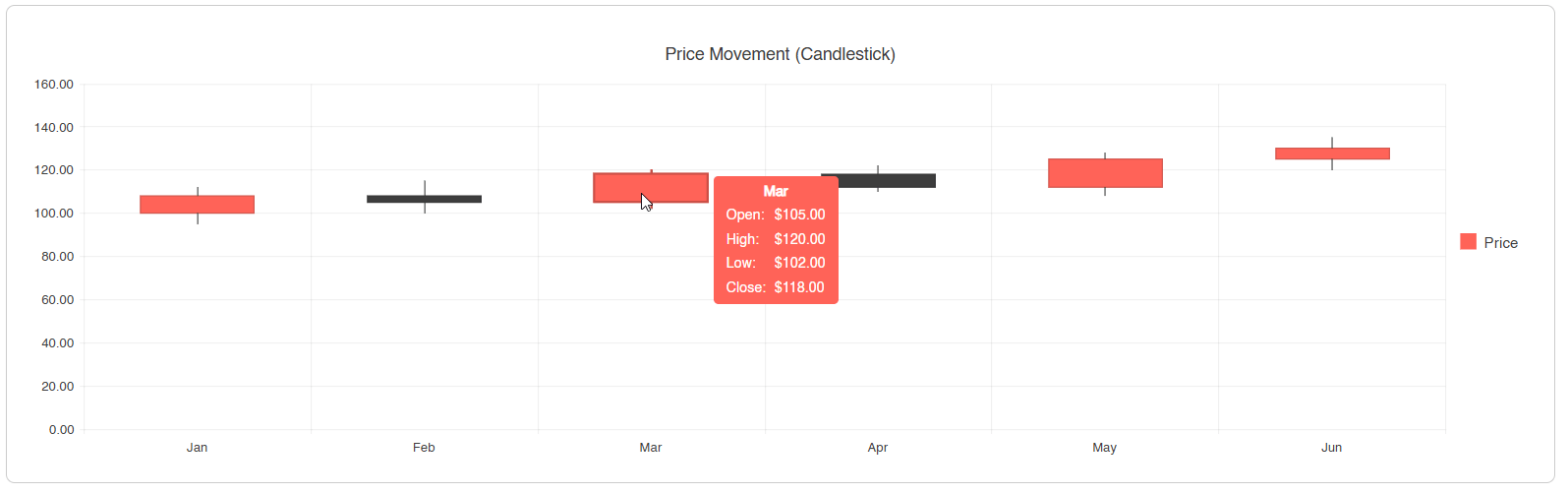
This chart is suitable for showing financial movements or when you want to identify trading patterns.
OHLC Chart (Open-High-Low-Close)
This chart shows the same four values as the candlestick chart, but instead of using candle bodies, it uses horizontal marks. In this chart the horizontal values represent the open and close, while the lower and upper extremes show the maximum and minimum:
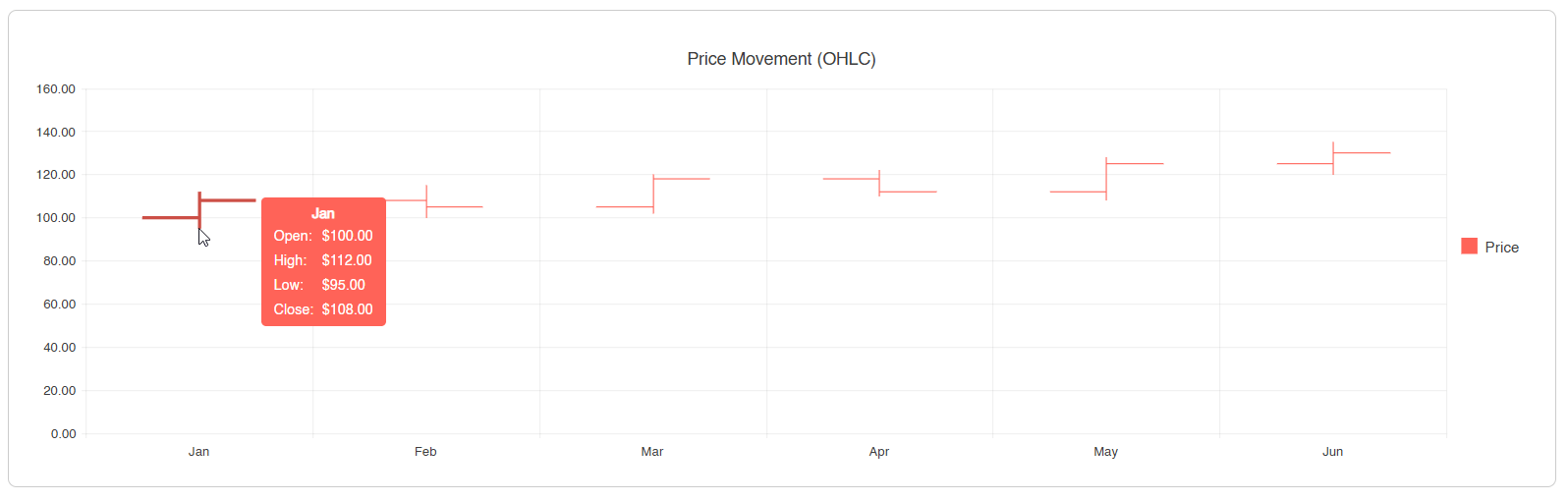
The use cases for this chart are the same as for the candlestick chart, but when you want a cleaner visualization. It is also ideal when you want to show many time periods, in which a candlestick chart would overlap the values.
Heatmap Chart
The heatmap displays a grid where color intensity represents the magnitude of a value across two dimensions:
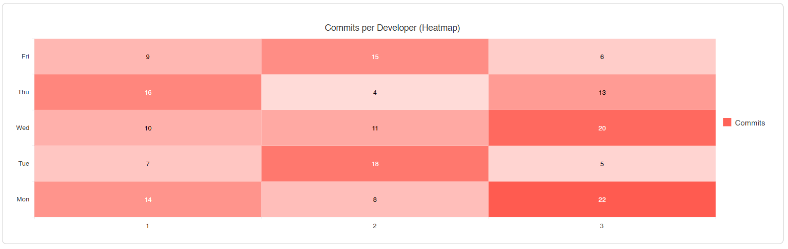
If you are a software developer, you will surely recognize the image above, since GitHub shows a similar chart to display the commits you have made on an account. This demonstrates that the chart is ideal for showing an activity density in two dimensions and when you want to show behavior patterns across intersecting categories.
Radar Line Chart
This chart starts from a common center from which several axes radiate. Each axis represents a specific value, which are then connected to form a closed shape:
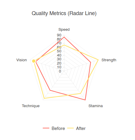
It is very useful when you want to make profile comparisons, such as variables between LLM models or when you want to make before/after comparisons.
Radar Area Chart
This radar area chart is similar to the radar line chart, with the difference that the space of the formed shape is filled with a color:
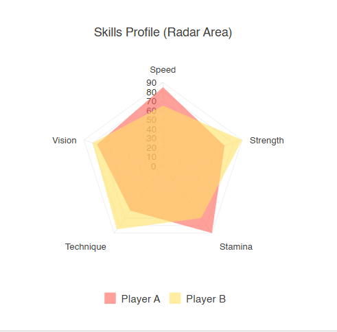
This chart works well to understand how different profiles overlap on the chart quickly.
Radar Column Chart
The radar column chart follows the same principle as the radar line and radar area charts, with the difference that it shows diagonal bars extending from the center:
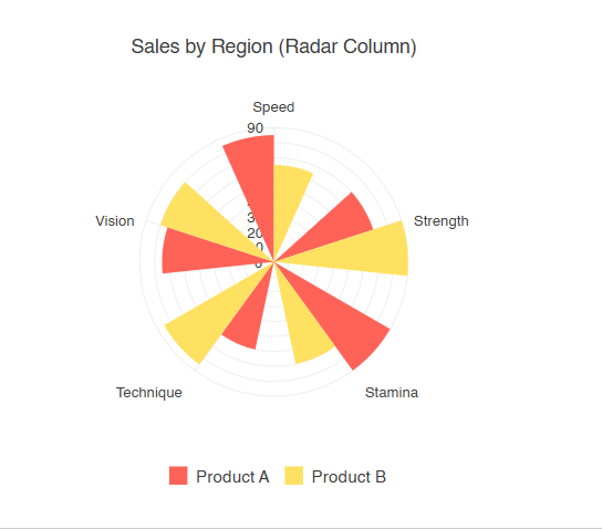
By showing bars instead of connecting points, this chart is excellent for comparing individual values across categories and when an overlap in the radar area could make reading values difficult.
Range Area Chart
The range area chart shows an area defined between two continuous lines defining the range between a minimum and a maximum value, similar to the area chart but not starting from zero:
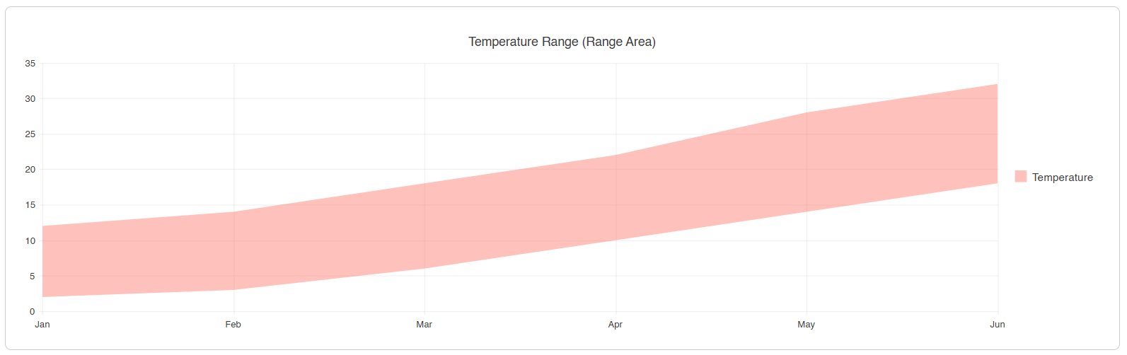
By displaying ranges, it is ideal in scenarios such as temperature ranges, error margins and when you need to emphasize a difference between continuous sequences of values.
Range Bar Chart
This chart lets you display ranges of values over a period of time using horizontal bars, whose position and length vary according to a from value and a to value:
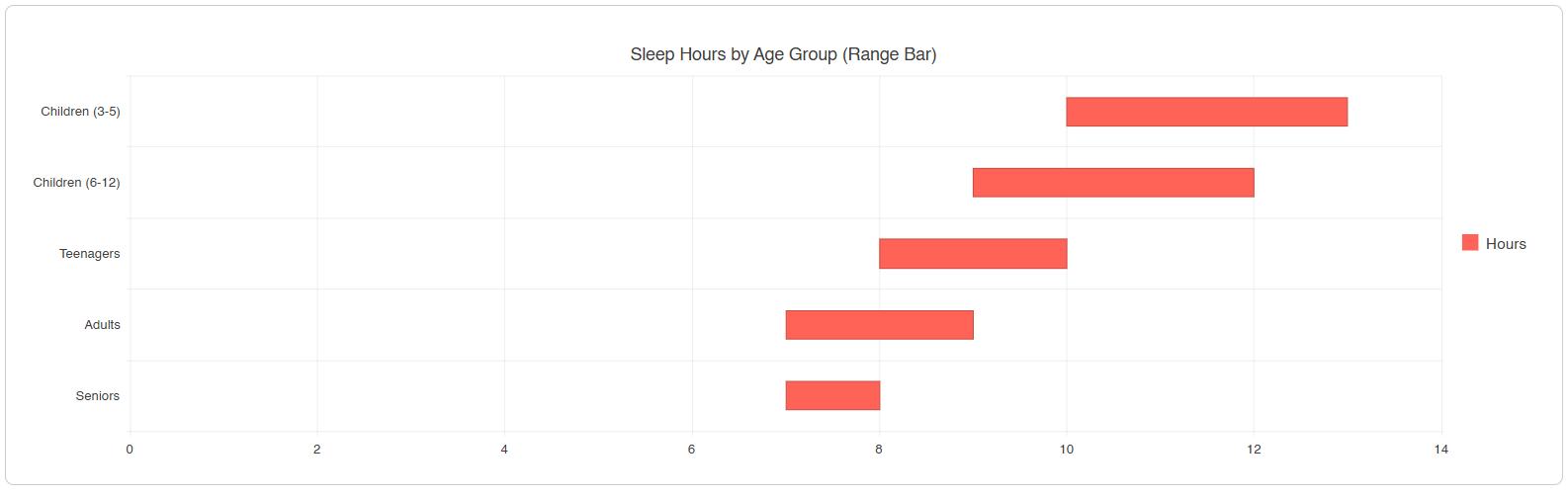
This chart can help you show time ranges or durations, or compare ranges between categories or groups.
Range Column Chart
It is the vertical version of the range bar chart. In this chart vertical bars are displayed, which vary according to the from and to values:
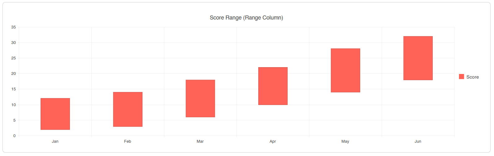
This chart could be useful to show ranges of scores between periods or when you need to emphasize both the minimum and the maximum of each category.
Waterfall Chart
This chart is based on a series of bars that show a cumulative value of sequential positive and negative values. Each bar starts where the previous one ended, which allows you to see the value’s behavior after a period. In the Telerik component it is also possible to display columns with total or partial values:
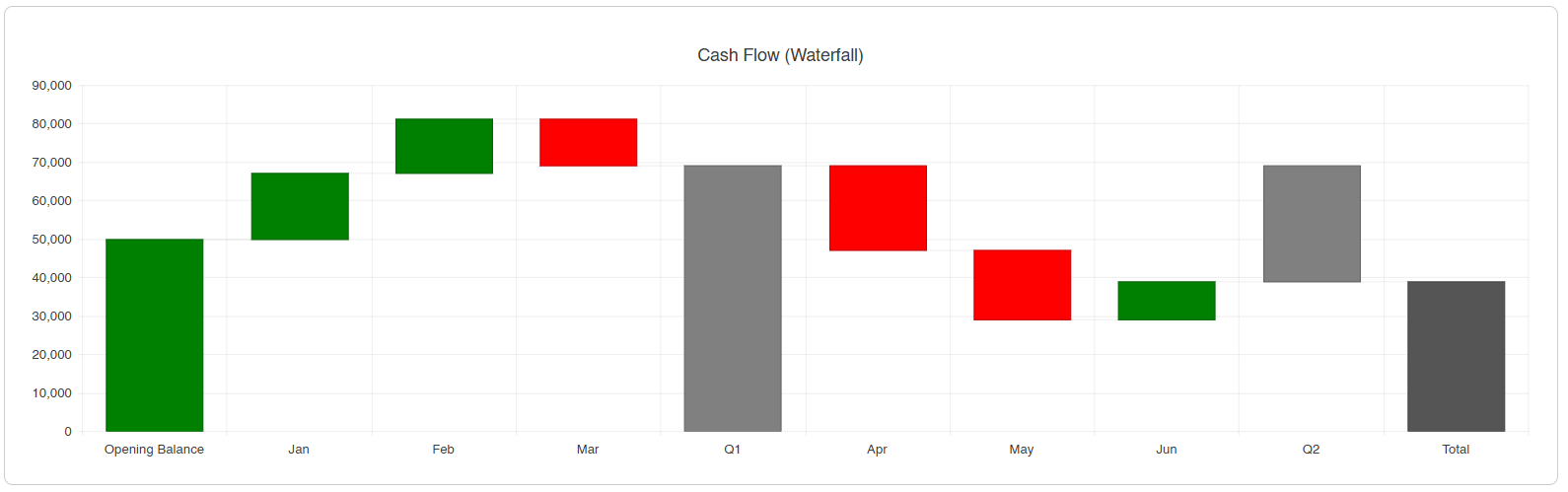
Use cases for this chart include when you need to analyze cash flow over months, for budget and profitability analysis, among others.
Sankey Chart
This Telerik component TelerikSankey displays a set of entities and links to represent the flow between them. In addition, the thickness of each link shows the value, allowing users to easily see the entity-to-value flow:
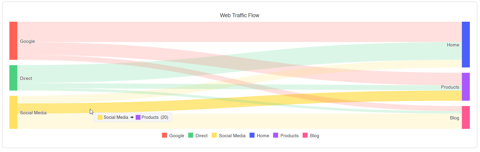
Because of its flexibility, the Sankey chart is ideal for analyzing traffic distributions, breaking down budgets or redistributing resources.
Stock Chart
To use a stock chart, you should use the TelerikStockChart component, which is part of the Telerik UI for Blazor suite. This component is specifically designed for financial time series data. It supports types we’ve already covered such as candlestick and OHLC, with the difference that it includes a navigator to select a specific time period:
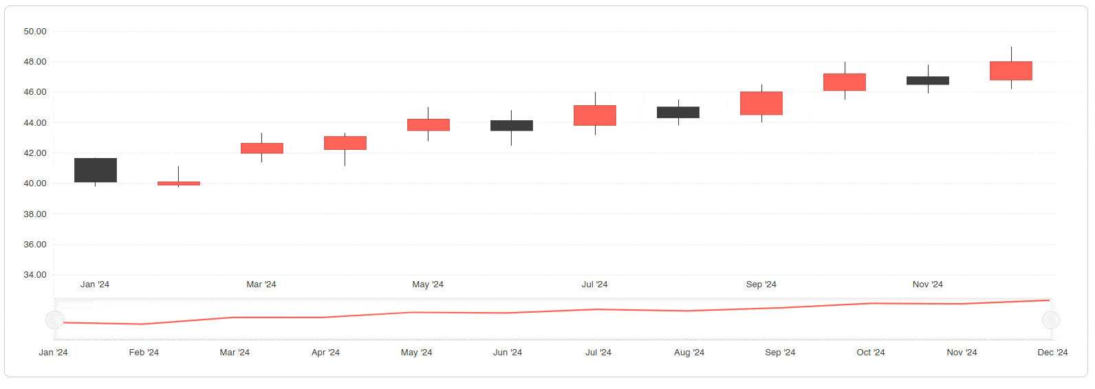
This component is useful when you need to navigate time periods in financial data or to create trading dashboards or investment analysis.
Trendline Chart
The last chart type we’ll analyze is the trendline type. This chart isn’t really a chart type where you define its own data; rather, it takes the data from an existing chart to reveal the trend of the data. The component supports several trend types: linear, average, exponential, logarithmic, among others:
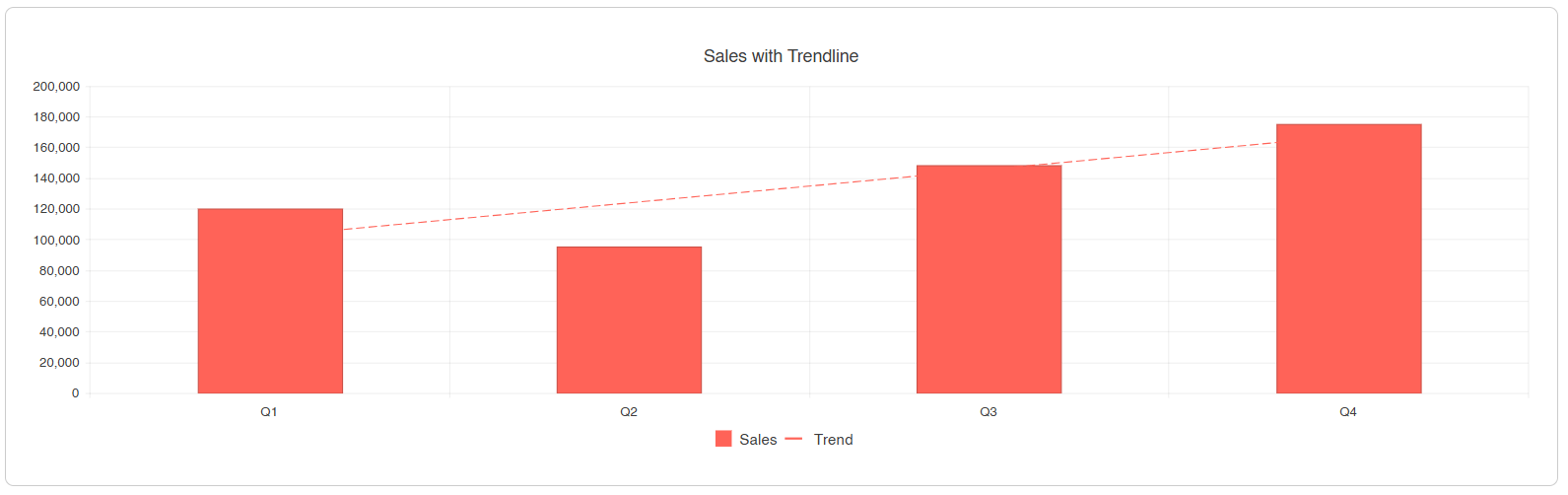
Some use cases for this chart type include revealing the overall direction of the data, smoothing fluctuations, performing forecasts, as well as conducting statistical analyses and validating patterns over time.
Decision Tree for Selecting the Best Chart
After having analyzed the different types of charts that we can find in the Telerik UI for Blazor suite, I want to leave you a decision list that can help you select the best chart for your use case:
Comparison & Trends
- If there is time or continuity -> Use a line, area or scatter line chart
- If there are simple categories -> Use a column or bar chart
- If there are long category names -> Use a bar chart
- If you want to show underlying trends -> Add a trendline
Composition (Parts of a Whole)
- For a single series -> Use a pie or donut chart
- For multiple series -> Use a donut chart
- For flows between domains -> Use a Sankey diagram
Relationships & Distribution
- With 2 variables -> Use a scatter plot
- With 3 variables -> Use a bubble chart
- For 2D density -> Use a heatmap
- For multidimensional profiles -> Use a radar chart (area, column or line)
Ranges & Cumulative Changes
- To show the effect of changes -> Use a waterfall chart
- For continuous ranges -> Use a range area chart
- For time durations -> Use a range bar chart
- For vertical ranges -> Use a range column chart
Specialized Data
- For financial/price movement -> Use a candlestick or stock chart
This list should help you make a better decision about when to use each type of chart.
Conclusion
Throughout this article, we have taken a tour of the different types of charts that we can find in the Telerik suite for Blazor. This was aimed at understanding the structure of each one, how it looks and which are the best scenarios for their use. After this information, it’s your turn to present your users’ data in different ways, always keeping in mind that their interpretation should be as simple as possible.
Ready to experiment with all these chart types? Telerik UI for Blazor comes with a free 30-day trial:

Héctor Pérez
Héctor Pérez is a Microsoft MVP with more than 10 years of experience in software development. He is an independent consultant, working with business and government clients to achieve their goals. Additionally, he is an author of books and an instructor at El Camino Dev and Devs School.
Related Posts
Comments
All articles
Topics
Web MobileMobile
Desktop
Design
Productivity
People
