Telerik UI for Blazor vs. Syncfusion Blazor: Which Is Better for Long-Term Application Development?
 by Maya Mateva

Summarize with AI:
Both Telerik UI for Blazor and Syncfusion Blazor can be used to build complex business applications. See how the two stack up across several evaluation areas.
Blazor has become a serious platform for building modern web applications with .NET. As the framework has matured, commercial UI component libraries have become an important part of the Blazor development experience.
Instead of building every Grid, Chart, Scheduler, Form, Editor, and navigation component from scratch, teams can rely on mature component suites to accelerate development, improve UI quality and reduce long-term maintenance effort. Two of the most common options for Blazor development are Progress Telerik UI for Blazor and Syncfusion Blazor.
Both are mature. Both provide large component collections, commercial support, documentation, examples and tooling for .NET developers. Both can be used to build complex business applications.
The decision is rarely about whether one product is objectively “better.” A more useful question is: “Which library better matches the way your team builds, maintains, upgrades and scales Blazor applications over time?”
At a high level, Syncfusion Blazor is attractive for teams that want a very broad component catalog, access to many specialized controls and a Community License for qualifying users. Telerik UI for Blazor is a strong fit for teams that value a cohesive developer experience, predictable APIs, strong theming workflows, product polish, support reputation and long-term maintainability.
This comparison looks at both products through practical evaluation criteria: onboarding, component coverage, grid capabilities, theming, accessibility, performance, support, AI readiness and long-term project fit.
Quick Decision Summary
Choose Telerik UI for Blazor if…
- You are building a long-lived application that will be maintained for several years.
- Multiple developers or product teams will contribute to the same UI codebase.
- You value predictable APIs and standardized implementation patterns.
- You need strong theming, design-token management or designer-developer collaboration.
- You care about upgrade experience, support quality and long-term maintainability.
- You want a component suite that is easy for both developers and AI coding assistants to reason about.
Key Differences at a Glance
| Evaluation Area | Telerik UI for Blazor | Syncfusion Blazor |
|---|---|---|
| Primary Strength | Cohesive developer experience, theming, maintainability | Broad component catalog and ecosystem coverage |
| Best Fit | Long-lived apps, shared UI platforms, design-system driven teams | Teams prioritizing maximum component availability |
| Component Count | 120+ Blazor components | 145+ Blazor components through the Community License page |
| Community License | No equivalent free Community License for qualifying small companies | Available for qualifying companies and individuals under stated revenue, developer and employee limits |
| Theming | ThemeBuilder with visual customization, CSS/SASS variables, Figma integration, project sharing, version control and user access rights | Flexible styling and theme customization options |
| Accessibility | Provides a WCAG 2.2 compliance table and Accessibility Conformance Report through VPAT | Documents WAI-ARIA, WCAG 2.2, Section 508, screen reader, keyboard, color contrast and RTL accessibility support |
| Grid | Strong focus on polished data scenarios, predictable usage patterns and accessibility documentation | Broad Grid feature set and detailed accessibility documentation |
| AI Readiness | Public documentation references AI/WebMCP-related work in Telerik Blazor docs | Syncfusion has published Blazor skills and license-related resources for AI-assisted component workflows |
| Overall Positioning | Strong fit when coherence, team productivity and UI governance matter most | Strong fit when breadth and licensing flexibility matter most |
What Most Teams Eventually Optimize For
When teams first compare component libraries, they usually start with feature lists.
That makes sense. Component count, available controls, Grid features, Scheduler options, chart types, templates, exporting and documentation examples are easy to compare.
But once a Blazor application moves into production, different questions become more important:
- How easy is the application to maintain?
- Can new developers understand the UI code quickly?
- Are component APIs predictable?
- How painful are upgrades?
- Can we apply the same branding across multiple applications?
- Can designers and developers work from the same design system?
- How reliable is support when something breaks?
- Can AI coding assistants generate correct and maintainable UI code?
This is where the distinction between breadth and cohesion matters.
Syncfusion has a strong case when a team wants access to a broad collection of components, related document libraries and specialized controls. Telerik has a very strong case when a team wants a more unified development model, mature theming workflows and a polished component experience across the core UI scenarios that most business applications depend on.
Neither priority is wrong. The better choice depends on what your team values most.
Time to First Value
Feature comparisons are useful, but the first developer experience is usually more practical:
- How do I install the package?
- How do I configure licensing?
- How do I set up NuGet access?
- How do I create the first Blazor project?
- How quickly can I render a real component?
- How many manual steps are required before I can start evaluating the library?
This is where time to first value becomes important.
Time to First Value: Telerik UI for Blazor
Telerik puts a strong emphasis on guided onboarding. The product experience includes getting-started documentation, templates, licensing guidance, CLI-based workflows and integration with Telerik tooling.
Telerik focuses heavily on onboarding and guided setup, and this includes:
- Structured getting-started documentation
- Starter project guidance
- Project templates and configuration assistance
- Consistent setup patterns across components
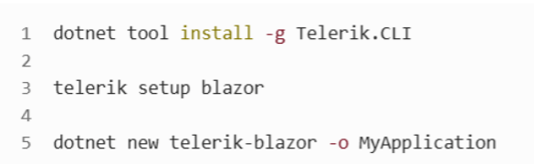
The Telerik CLI can help reduce setup friction by assisting with project creation, package configuration, licensing-related setup, templates and related tooling.
This matters because early evaluation is not only about installing a NuGet package. It is about reducing the number of small setup decisions that slow teams down before they can assess the actual components.
The setup becomes as simple as:
For larger teams, this kind of guided setup can be useful because new developers do not need to rediscover the same configuration steps independently.
Time to First Value: Syncfusion Blazor
Syncfusion also has a strong onboarding story. Its ecosystem includes product documentation, sample applications and a large collection of examples. The Syncfusion Blazor samples repository describes demos for Blazor Server and Blazor WebAssembly apps, including project files targeting modern .NET versions.
That breadth of examples can be valuable when a developer is looking for a specific scenario or specialized component behavior.
Time-to-First-Value Takeaway
For a small proof of concept, both products can get developers started quickly.
The advantage of Telerik UI is more about guided setup and a cohesive path from installation to production-style usage. Syncfusion’s advantage is the large ecosystem of samples.
Component Coverage
Component count is one of the most visible comparison points.
Syncfusion Blazor is known for broad component coverage. Its Community License page describes access to 145+ Blazor components for eligible users and organizations. Syncfusion’s broader product line also includes UI components, document SDKs and standalone UI SDKs under the Community License description.
That breadth is a legitimate advantage. Teams that need niche controls, document processing capabilities, PDF-related libraries, Office document support or specialized UI scenarios may find Syncfusion difficult to overlook.
Telerik UI for Blazor takes a somewhat different approach. It provides a large suite of core Blazor components, but its strongest value proposition is not simply the number of controls. Telerik UI is strongest when the application depends heavily on polished core components such as Grid, Charts, Scheduler, Forms, Inputs, Editors, Layout, Navigation, Upload and theming.
For many business applications, both libraries cover the essential requirements. The practical difference is often not “Does a component exist?” but:
- How predictable is it to configure?
- Does it follow familiar patterns from other components in the same suite?
- Does documentation match real development scenarios?
- Is the component easy to theme and maintain?
- Does it fit into a shared UI platform?
Component Coverage Takeaway
Syncfusion has the advantage in overall breadth and specialized coverage.
Telerik has the advantage when teams want a cohesive suite focused on core business application scenarios, polished UI behavior and maintainable implementation patterns.
The Grid: The Component That Often Decides the Evaluation
If one component influences UI library decisions more than any other, it is usually the grid.
Business applications spend a large amount of time displaying, filtering, grouping, sorting, editing, exporting and analyzing data. For many teams, the grid is not just one component. It is the center of the application.
Both Telerik UI for Blazor and Syncfusion Blazor provide capable Grid components with support for common business scenarios such as:
- Sorting
- Filtering
- Grouping
- Paging
- Virtualization
- Inline editing
- Batch editing
- Templates
- Aggregates
- Exporting
- Hierarchical data
- Large dataset scenarios
Both vendors can support serious data-heavy applications. In practice, grid performance depends not only on the component itself but also on data access strategy, rendering mode, server communication, virtualization configuration and application architecture.
Telerik UI for Blazor Grid
The Telerik UI for Blazor Grid is strongest when teams care about a polished and predictable implementation model.
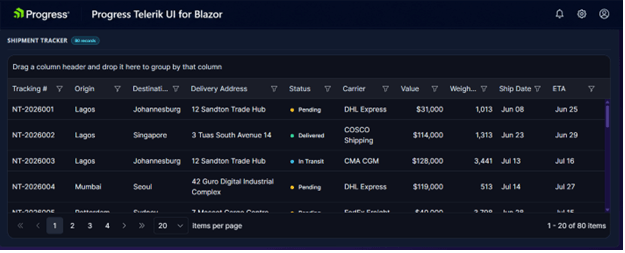
The main advantages are not only feature availability, but how the Grid fits into the broader development experience:
- Predictable configuration patterns
- Strong template support
- Familiar event and data-binding approaches
- Alignment with the rest of the Telerik component suite
- Accessibility-specific documentation
- A mature experience for common business data scenarios
Telerik Grid accessibility is WCAG 2.2 AA and Section 508 compliant, follows WAI-ARIA best practices for keyboard navigation and is tested with popular screen readers. That is a concrete point worth considering for teams building applications with formal accessibility requirements.
Syncfusion Blazor Grid
The Syncfusion Grid is also highly capable and has a broad feature surface. It is particularly attractive when teams need extensive configuration options or specialized behaviors.
Syncfusion’s Grid supports accessibility standards including ADA, Section 508, WCAG 2.2 and ARIA roles, with details on screen reader support, RTL support, color contrast, mobile device support, keyboard navigation and Axe-core validation.
Grid Takeaway
Both Grids are mature and capable.
Syncfusion’s Grid stands out for broad functionality and configurability. The Telerik Grid stands out for a polished developer experience, accessibility documentation and a usage model that tends to fit well into long-lived applications with multiple contributors.
If your evaluation is based on a specific Grid feature, test that feature in both products. If your evaluation is based on long-term maintainability, onboarding, accessibility and shared implementation patterns, Telerik deserves stronger consideration.
Scheduler, Charts and Dashboards
After the Grid, Scheduler and Charts are often among the most important components in business applications.
Scheduler
Both Telerik and Syncfusion support common scheduling scenarios such as:
- Day, week and month views
- Recurring events
- Resource grouping
- Drag-and-drop editing
- Custom templates
- Business calendar scenarios
Syncfusion is attractive when the team wants broad scenario coverage and many examples.
Telerik is attractive when the Blazor Scheduler needs to feel like part of the same UI platform as the Grid, Forms, Inputs, Dialogs, Charts and navigation components.
Charts and Dashboards
Both libraries provide charting capabilities suitable for dashboards, reporting UIs, KPI tracking, analytics screens and business intelligence-style interfaces.
The distinction is less about whether common chart types exist and more about the surrounding workflow:
- How easily can charts be themed?
- Can they follow the same visual system as the rest of the app?
- Can multiple teams reuse the same design language?
- Can dashboard screens stay visually aligned over time?
This is where the Telerik theming story becomes especially relevant.
Theming and Design-System Governance
Theming is often underestimated during evaluations.
At the start of a project, teams usually focus on functionality. Later, especially in long-lived applications, theming becomes a product and architecture concern.
Questions start to appear:
- Can we align components with our brand?
- Can designers and developers collaborate without translating everything manually?
- Can we reuse themes across multiple applications?
- Can we manage design tokens centrally?
- Can we support light and dark modes?
- Can we avoid one-off CSS overrides that become hard to maintain?
- Can we update the visual language without rewriting large parts of the UI?
This is one of Progress Telerik UI’s clearest differentiators.
Progress Telerik ThemeBuilder
Progress Telerik ThemeBuilder is a SaaS tool that enables teams to create custom themes and preview how they affect component appearance. It can generate a CSS file that can be used in a Blazor app instead of a built-in theme.
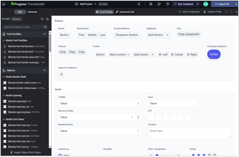
ThemeBuilder also supports capabilities that matter in design-system driven organizations, including:
- Atomic customization
- CSS/SASS variables
- Custom HTML support
- Figma integration
- Theme modes and built-in themes
- Custom fonts and iconography
- Project sharing
- Version control
- Collaboration and user access rights
This is more than visual customization. It helps teams create a shared styling workflow between design and engineering.
For organizations with multiple product teams, this can reduce duplicated CSS work, prevent visual drift between applications and make brand updates easier to manage.
Syncfusion Customization
Syncfusion also provides styling and customization options. For many teams, those capabilities will be enough.
However, if centralized design-system governance is a major requirement, Progress Telerik ThemeBuilder gives it a particularly strong position.
Theming Takeaway
Both libraries can be customized.
Telerik has a clearer advantage when teams need design tokens, Figma-related workflows, centralized branding, visual governance and reusable themes across multiple applications.
Blazor App Accessibility
Accessibility should be part of any serious UI library evaluation.
Teams building applications for public sector, healthcare, finance, education, government or large internal platforms often need to consider:
- WCAG
- Section 508
- Keyboard navigation
- Screen reader support
- WAI-ARIA roles and attributes
- Color contrast
- Accessible interaction alternatives
- Accessibility conformance documentation
Telerik Accessibility
Telerik UI for Blazor provides an accessibility compliance table that lists WCAG 2.2 compliance levels for individual components. Progress Telerik also provides an Accessibility Conformance Report through VPAT.
For the Grid specifically, Telerik documents WCAG 2.2 AA and Section 508 compliance, WAI-ARIA best practices, keyboard navigation, and screen reader testing.
Syncfusion Accessibility
Syncfusion documents accessibility support for Blazor components, including WAI-ARIA, WCAG 2.2, Section 508, keyboard navigation, screen reader support, RTL support and color contrast considerations.
Syncfusion’s DataGrid accessibility documentation also provides a detailed view of supported standards and limitations for complex interactions.
Accessibility Takeaway
Both vendors take accessibility seriously and provide documentation around standards and component behavior.
The Telerik component-level compliance table and documented Grid compliance are helpful for teams that need formal accessibility evidence. Syncfusion also provides broad accessibility documentation, including detailed DataGrid accessibility coverage.
For accessibility-sensitive applications, the best approach is to test the exact components and configurations your application will use.
Support, Documentation and Learning Resources
Support quality is hard to capture in a comparison table, but it often becomes critical after adoption.
During a trial, teams should evaluate:
- How quickly developers find answers in documentation
- Whether examples match real scenarios
- How clear upgrade notes are
- How support handles complex issues
- Whether feedback and bug reports are visible
- Whether the vendor provides practical guidance beyond simple demos
Telerik UI for Blazor Support
Progress Telerik has a long-standing reputation in the ecosystem for polished components, detailed documentation, active forums, feedback channels and strong support. That reputation is one of the reasons Telerik UI is often favored by teams building long-lived applications.
This should still be validated during evaluation. The best support test is not reading a marketing page. It is submitting realistic trial questions and measuring how useful the answers are.
Syncfusion Blazor Support
Syncfusion also provides commercial support, documentation, samples and a large knowledge base. Its broad ecosystem can be helpful when developers are searching for examples across many controls and scenarios.
Syncfusion’s large sample repository is especially useful when teams want to inspect working examples and compare usage across components.
Support Takeaway
Both vendors provide serious support and learning resources.
Telerik UI is often especially attractive for teams that prioritize product polish, support confidence and long-term UI quality. Syncfusion is strong for teams that value broad documentation coverage, many samples and a large ecosystem.
Product Quality, Stability and Upgrade Experience
Product quality is more than whether a component works in a demo.
For long-lived applications, quality usually means:
- Stable APIs
- Clear documentation
- Predictable behavior
- Accessibility guidance
- Reliable release notes
- Manageable upgrades
- Good support for modern .NET versions
- Transparent handling of bug fixes and breaking changes
- Similar concepts across related components
This is where the Telerik UI value proposition becomes stronger. Its advantage is not only that the components are polished, but that the suite tends to feel like a coherent product rather than a collection of unrelated controls.
That can reduce cognitive load for teams. Developers who learn common Telerik concepts in one component often find similar ideas elsewhere in the suite.
Syncfusion’s broader catalog is valuable, but naturally creates a larger surface area to learn, test and govern. That tradeoff may be completely acceptable if the team needs the additional breadth.
Upgrade Experience Takeaway
For short-lived apps, upgrade experience may not matter much.
For applications expected to live for several years, upgrade predictability and maintainable implementation patterns become important. Telerik UI is particularly compelling for teams that prioritize those concerns.
AI Readiness and Agentic Development
A few years ago, component library evaluations focused primarily on features, performance and support. Today, many teams are adding another criterion to their evaluation:
How well does the platform integrate with AI-assisted development workflows?
The discussion is no longer limited to AI-powered components. Developers increasingly expect AI tools that can help generate interfaces, configure components, validate code, enforce design-system rules and accelerate application development.
Progress Telerik AI Approach
Progress Telerik has invested in AI-assisted development across several areas of the product ecosystem, combining UI components, AI-powered tooling and agentic workflows into a more complete development experience.
The foundation of this effort is the Telerik AI Coding Assistant, which integrates directly into developer workflows through IDE-based experiences, GitHub Copilot extensions, and MCP-based tooling. The assistant can help generate Telerik UI for Blazor code, configure components, scaffold common scenarios, generate sample data and provide implementation guidance using Telerik-specific knowledge rather than generic web examples.
Beyond code generation, Progress Telerik has introduced an Agentic UI Generator that uses a collection of specialized assistants working together through an MCP-based architecture. Rather than generating isolated snippets, it can help create complete pages, dashboards, layouts and component configurations while following Telerik component patterns and design-system guidance.
The platform includes specialized assistants for:
- Page and UI generation
- Component selection and configuration
- Layout creation
- Styling and theming
- Icons and visual assets
- Accessibility guidance
- Validation and quality checks
- Project onboarding and setup workflows
These capabilities are orchestrated through the Agentic UI Generator, allowing developers to work at a higher level of abstraction when creating Blazor applications.
Telerik AI Plugins, MCP and Development Tools
One notable aspect of the Telerik AI strategy is the focus on developer tools rather than only AI-enabled components.
The Telerik MCP-based tooling includes plugin capabilities for:
This allows AI tools to work with Telerik-specific knowledge instead of relying solely on generic LLM training data, which can help reduce incorrect component usage and configuration errors.
In addition, Telerik provides AI-enhanced capabilities within its component ecosystem, including AI-powered chat experiences, semantic search scenarios, AI-assisted data operations, AI integrations within Grid and Editor components, WebMCP support, and integration scenarios involving technologies such as A2UI, AG-UI and Microsoft Agent Framework.
Syncfusion AI Position
Syncfusion is also actively investing in AI-based developer experiences and provides AI-related features, assistants and tooling across its ecosystem. Like Progress Telerik, Syncfusion is exploring AI-assisted development workflows and has published AI-related resources and component skills for developers working with its platform.
One of Syncfusion’s broader advantages remains the size of its overall ecosystem, which includes a large collection of UI components, document processing libraries and developer tools that can participate in AI-assisted workflows.
AI Readiness Takeaway
Which platform has the stronger AI story? Today, both Progress Telerik and Syncfusion are investing in AI.
The difference is less about whether AI capabilities exist and more about where the investment is focused.
Syncfusion’s strength comes from the breadth of its ecosystem and the large number of controls, libraries, and scenarios available to developers.
Telerik UI’s strength comes from providing an increasingly connected AI development experience that spans:
- AI Coding Assistant
- Agentic UI Generator
- MCP-based development tooling
- Specialized AI assistants
- Validation workflows
- Accessibility guidance
- Design-system alignment
- AI-enhanced components and features
For teams looking beyond AI-powered controls and toward AI-assisted UI development, Telerik currently offers one of the more comprehensive AI stories available in the Blazor ecosystem. The combination of UI generation, component-aware assistants, validation tooling, theming guidance and MCP integration makes the AI capabilities feel like part of the overall developer workflow rather than a collection of isolated features.
Where Telerik Has a Clear Advantage
Telerik is strongest when the team cares less about maximizing the catalog and more about building a maintainable UI platform.
Telerik is particularly compelling when:
- The application will live for several years.
- Multiple developers or product teams will work in the same codebase.
- The Grid, Forms, Charts, Scheduler and layout components need to feel cohesive.
- Design-system governance matters.
- The team wants strong theming workflows through ThemeBuilder.
- Accessibility evidence is important.
- Support confidence is a major factor.
- AI-assisted development is becoming part of the engineering workflow.
The clearest Telerik differentiator is ThemeBuilder. Its support for visual customization, variables, Figma integration, theme modes, custom fonts, project sharing, version control and collaboration makes it especially useful for teams that need a structured design-to-development workflow.
Pros and Cons
Telerik UI for Blazor
| Pros | Cons |
|---|---|
| Cohesive component suite | Commercial licensing required |
| Strong Grid experience | Smaller component catalog than Syncfusion (Telerik – 120+, Syncfusion – 145+) |
| Predictable APIs and implementation patterns | Fewer niche controls in some specialized areas |
| Strong ThemeBuilder and design-system workflow | Some advanced scenarios may require custom implementation |
| Accessibility documentation and compliance resources | Not the best fit if raw component count is the top priority |
| Strong fit for long-lived applications | |
| Good alignment with AI-assisted development trends | |
| Strong support reputation in the .NET ecosystem |
Syncfusion Blazor
| Pros | Cons |
|---|---|
| Broad component catalog | Larger API surface can increase complexity |
| Community License for qualifying users | More governance may be needed to standardize usage |
| Document and file-format related ecosystem | Component experience may vary more across the suite |
| Many samples and examples | Teams should carefully test upgrades and scenario-specific behavior |
| Strong specialized-control coverage |
Decision Framework
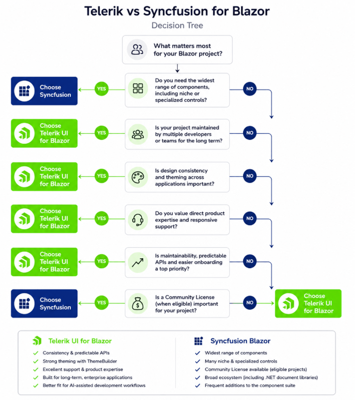
Telerik UI for Blazor is likely the better fit if…
- The application will be maintained for several years.
- Multiple developers or teams will contribute to the UI.
- You need a shared design system.
- The Grid is central to your application.
- Accessibility documentation is important.
- You want a polished and cohesive development experience.
- Support confidence is part of the buying decision.
- You expect AI-assisted development to become more important.
- You value maintainability more than raw component count.
Syncfusion Blazor is likely the better fit if…
- You need the large component catalog.
- You need niche components.
- The Community License applies to you.
- Your team is comfortable managing a larger API surface.
- Your evaluation is primarily driven by breadth and feature availability.
Final Verdict
If your primary goal is maximizing the number of available controls, accessing specialized components, benefiting from a Community License, Syncfusion Blazor is difficult to overlook.
If your priority is building a long-lived Blazor application with a cohesive developer experience, strong theming, accessibility documentation, support confidence, predictable implementation patterns and maintainable UI architecture, Telerik UI for Blazor offers a very compelling value proposition.
The choice comes down to what your team wants to optimize for. Feature breadth matters during evaluation. Maintainability matters in production.
For teams building applications that need to scale across developers, products, themes, accessibility requirements, and future AI-assisted workflows, Telerik UI for Blazor stands out as the stronger long-term choice—not because Syncfusion is weak, but because Telerik UI for Blazor’s strengths align especially well with the needs of structured, design-system driven, maintainable Blazor development.
Maya Mateva
Maya is a Software Engineering Manager at Progress, leading the Telerik UI for Blazor components with a focus on delivering enterprise-grade and AI-enhanced user experiences. Previously, she has been a Principle Software Engineer in the teams developing Telerik components for WPF and NativeScript.
Related Posts
Comments
All articles
Topics
Web MobileMobile
Desktop
Design
Productivity
People