What’s New in KendoReact With R1 2022

Summarize with AI:
The R1 2022 release of KendoReact has finally arrived, bringing seven brand-new components and 20 new enhancements across existing components.
The new year has barely started, but we’re ready to hit the ground running with the R1 2022 release of KendoReact! This release brings new components, tons of features to existing UI components, new Figma assets, and a huge set of improvements to our themes! There’s so much to cover, so let’s jump right in.
Telerik & Kendo UI Kit for Figma v1.7
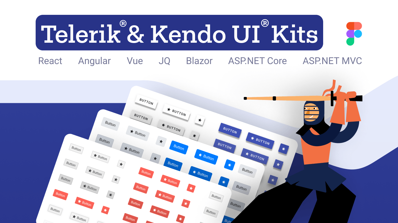
The Telerik and Kendo UI Kits for Figma were created and constantly improved throughout 2021 with the ultimate goal of providing Figma UI assets covering the full KendoReact UI library.
I’m happy to announce that with R1 2022 we have introduced Figma components for almost all KendoReact components. There’s really just one exception: the chart component.
Buttons, Inputs, DateInputs and DropDowns Packages: New Theme Rendering Options
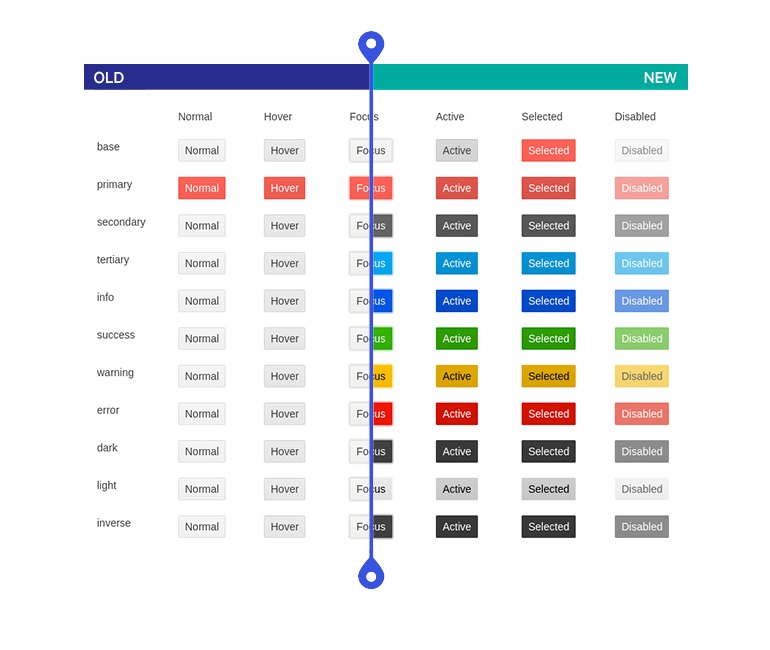
We know many KendoReact users are basing internal UI libraries on our React UI components and a big part of this involves creating and maintaining a design language. Based on feedback from our customers, we have started a process to review and improve the Default, Bootstrap and Material themes across all KendoReact UI components. Our goal with this effort is to simplify the themes associated with KendoReact and simplify the act of customizing all of our React UI components.
With R1 2022 we have updated the Buttons, Inputs, DateInputs and DropDowns to offer the following theme rendering options:
- themeColor
- fillMode
- size
- shape
- rounded
A note to make here is that these updates will include breaking changes to the visual aspect of Kendo UI for Angular. For anyone customizing our components or doing visual regression testing, we recommend taking some extra time to review these changes.
Larger visual updates like these can have implications in the form of visual regressions which could appear when upgrading from an older version to R1 2022. While we believe that we have caught and resolved many visual regression issues while getting ready for R1 2022, there may be additional issues discovered after the release. We are firmly committed to addressing these issues as quickly as possible and will continue to push out updates with fixes to our themes and components after the R1 2022 release.
To provide more information about these changes and our general plan around the Kendo UI themes, we recently posted Improvements Coming to Telerik and Kendo UI Themes in 2022.
New React Components
New Component: React FlatColorPicker
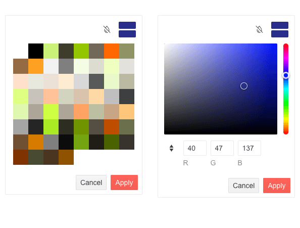
The first component that I want to introduce with R1 2022 is the new KendoReact FlatColorPicker component. Expanding on the several ways the KendoReact UI library lets users select a color, this component focuses on delivering a React ColorPicker component without being rendered within a popup or dropdown.
Here’s a direct link to the new React FlatColorPicker component demos.
New Components: React Drag & Drop Utilities
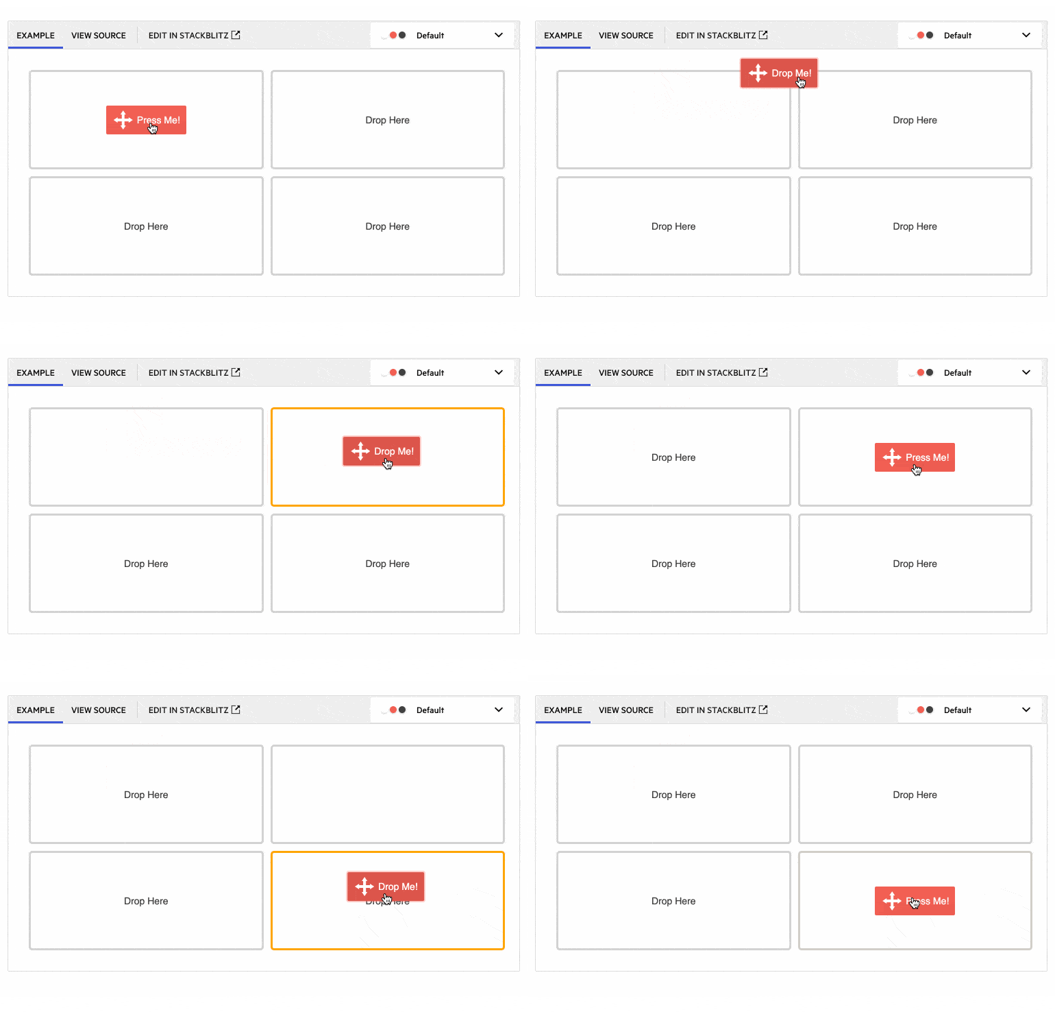
With R1 2022 we are introducing a new collection of components and hooks focused specifically on drag-and-drop capabilities within React applications. The KendoReact Drag & Drop utilities is a set of components and hooks which can be used to add this drag-and-drop interactivity. These tools include the new DragAndDrop, Draggable and Droppable React components which can be used on their own on wrapped around other React components to add the ability to drag and drop elements. We also added the useDraggable and useDroppable hooks for those who prefer to use hooks within their React apps.
Check out the React Drag & Drop Utilities package right here.
New Component: React ExpansionPanel
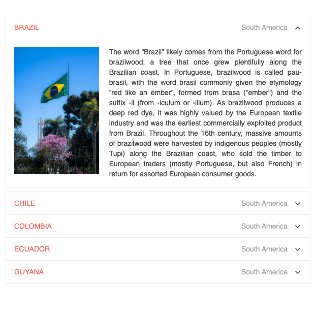
New to R1 2022 is the KendoReact ExpansionPanel component. This is a fundamental UI layout component which organizes any content into a UI element consisting of a title bar and expandable and collapsible content. Beyond the ability to show and hide an area of an application, the React ExpansionPanel component supports any type of content within its content area, sports built-in animations, provides custom icon support, and much more.
Here’s a direct link to the React ExpansionPanel component demos.
New Component: React ScrollView (Carousel)
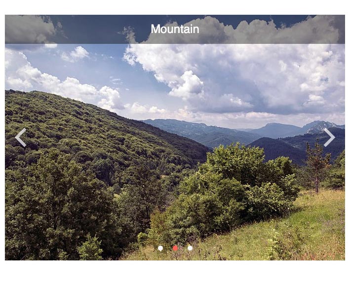
The new KendoReact ScrollView, also called a React Carousel component, displays a horizontal collection of content or images with built-in navigation tools. Items within the ScrollView are displayed as dots in the navigation overlay and scrolling through content can be done automatically at a set interval or set to only be done manually by the end user.
Check out the React ScrollView component demos for more information.
New Component: React Popover
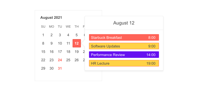
The KendoReact Popover component is perfect for displaying rich content when users hover, click or focus on elements within any React application. The React Popover component offers similar functionality to that of the Popup and Tooltip component but with support for more complex content and layouts. A common use case for this component is the additional element displayed with calendar events which might include a list of attendees, meeting room information, as well as any additional notes around agenda.
Here’s a direct link to the React Popover component demos.
New Component: React Barcode
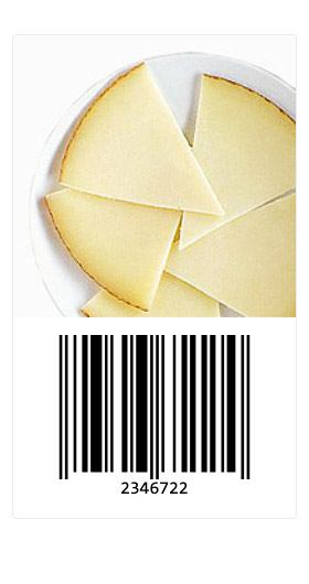
With R1 2022, we are also introducing the KendoReact Barcode component. This new component is ideal for representing 2D barcodes within any React application and comes with built-in support for several Barcode types. Additionally, the React Barcode can be displayed as either a SVG or Canvas element.
For more information, here’s the React Barcode component demos.
New Component: React QR Code
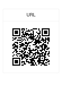
The KendoReact QR Code component lets developers generate various types of QR Codes within their React applications. With support for different styles of QR Codes and the ability to add custom overlays to any QR code, this component can support advanced QR Code types like Swiss QR Codes or display logos within a generated QR Code. Additionally, the React QR Code supports either SVG or Canvas rendering.
See this new component in action in the React QR Code component demos.
Expanded Component Features
All React Charts: Updated Colors and Design
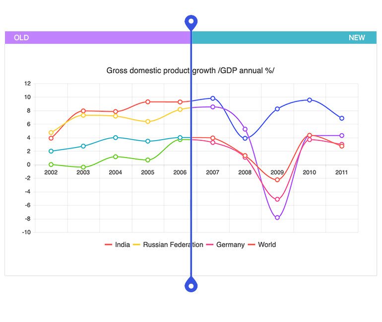
The theme updates mentioned earlier have also touched the KendoReact Charts package. Specifically, with R1 2022 we have updated the default colors offered by all React Charts using any KendoReact theme. These colors are used when developers do not set their own color on a series. This update makes the charts look and feel more modern out of the box and also ensures there are more colors that can be used without having to recycle colors, which helps in scenarios with many series existing in the same chart.
For those interested in reverting back to the old theme colors after this update, we have prepared a “Using Series Colors from Themes v4” documentation section.
See the new KendoReact Chart default colors here.
All React Charts: Improved Pan and Zoom
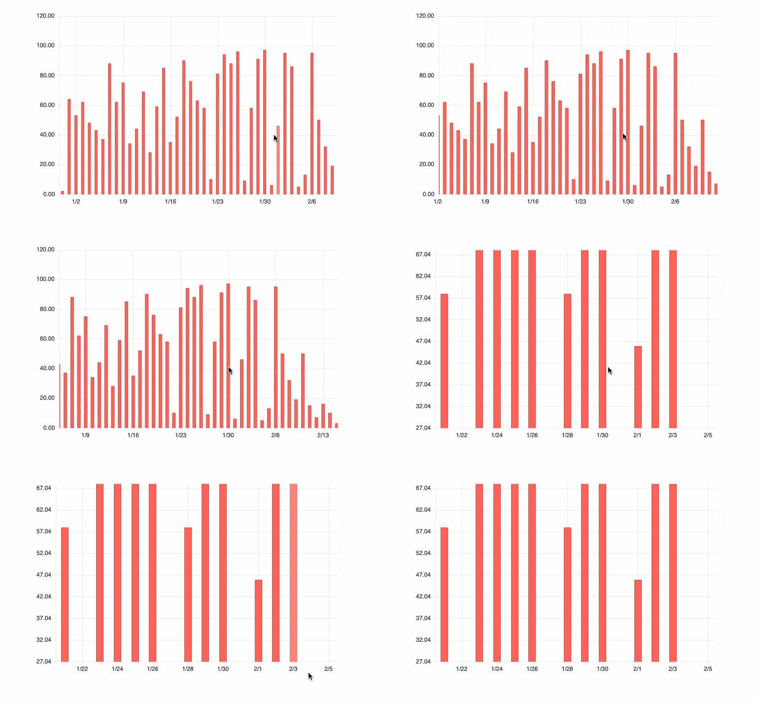
Another quality-of-life improvement to the KendoReact Charts library is the new optimized pan and zoom functionality. The zoom is now consistent in both directions (zooming in and zooming out), and the hovered point remains under the cursor.
Head on over to the React Chart component Pan and Zoom demos to see what this updated featured looks like.
React PivotGrid: Bind to Local Data
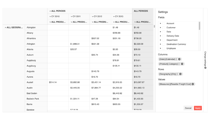
With R1 2022, the KendoReact PivotGrid component has added support for binding to local data. Previously, data binding was handled solely through binding to an OLAP cube, which required a server-side implementation to serve data. With this update, developers can pull or create data within the client and bind it directly to the React PivotGrid component. This lets developers choose the best approach to data binding within the KendoReact PivotGrid, depending on the application requirements.
Here’s a direct link to the React PivotGrid component and the local data binding demo.
React Data Grid: Column Virtualization with Multi-Column Headers
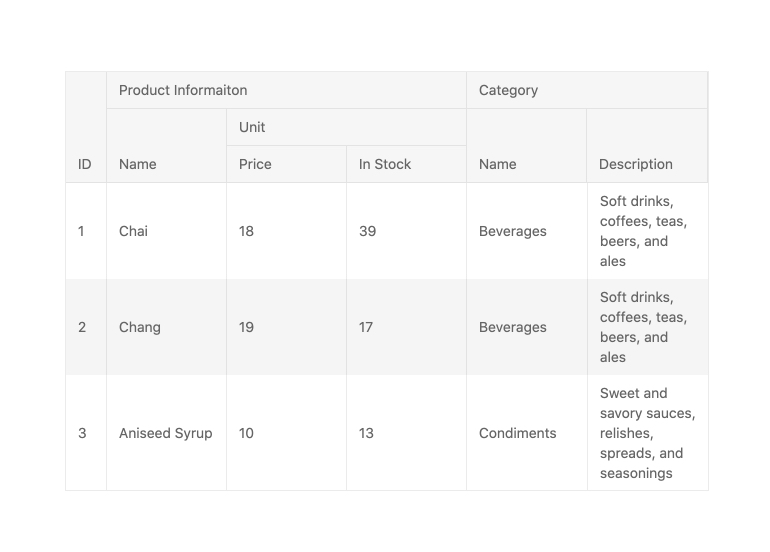
This next improvement is a quality-of-life feature. With R1 2022, we added the ability to have multi-column headers when virtualizing the KendoReact Data Grid. These two features did not work that well together previously, but as of the 4.10.0 update they work together without any issues.
To see this improvement, you can refer to the React Data Grid Virtualization demos.
React Data Grid: New Performance Section in Documentation
Performance is always top-of-mind for any developer evaluating and using a Data Table, so we know just how important this is for anyone using the KendoReact Data Grid. To help all developers using our React Data Tables wring the most performance out of their implementation, we spent some time creating a new documentation section to show features and tactics for making your React Data Grids as fast as possible.
Click here to go straight to the new React Data Grid Performance docs.
React Data Grid: Live Data Sample in Docs
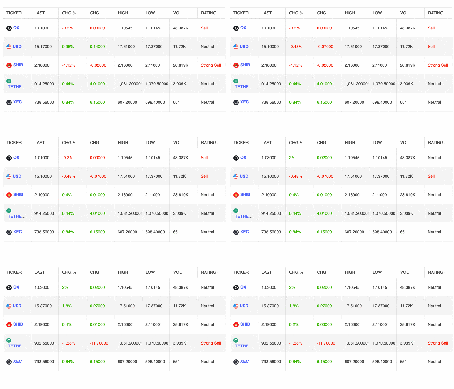
While the KendoReact Data Grid has supported live and updating data since its initial release, we did not have a specific demo highlighting this functionality within our documentation. This has led to many users asking how to approach live data, or if the React Data Table even supports this feature. Well, with R1 2022 we now have specific examples that showcase how to work with live data within your React Data Grid!
Here’s a quick link to the Live Data demo in the React Data Grid docs.
React Editor: Improved Selection
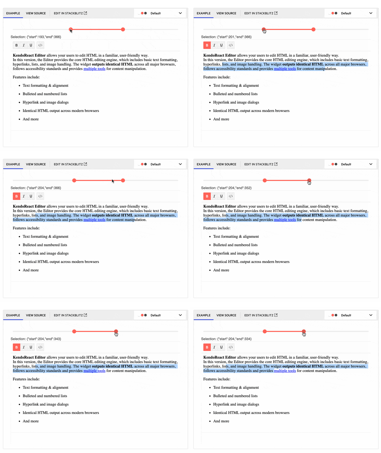
Kicking off a list of features added to the KendoReact Editor in R1 2022, the KendoReact team improved how selection is handled within the Editor component. This will allow for scenarios like automatically extracting the HTML from the Editor’s content upon selection, or extracting content when interacting with a button.
For more information, you can refer to the React Editor Selection documentation.
React Editor: Editor Resizing
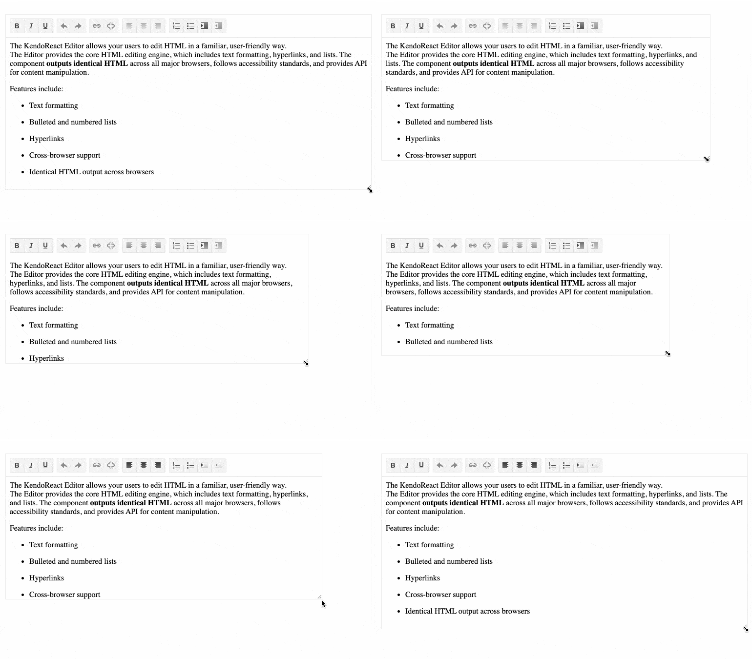
A highly requested feature added to the KendoReact Editor component is the ability to resize the Editor itself. Up until now, the React Editor only rendered with a set height and width. When this new resizing feature is enabled, users can easily resize the Editor with drag handles that appear when hovering around the edges of the Editor element.
To see how to resize the Editor itself, you can refer to the React Editor Resizing demo.
React Editor: Image Resizing
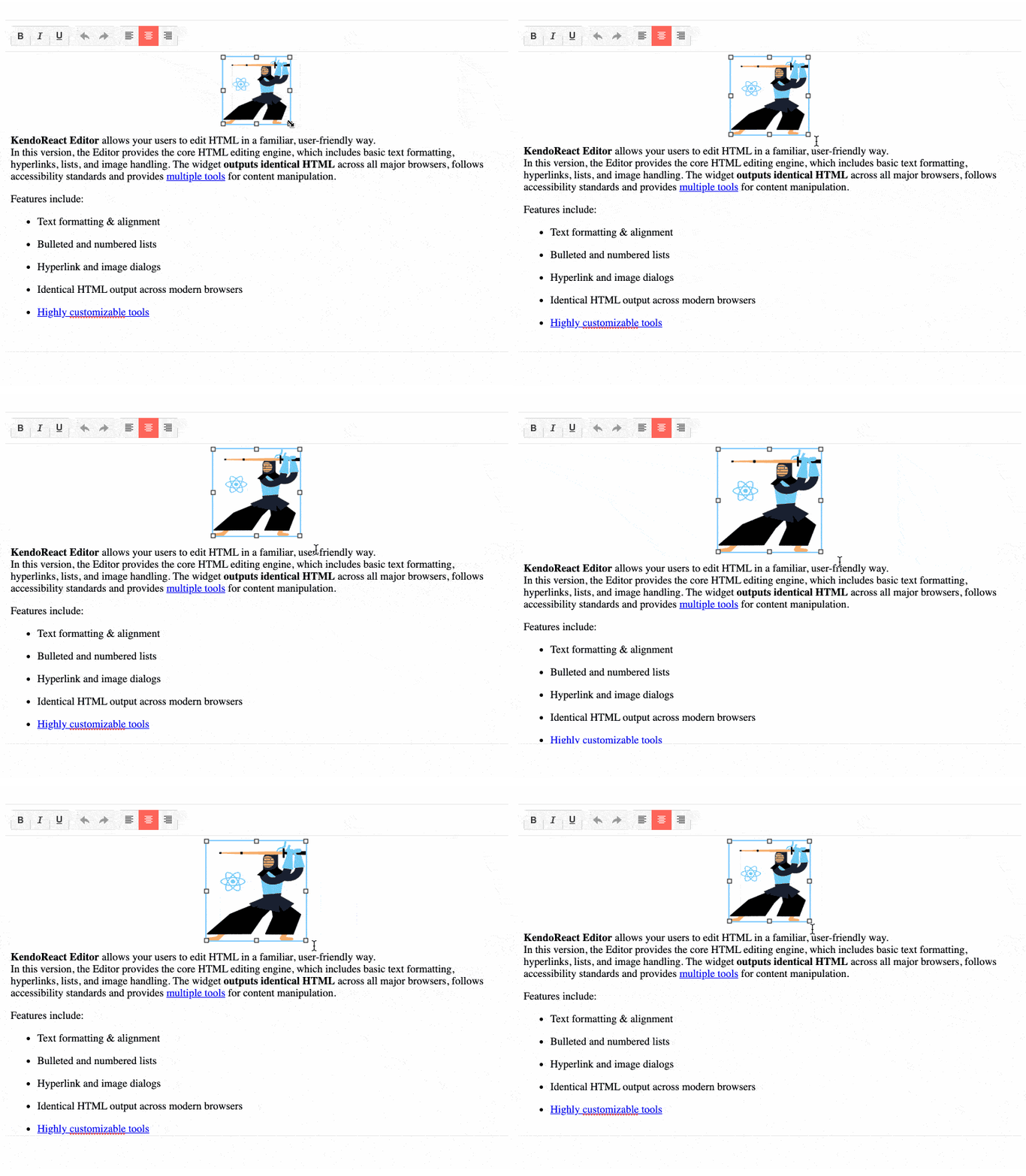
Related to resizing, with R1 2022 KendoReact also added the ability for users to resize images in the React Editor’s content area. Now when a user clicks or focuses an image within the content, drag handles will be displayed around the image and can be used by users to resize the image.
To see how images can be resized in the Editor, you can check out the React Editor Images Resizing documentation section.
React Editor: Improved Tools for Handling Lists
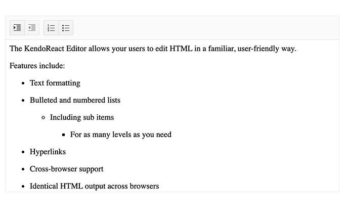
The KendoReact Editor also received an update for how lists are handled within the Editor component’s content area. Users can now work with alphabetical lists and the React Editor component has also improved how nested lists are handled. Beyond supporting nested lists, we made sure users can control what type of list should be used when creating sub-items within existing lists.
For more information, you can refer to the React Editor demos.
React Editor: Expose TypeScript Interfaces for onMount, onExecute, onPaste, onFocus and onBlur events
We also took a look at the available TypeScript Interfaces that we offer for events in the KendoReact Editor component and introduced several new TS Interfaces, including the onMount, onExecute, onPaste, onFocus and onBlur events.
To see more events, you can refer to the React Editor API section.
React Scheduler: Adaptive Slot Height
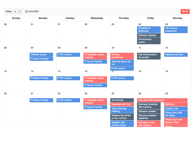
Out of the box, the React Scheduler component has a predefined (and uniform) height for displaying events available on that day. When certain days have more events than others, or there are special events or days that need to be emphasized a bit more, this default behavior may not be ideal.
This scenario is where the new Adaptive Slot Height feature can help. This feature lets event slots available in a day adapt to all the events automatically and can let developers set properties like a minimum height to let days without events display without being completely collapsed.
You can see more of this feature in the React Scheduler Adaptive Slot Height demo section.
React Scheduler: Auto Item Height
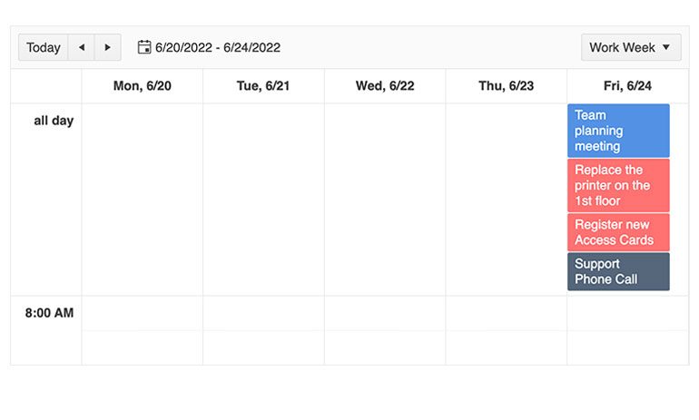
Along the lines of the adaptive slot height feature above, there’s also the new Auto Item Height feature. This new React Scheduler feature has the same ability to auto-adjust or have a predefined height when events are displayed. This focuses specifically when events are displayed in a horizontal fashion, which is the case when using the TimelineView and the MonthView, among a few other views and scenarios.
For more information you can refer to the React Scheduler Auto Item Height demos.
React ColorPicker: New Design
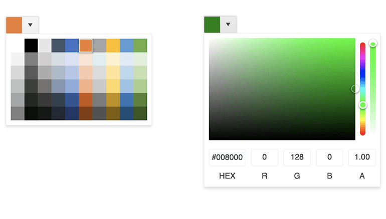
For R1 2022, the KendoReact team revisited the React ColorPicker to follow a new and improved design based on feedback from customers and research we have done over the years. These changes include a brand-new design with new UI elements and features which include toggleable HEX and RGB inputs with opacity support, a new preview area where you can compare two colors, as well as the ability to switch between the Gradient and Palette views for selecting a color.
To see the new design in action, you can refer to the React ColorPicker component docs.
React TileLayout: Define Keys to Avoid Re-Rendering
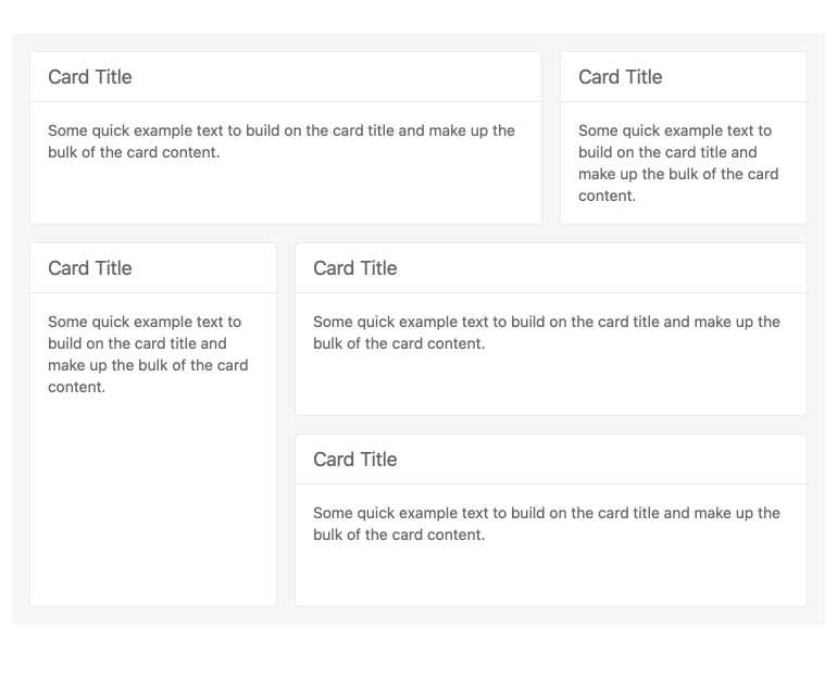
To help improve the overall performance of the KendoReact TileLayout component, with R1 2022 the KendoReact team added the use of keys associated with individual Tiles to avoid re-rendering the TileLayout component whenever the items collection is changed. This should be an immediate performance boost for anyone using the TileLayout component. All you need to do is update to the latest version and you are good to go!
While this is more under the hood, you can check out more about the TileLayout component in the KendoReact TileLayout docs.
React PanelBar: Controlled Mode & Tab Mounted Options
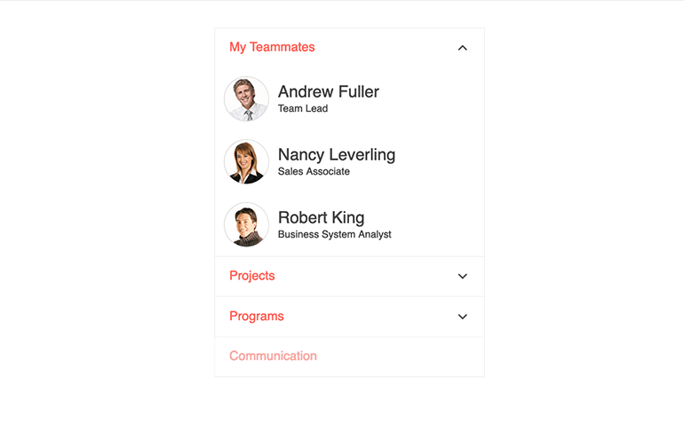
The KendoReact PanelBar also received some updates R1 2022. Specifically, support for using the component in controlled mode was added. Additionally, a Boolean option that allows content of collapsed panels to stay mounted is now available. This gives more opportunities for developers to customize and interact with the KendoReact PanelBar.
See these new features under the KendoReact PanelBar component demos.
Sample Project: Full-Stack App Using the KendoReact Data Grid & ASP.NET Core
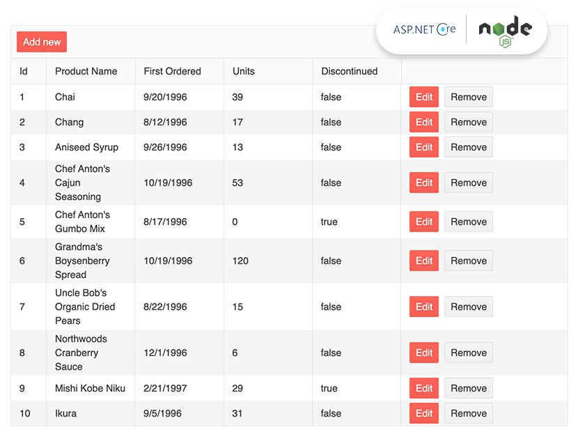
Expanding the amount of documentation and samples that we offer for one of KendoReact’s more popular UI components, with R1 2022 we added a full-stack sample application using the React Data Table and an ASP.NET Core backend. The goal of this project is to help developers get an understanding of how to shape requests and responses traveling between the React Data Grid and a backend. For .NET developers, this should be extremely useful to understand just how to structure your API endpoints and how to interact with data within the KendoReact Data Table.
Jump on over to the KendoReact Data Grid and ASP.NET Core sample right here.
Sample Project: Full-Stack App Using the KendoReact Data Grid & Node.js

Similar to the project above, we created a full-stack application that highlights the KendoReact Data Grid on the frontend with a Node.js backend. This sample highlights common aspects of the React Data Grid like paging, sorting, filtering, grouping and editing, and will give insight into how the request and responses coming to and from the server should be handled.
You can see the KendoReact and Node.js sample here.
Various React Components: Context Provider for Default Props
This enhancement focuses on the DateInputs, Inputs and DropDowns packages specifically. For R1 2022, the KendoReact team focused on adding a Context Provider, using React.Context, to override deeply nested components.
For those wondering when this feature may become applicable, the main scenario this enhancement targets is when developers need to customize components that are nested within other components. In KendoReact UI components, like the Data Grid, we often use other KendoReact components to build said UI components. This means there can be multiple layers of nested components within a single component, which can be tough to deal with when going deeper into customization.
With R1 2022, we have introduced this new prop context within a larger set of UI components. We want to gather feedback from our users and understand how we can help extend this functionality to other packages and components in the future, so feel free to take this for a spin and let us know what you think!
For a quick link, here’s the Inputs package, the DateInputs package and the DropDowns package.
React Report Viewer
In related React news, we also have an exciting announcement from one of our other products within the Telerik portfolio. For those interested in building reports, invoices or some sort of business intelligence aspect to their React applications, I have great news. With R1 2022, Telerik Reporting is introducing their official React ReportViewer.
For those interested, click on the link I just posted and check out how Telerik Reporting can enhance your React apps today.
Got Feedback?
Did we miss a particular component or feature that you were looking for? We want to hear from you! Check out the KendoReact Public Feedback Portal where you can submit your own ideas or vote and comment on existing ideas to ensure that we add them to our roadmap. This is your chance to influence the roadmap of KendoReact directly!
Webinars and Live Streams
To see all the above updates live and in-person, we are hosting the Kendo UI R1 2022 release webinar on Tuesday, February 1, at 11 am ET! Join us to find out what is new in the React , Angular, jQuery and Vue UI components!
For those interested in even more interactive sessions, we are streaming an update around R1 2022 for KendoReact on Wednesday, January 26, at 10:00 am ET. If you are also interested in Angular, we will be streaming Kendo UI for Angular content on Thursday, January 27, at 10:00 am ET.
Tons of fun will be had, so head on over to the Kendo UI R1 2022 webinar registration page to reserve your seat and join in on the festivities!

Carl Bergenhem
Carl Bergenhem was the Product Manager for Kendo UI.
