Telerik UI for Blazor R1 2021—Splitter, Sliders, Loader Container and More!

Summarize with AI:
As we kick off 2021, we're excited to announce that the Telerik UI for Blazor component suite reached a new milestone of 65+ truly native components. Let’s dive into the Telerik UI for Blazor 2.21.0 release goodies and see in detail all the new components and features that will help you speed up the development of Blazor Server and WebAssembly apps!
Happy new blazing 2021, fellow developers! We hope it brings above all health, inspiration and success to all of you! With the first release for 2021 the Telerik UI for Blazor Team introduces four new components— Splitter, Slider, Range Slider, Loader Container, multiple new desired features in the Grid, TreeView, TabStrip, new Blazor demo application and more!
New Native Blazor UI Components
Blazor Splitter UI Component
Splitter UI Component Overview
The Telerik UI for Blazor Splitter component lets you divide the layout of a page in multiple panes (sections), that can be expanded, collapsed, resized and nested. Using the Splitter control you can add any type of content within its sections (including other components) and provide users with the functionality to adjust layout in Blazor apps according to their needs—expand a section that they need to focus on, collapse those that will be used later, or easily resize them according to their preference.
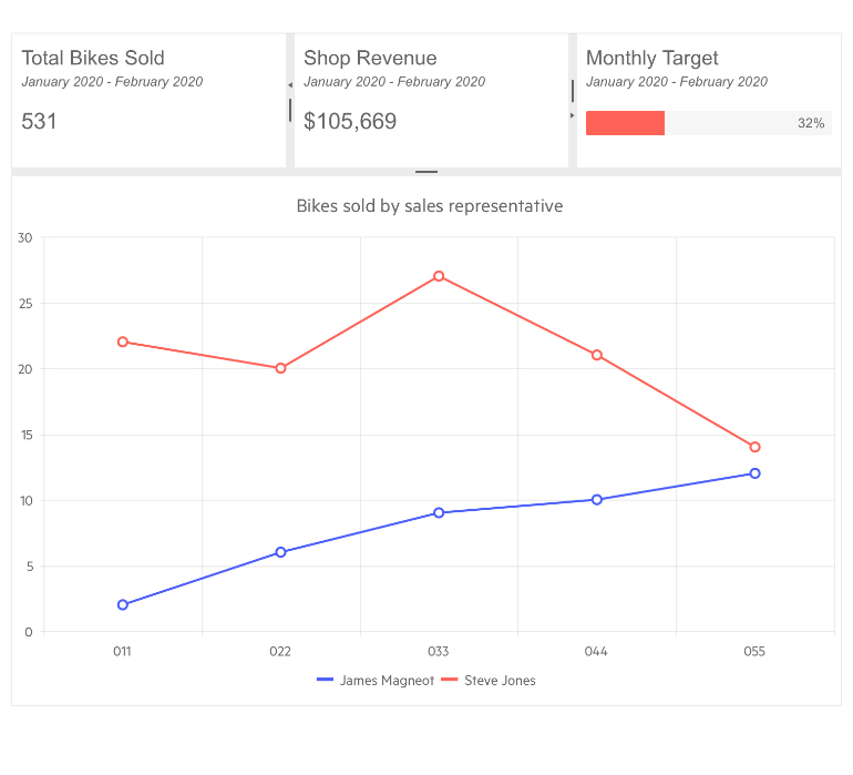
Telerik UI for Blazor Splitter Component
Using and Customizing the Splitter and Panes
The Splitter component consists of a main container defined by the <TelerikSplitter> tag and one or more splitter panes defined with <SplitterPanes> and <SplitterPane> nested tags as shown in the code sample below:
<TelerikSplitter Width="100%" Height="100%" Orientation="@SplitterOrientation.Horizontal">
        <SplitterPanes>
            <SplitterPane Size="100px" Min="50px" Max="150px" Collapsible="true">
                <div>left sidebar. Can be collapsed and can be resized between 50px and 150px.</div>
            </SplitterPane>
            <SplitterPane Collapsible="false">
                <div>right hand side pane - content. You cannot collapse this pane so it is always visible.</div>
            </SplitterPane>
            <SplitterPane Collapsed="true" Collapsible="true" Resizable="false" Size="100px">
                <div>Third pane that is initially collapsed and is not resizable.</div>
            </SplitterPane>
        </SplitterPanes>
    </TelerikSplitter>
For the <TelerikSplitter> main container you can define CSS class, size, orientation for the individual panes, as well as several events listed in the Splitter Component Events section.
For the <SplitterPane> individual panes you can define their own CSS class, size, and configure behaviors related to their ability to change its size and collapse (including max and min resizing validation). Detailed information related to the Splitter features can be found in the component documentation.
Splitter Component Orientation
The orientation of the split panes can be horizontal or vertical inside the Blazor Splitter component.
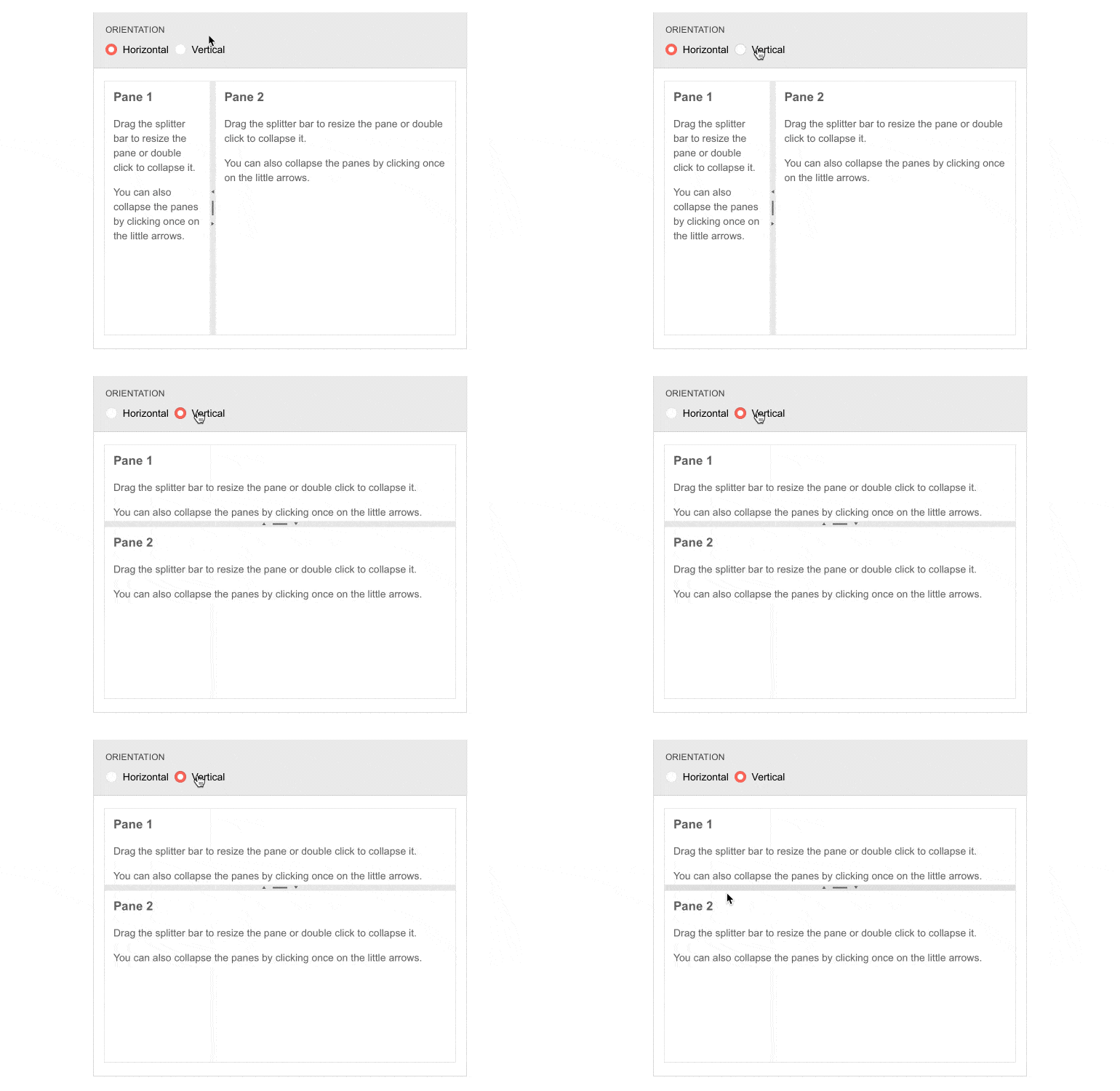
Telerik UI for Blazor Splitter – Horizontal & Vertical
Splitter Component State Management
The Splitter component exposes two methods SetState(SplitterState updatedState) and GetState() that let you save and restore the control states. Check out an example on how to save, load and control programmatically the Telerik Splitter for Blazor.
Splitter Component Events
The Telerik UI for Blazor Splitter component exposes three events to let you handle and take actions based user input Blazor apps:
- OnCollapse - fires when a pane is collapsed and receives in its event arguments the index of the pane that was collapsed
- OnExpand - fires when a pane is expanded and receives in its event arguments the index of the pane that was expanded
- OnResize - fires for each resized pane after the user has finished resizing a pane (after the mouse button is released) and receives the index and new size in its event arguments
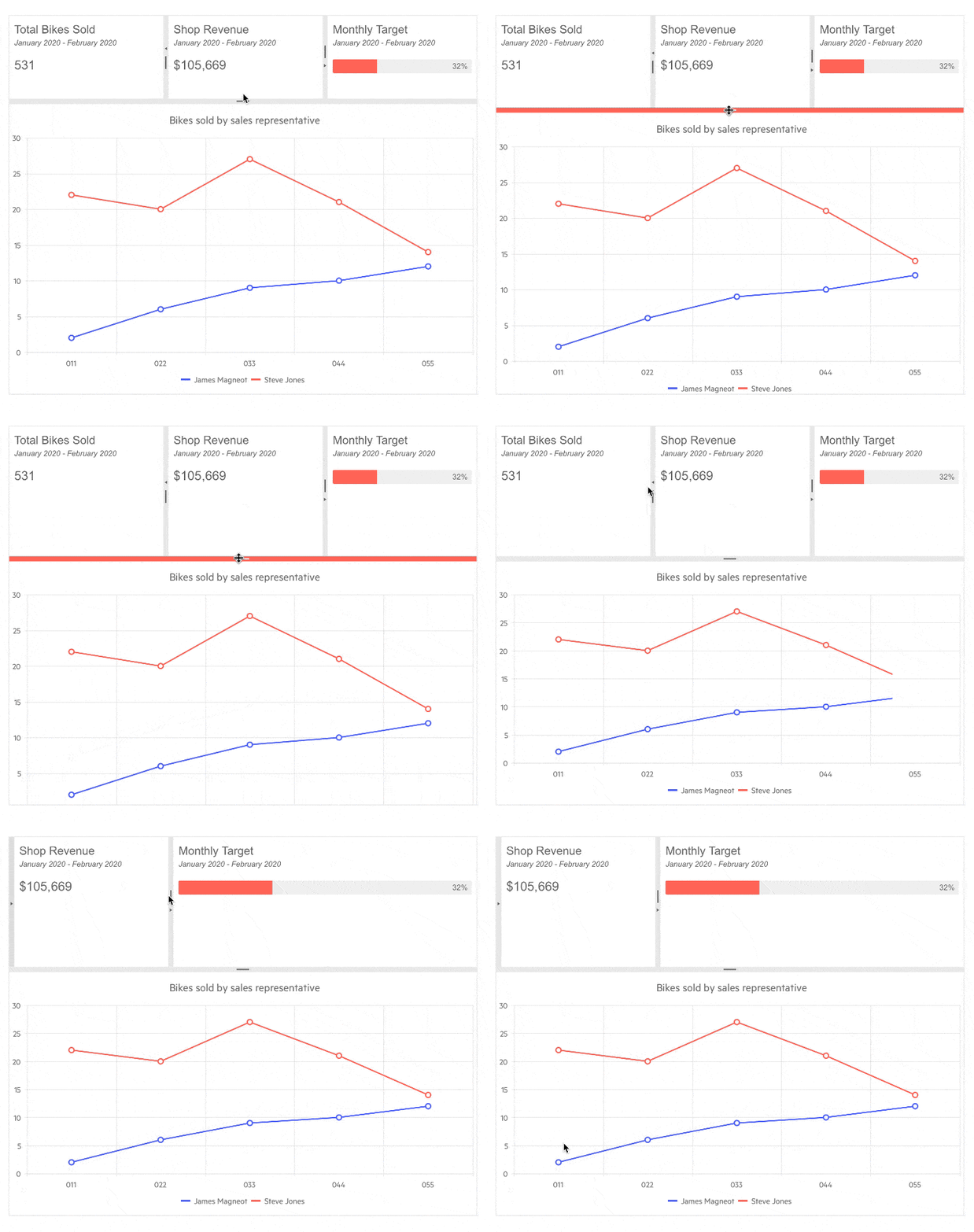
Telerik UI for Blazor Splitter Resizing
Blazor Slider Component
Slider UI Component Overview
Users in your Blazor apps can now slide through values and pick one with the new Slider component. The navigation through the defined range of values can be done either by dragging its handle or using the side arrow buttons. The Slider offers multiple configuration options and features:
- Min and max values
- Orientation
- Tick position
- Label templates
- Small/Large step
- Built-in keyboard navigation
- Globalization support
- and more!

Telerik UI for Blazor Slider Component
To use Telerik Slider for Blazor all you need to do is add TelerikSlider tag, bind it to value and configure the needed settings to make it look and work as required. The code sample below adds a Slider component, uses two-way binding with range of 0-100 and visualizes smaller ticks of 1 and larger steps ticks for 0, 20, 40, 60, 100.
<TelerikSlider @bind-Value="@Volume"
               Min="0"
               Max="100"
               SmallStep="1"
               LargeStep="20"
               Width="400px">
</TelerikSlider>

@code{

    int Volume { get; set; } = 77;

}
Slider UI Component Orientation
Depending on your app scenario you can easily configure the Slider with either horizontal or vertical orientation.

Telerik UI for Blazor Vertical Slider
Slider UI Component Labels Customization
The Slider label's content along the track can be easily customized using label templates. Whether you would like to apply number formatting or custom styling of the labels, you can easily do so within the LabelTemplate tag as shown in the example below:
<LabelTemplate>
     <span style="font-weight:bold; font-style: italic;">
         @context.ToString("C2")
     </span>
</LabelTemplate>
More examples related to custom Blazor Slider labels can be found in the component documentation.
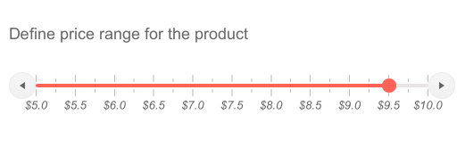
Telerik UI for Blazor Slider – Label Templates
Slider ValueChanged Event
The Slider ValueChanged event fires every time the Value parameter changes, which occurs when:
- The user clicks the increase/decrease side buttons
- After the user stops dragging the handle
- When the user clicks on the slider track
Blazor Range Slider Component
Range Slider UI Component Overview
To expand the capabilities for value selection of the Slider, we shipped a dedicated RangeSlider component for Blazor that covers scenarios requiring range selections.

Telerik UI for Blazor Range Slider
All the features, configuration options, orientation and label templates remain valid for the RangeSlider component as well. Due to its range nature, the control exposes two events (instead of just ValueChanged as is the case with the Slider) as follows:
- StartValueChanged - fires when the user moves the lower range of the slider
- EndValueChanged - fires when the user changes the higher range of the slider
Both events fire every time the corresponding Value parameter change—i.e., after the user stops dragging the handle or when they click on the track.
Blazor Loader Container Component
LoaderContainer UI Component Overview
The new LoaderContainer component is a great addition for long-running operations and your Blazor app can visually signal that a process is happening on the background. The Loader Container provides an animated indicator, a panel, and an overlay which you can easily configure it in terms of appearance—color, size, positioning and text.
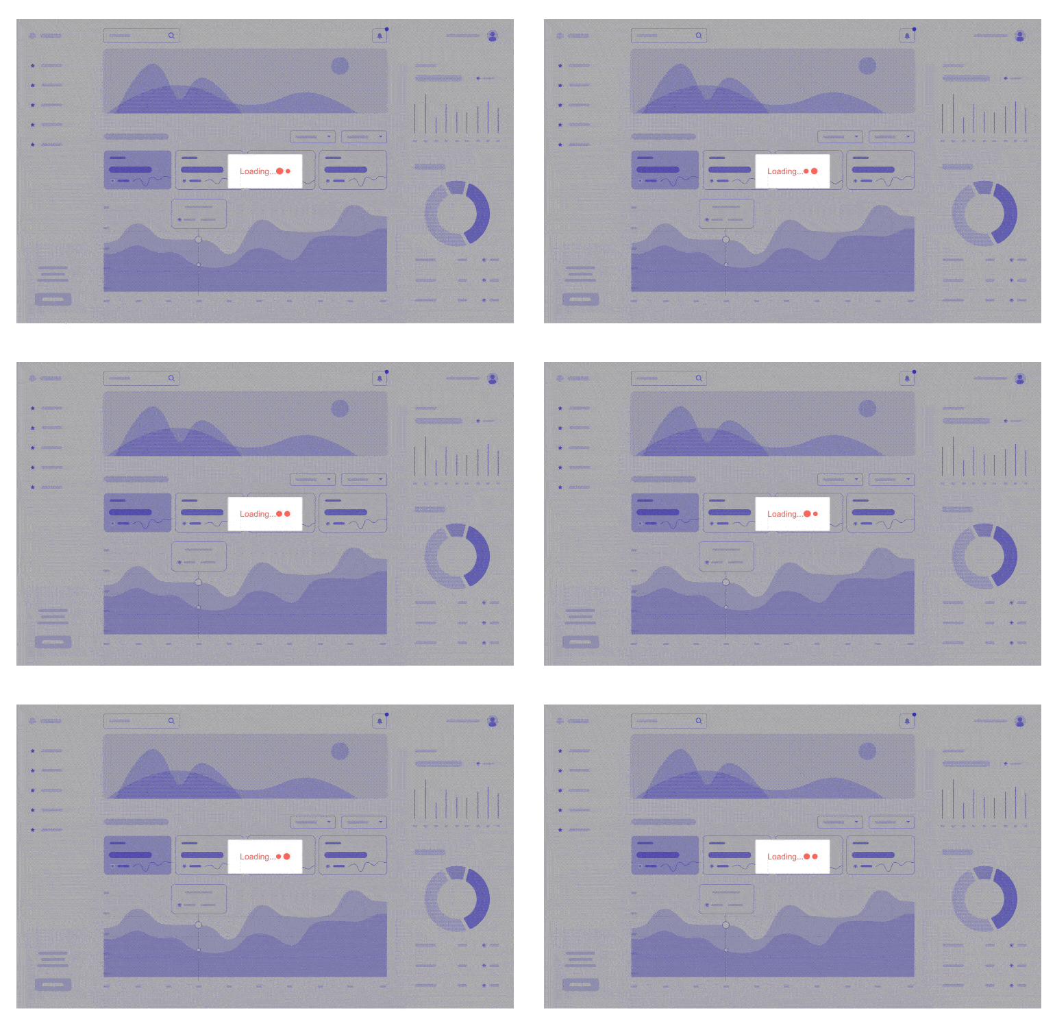
Telerik UI for Blazor Loader Container Component
To add a Telerik LoaderContainer to your Blazor application, use the <TelerikLoaderContainer> tag and show it when needed by your app by using its Visible parameter.
<TelerikLoaderContainer Visible="@LoaderContainerVisible"></TelerikLoaderContainer>
Customizing the Appearance of the LoaderContainer
We ensured that the LoaderContainer appearance is fully customizable through rich set of configuration options such as:
- OverlayThemeColor – null (transparent), dark, light
- LoaderPosition – top, start, end
The LoaderContainer utilizes the previously released Loader component internally to provide the animated indicator, so there are several shared appearance settings which you can use to style the loading indicator, namely:
- Type – Pulsing, InfiniteSpinner, ConvergingSpinner
- Size – small, medium (default), large
- ThemeColor - Primary, Secondary, Tertiary, Success, Info, Warning, Error, Dark, Light, Inverse

Telerik UI for Blazor Loader Container Appearance Settings
LoaderContainer Templates
With the Telerik UI for Blazor Loader Content templates you have full control over the rendering of the markup. You can easily define custom loader container, change the default loader indicator or implement your own panel.

Telerik UI for Blazor Loader Container Templates
Built-In Loading Indicator
Many of the Telerik UI for Blazor components such as Grid, Scheduler, ListView, MultiSelect use internally both the Loader and LoaderContainer components to ensure the controls provide the right user experience when slow-running async data operation is detected. A list of all UI for Blazor components that support built-in loading indicator can be found in the dedicated documentation page.
Custom Integrations with LoaderContainer
The Loader Container can be easily integrated in any scenario and any custom component at hand—loading animation with heavy data in Blazor Grid, long-running process while submitting a form and more!
Blazor UI Components New Features
Blazor Grid New Features
Grid Multi-Checkbox Filter
With this release we are expanding the available options for Grid data filtering and adding a multi-checkbox filter—also known as Excel-like filtering. The new multi-checkbox filter allows filtering of Grid values by displaying a list of checkboxes in the Grid header menu that correspond to unique values for a Grid column.
To enable the checkbox list filtering in the grid you need to set the FilterMode parameter to Telerik.Blazor.GridFilterMode.FilterMenu and FilterMenuType to Telerik.Blazor.FilterMenuType.CheckBoxList. Data Grid checkbox filter examples and filtering when using OnRead can be found in the in the documentation page.
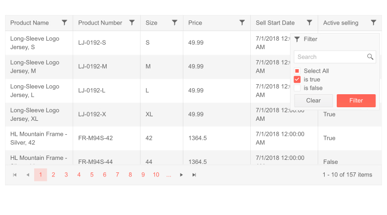
Telerik UI for Blazor Grid Multi-Checkbox Filter
Grid Load Groups on Demand
The Telerik Blazor Grid now supports loading groups on demand, favoring scenarios with a large number of groups in data and enabling the faster and easier location of a particular group. Initially groups will show up collapsed by default and the corresponding child rows for the group will be loaded only after the user expands a given group.
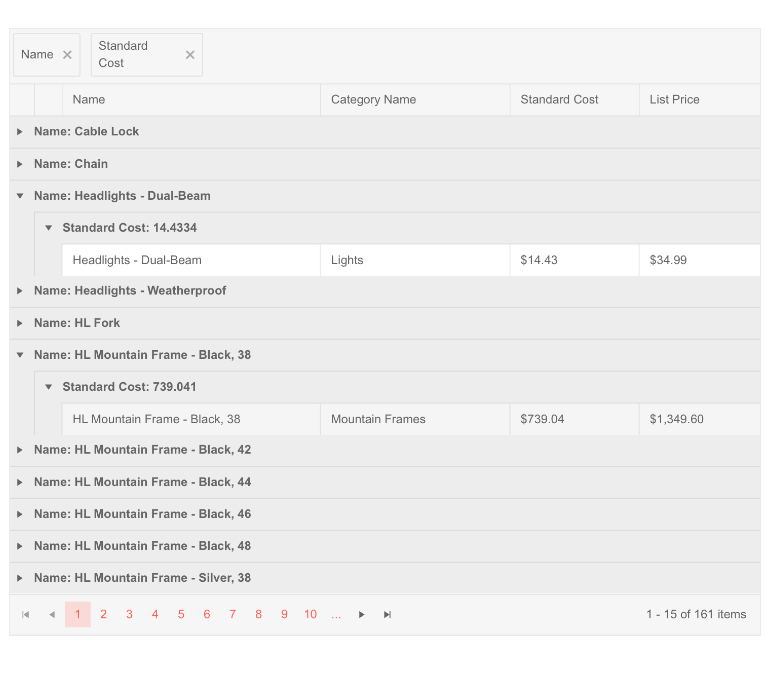
Telerik UI for Blazor Grid Load Groups on Demand
The loading groups on demand feature can be easily enabled by setting a single parameter LoadGroupsOnDemand to true and can be combined with row virtualization for further performance enhancement for heavy data with large number of groups.
Loading Animations in Grid
In the current 2.21.0 release we also enhanced the Grid to make sure the user experience when performing heavy data operations is excellent. When the Telerik UI for Blazor Grid detects a slow running async data operation while the user works with it (modifies records, or performs paging, sorting, filtering and grouping.), the data grid shows a loading indicator.
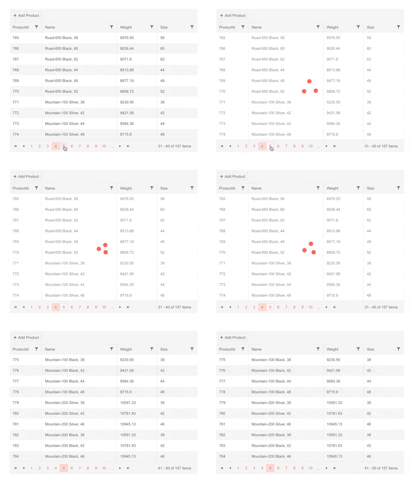
Telerik UI for Blazor Grid Loading Animation
TreeList Multi-Checkbox Filter
We added a multi-checkbox filter to another component that is heavily loaded with data —the TreeList. The new multi-checkbox filter allows filtering of TreeList column values by displaying a list of checkboxes in the header menu that correspond to unique values for a specified column.
Blazor TreeView New Features
TreeView Checkbox Selection
The Telerik Blazor TreeView component now provides built-in support for checkboxes, allowing users to select one or more items. The feature comes with multiple properties to get the checked/unchecked treeview items, ensure that the parent node checkbox reflects the state of its child nodes, configure checkbox selection mode (none, single, multiple) and events to let you handle the selected items with ease. If your users prefer working mostly with the keyboard, they can benefit from the built-in keyboard navigation and checkbox selection can easily be done by just using the “Space” key.

Telerik UI for Blazor TreeView Checkbox Selection
TabStrip Header Template
With the header template feature of the TabStrip component you can add any HTML content including other Blazor components in the tab header. In case you only need to add some styling to the TabStrip tab header, you can use the Class parameter of the TabStripTab to define your custom CSS (see the next section for info related to CSS Class parameter).
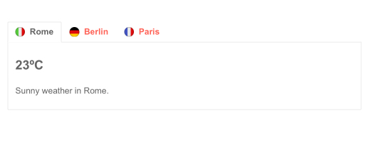
Telerik UI for Blazor TabStrip Header Template
Component Specific CSS
You can now easily apply and cascade custom CSS for any component using the newly added Class parameter that is now available for all components. In addition to that, we also added a PopupClass parameter that provides an option to customize the appearance of the dropdowns within Blazor components such as ComboBox, AutoComplete, DatePicker etc.
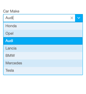
Telerik UI for Blazor Component Specific CSS
Keyboard Support for Upload, TreeList, Scheduler
With the January 2021 release we added built-in keyboard support for several favorite components—Upload, TreeList and Scheduler.
New Features in Telerik Document Processing: WordsProcessing support for content controls
We have update and for those of you who are using Telerik Document Processing within their Blazor apps! Content Controls or Structured Document Tags (SDT) enable users to add specific semantics to the document: restricting input, modifying editing behavior, etc. Usually, the content controls are used to create a template that allows you to fill specific data by interaction with the document (using checkboxes, predefined options, calendars). With the latest version of the RadWordsprocessing library, we have introduced support for this feature, and you can now create and manipulate the content controls inside a document.
New Blazor Sample Solution Blazing Coffee
We made sure that along with the increasing number of UI for Blazor demos, we add new applications that showcase the usage and scenarios for various Blazor components.
As many of you have requested to be able to access the source code and play around with Blazing Coffee demo app (thanks to our team mate and Blazor guru Ed 😊 ) with this release we are adding it officially as Blazing Coffee Sample Application.
The Blazing Coffee demo application shows how a full-stack .NET application can be built with ASP.NET Core, Blazor WASM and Telerik UI for Blazor. Within the demo you can see in action components like: Drawer, Grid, DropDownList, DateRangePicker, Chart, Upload, Tooltip and more! Also, the sample app showcases usage of globalization and localization, authentication, authorization as well as applying light and dark themes. Make sure to check it out on our Blazor demos hub page.
Download Telerik UI for Blazor 2.21.0
Head over to the Telerik UI for Blazor page, download a free trial of Telerik UI for Blazor 2.21.0, or if you are an active license holder you can grab the latest and greatest from the “Your Account” page or update your NuGet Telerik.UI.for.Blazor package reference to version 2.21.0. directly in your Blazor solutions.
Special Twitch Session & Webinar
Be sure to sign up for the Telerik R1 2021 release webinar on Tuesday, January 26 | 11 am – 1 pm ET or join the full-day live session on Twitch on Friday, January 29, 8:00 am – 5:00 pm ET to see the newly released components and features in action and get ideas on how to use them in your projects. Take a deeper look at all the new features in the release.
Thank You from the Telerik UI for Blazor Team at Progress!

Maria Ivanova
Maria Ivanova is a Manager of Product Management at Progress, for Telerik and Kendo UI components and developer tooling. She joined the company in 2019 as a Product Manager for Telerik UI web components and is passionate about developing impactful and innovative software products. Maria believes that to create great products, it's important to challenge the status quo, closely collaborate with customers, and embrace a spirit of experimentation.
