.NET MAUI CircularSlider Overview
Updated on Aug 20, 2026
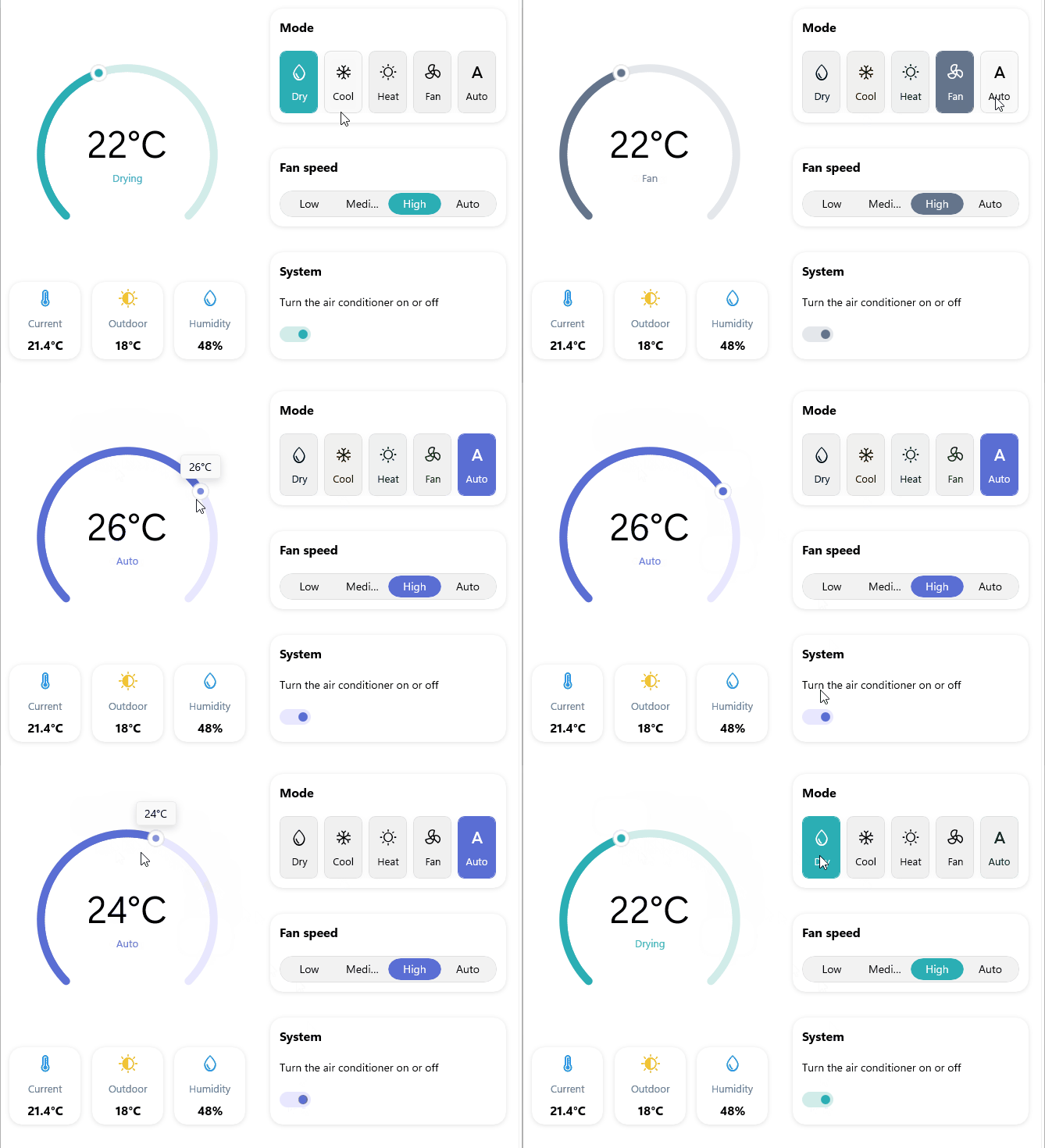
The Telerik UI for .NET MAUI CircularSlider represents a slider component that displays a value in a predefined min-max range along a circular arc. End users can change the selected value by dragging the thumb along the circular path.
 Start Free Trial
The CircularSlider supports ticks, labels, and tooltips. The users can quickly identify the min-max range and the currently selected value, and modify them, if needed.
Key Features of the .NET MAUI CircularSlider
- Arc configuration—Control the shape of the circular arc through the
StartAngle,SweepAngle,SweepDirection, andRadiusFactorproperties. Configure a partial arc or a full circle. - Value thumb—The CircularSlider's value thumb is drawn corresponding to its
Valueproperty. Users can modify theValueby dragging the thumb along the arc. - Range track—The CircularSlider provides a customizable range track for better representation of the selected value. You can modify the range track's initial position with the
OriginValueproperty. - Backtrack—The thumb runs along the backtrack of the CircularSlider. The backtrack represents all the values your end users can choose from.
- Ticks—Ticks let users easily identify the min-max range.
- Labels—Labels displayed along the arc provide additional clarity about the underlying min-max range.
- Tooltip—The CircularSlider can show a customizable tooltip to help users choose the desired value with better precision.
- Templates—The exposed templates let you further customize the look of the CircularSlider's labels, ticks, and tooltip.
- Flexible Styling API—The CircularSlider provides full control over the appearance of the thumb, track, ticks, and labels.