.NET MAUI CircularSlider Ticks
The CircularSlider for .NET MAUI can show ticks along the backtrack. Ticks help end users to more easily identify the selected value.
Ticks Step and Placement
To display ticks along the arc, define the TickStep and TicksPlacement properties of the CircularSlider.
TickStep(double)—Defines the values on the backtrack that are indicated by ticks. Each tick is placed at the specified value interval. For example, ifTickStep="5", your ticks are placed on the 0, 5, 10, 15, and 20 positions on a 0-20 backtrack.TickOrigin(double)—Defines a custom value that indicates where the ticks originate. The position of the ticks is determined based on the combination of theTickStepandTickOriginvalues. The CircularSlider generates the ticks and labels in a way so that a tick is positioned at the givenTickOrigin.TicksPlacement(Telerik.Maui.Controls.RangeSlider.SliderTicksPlacement)—Defines where the ticks are displayed relative to the position of the backtrack. The available options are:None—No ticks are displayed.Start—The ticks appear on the inner side of the arc.Center—The ticks overlay the arc.End—The ticks appear on the outer side of the arc.
CircularSlider SnapMode
The CircularSlider for .NET MAUI provides snapping to ticks (the thumb snaps from tick to tick, ignoring the values in-between). This limits the selected Value to a predefined set of values related to the TickStep value. You can enable or disable snapping with the SnapMode property:
SnapMode(Telerik.Maui.Controls.RangeSlider.SliderSnapMode)—Defines whether the thumb should snap to a tick, ignoring the values between ticks. The available options are:None—The end user can move the dragged thumb freely.SnapToTicks—The thumb is snapped to the position of the ticks when an end user is dragging it.
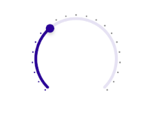
The snippet below shows how to apply the ticks configuration settings:
<telerik:RadCircularSlider Grid.Row="2"
                           x:Name="circularSlider"
                           Minimum="0"
                           Maximum="100"
                           Value="35"
                           TicksPlacement="End"
                           TickStep="5"
                           SnapMode="SnapToTicks"
                           HorizontalOptions="Fill"
                           VerticalOptions="Start"
                           MinimumHeightRequest="300" />
This is the result:
For a runnable example demonstrating the CircularSlider ticks settings, see the SDKBrowser Demo Application and go to the CircularSlider > Ticks category.
Tick Template
Through the TickTemplate property you can customize the appearance of the ticks.
TickTemplate(DataTemplate)—Defines the template of the CircularSlider ticks.
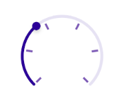
Check below a sample TickTemplate example:
- First define the custom
DataTemplate:
<DataTemplate x:Key="CustomTickTemplate">
    <Rectangle WidthRequest="4"
               HeightRequest="10"
               BackgroundColor="#7C59B6" />
</DataTemplate>- Then apply it to the CircularSlider's
TickTemplate:
<telerik:RadCircularSlider Minimum="0"
                           Maximum="100"
                           Value="35"
                           TicksPlacement="Start"
                           TickStep="20"
                           TickTemplate="{StaticResource CustomTickTemplate}"
                           HorizontalOptions="Fill"
                           VerticalOptions="Start"
MinimumHeightRequest="300" />- Add the
teleriknamespace:
xmlns:telerik="http://schemas.telerik.com/2022/xaml/maui"This is the result:
For a runnable example demonstrating the CircularSlider ticks template, see the SDKBrowser Demo Application and go to the CircularSlider > Ticks category.