.NET MAUI CircularSlider Labels
The CircularSlider for .NET MAUI can show labels along the backtrack. This helps users to better understand the underlying range of values.
Labels Step and Placement
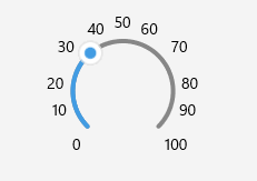
To display labels, define the LabelStep and LabelsPlacement properties of the CircularSlider.
LabelStep(double)—Defines the values on the backtrack that are indicated by labels. Each label is placed at the specified value interval. For example, ifLabelStep="5", your labels show the 0, 5, 10, 15, and 20 values on a 0-20 backtrack.LabelsPlacement(Telerik.Maui.Controls.RangeSlider.SliderLabelsPlacement)—Defines where the labels are displayed relative to the position of the backtrack. The available options are:None—No labels are displayed.Start—The labels appear on the inner side of the arc.End—The labels appear on the outer side of the arc.
Check an example on how you can configure labels:
<telerik:RadCircularSlider Grid.Row="2"
                           x:Name="circularSlider"
                           Minimum="0"
                           Maximum="100"
                           Value="35"
                           LabelsPlacement="End"
                           LabelStep="10"
                           HorizontalOptions="Fill"
                           VerticalOptions="Start"
                           MinimumHeightRequest="300" />
This is the result:
For a runnable example demonstrating the CircularSlider labels settings, see the SDKBrowser Demo Application and go to the CircularSlider > Labels category.
Full Circle Label Display Mode
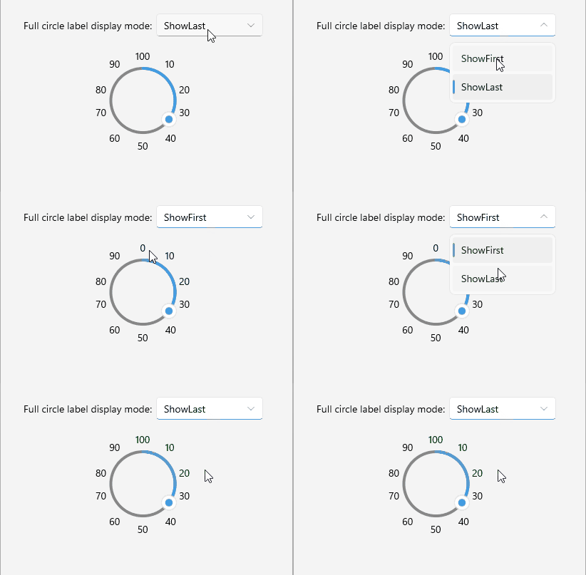
When the CircularSlider forms a full circle, the first (minimum) and last (maximum) value labels overlap at the same position. Use the FullCircleLabelDisplayMode property to control which label is shown at that overlap point.
FullCircleLabelDisplayMode(Telerik.Maui.Controls.CircularSlider.CircularSliderFullCircleLabelDisplayMode)—Defines which label is shown at the overlap point when the slider is a full circle. The available options are:ShowFirst—The first (minimum) value label is shown at the overlap point. This is the default value.ShowLast—The last (maximum) value label is shown at the overlap point.
<telerik:RadCircularSlider x:Name="circularSlider"
                           Grid.Row="1"
                           Minimum="0"
                           Maximum="100"
                           Value="35"
                           StartAngle="90"
                           SweepAngle="360"
                           LabelsPlacement="End"
                           LabelStep="10"
                           FullCircleLabelDisplayMode="ShowLast"
                           HorizontalOptions="Fill"
                           MinimumHeightRequest="300" />
This is the result:
For a runnable example demonstrating the CircularSlider full circle label display mode, see the SDKBrowser Demo Application and go to the CircularSlider > Labels category.
Labels Formatting
You can use the formatting properties to modify the text of the labels.
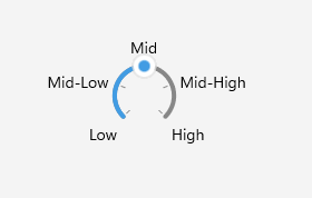
StringFormat(string)—Defines a custom string format for the labels of the CircularSlider.StringConverter(Telerik.Maui.IStringConverter)—Defines a custom string converter. You can use the string converter to replace the range values with more user-friendly names in your CircularSlider labels.
Here is a quick example with a custom string converter:
- Add the following sample Dictionary String Converter to your resources. It replaces the values of the range with meaningful names to make the range more readable:
<telerik:DictionaryStringConverter x:Key="LowMidHighConverter">
    <telerik:DictionaryStringConverterItem Key="{x:Double 1}" Value="Low" />
    <telerik:DictionaryStringConverterItem Key="{x:Double 2}" Value="Mid-Low" />
    <telerik:DictionaryStringConverterItem Key="{x:Double 3}" Value="Mid" />
    <telerik:DictionaryStringConverterItem Key="{x:Double 4}" Value="Mid-High" />
    <telerik:DictionaryStringConverterItem Key="{x:Double 5}" Value="High" />
</telerik:DictionaryStringConverter>- Apply the converter to the CircularSlider:
<telerik:RadCircularSlider Minimum="1"
                           Maximum="5"
                           Value="3"
                           TickStep="1"
                           LabelStep="1"
                           RadiusFactor="0.4"
                           SnapMode="SnapToTicks"
                           TicksPlacement="Start"
                           LabelsPlacement="End"
                           StringConverter="{StaticResource LowMidHighConverter}"
                           HorizontalOptions="Fill"
                           VerticalOptions="Start"
MinimumHeightRequest="360" />- Add the
teleriknamespace:
xmlns:telerik="http://schemas.telerik.com/2022/xaml/maui"This is the result:
For a runnable example demonstrating the CircularSlider labels string converter, see the SDKBrowser Demo Application and go to the CircularSlider > Labels category.
Label Template
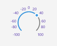
You can use the LabelTemplate property to customize how the CircularSlider labels render.
LabelTemplate(DataTemplate)—Defines the template of the CircularSlider labels.
Check below a sample LabelTemplate example:
- Add the custom
DataTemplateto your page resources:
<DataTemplate x:Key="CustomLabelTemplate">
    <Label Text="{Binding}"
           FontSize="16"
           TextColor="#674BB2" />
</DataTemplate>- Apply it to the CircularSlider's
LabelTemplate:
<telerik:RadCircularSlider Minimum="-100"
                           Maximum="100"
                           Value="35"
                           LabelsPlacement="End"
                           LabelStep="20"
                           LabelTemplate="{StaticResource CustomLabelTemplate}"
                           HorizontalOptions="Fill"
                           VerticalOptions="Start"
                           MinimumHeightRequest="300" />
This is the result:
For a runnable example demonstrating the CircularSlider labels template, see the SDKBrowser Demo Application and go to the CircularSlider > Labels category.