New to Telerik UI for .NET MAUI? Start a free 30-day trial
.NET MAUI CircularSlider Ticks Styling
Updated on Aug 20, 2026
The CircularSlider for .NET MAUI provides the following styling options and a style selector for the ticks (to let you apply additional styles):
InRangeTickColor(Color)—Defines the color of the ticks shown along the range track (betweenOriginValueandValue).OutOfRangeTickColor(Color)—Defines the color of the ticks shown outside of the range track.TickThickness(double)—Defines the width of the ticks.TickLength(double)—Defines the custom length of the ticks.InRangeTickStyle(Style)—Defines a custom style for the ticks shown along the range track.OutOfRangeTickStyle(Style)—Defines a custom style for the ticks shown outside of the range track.TickStyleSelector(Telerik.Maui.Controls.IStyleSelector)—Defines a selector that can apply different styles to ticks according to custom logic.
Tick Styles Example
The following example demonstrates how to use the described styling properties to style the CircularSlider's ticks:
- Add the custom styles to the page's resources:
XAML
<Style x:Key="CustomInRangeTickStyle" TargetType="telerik:RadBorder">
    <Setter Property="BackgroundColor" Value="#018383" />
    <Setter Property="WidthRequest" Value="3" />
    <Setter Property="HeightRequest" Value="10" />
</Style>
<Style x:Key="CustomOutOfRangeTickStyle" TargetType="telerik:RadBorder">
    <Setter Property="BackgroundColor" Value="#830183" />
    <Setter Property="WidthRequest" Value="2" />
    <Setter Property="HeightRequest" Value="10" />
</Style>- Apply the custom styles to the CircularSlider:
XAML
<telerik:RadCircularSlider Minimum="0"
                           Maximum="100"
                           Value="35"
                           TicksPlacement="Start"
                           TickStep="10"
                           InRangeTickStyle="{StaticResource CustomInRangeTickStyle}"
                           OutOfRangeTickStyle="{StaticResource CustomOutOfRangeTickStyle}"
                           HorizontalOptions="Fill"
                           VerticalOptions="Start"
                           MinimumHeightRequest="300" />
This is the result:
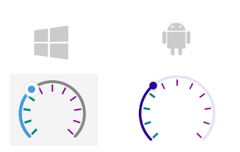
For a runnable example demonstrating the CircularSlider tick styling, see the SDKBrowser Demo Application and go to the CircularSlider > Styling category.
TickStyleSelector Example
The following example demonstrates how to use the TickStyleSelector to set two different styles for the major and minor ticks:
- Add the style selector to the page's resources:
XAML
<local:CustomTickStyleSelector x:Key="CustomTickStyleSelector">
    <local:CustomTickStyleSelector.MajorTickStyle>
        <Style TargetType="telerik:RadBorder">
            <Setter Property="BackgroundColor" Value="#018383" />
            <Setter Property="WidthRequest" Value="3" />
            <Setter Property="HeightRequest" Value="10" />
        </Style>
    </local:CustomTickStyleSelector.MajorTickStyle>
    <local:CustomTickStyleSelector.MinorTickStyle>
        <Style TargetType="telerik:RadBorder">
            <Setter Property="BackgroundColor" Value="#830183" />
            <Setter Property="WidthRequest" Value="1" />
            <Setter Property="HeightRequest" Value="6" />
        </Style>
    </local:CustomTickStyleSelector.MinorTickStyle>
</local:CustomTickStyleSelector>- Apply the style selector to the CircularSlider:
XAML
<telerik:RadCircularSlider Minimum="0"
                           Maximum="100"
                           Value="35"
                           TicksPlacement="End"
                           TickStep="2"
                           TickStyleSelector="{StaticResource CustomTickStyleSelector}"
                           HorizontalOptions="Fill"
                           VerticalOptions="Start"
                           MinimumHeightRequest="300" />
This is the result:

For a runnable example demonstrating the CircularSlider tick style selector scenario, see the SDKBrowser Demo Application and go to the CircularSlider > Styling category.