.NET MAUI CircularSlider Arc Configuration
The CircularSlider for .NET MAUI draws its backtrack along a circular arc. You can control the shape, length, direction, and size of that arc through a set of dedicated properties.
Arc Angles and Direction
Use the following properties to define the position and length of the arc:
StartAngle(double)—Specifies the angle from which the arc starts. Regardless of theSweepDirection, the start angle is treated as in trigonometry—a positive rotation is a counter-clockwise rotation.SweepAngle(double)—Specifies the angle that defines the length of the arc. When theSweepAngleis360, the CircularSlider forms a full circle.SweepDirection(Telerik.Maui.SweepDirection)—Specifies the sweep direction of the arc. The value of this property does not affect the direction of the start angle. The available options are:Clockwise—The arc sweeps in a clockwise direction.CounterClockwise—The arc sweeps in a counter-clockwise direction.
The following example shows how to configure a partial arc:
<telerik:RadCircularSlider Minimum="0"
                           Maximum="100"
                           Value="35"
                           StartAngle="180"
                           SweepAngle="180"
                           SweepDirection="Clockwise"
                           HorizontalOptions="Fill"
                           VerticalOptions="Start"
                           MinimumHeightRequest="300" />
For a runnable example demonstrating the CircularSlider arc configuration, see the SDKBrowser Demo Application and go to the CircularSlider > Features category.
Radius Factor
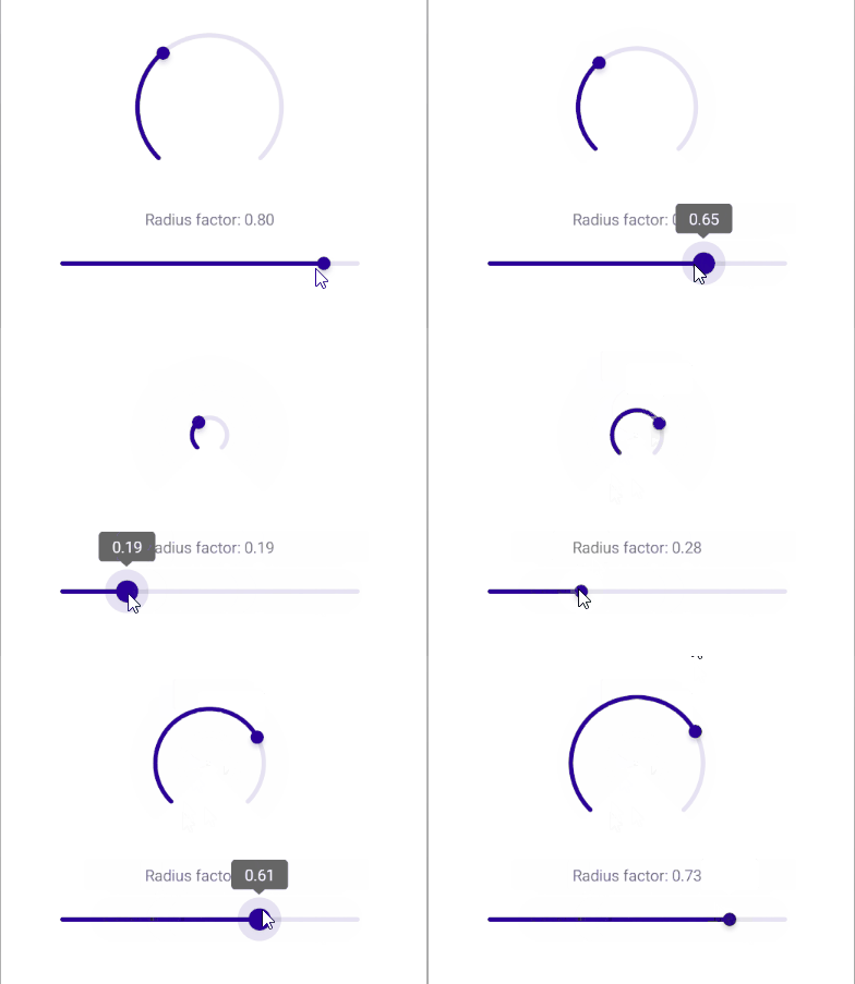
Use the RadiusFactor (double) property to control the size of the circular arc relative to the available space. The value must be between 0.1 and 1.0, where 1.0 means the arc fills the entire available space and 0.1 means the arc is very small. The default value is 0.7.
<telerik:RadCircularSlider Grid.Row="0"
                           x:Name="circularSlider"
                           Minimum="0"
                           Maximum="100"
                           Value="35"
                           RadiusFactor="0.6"
                           HeightRequest="300"
                           HorizontalOptions="Fill"
                           VerticalOptions="Start"
                           MinimumHeightRequest="{OnPlatform iOS=300}" />
This is the result:
Size
The CircularSlider defines default minimum dimensions so that the arc, ticks, and labels remain readable. You can override these dimensions:
MinimumHeightRequest(double)—Specifies the minimum height of the control.MinimumWidthRequest(double)—Specifies the minimum width of the control.
For a runnable example with the CircularSlider arc configuration scenario, see the SDKBrowser Demo Application and go to CircularSlider > Features category.