The UX Challenge of Designing AI-Powered User Interfaces

Summarize with AI:
UX is how we bridge the gap between what we intended when we built our AI application and what the user actually experiences. It doesn’t matter what our software can do if our users hate using it so much that they avoid it at all costs.
AI is a truly unique new technology: rapidly developing, and with so much potential to improve systems and software in ways that we couldn’t have even dreamed of just a few years ago.
However, along with all that potential is no small amount of risk. AI’s non-deterministic nature means that output can wildly range in quality, format, style and accuracy. On top of that, it requires entirely new types of interaction patterns to use. We’ve seen the emergence of new vocabulary, techniques and sometimes entire roles to address that need!
For those of us who live and breathe this technology every day, concepts like prompt engineering, hallucinations, retrieval-augmented generation and so much more have become a regular part of life. But for the vast majority of our users, that simply isn’t the case.
The Developer / User Gap
In any kind of technology, there’s a gap between the developer—who has, by nature, become the subject matter expert—and the user. The technical literacy of the average software engineer is always going to be higher than the average user of said software.
That’s where UX comes in. It’s how we bridge the gap between what we intended when we built the application and what the user actually … well, experiences. After all, it doesn’t actually matter what our software can do if our users hate using it so much that they avoid it at all costs.
Right now, AI has a serious UX problem. Our users are seeing AI features get added to basically everything right now—from their work software to their social media apps, right down to their computer and phone operating systems. But, as a wise technologist once said: “Your scientists were so preoccupied with whether or not they could, they didn’t stop to think if they should.”

We’re pushing users to adopt these new tools and features, but we’re not making it easy to do so. It’s common to see situations where a user is presented with a poorly designed AI feature they have only the barest idea how to use. Then, when they try it and it doesn’t do what they wanted or expected it to do, they feel annoyed, off-put and negative about AI, generally.
The more times users try an AI feature and get subpar results, the less likely they are to engage with it again in the future—which means that as the creators of these features and software, we only have so many chances to get this right before our users disengage and stop trying at all.
In my personal opinion, the knowledge gap between developer and user when it comes to AI is one of the widest I’ve ever seen. That makes it extremely hard for us to build AI-powered features that our users will actually get the full benefit from.
But, thankfully, this isn’t the first time we’ve had to introduce complex new technologies to our users. We have decades of user interface design history we can learn from!
Adapting Existing Patterns
For example: when Macintosh introduced their graphical user interface, it was—like AI is now—something very different and unfamiliar to their users. A large part of their success and reputation was built on their ability to create a user experience that met users where they were. They borrowed terminology and user flows from real life, included lots of icons and visual representations, and walked users through how to get the most out of their computers.
Over time, as the average user became more comfortable and literate in the space, the UX evolved with them and we start to see more technical terms and fewer abstractions.
Look at the difference here between the Control Panels in Macintosh System 1 and System 6:
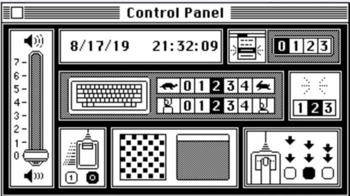
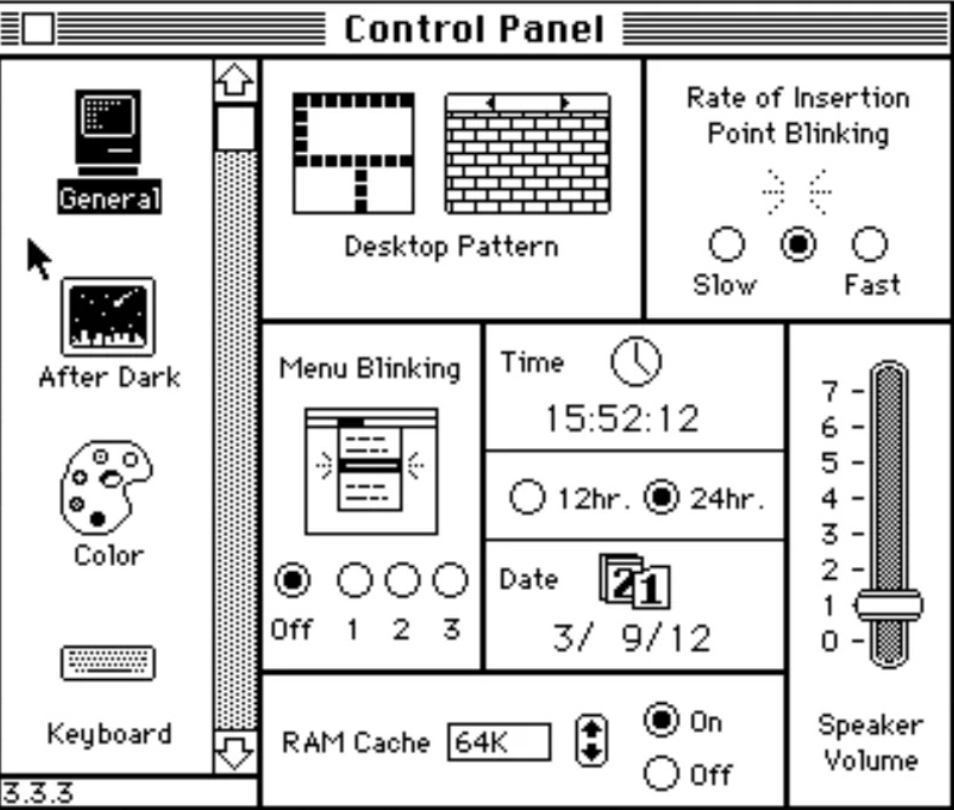
If you’d presented a System 1 user with the words “Rate of Insertion Point Blinking” or “RAM Cache,” it would have been meaningless to them. Similarly, we see the low and high volume icons are gone in System 6, along with the turtle and rabbit speed icons—that kind of more literal depiction isn’t needed anymore.
Right now, we’re probably somewhere around System 3 in this (now very extended) metaphor of introducing AI to users. We may not need the turtle and rabbit icons anymore, but we also can’t just assume they’ll sit down with our AI software as experts.
The good news is that (unlike the System 1 Macintosh UI) we’re not starting from scratch. Our users already have mental models about software usage that will carry over to what we’re building—they just won’t always map over exactly one-to-one.
That’s where we come in. As developers, it’s our role to leverage patterns users are already familiar with, combine them in new ways and introduce them to our users gradually in a way that doesn’t feel overwhelming. A good user experience will not only provide a user with the tools, but also guide them through how to use them.
For instance, let’s consider an AI chat interface. From a purely UI perspective, chatting with an LLM is almost—but not quite—like chatting with another user. We’ll be able to borrow some familiar patterns, like having the user’s chats show up on one side and the AI’s chats on the other, messages appearing above an input field with a send button, a scrollable message history and more. That gives our users a great jumping-off point as well as a lot of visual clues about how to start interacting with our AI chat.
However, the experience isn’t quite close enough that we can just lift an existing interface for direct messages and repurpose it wholesale—a chat interface that was built for two people won’t have the accommodations we need for things like adding reference sources, pausing or stopping an in-progress reply from the LLM, leveraging agentic tools or integrations, and more.
Those are the kinds of places where we need to adapt existing UX and UI patterns into something new. We have to be the bridge, helping our users transition into familiarity with AI experiences.
We can see the difference here. Compare this Copilot Research Agent new chat with the new Teams chat below:
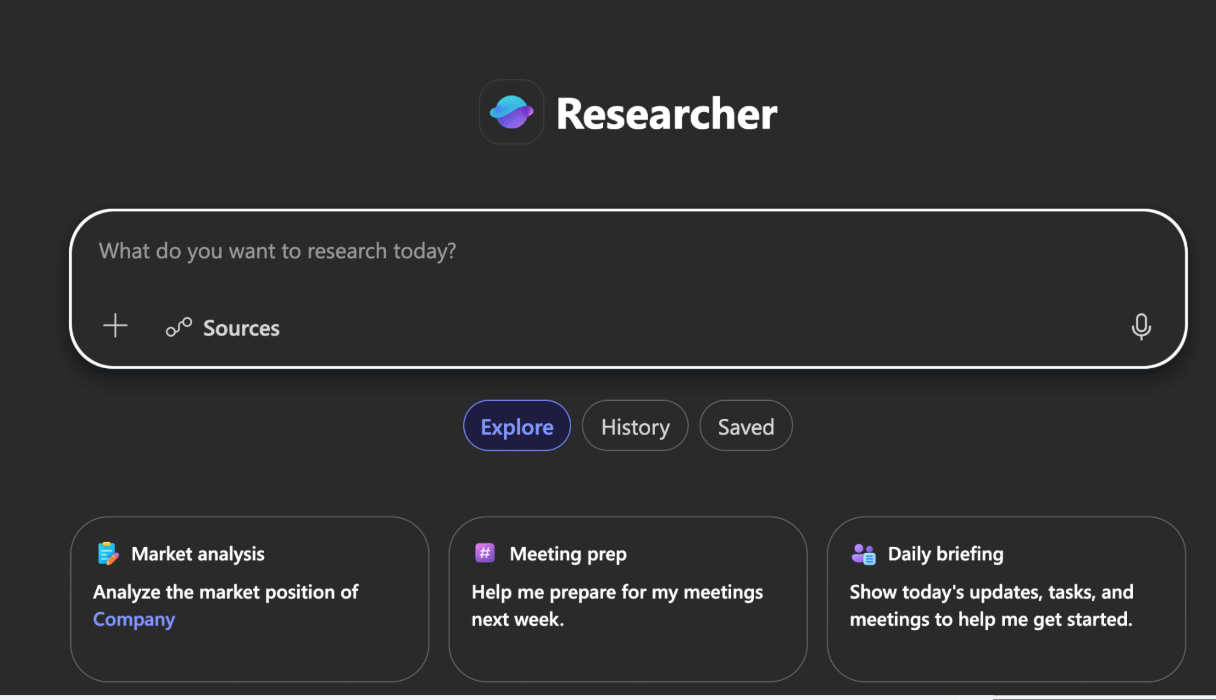
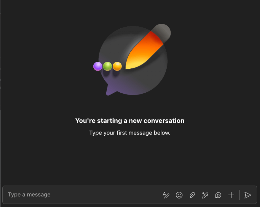
Both have familiar aspects such as text boxes, the “plus” to attach files and so on, but the Teams chat assumes a much higher level of familiarity. It doesn’t spell out any of the iconography used, and we don’t see some of the elements intended to lower the barrier of entry (such as the examples, large text buttons or voice interaction options).
Can’t We Just AI-Generate This?
Before we really dive in, though, I think we have to address the elephant in the room: why not just have the AI create these solutions for us? Why do we have to be the ones who design and build these new patterns when we have technology that can generate interfaces for us now?
The problem with that is that an AI can only “create” things that already exist. It’s fantastic for looking at existing common patterns and replicating them—but (as discussed) the new patterns for AI interfaces just don’t exist yet. Or, at the very least, they’re still being rapidly developed and changing all the time as the technology advances.
There’s not a long history of standardized and familiar AI-related interfaces that can be referenced to solve this problem, so (at least for now) we have to solve this one on our own. Maybe that will change down the road—but for the time being, this is still a very human problem.
Additionally, as many folks (including our users) have begun to notice, the design an AI creates will be … well, a lot like every other design out there.
AI can reference and remix, but you’re not going to get brand new concepts from it. An AI-generated UI tends to look pretty darn average—and while that can be a good starting point, it’s not usually a good ending point. If you just need a quick landing page, it will probably do the trick. But since we’re dealing with a whole new interaction mode that needs more attention paid to the UX rather than less, it’s just not going to be enough to get us where we need to go at the quality level our users deserve.
The Five Categories of AI UX Priorities
So: if we’re going to build new patterns and new interfaces to help our users get the most value out of this technology, where do we start?
Well, like most things in design, it’s best to start with the user—specifically, the user’s problems. That means that when we’re thinking about building our AI features, we need to be thinking about what challenges our users have with AI and the user flows that will mitigate those issues as much as possible.
From the user research I’ve been doing and the users I’ve spoken to, I’ve grouped the main priorities into five categories:
In this blog series, we’re going to discuss each of these in depth—understanding the problems our users have when using AI, and looking at some examples of patterns or techniques we can employ to address them. By addressing each of these, we can create AI experiences that support our users through the introduction of this new technology and empower them to use it to its fullest potential.
Read next: AI UX Patterns for User Trust

Kathryn Grayson Nanz
Kathryn Grayson Nanz is a developer advocate at Progress with a passion for React, UI and design and sharing with the community. She started her career as a graphic designer and was told by her Creative Director to never let anyone find out she could code because she’d be stuck doing it forever. She ignored his warning and has never been happier. You can find her writing, blogging, streaming and tweeting about React, design, UI and more. You can find her at @kathryngrayson on Twitter.
Related Posts
Comments
All articles
Topics
Web MobileMobile
Desktop
Design
Productivity
People