AI UX Patterns for User Clarity

Summarize with AI:
These patterns can help provide insight into what our AI is doing, inviting users to engage because they’re clear on what’s happening.
Hand-in-hand with trust comes clarity. Clarity is one of the most important aspects of creating a good user experience, generally—and the stakes only get higher when we start incorporating AI.
Because so much of AI still feels like an unknown our users, we need to be as descriptive and straightforward as possible about what’s happening at any given time. The more insights we can give them about what our software is doing and what they can expect to happen next, the more comfortable they will feel engaging with our AI features.
I’ve noticed that there can be a kind of impulse to position AI to users as “magic,” not only in marketing but also within the software, itself. We don’t have to look any further than the prevalence of the AI sparkle icon to see example of that. However, while that might feel mysterious and cool, it’s not accurate.
Our users deserve clarity over dramatics. They want to know what’s going on and how a given output was created, and there’s no reason for us not to pull back that curtain wherever we can.
UX Pattern: Live Generation
One of the most obvious ways for us to do this is with streaming text or similar live generation of content. Not only is this is a great way to disguise the latency issue of AI generation (after all, nobody likes to watch a loading spinner), but it’s also a fantastic way to show the user what’s happening in real time.
If we make the user wait until an entire response is generated, there’s a non-zero chance that it won’t actually be what they wanted. However, if we start showing a partial response as it’s being generated, we give our users the chance to start assessing it immediately. That means they can start coming up with followup questions, adjustments or simply stopping the process entirely if it’s not returning what they expected.
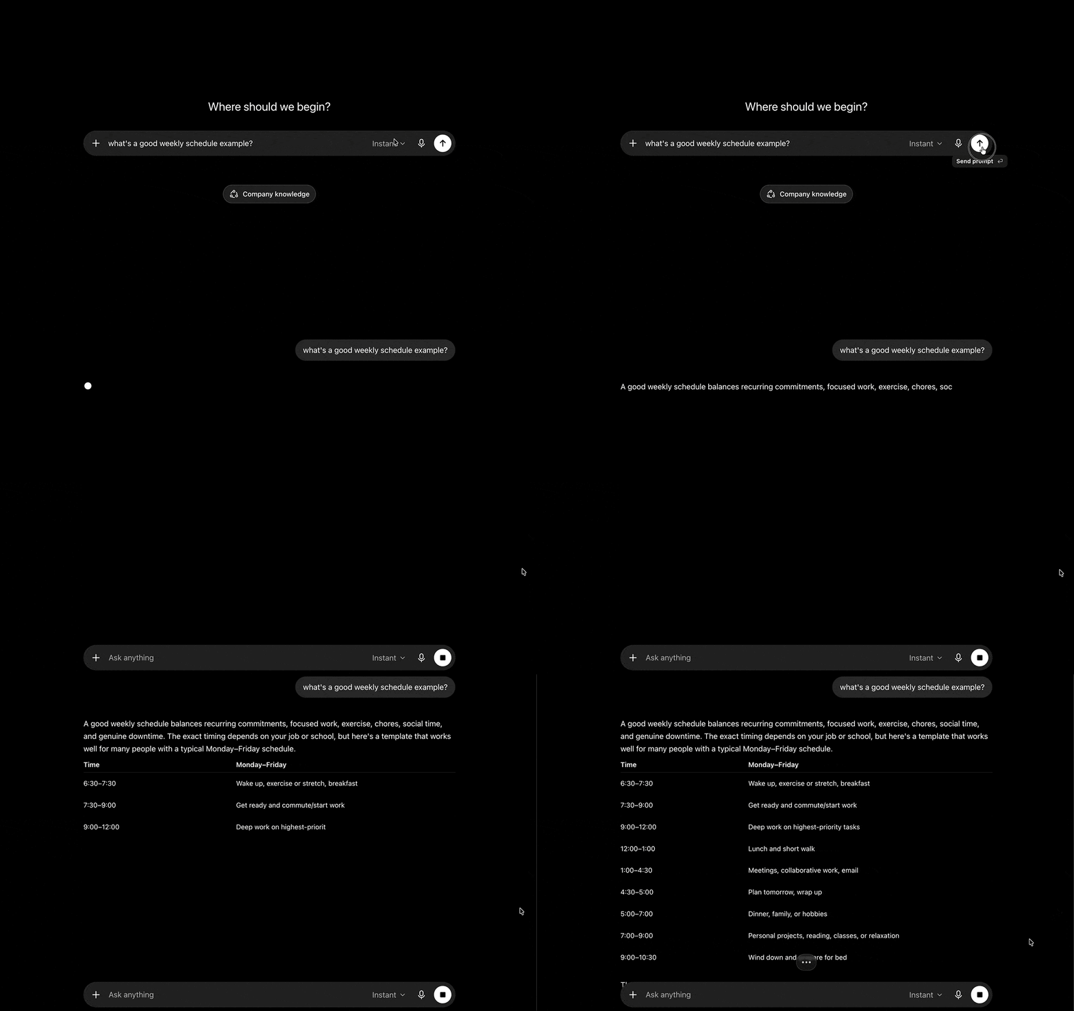
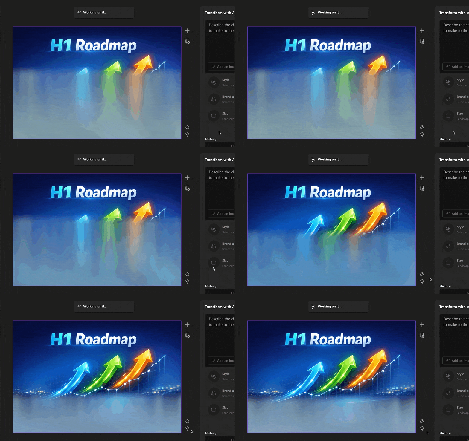
This also engages the user as an active participant in the process, helping to prevent the XKCD “code compiling” experience of pressing a button and then walking away. You’ve probably experienced how much harder it is to complete a task if you’re constantly disengaging from the workflow. Even if you know that a process only takes a minute, if there’s not something to keep you there, you’ll start checking your emails, replying to Slack messages, scrolling social media … and just like that, a one-minute wait becomes a 10-minute detour, making it much harder to pick up where you left off. The more we can prevent this for our users, the more productive they can be with our tools.
UX Pattern: Thinking Aloud
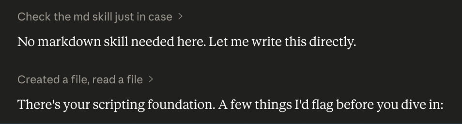
Another thing that can help remove the wall between the AI and the user is having it “think out loud” as it processes a request. Similarly to live streaming, this also improves a user’s confidence level in the output because they’re able to kind of follow the breadcrumbs and have a deeper understanding of how a given conclusion was reached.
After all, we do this all the time when talking to other people! If we’re presenting an idea, we know that it’s helpful for us to talk through the rationale behind how we got there and why we think it’s the right choice. Explaining ourselves is a very natural part of human interaction that we’ve come to expect, and when we don’t see that mirrored in the systems we use it can feel frustrating—like something is being intentionally hidden from us.
Additionally, seeing the chain of thought process allows for better, more accurate revisions when the output wasn’t what they expected. If the user can understand all the steps that happened between points A and F, they can pinpoint where things went off the rails, allowing them to give more specific instructions or clarify ambiguous requests.

UX Pattern: Highlight Changes
Some patterns are easy to adjust from their previous non-AI usage into this context. Highlighting new content is one of those: it’s not groundbreaking, but when combined with everything else, it’s immensely helpful in helping users keep track of AI actions—especially when an agent is acting autonomously.
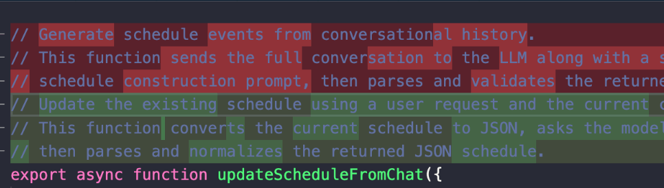
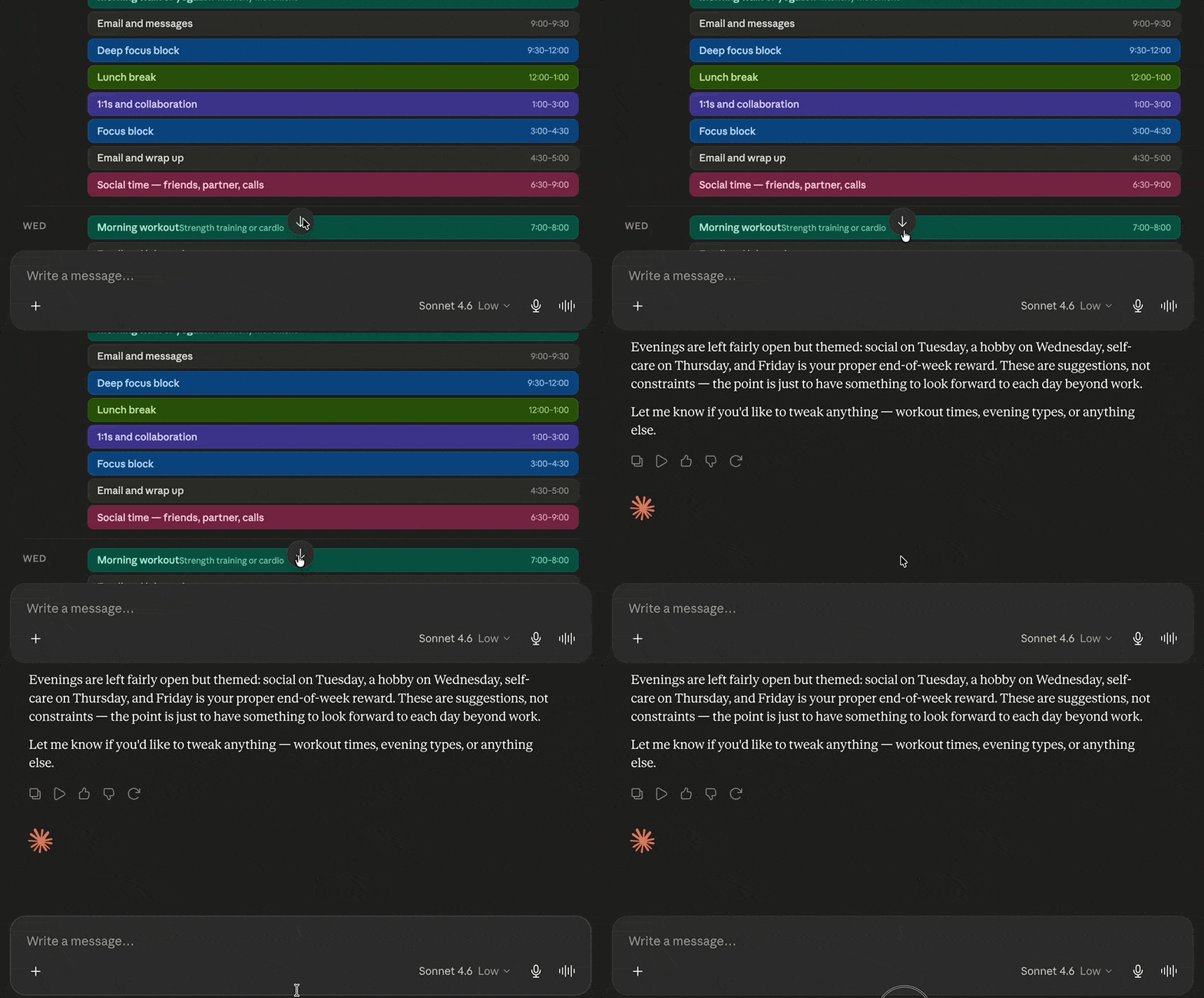
The basic idea is that when new content appears or something is updated, it gets specially marked for the user to draw their attention to it.
Sometimes that might mean literally moving their focus up or down the page to see what’s changed—like when new messages appear in an ongoing chat and the message history automatically scrolls down to display it.
But other times, it can just mean drawing the user’s eye back to a space they might not have been actively watching, even if that doesn’t include any literal movement on the page—like changing the color of revised text, putting a box or highlight around new material, or marking lines of code that are different.
Read next: AI UX Patterns for User Control

Kathryn Grayson Nanz
Kathryn Grayson Nanz is a developer advocate at Progress with a passion for React, UI and design and sharing with the community. She started her career as a graphic designer and was told by her Creative Director to never let anyone find out she could code because she’d be stuck doing it forever. She ignored his warning and has never been happier. You can find her writing, blogging, streaming and tweeting about React, design, UI and more. You can find her at @kathryngrayson on Twitter.
Related Posts
Comments
All articles
Topics
Web MobileMobile
Desktop
Design
Productivity
People