
Combining Components, HTML, and C# to Create an Effective UI
 by Peter Vogel

Summarize with AI:
Creating an effective UI doesn’t require a lot of code – just integrating and customizing the right set of Telerik components. In fact, the only code required is a single property.
Creating useful web pages involves integrating multiple components and technologies. Here's how to integrate Telerik UI for Blazor components to create a master/detail page with multiple tabs and an animated display that only shows the details when requested (and with only one new line of code).
In an earlier post, I walked through the process of combining ASP.NET Core Views (or Razor Pages) with a Blazor component containing a TelerikGrid. In that scenario, using C# on the server, I retrieved a set of Customer objects that I then passed, through the Model property of a View, to a Blazor component that displayed a list of customers in a TelerikGrid.
Using this process, the page (including my Blazor component) is rendered to HTML on the server before being sent to the browser. The net result is that the user gets a complete page without having to wait for an AJAX call to fetch the page's data after the page is displayed.
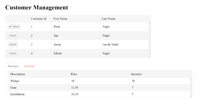
In my case, however, each customer that I'm displaying in the grid owns two collections: a set of payments and another set of purchases. When the user clicks on a customer in the grid, I want to display the two lists of payments and purchases in tabs beneath the grid of customers. I also want to highlight the selected customer so that the user gets some feedback on which customer the display payments and purchases belong to.
But, once the page is displayed in the browser, I don't want to go back to the server unless I have to (AJAX and SignalR calls excepted, of course). A combination of HTML, Telerik components, and a little bit of code delivers all of that. I can even add some animation to my UI.
Sizing the Grid with HTML and Component Attributes
By default, the TelerikGrid takes up the full page with each column in the grid dividing the space evenly. I can customize that behavior by enclosing the grid in a <div> element and setting the width on that <div> element to 75% of the page. The grid will automatically size itself to fill all of the <div> element instead of the whole page.
Within the grid, I can use the same strategy with the grid's columns to control their size (using percentages, rather than fixed widths, allows the grid to adjust its size based on the width of the browser). The result is something like this:
<div style="width:75%">
  <TelerikWindowContent>
    <TelerikGrid Data="@custs">
      <TelerikGridColumns>
        <TelerikGridColumn Field="Id"
                           Title="Customer Id"
                           Width="16%">
        </TelerikGridColumn>
        <TelerikGridColumn Field="FirstName"
                           Title="First Name"
                           Width="42%">
        </TelerikGridColumn>
        <TelerikGridColumn Field="LastName"
                           Title="Last Name"
                           Width="42%">
        </TelerikGridColumn>
      </TelerikGridColumns>
    </TelerikGrid>
  </TelerikWindowContent>
</div>
Adding a Button to Trigger Displaying Details
In order to display the purchases and payment information for a specific customer, I need to give the user the ability to select a row in the grid. In an earlier column I took advantage of the grid's native events to implement a “select row” button. However, that involved invoking and then suppressing the grid's edit functionality. There's nothing wrong with that, of course, but it makes more sense to me to use a Telerik button that doesn't require me to suppress any behavior.
Normally, each column in the grid generates its own HTML. However, by inserting a <Template> element inside a <TelerikGridColumn> element, I can include pretty much whatever I want inside the column (if you don't believe me, see Ed Charbeneau's justly named post “Why Blazor Grid Templates Will Make You Question Everything”). I can even integrate C# into the template by flagging the code with an @ symbol.
Putting all that together, I can add a column to my grid containing a <TelerikButton> element with a click event handler that stuffs the row's context into a property called currentCustomer:
<TelerikGridColumn>
  <Template>
    <TelerikButton OnClick="@(_=> currentCustomer = (Customer) context)">
      Select
    </TelerikButton>
  </Template>
</TelerikGridColumn>
By the way: Be careful when entering the <Template> element. Currently, Visual Studio will attempt to “correct” the element name to use a lower case “t” and give you <template>; you may need to restore the uppercase “T.”
Now, I need to set up the currentCustomer property to hold the selected customer:
@functions
{
  private Customer currentCustomer { get; set; }

  // ...
}
Before leaving the customer grid, though, I should provide some feedback to the user on which customer is currently selected. A little bit of extra code in my template will let me set the Icon property on the <TelerikButton> element to show a checkmark when the customer current row's context property matches the customer in the currentCustomer property:
<TelerikGridColumn>
  <Template>
    <TelerikButton Icon="@(currentCustomer == context ? "checkmark" : "")"
      OnClick="@(_ => currentCustomer = (Customer) context)">
      Select
    </TelerikButton>
  </Template>
</TelerikGridColumn>
Displaying Multiple Tabs
To handle displaying and revealing the two grids showing payments and processing, I could enclose those grids inside a <TelerikWindow> element (as I did in an another post). But where's the fun in that? Instead, I can use the <TelerikAnimiationContainer> element to have my payments and purchases slide in in some cool way whenever the currentCustomer property isn't null:
<TelerikAnimationContainer Visible="@(currentCustomer != null)"
                           AnimationType="AnimationType.ZoomOut"
                           Width="100%"
                           Height="500px">
  // ... purchases and payments
</TelerikAnimationContainer>
Because I have two sets of data to display, I'll nest a <TelerikTabStrip> element inside the animation container with two tabs: one for each of my payments and purchases:
<TelerikAnimationContainer Visible="@(currentCustomer != null)"
                           AnimationType="AnimationType.ZoomOut"
                           Width="100%"
                           Height="100%">
  <TelerikTabStrip>
    <TelerikTab Title="Purchases">
      // ... purchases grid
    </TelerikTab>
    <TelerikTab Title="Payments">
      // ... payment grid
    </TelerikTab>
  </TelerikTabStrip>
</TelerikAnimationContainer>
Within each <TelerikTab> element, I can just drop another <TelerikGrid> element bound to the appropriate property on the currentCustomer property (purchases or payments). Here's the grid entitled, “Purchases” inside its tab as an example:
<TelerikTab Title="Purchases">
  <TelerikGrid Data="@currentCustomer.Purchases">
    <TelerikGridColumns>
      <TelerikGridColumn Field="Description" Title="Description">
      </TelerikGridColumn>
      <TelerikGridColumn Field="Price" Title="Price">
      </TelerikGridColumn>
      <TelerikGridColumn Field="Quantity" Title="Quantity">
      </TelerikGridColumn>
    </TelerikGridColumns>
  </TelerikGrid>
</TelerikTab>
I'd be the first to admit that's a lot of markup. However, it's not much code (all I had to add was the currentCustomer property). But, by integrating multiple components, HTML, and some code, I've got an effective UI out of it:
Of course, this page isn't much good without giving the user the ability to update this information, so I'll look at that in my next post. Stay tuned!
Peter Vogel
Peter Vogel is both the author of the Coding Azure series and the instructor for Coding Azure in the Classroom. Peter’s company provides full-stack development from UX design through object modeling to database design. Peter holds multiple certifications in Azure administration, architecture, development and security and is a Microsoft Certified Trainer.