ASP.NET Core Basics: Creating Apps with More Accessibility

Summarize with AI:
Through concepts, syntaxes and elements, you can make webpages accessible to users, especially those with disabilities. Find out how to make an ASP.NET Core application more accessible.
The web is an incredible place where we can all search any question that comes to mind, or maybe buy something new, or even research places we want to visit. In short, the possibilities are endless.
But have you ever stopped to think that not everyone can fully access this wonderful place? That’s why it’s always important to make sure the design of your web application is as accessible and inclusive.
In addition to making your application better overall, creating inclusive applications allows people with various types of disabilities to have full access to the internet. Guaranteeing their right to participate and enjoy the benefits that other users also enjoy is a very rewarding endeavor.
Fortunately, HTML and web standards were designed with accessibility in mind, so designing an accessible application is not that difficult. You, as a developer, just need to know how to use the available resources correctly.
ASP.NET Core templates are built with Bootstrap, which has accessibility considerations built in. They have important factors that represent accessibility such as responsive design, structural markup and color contrast. Let’s take a look at some of the main resources commonly used to create an accessible ASP.NET Core application.
In this post, we’re going to create a new ASP.NET Core web app and then look at the issues that affect its accessibility. We’ll install tools to diagnose inaccessibility, and we’ll fix issues with forms and visual accessibility. Finally, we’ll use a screen reader to better understand how accessibility issues can affect user experience.
Identifying Accessibility Issues in an ASP.NET Core Application
There are several aspects that identify an accessibility-oriented design. First, let’s create a base application and add some basic HTML. We’ll then identify gaps where we can implement accessibility features.
You can access the complete project code in this GitHub repo. Note that, there are two versions of the app, one with accessibility design and the other without.
To create your project in Visual Studio, follow these steps:
- Click Create a new project.
- Choose ASP.NET Core Web App (Model-View-Controller).
- Enter a name. This example uses DevNews.
- Choose the appropriate .NET version. This example uses .NET 7.
- Click Create.
In the project you’ve created, navigate to Views > Home and replace the code in the Index.cshtml file as follows:
@{
    ViewData["Title"] = "Home Page";
}

<div class="text-center">
    <h1 class="display-8">Welcome to the Dev News</h1>
</div>

<style>
    div.button {
        width: 200px;
        height: 50px;
        border-radius: 20px;
        background-color: lightgray;
        text-align: center;
        padding: 10px;
        margin: 50px;
    }
</style>

<div class="text-center">
    <h2 class="display-10">Join our mailing list</h2>
    <p>
        Sign up and follow the news from the dev world
    </p>
    <form name="CustomerInfo">
        <div class="container">
            <div class="row">
                <div class="col-4 text-black-50">
                    Name
                  </div>
                  <div class="col-8">
                    <input type="text" id="Name">
                  </div>
            </div>
            <div class="row">
                <div class="col-4 text-black-50">
                    E-mail
                </div>
                <div class="col-8">
                    <input type="text" id="Email">
                </div>
            </div>
            <div class="button">
                <a href="#" onclick="document.getElementById('CustomerInfo').Submit();">
                    Submit
                </a>
            </div>
        </div>
    </form>
</div>

<p style="font-size: 30px"><b>All about programming</b></p>
<p class="bg-light text-muted">
    Here you will find the best content about current technology<br><br>
</p>

<div class="text-center">
    <img width="120" src="https://raw.githubusercontent.com/zangassis/dev-news/main/assets/dev-news-icon.jpg">
</div>

<p style="font-size: 30px"><b>Main topics</b></p>
<p class="bg-light text-muted">
    - ASP.NET Core<br>
    - Web development<br>
    - .NET
</p>

<p style="font-size: 30px"><b>We take your privacy seriously!</b></p>
<p class="bg-light text-muted">
    We care about your privacy.<br><br>
    Want to know more? <a href="/Privacy">Click here.</a>
</p>
Analyzing Accessibility Issues
At first glance, the code above doesn’t look like anything out of the ordinary. It contains just a form and a few paragraphs. However, there are a number of accessibility issues in it.
To identify these problems, you can use tools like Accessibility Insights for Web. You can download and install it or use it as a plugin in Chrome or Edge. This example uses it as a plugin in Chrome.
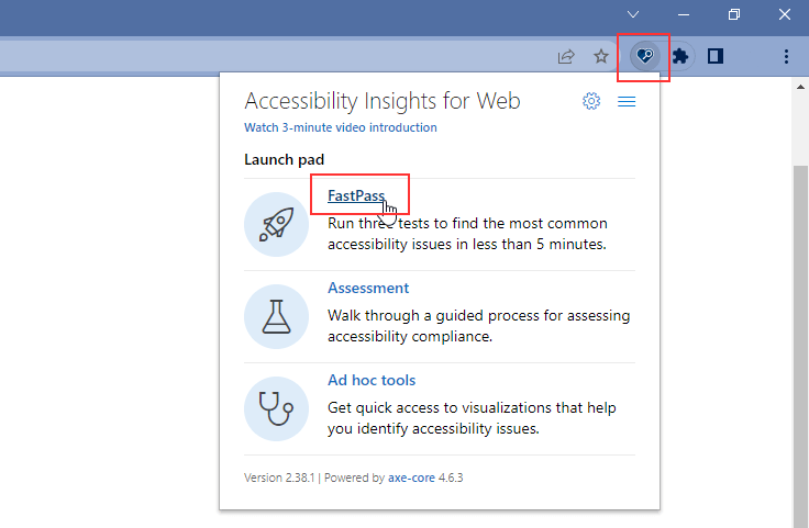
Run the application through Visual Studio. In a browser with the application’s home page open, click the Accessibility Insights for Web plugin icon. Three options will appear:

- FastPass is a simple, two-step process that helps developers identify common, high-impact accessibility issues. These include missing tabs, keyboard traps and incorrect tab order, among others.
- Assessment allows anyone with HTML skills to verify that a web application or site complies with Web Content Accessibility Guidelines (WCAG) 2.1 Level AA.
- Ad hoc tools provide quick access to views that help identify accessibility issues.
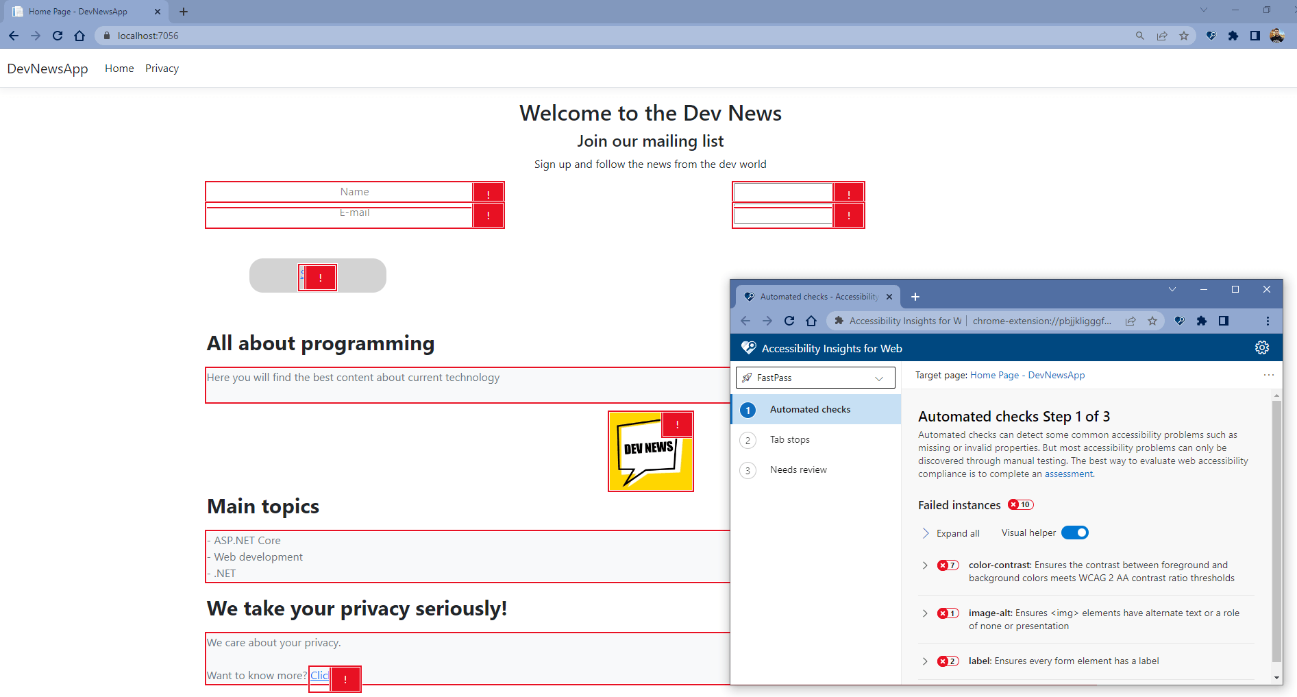
For this example, click FastPass. You can see in red all the elements that have an accessibility problem:

Note that there are several accessibility issues in our app that have been identified by the plugin. If you click on the area highlighted in red, you can see details about each error. We’ll deal with each one until our app is compatible with an accessibility-oriented design.
Failed Rules
Accessibility Insights for Web defines two lists of Failed Rules that are used to identify accessibility issues found in the application. One list is for web apps and the other is for Android devices. We’ll analyze each of the Failed Rules present in our application and correct them.
Failed Rule: Color Contrast
The plugin reports that there is a color contrast failure in some code elements. This happens because we’ve defined a text color to display with a low contrast. In this case, the text-black-50 class gives the text
with a light gray color, which may make it impossible for visually impaired people to read.
To fix it, set a darker color for the text. In all elements that have the error color-contrast, add the native ASP.NET Core class text-primary. Delete the class text-black-50 according to the example below:
Accessibility
 <div class="row">
                <div class="col-4 text-black-50" >
                    Name
                </div>
                <div class="col-8">
                    <input type="text" id="Name">
                </div>
</div>
Better accessibility
 <div class="row text-primary">
                <div class="col-4" >
                    Name
                </div>
                <div class="col-8">
                    <input type="text" id="Name">
                </div>
</div>
Note that the button div has a custom CSS that sets the button’s background color to lightgray. This poses another problem. When building a design focused on accessibility, we must give preference to colors with
high contrast, such as complementary colors, which are opposite one another in the chromatic circle. For example, blue and orange, or green and red.
In this example, replace lightgray with black to give a high contrast to the button text. Replace this code snippet:
background-color: lightgray;
with the code below:
background-color: black;
Note that other elements of our code are also failing the color-contrast rule, like the <p> tags at the end of the code block. This happens because we’re using the class bg-light.
To fix it, remove the class bg-light everywhere in the code.
Failed Rule: Label
This issue is indicated because we’re not using the <label> tag for the Name and Email fields.
So that assistive technologies can associate an element with a specific user interface object, we need to use an accessible name for fields in the application. This makes it possible for people who use assistive technology to know the specific purpose of the element.
Note that in the example with accessibility, the type of tag was also changed. What was previously text and is now email, which is more appropriate. The required class is also used to make filling in the field mandatory.
Replace the following code:
 <div class="row">
                <div class="col-4 text-primary">
                    Name
                  </div>
                  <div class="col-8">
                    <input type="text" id="Name">
                  </div>
            </div>
            <div class="row">
                <div class="col-4 text-primary">
                    E-mail
                </div>
                <div class="col-8">
                    <input type="text" id="Email">
                </div>
            </div>
with the code below:
     <div class="row">
                <div class="col-4 text-primary">
                    <label for="Name">Name</label>
                  </div>
                  <div class="col-8">
                    <input type="text" id="Name" required>
                  </div>
            </div>
            <div class="row">
                <div class="col-4 text-primary">
                    <label for="Email">E-mail</label>
                </div>
                <div class="col-8">
                    <input type="text" id="Email" required>
                </div>
            </div>
Failed Rule: image-alt
Images cannot be interpreted directly by assistive technologies. Instead, they use alternative text that must be entered into the image element. Based on this text, the assistive technology can communicate the meaning of the image to users.
The image in our code doesn’t have the "alt="image-description" property, so it’s failing the image-alt rule. To solve this problem, just add the alt property to the <img> tag and add text in it.
Replace this code snippet:
<img width="120" src="https://raw.githubusercontent.com/zangassis/dev-news/main/assets/dev-news-icon.jpg">
with this one:
<img width="120" src="https://raw.githubusercontent.com/zangassis/dev-news/main/assets/dev-news-icon.jpg" alt="Dev News icon">
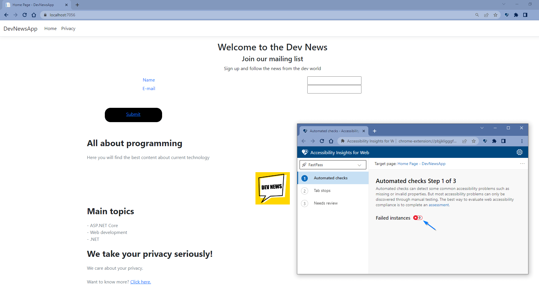
If you followed all the previous steps, all accessibility issues should be resolved when you run your application and open the Accessibility Insights for Web FastPass feature. Your result should be similar to the following image:

Tab Stops
Tab stops are a very important element for web accessibility. For example, a visually impaired person can use them to navigate through the page using the Tab key on their keyboard. Let’s check if these are properly implemented in our application.
In the FastPass menu of the Accessibility Insights for Web plugin, follow these steps:
- Access Tab stops.
- Enable the Visual Helper function.
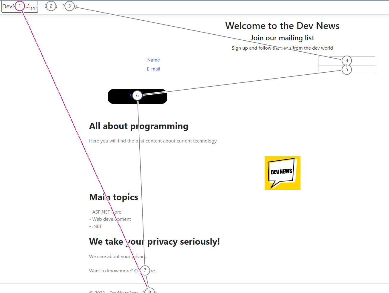
- In the tab with the initial screen of the application, press the Tab key on the keyboard to follow the flow, as shown in the image below.

Testing Accessibility with a Screen Reader
Narrator is a native Windows feature that is used to read the screen, allowing users to complete common tasks without a mouse.
To enable Narrator in Windows, use the keyboard shortcut combination Windows logo key + Ctrl + Enter. To turn Narrator off, just press these keys again. You can also turn on Narrator manually by pressing Windows logo key + Ctrl + N to open Narrator settings, then turn the feature on or off via the toggle.
With the application running and Narrator enabled, access the page where the application is running.
Select 1 on the keyboard. This instructs Narrator to read the <h1> title on the page, and you should hear Narrator speak the phrase “Welcome to the Dev News.” Press key 1 again, and Narrator reports that
there are no more
<h1> elements. That is correct for this application—the page should only contain a single <h1> element.
Select key 2 on the keyboard to have Narrator read the <h2> title. You should hear Narrator speak the phrase “Join our mailing list.” Press the 2 key again, and the Narrator reports that there are no
more <h2> elements.
However, this is incorrect. There are other important points on the page, but because they are not within a title, Narrator ignores them. To fix this, make the following code changes:
Replace:
Here you will find the best content about current technology
with:
<h2>Here you will find the best content about current technology<h2>
Replace:
<b>We take your privacy seriously!</b>
with:
<h2>We take your privacy seriously!</h2>
Another problem is the link with the text Click here. Narrator reads this text, which doesn’t indicate anything specific for the reader. They’re just told to click there. To make things clearer, replace the
code:
Want to know more? <a href="/Privacy">Click here.</a>
with:
Please visit our <a href="/Privacy">privacy policy</a> for more information.
Now run the application again, enable Narrator and select key 2 on the keyboard again. This time, you should hear all the titles set as <h2> which now offer more information.
Click the Tab key until you reach the privacy link at the bottom of the page. Narrator should speak the text aloud “privacy policy.”
Conclusion
If you do a full review of this example application’s code, you might notice that there are still a few minor accessibility issues on the page. Resolving all of them is beyond the scope of this post, so feel free to dig deeper and resolve them on your own.
In this post, you were introduced to the subject of accessibility, a very important topic in software development. Whenever you develop a new application, consider adding accessible elements with the tips given in this post. Take advantage of the benefits of web accessibility, both for yourself as a developer and for those who will use your software.


