
Understanding Color and Accessibility

Summarize with AI:
When it comes to making your applications accessible, the colors that you choose play a huge role! This is especially true if you’re trying to meet accessibility-related legal requirements, such as the European Accessibility Act or Section 508.
From contrast ratios to communicating information and offering users optional themes, let’s take a look at ways you can optimize your color choices to be as accessible as possible!
Color Contrast
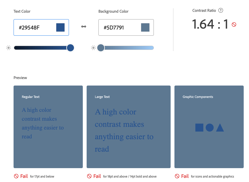
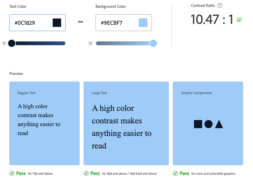
When you’re choosing colors for your various UI elements, it’s important to make sure you’re meeting an accessible standard for color contrast. The WCAG (Web Content Accessibility Guidelines) defines three levels of color contrast ratios—failing, AA and AAA. AA level means your colors have enough contrast to be readable, but might still present problems for some users. AAA level means you have achieved extremely high contrast that should be readable for the vast majority of your users. You should always aim for AAA compliance, but making sure you’re not failing is a good starting point.
Text, especially, is incredibly difficult to read when there’s not enough contrast between it and the background color—and this is only exacerbated for any of your users with less-than-perfect 20/20 vision. Not to mention, there are lots of adjustments a user can make to their display—night shift, brightness, monitor calibrations, etc.—all of which can impact your colors in ways that are entirely outside your control. One of the best ways you can allow your app to remain accessible through all of this is to pay attention to your color contrast ratios and ensure that they comply with the WCAG standards, so you have some wiggle room to accommodate these extenuating circumstances.
Fortunately, this is a really easy thing to do, because color contrast analyzers are easily found online just by googling “color contrast checker.” My personal favorite is the Adobe Color accessibility tools, which does a great job of showing examples for different color contrast situations, as well as allowing you to simulate different versions of colorblindness to see how your color palette would look to differently sighted users.
Value
You might already be familiar with the color contrast ratios and even understand why they’re so important—but do you know the color theory behind how they work?
When we’re talking about color contrast, what we’re primarily talking about is a comparison of values. Value is the lightness or darkness of a hue—it’s what creates the difference between sky blue and navy. You can change the value of a color in three ways: by adding white to create a tint, adding gray to create a tone or adding black to create a shade. When the values of two different colors are too similar, that’s when you run into contrast issues. Some colors (like bright oranges or reds) will be especially difficult to achieve high contrast with because their values fall right in the middle of the spectrum—it’s hard to go either light or dark enough to contrast with them effectively.
A great quick, way to check your contrast (and see this in action) is to convert your display to grayscale, which takes the hue out of the equation and only shows you the value. If you can’t easily read the text or understand the layout when it’s in grayscale, chances are you have a color accessibility issue that needs solving.
Communicating Information via Color
Another important aspect of accessibility and color is ensuring that you’re not communicating any information through color alone. This is a dangerously easy trap to fall into, unfortunately—especially with things like forms, data visualization and confirmation/cancellation dialogs.
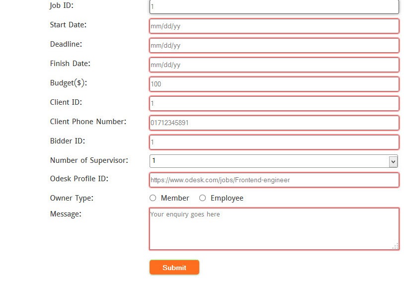
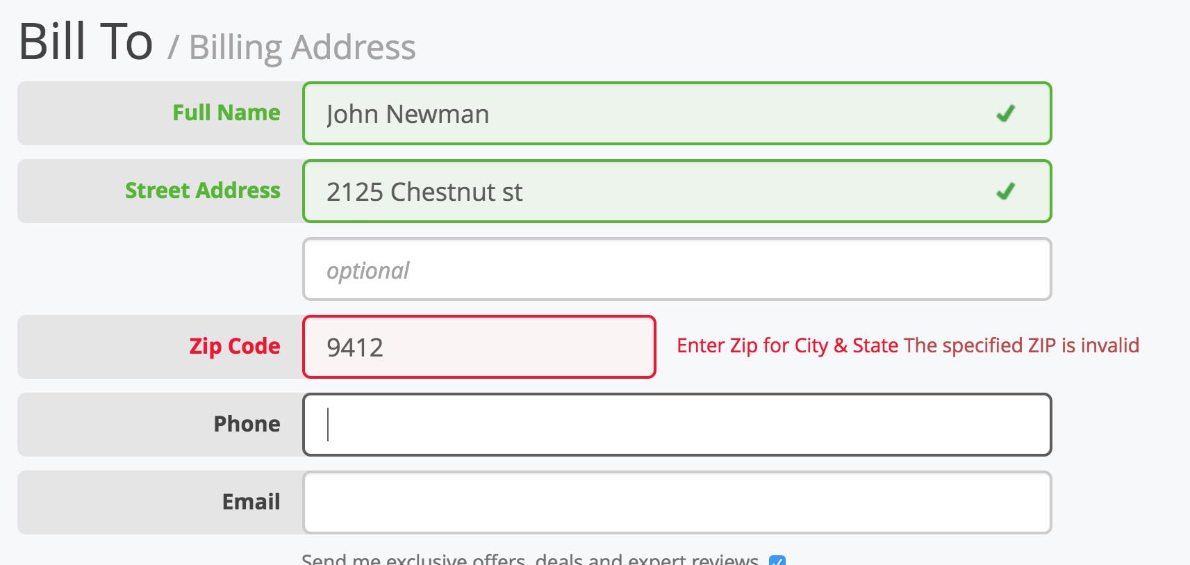
In fact, let’s take a look at some forms to see an example. How many times have you seen a form that changes the border color of an input element to red in order to signify failed validation? It’s not such a bad thing to do ... as long as you also make sure to include some kind of icon, text or other element to indicate to the user that something isn’t right. If you’re relying on the red border color alone, then there’s a large percentage of your users who will struggle to figure out why their form won’t submit.
Bad Example
Good Example
Charts and Data Visualizations
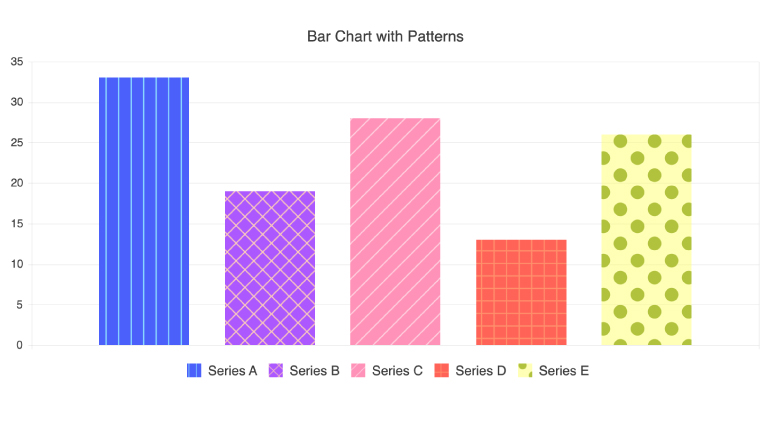
In addition to forms, another common place where color gets (unfortunately) used to convey information is in charts and data visualizations. Many times, we see things like a bar chart that uses differently colored bars and relies exclusively on a color-coded key to understand and connect the labels.
While this may seem like a simple and useful approach, it excludes our users who may be colorblind, users who have low vision (and difficulty distinguishing similar colors), users who have nightshift or other color adaptations applied to their monitors—or just anyone who wants to print out that chart in black and white.
An easy way to work around that is to use patterns in your charts, in addition to colors. In fact, the Kendo UI Chart component allows you to do just this—customize your charts with crosshatching, diagonal stripes, dots, a grid or vertical stripes to help differentiate the information using more than just color. Now, these bar chart elements can be easily distinguished, even when viewed with no color at all!
Theming
These days, it’s becoming more and more popular to offer multiple theme options in your application and allow your users to choose the one they like best. Almost all apps now include light and dark themes, but some go beyond that to offer all sorts of color palettes! This is not only a delightful touch for your users, though—it can also be an accessibility tool for them.
Dark Mode
Offering a dark mode is actually a really great thing you can do to support your users … even if you might not have thought of it as an accessibility feature before now! Dark mode is important for folks that struggle with migraines, light sensitivity, eye strain and similar. Most folks already kind of know this, but might not really be thinking about it as an actual accessibility feature—but I’d bet that the majority of developers have their code editor set to a dark theme in order to reduce the eye strain of staring at their computers all day.
However, dark mode (and other alternate color themes) are often forgotten when you’re running accessibility checks—can you really guarantee that your color contrast is still good enough in dark mode, or that your focus highlight is still clearly visible? It’s not enough to only be accessible in the default theme! If you’re offering multiple color themes but only one of them is accessible ... then you’re not really offering multiple color themes to everyone.
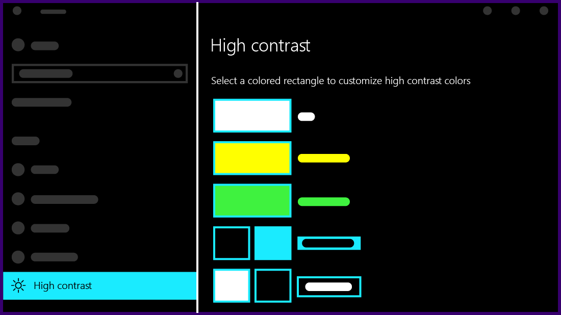
High-Contrast Themes
Another thing worth considering is high-contrast themes. You might have seen these before; they usually use a pure black background color and then neon colors for the rest of the palette. You might find it visually jarring or unpleasant, but pleasantness isn’t the goal—it’s purely an exercise in readability. The example here is one of the Windows OS high-contrast themes, and you can see that the colors they’ve chosen stand out starkly from the black background. If you’re creating color themes for an application UI, it‘s worth considering adding a theme like this in addition to whatever standard themes you’re planning to include.
Accessible Theming in Kendo UI
If you’re using Progress Kendo UI, then you have access to a color palette that will take care of all your color contrast issues right out of the box: the Ocean Blue A11Y swatch. Swatches are specific color customizations that can be applied to any theme—in this case, the Ocean Blue A11Y swatch can be applied to the main Telerik and Kendo UI Default Theme.
While the Progress Telerik and Kendo UI components already adhere to a high level of compliance in terms of keyboard navigation and general functionality, using this swatch will help improve accessibility compliance even further—one less thing for you to worry about when you’re coding!
This swatch was created to meet WCAG AA standards for color contrast (4.5:1 for normal text, 3:1 for large text) and also includes high-contrast focus indicators to comply with the WCAG requirements regarding focus. Consider adding it as an alternate, user-selectable theme in your application and know that you’ll be offering your users an accessible experience.
Conclusion
Once we acknowledge the reality that accessibility is a required part of the full functionality of the product, that truth can inform every decision we make around planning, design, development and testing. Working as a developer, by nature, involves constantly learning new things and adjusting the way we think about software and the web. The more you can learn about accessibility and start implementing that knowledge in your work, the more your users will benefit!

Kathryn Grayson Nanz
Kathryn Grayson Nanz is a developer advocate at Progress with a passion for React, UI and design and sharing with the community. She started her career as a graphic designer and was told by her Creative Director to never let anyone find out she could code because she’d be stuck doing it forever. She ignored his warning and has never been happier. You can find her writing, blogging, streaming and tweeting about React, design, UI and more. You can find her at @kathryngrayson on Twitter.
Related Posts
Comments
All articles
Topics
Web MobileMobile
Desktop
Design
Productivity
People
