New: Fluent Theme Figma Kits and ThemeBuilder Pro Support!

Summarize with AI:
We’re proud to introduce a Fluent Figma UI Kit, plus Fluent support in Progress ThemeBuilder!
Is Your Team Using the Fluent Design System?
If so, then we have fantastic news: to expand our Fluent theme for the Telerik and Kendo UI Component Libraries, we’re proud to introduce a new Fluent Figma UI Kit, as well as Fluent support in ThemeBuilder!
What’s the Fluent Theme?
Fluent is an open-source, cross-platform design system managed and maintained by Microsoft. They place a particular emphasis on accessibility, internationalization and performance.
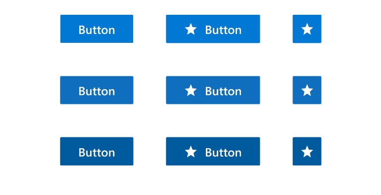
If you’re using our ASP.NET MVC, ASP.NET Core, Blazor, jQuery, Angular, React or Vue UI components, you can use our Fluent theme to blend those components seamlessly with anything else using the Fluent design system.

The new Fluent theme was announced in September as part of our R3 release, so we’re excited to offer Figma UI Kit and ThemeBuilder support for Fluent as well! This will make it even easier for you to create beautiful designs using Telerik and Kendo UI components in coordination with the Fluent Design System.
ThemeBuilder Fluent Support
As of November 9, 2022, ThemeBuilder now supports our new Fluent theme!
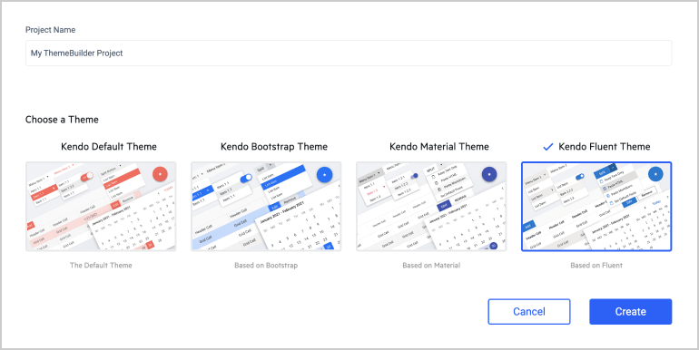
ThemeBuilder is a web application that functions as a full WYSIWYG editor for all our components, allowing developers or designers to dive deep and customize the details of each component—without touching any CSS or Sass. It’s our recommended approach for teams who want to make design changes to the Telerik or Kendo UI components in a visual, no-code environment and then export code directly.
Select any of our themes (including the Fluent theme) as a base, and then customize away!

Figma UI Kit Fluent Support
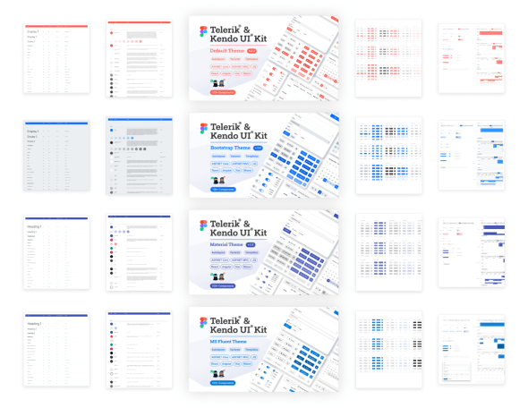
As of November 14, 2022, we now offer a Fluent themed Figma UI Kit!
If you’re not familiar with the concept of a UI kit, it’s a collection of all the elements of your UI design, including (but not limited to) fonts, colors, icons, component design files and documentation. These are useful on their own, both as a form of documentation and to speed up the design process by providing a set of base elements that can be re-used in new designs, but are especially powerful when combined with an existing component library—as we offer via the the Telerik and Kendo UI Kits for Figma.
With our Figma Kits, we offer designers an inside look at how all of our 100+ components are designed, including all their various user interaction states and the atomic design principles we’ve used to build our library. This gives designers an innate understanding of how the components work, and how visual styles are carried through from our smallest tokens all the way up to our most complex components. It’s our recommended approach for teams that include a designer who wants to customize the Telerik or Kendo UI components.
Just head over to our Figma Community page and make a copy of the MS Fluent Theme Figma Kit to get designing!

Telerik & Kendo UI Empowers Your Design Process
If you have a designer, they’ll love the depth and resources of our Figma Kits, allowing them access to every Telerik and Kendo UI component—in their native design software. For teams of all shapes and sizes, ThemeBuilder is here to make editing, previewing, sharing and implementing design changes easier than ever before!
With our expanded Fluent theme support, we’re excited to empower more developers to get involved in the design process and close the handoff gap. We can’t wait to see what you build!

Kathryn Grayson Nanz
Kathryn Grayson Nanz is a developer advocate at Progress with a passion for React, UI and design and sharing with the community. She started her career as a graphic designer and was told by her Creative Director to never let anyone find out she could code because she’d be stuck doing it forever. She ignored his warning and has never been happier. You can find her writing, blogging, streaming and tweeting about React, design, UI and more. You can find her at @kathryngrayson on Twitter.

