Unifying Your UIs With Telerik Material Theme

Summarize with AI:
Creating a consistent experience for your web users across all of the technologies and tools you use can be … challenging. The Telerik Material theme can make achieving that goal considerably easier.
When it comes to UX design for web applications, the three things that your users value most are “Consistency, consistency and … (wait for it) … consistency.”
The problem is that most organizations use a combination of server-side and client-side tools to create their web applications. When it comes to creating consistency in the Microsoft world, it helps that the technology used on the server is some version of ASP.NET (currently, ASP.NET Core). On the client side, however, the technology for creating an applications’ UI might be any one of “plain old” JavaScript+jQuery or the current “usual suspects” in client-side frameworks: Angular, React and Vue. And, just to make things more interesting: Blazor.
In fact, many organizations are using more than one of those client-side frameworks. Couple that with a variety of development tools (for example, Visual Studio Code or Visual Studio) and delivering consistency is going to be a challenge. Just ensuring that all of your applications “look alike” (the base level of consistency) can be a time-consuming task.
Which is why, of course, we have CSS stylesheets … and Telerik themes.
Introducing Material Design
The Telerik environment supports using any of three pre-defined themes—Default, Bootstrap and Material (along with multiple variations called “swatches”)—to give you visual consistency across your applications.
As a visual design tool, Bootstrap is so popular that, ever since the open-source toolset was released in 2011, its default settings have created a virtually de facto standard for “how a webpage looks.” Telerik’s Bootstrap theme not only supports the current version of Bootstrap (version 5) but, if you pick the right swatch, also versions 3 and 4.
But the new kid on the block (though only by three years, premiering in 2014) is Google’s Material Design. While Bootstrap focuses on simplifying creating webpages, Material Design has more ambitious goals: Material Design’s purpose is to create “a new visual language that combines principles of good design with technical and scientific innovation.”
Material Design is based on a paper and ink paradigm but rethought to take advantage of the digital environment. To quote designer Matías Duarte, “unlike real paper, our digital material can expand and reform intelligently. Material has physical surfaces and edges. Seams and shadows provide meaning about what you can touch.”
Material Design isn’t just about a page’s appearance—Material Design also provides guidance on how users interact with the application the pages are part of. As Dylan Lee at Eclipse Media Solutions notes, “Using motion, Material Design seeks to place the user in the center, making actions that [the user takes] fluid … with clear transitions and feedback.”
In developing Material Design, Google obviously has the Android OS and related personal devices on its mind (just to make that point, the latest version of Material Design on Android is called “Material You”). However, Google has also implemented Material Design for iOS, the web and Flutter (which is inherently cross platform). As a result, Material Design is a natural choice for creating a look that spans all platforms.
The Telerik Material Theme
The Telerik Material theme closely implements the look and feel of the Material Design Guidelines—getting you over the first step in implementing a Material Design UI. To support designing with the Material theme, if you’re using Figma as your UI design tool, you can also download a Material support kit. At the implementation level, the Telerik extensions to Visual Studio Code and Visual Studio make it easy to apply Telerik’s Material theme to your projects.
And you’re not limited to the default Material theme, as Telerik provides several Material swatches for you to pick from. If none of those variations meet your needs, Telerik’s themes expose literally dozens of Sass variables that you can use to customize the theme.
If that still doesn’t give you the theme you want, you can generate your own set of CSS files using the Progress Sass ThemeBuilder starting with your framework and base theme (Angular and Material, for example).
Themes With Visual Studio Code and Angular/React/Vue or just jQuery and CSS
When it comes to implementing a theme, creating a project in Visual Studio Code based on the Material theme is easy. First, add the Kendo UI Productivity Tools extension to Visual Studio Code from the Extensions choice in the Explorer pane on the left.
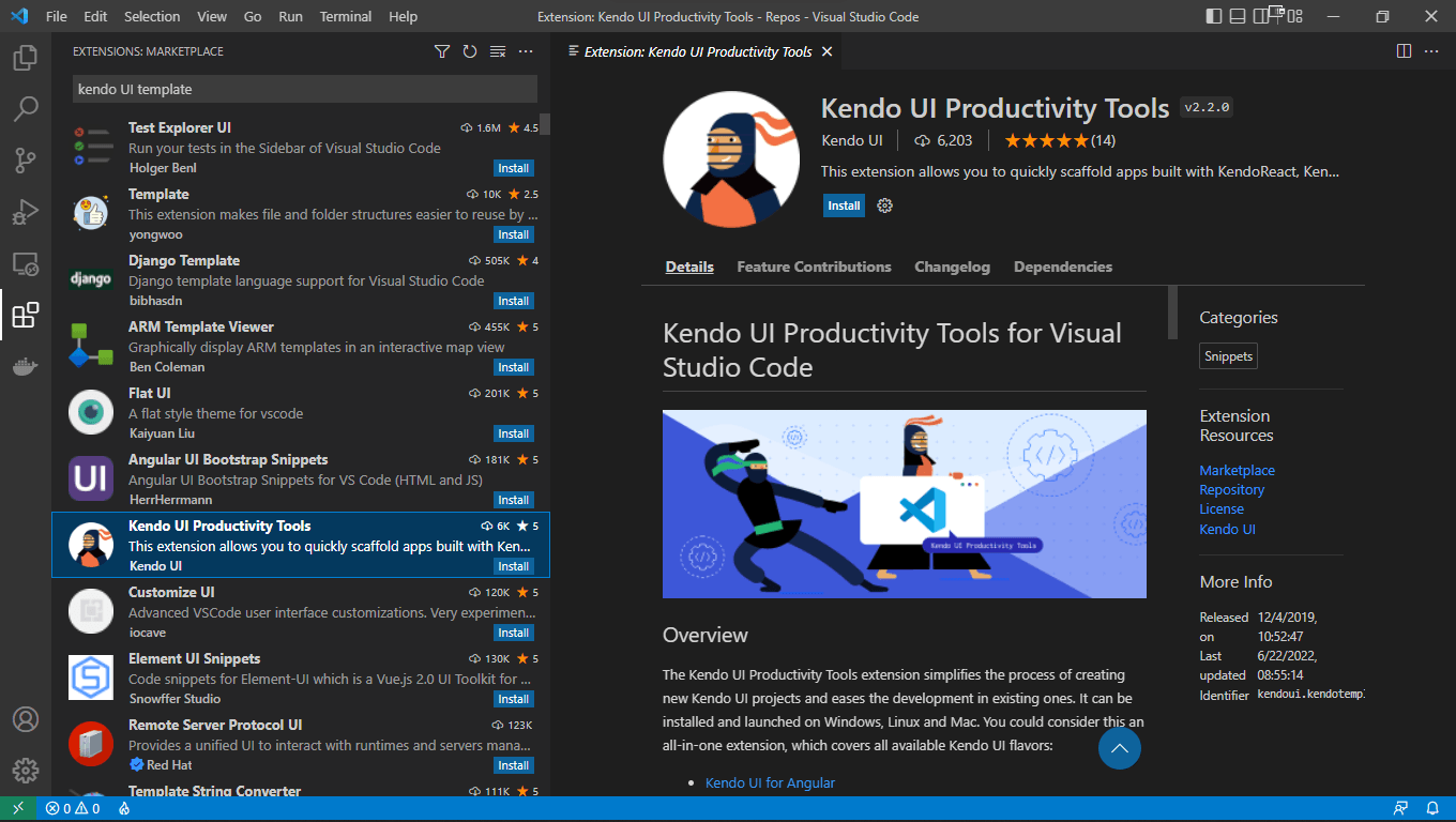
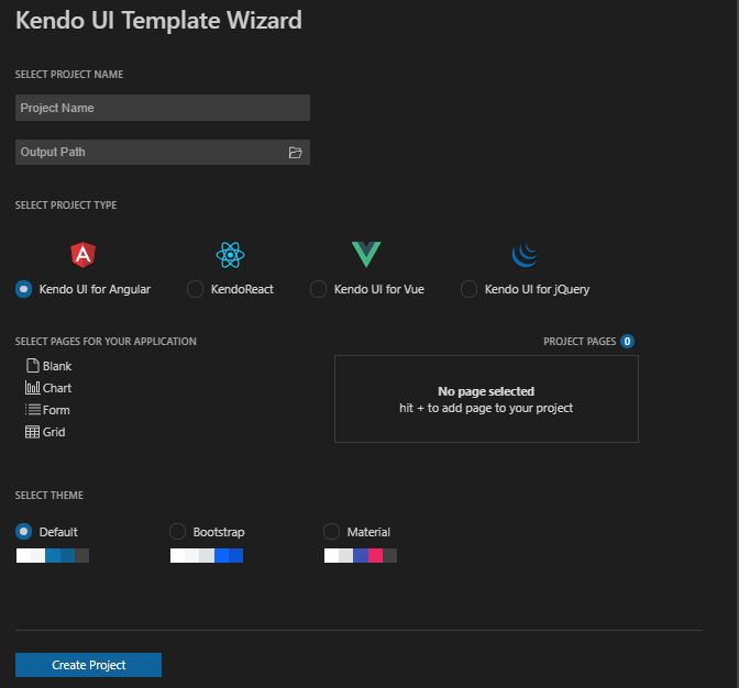
Once that extension is installed, use CTRL (or Command) + Shift + P to bring up Visual Studio Code’s Command Palette and launch the Kendo UI Template Wizard from it.

That displays a Visual Studio Code single page wizard. Working your way down through this wizard page lets you pick the development platform (jQuery, Angular, React or Vue) for your project, add any default pages you want, and select the theme you want applied to your application.
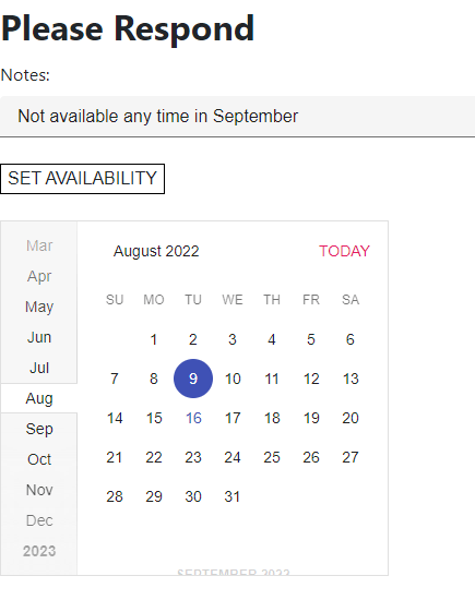
As an example of what you get with the default theme, here’s a simple Angular form that uses the base Material theme with Telerik’s TextBox and Calendar components.
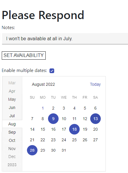
As this example shows, this flat, paper-based design for the calendar uses muted colors for less critical information (the calendar as a whole) along with bold colors that cause critical information (the selected dates) to pop. Sharp edges and color flows divide the month list on the left from the date area on the left while effectively highlighting the current month (which is visually integrated into the dates on the right). Even though the colors used in the calendar itself are muted, the calendar is still very readable.
The theme also contributes to implementing user-centered interactions. For example, as users move their mouse over the calendar, individual dates are highlighted with a circle that mimics the blue circles around the selected dates. This provides the user with feedback on both what date will be selected when the user clicks and what the result of that click will be.

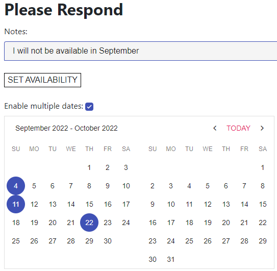
And here’s a similar form in React, using the React Calendar control. Telerik’s Material theme maintains the Material look and feel even across platforms.
Not surprisingly, there are functional differences between components in the different platforms—the React Calendar doesn’t support select supporting multiple dates. Instead, among other date-related components, the React MultiViewCalendar lets you give the user the ability to select more than one date. The Material look and feel is also maintained across different (though related) components.
The Material Theme in Visual Studio and ASP.NET Core/Blazor
If you’re using Visual Studio, then adding a theme to a new project is equally easy: From File | New | Project menu, select either the Telerik ASP.NET Core MVC Application or Telerik C# Blazor Application templates, depending on what kind of project you want to create. Both templates include wizards that let you pick the theme (or swatch within a theme) that you want.
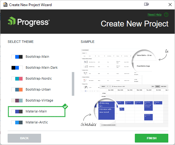
And here’s the ASP.NET form of the sample page using the base Material theme:
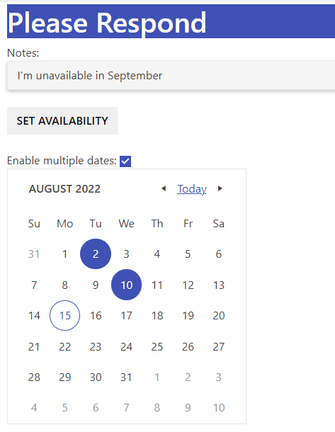
While the ASP.NET Core Calendar is a different component than the Angular and React component and, as a result, has a different layout, the page still shares the same look and feel of the Angular and React examples. The markup to get this appearance just requires you to set the component-type attribute to “modern,” like this:
<kendo-calendar selectable="single"
                component-type="modern"
                name="calendar">
</kendo-calendar>
The Blazor version gives a virtually identical experience to the ASP.NET Core experience.
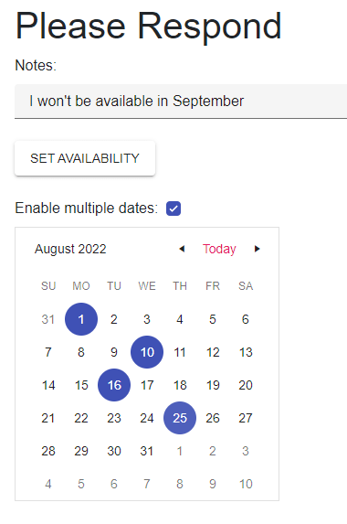
Any Telerik components you use will automatically pick up the project’s theme but it’s also easy to integrate any ordinary HTML elements on your page into the theme, thanks to pre-defined CSS classes included with the theme. All of these classes have names that begin “k-” followed by the element type. Here’s a sample of how the header and the first label have been styled using two predefined classes:
<h1 class="k-header">Please Respond</h1>
<label class="k-label">Notes: </label>…
Changing Themes
In the unlikely event that you want to change your theme, it’s not difficult to do, especially if you’re using ASP.NET Core in Visual Studio: From Visual Studio’s Extensions menu just select Telerik | Telerik UI for ASP.NET Core | Configure Project to open a wizard that lets you select a new theme. Any Telerik components you’re using automatically pick up the new theme.
As an example, here’s the previous ASP.NET Core application with the Material Dark theme swapped in.
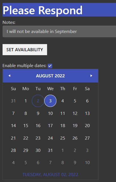
It’s equally easy to change the theme on any of the platforms if your application is using the CDN version of the theme’s CSS files. As an example, the <link> element for the base Material theme looks like this in an
ASP.NET Core project:
<link id="theme" rel="stylesheet"
         href="https://kendo.cdn.telerik.com/themes/5.4.0/material/material-main.css" />
To change to the dark version of the Material theme, you just need to tweak the CSS file reference in the element’s href attribute to this:
<link id="theme" rel="stylesheet"
         href="https://kendo.cdn.telerik.com/themes/5.4.0/material/material-mainblack.css" />
You’ll notice that the “k-*” style classes you can use to style HTML element don’t incorporate the theme in their names. Since each theme has equivalently named CSS classes, HTML styled with these classes always reflect the project’s current theme. This not only allows you to switch themes easily but to even to do it dynamically at run time.
Getting the look and feel of your pages right is the first step in unifying your application UIs but, to fully implement a Material Design, you’ll also need to get the user interaction right. Certainly, applying Telerik’s Material theme frees you up to concentrate on implementing those interactions.
But, on top of that, the default behavior of the Telerik components goes a long way to implementing Material Design’s interaction goals. If, for example, you change a month in the ASP.NET Core Calendar control, the old month “rolls away” and the new month “rolls in” in the direction of the arrow used to change the month. If you change the month in the Angular calendar’s month list, the month rolls in from the top or bottom, depending on whether the user picked a date higher or lower in the list. Basically, the screen response echoes the user’s actions.
Telerik’s themes, extensions and components let you deliver a unified experience to your users, based on a modern cross-platform paradigm, no matter what platform or development tool you’re using.
Next, learn about the Fluent theme, which you can similarly use to unify your apps.
Try DevCraft Today
Get started with a Telerik DevCraft Trial today! The DevCraft suite is the most powerful collection of Telerik .NET and Kendo UI JavaScript developer tools. It includes modern, feature-rich, professionally designed UI components for web, desktop and mobile applications; embedded reporting and report management solutions; document processing libraries; and automated testing and mocking tools.
DevCraft will arm your developers with everything needed to deliver outstanding applications in less time and with less effort, and with consistent theming across your applications.
With award-winning technical support delivered by the developers who built the products and a ton of resources and trainings, you can rest assured that you have a stable provider to rely on for your everyday challenges along your software development journey.

Peter Vogel
Peter Vogel is both the author of the Coding Azure series and the instructor for Coding Azure in the Classroom. Peter’s company provides full-stack development from UX design through object modeling to database design. Peter holds multiple certifications in Azure administration, architecture, development and security and is a Microsoft Certified Trainer.

