Themes Magic in Telerik UI for Blazor

Summarize with AI:
If you want your application to not only work but to also look like something create by a professional, UI for Blazor themes are the answer. Plus they support all the customization you need.
You open Visual Studio, pick Create a New Project, pick one of the Blazor project templates, and you’re ready to create a fully functional Blazor application. If you’re working in Visual Studio Code, you’ll grab the Telerik UI for Blazor Template Wizard from the Extensions tab and then use the wizard to create your project (there’s even a step-by-step guide to using the wizard to guide you through the process).
But, after you get your application working, you’ll need to invest some time on your application’s HTML and CSS to make your app look, well, “professional.”
There’s a better option: You can use Telerik UI for Blazor’s themes and, just by selecting the right project template options, get an application that already looks like a professional app. And, if you want, you can create a UI that mimics two of the most popular application styles: Bootstrap and Material. Finally, if you’d prefer, you can customize your selected them to match your preferences or your organization’s preferred style.
Adding Themes to Your Project
The first step in using Telerik Blazor themes is to add the necessary files to your project. The are two ways to do that:
- Have the files included when you create your project using Telerik’s Create New Project Wizard
- Pick up the files later
If you want, do both: Set a theme when you create your project so you can get going quickly but then change to a different theme by adding the appropriate files later.
Creating a Project with Themes in Visual Studio
To have the files included when you create your Visual Studio project, use the Telerik C# Blazor Application template when you create your project. That starts a three-step wizard.
In the wizard’s first step, you get to pick a layout for your application’s UI.
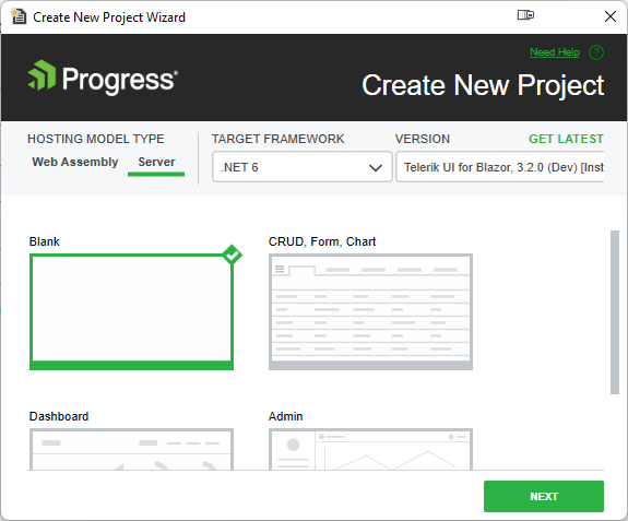
Once you’ve picked a layout, the second step of the Wizard will let you pick a theme (I’ll skip over the wizard’s third step which lets you turn on localization).
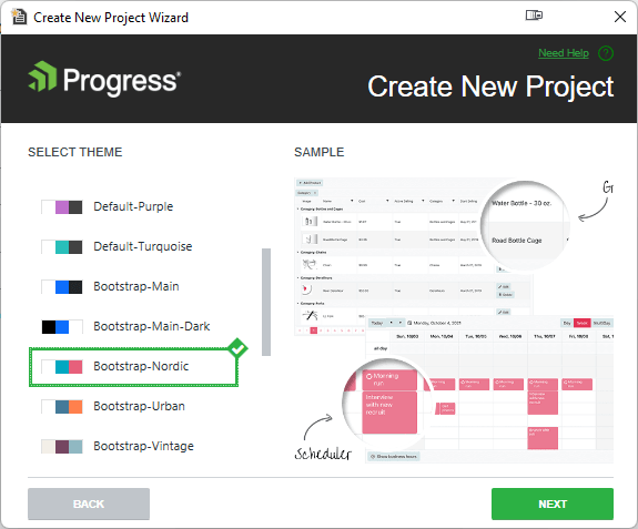
In that second dialog, the themes are broken into three categories: Default, Bootstrap and Material. The Bootstrap theme gives you many of the features you get from using Bootstrap (both for styling and layout). The Material theme echoes the styling used by Material Design (a system of guidelines/components/tools designed to be used in both browser and mobile apps). Plus each theme has various color variations to choose from, or “swatches”
Creating a Project with Themes in Visual Studio Code
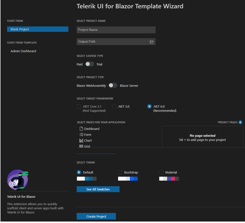
With the Visual Studio Code wizard, the process is similar but, like all good Visual Studio Code wizards, fits onto one page.
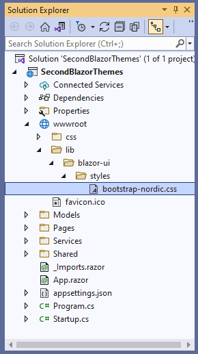
Once your project is opened in Visual Studio, you’ll find a CSS file in Solution Explorer, tucked into your project’s wwwroot\lib\blazor-ui\styles folder. That CSS file will have a name that reflects the theme you picked in the wizard. Because it’s already been minimized, though, you won’t be able to customize it.
In Visual Studio Code, the required files aren’t added to your project. Instead, in a client-side/WebAssembly Blazor application a <link> tag is added to the <head> element in the index.html file that’s
the default startpoint for your application:
<link rel="stylesheet" href="_content/Telerik.UI.for.Blazor/css/kendo-theme-material/all.css" />
In a server-side project, the equivalent link is in the _layout.cshtml file.
In a Visual Studio code project, to pick another theme, just change the theme name in the <link> tag’s ref attribute. The sample <link> tag above uses the Material theme and, as a result, the URL in the ref
attribute includes kendo-theme-material. Switching to the bootstrap theme just means changing the URL in the ref attribute’s to use kendo-theme-bootstrap.
Adding Theme Files to an Existing Project
If you have an existing Visual Studio project (or just want to change the theme you selected when you created the project), you can add the required files for a theme to your project. This process is also the one to use to a set of theme files that you can customize.
In Solution Explorer, right-click on your project and select Add | Client-Side Library to open a dialog that will add the files to your project (the dialog will also update the libman.json file in your project, ensuring that any missing files will be automatically restored when you build your project).
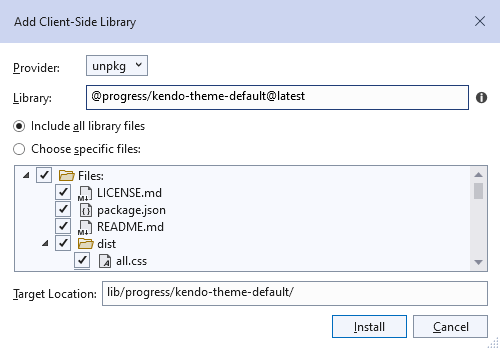
In the Add a Client-Side Library dialog, set:
- The Provider dropdown list at the top of the dialog to unpkg
- The Library textbox below the dropdown list to the theme category you want (
progress/kendo-theme-default@latest,progress/kendo-theme-bootstrap@latestorprogress/kendo-theme-material@latest) - The Target Location textbox to where you want the files to go (I’d stick with the default)
One warning: The current (Visual Studio 2022) version of the dialog doesn’t respond well to pasting in the entire library name—you’ll probably need to type at least some of the library name for the dialog to work as intended.
Finally, click the dialog’s Install button, and Visual Studio will fetch the theme files for you. Unlike the single .css file added with the template, this option adds a set of unminimized .scss (Sass) files and an all.css file built from those Sass files.
Visual Studio’s Add Client-Side Library dialog puts the downloaded files in a different folder in your project than the files added when you create the project with Telerik template. That means you can add the files using the template when you create the project and then, at your convenience, add/change to a different theme later.
In fact, by default, each theme category is installed in a different folder, so you could add all three categories to a single application. This would enable you to offer the user the choice of themes by including a <link> element in
your Blazor component and binding a field or property to the element’s href attribute.
<link href=" @cssFile" rel="stylesheet" />
Using the Themes in Your Application
Once you have the CSS file in your Visual Studio project, in a client-side/WebAssembly Blazor application, you’ll find a <link> element that references that single, minimized, local .css file in your wwwroot/index.html file:
<link href="lib/blazor-ui/styles/material-main-dark.css"

rel="stylesheet" type="text/css" />
In a server-side Blazor application, you’ll find a similar <link> element in the _Host.cshtml in your project’s Pages folder. That version takes advantage of the Url object’s Content method
to build the href attribute dynamically:
<link href="@Url.Content("lib/blazor-ui/styles/bootstrap-nordic.css")"
  rel="stylesheet" type="text/css" />
In Visual Studio, if you added the files using the Add Client-Side Library option, you’ll get all the Sass files that define every one of a category’s swatches (color variations). That’s a lot of files: the Default category, for example, has both Main and Main-Dark swatches, with Main-Dark having five “sub-swatches.” While that’s a lot of files, it does position you to customize the individual files you want to change.
Fortunately, you only need to reference the all.css in the folder for the category you added. That will be one of these elements, depending on which theme category’s files you downloaded:
<link href="/css/kendo-themes/default/dist/all.css" rel="stylesheet"/>
<link href="/css/kendo-themes/material/dist/all.css" rel="stylesheet" />
<link href="/css/kendo-themes/bootstrap*dist/all.css" rel="stylesheet" />
If you’d prefer, you can also get the “all.ccs” versions of the stylesheets from a Content Delivery Network using one of these URLs (again, based on the category you want to use):
<link href="https://blazor.cdn.telerik.com/blazor/3.4.0/kendo-theme-default/all.css"
  rel="stylesheet" />
<link href="https://blazor.cdn.telerik.com/blazor/3.4.0/kendo-theme-bootstrap/all.css"
  rel="stylesheet" />
<link href="https://blazor.cdn.telerik.com/blazor/3.4.0/kendo-theme-material/all.css"
  rel="stylesheet" />
If you’re going to use a CDN, it makes sense to take advantage of ASP.NET Core’s <script> tag helper to provide a fallback to your local copies of the files if, for some reason, the CDN link doesn’t work out at
runtime. The theme files contain a class (called k-theme-test-class) specifically intended for you to use to test if the all.css file has been successfully downloaded.
Something like this should work (this example grabs the all.css file for the Default theme—again, pick the URL for the category you want):
<link
  rel="stylesheet"
  href="https://blazor.cdn.telerik.com/blazor/3.4.0/kendo-theme-default/all.css "
  asp-fallback-href=" lib/blazor-ui/styles/kendo-theme-default.css "
  asp-fallback-test-class="k-theme-test-class"
  asp-fallback-test-property="opacity"
  asp-fallback-test-value="0" />
When choosing between using local copies of the files and a CDN version, remember that:
- For internal applications, it’s likely that a stylesheet on your site is closer to the user (as measured by network latency) than a stylesheet on the CDN and, as a result, will download faster than the CDN version
- A CDN version can’t be bundled into a single download along with any other stylesheets from your site. You might find it’s faster to use a local copy of the Telerik theme stylesheet that you can bundle in with your other stylesheets to save your users a separate trip to the CDN
Once you have the themes installed you can apply the various CSS rules defined in the theme to style individual elements both in your Blazor components and any other pages in your application (a good idea to keep your Blazor and HTML pages in visual sync).
If you need to, you can override the Blazor themes at selected spots in your application by creating a conflicting theme.
If you want to override the style for a specific component you can leverage Blazor’s CSS isolation by creating your own stylesheet with the name <razor file name>.razor.css—Blazor will automatically apply that stylesheet to that component alone.
Customizing Themes
Overriding themes makes sense where you have a few isolated places in your application that you want to style separately from the rest of your application. If you have a change that you want to make throughout your site, it’s probably a better idea to customize the Telerik theme.
If all you want to do is control the structure of your page, the easiest solution is to just use on of the various structural UI for Blazor components (e.g., Splitter, Carousel, Card, StackLayout, etc.).
Even customizing your theme’s CSS files can be reasonably straightforward: You can generate your own set of theme files using the Progress ThemeBuilder, picking the UI for Blazor option. Working with the builder’s options will generate a a Sass .scss file, the CSS file built from that file, and a JSON file that describes your custom theme. If you’re not happy with your first cut at a customized theme, you can upload the JSON file back to the theme builder and modify it some more.
If the theme builder doesn’t give you the options you need, downloading the individual theme files will give you the raw materials that will let you make any customizations you want. Because the theme files are written in Sass and then transpiled into CSS, you have some tools that simplify the customization process.
To begin with, you can pick which files you want to include in your custom theme by creating a .scss file of your own that imports the just the Telerik theme files you want. The Telerik themes also use a set of “Sass variables” to define common values. Setting those variables in your .scss file lets you set values for font-size, backgrounds, text color for buttons, styling for error messages and more, without having to visit (or coordinate) the individual theme files.
You can also download the Telerik & Kendo UI Design Kits which can be used with the Figma design tool to facilitate collaboration among stakeholders in generating themes.
If you find creating a “professional” look daunting … I feel your pain (I can barely spell “CSS”). Telerik themes will let you create that look as part of creating your project. And, if you want to put your own spin on the theme you select (or want tie the theme into the rest of your company’s styles) you can do that, too. With any luck, you may not have to learn how to spell CSS either and still have a great looking site.

Peter Vogel
Peter Vogel is both the author of the Coding Azure series and the instructor for Coding Azure in the Classroom. Peter’s company provides full-stack development from UX design through object modeling to database design. Peter holds multiple certifications in Azure administration, architecture, development and security and is a Microsoft Certified Trainer.

