

Overview of the Material Theme
The Telerik and Kendo UI Material theme is a fully-customizable SCSS-based theme for the Telerik and Kendo UI components. It is designed to closely resemble the Material Design system, following its guidelines to achieve seamless integration of Kendo UI components into applications that use Material components. This ensures a unified and consistent appearance across both libraries, creating a cohesive user experience.
Starting with version 11.0.0, the Telerik and Kendo UI Material theme is based on Material 3. This update introduces a modern and visually appealing design that reflects the latest trends. The updated Telerik and Kendo UI Material theme no longer adheres to the Material 2 guidelines in terms of metrics, layouts, fonts, elevation, and typography, but if you want to apply Material 2 colors in your apps, try out the bundled Material 2 color swatch. This swatch lets you maintain a similar color palette while benefiting from the updated Material 3 design system.
To get the Telerik and Kendo UI Material theme, use the available npm package, CDN link, or GitHub repository.
Getting Started
The fastest way to apply the out-of-the-box Telerik and Kendo UI Material theme is to reference the theme stylesheets that are located on a CDN. Alternatively, you can install the theme as an npm package—this approach allows you to customize the theme.
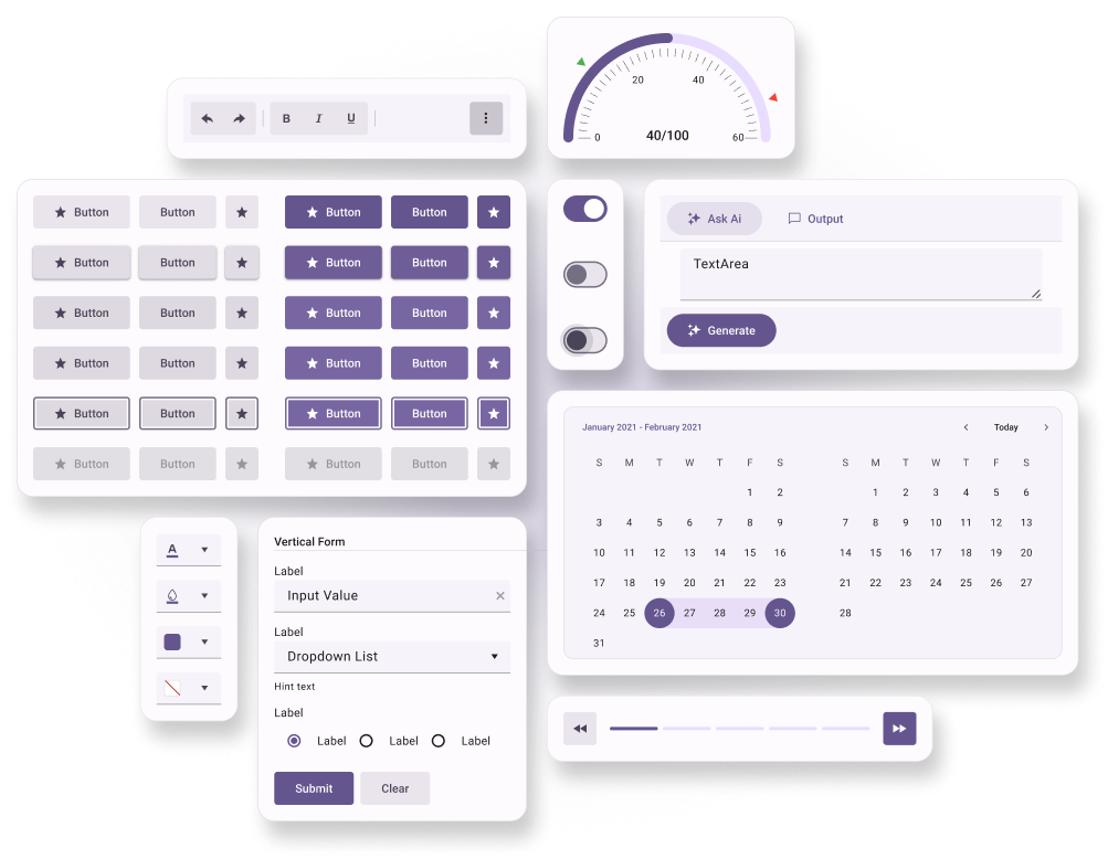
To apply the Material Design guidelines, the web app should load and use the Roboto font family.
Using the CDN Link
To use the Telerik and Kendo UI Material theme without customizing it, reference the precompiled CSS file URL for the required theme version and swatch in the head section of your application, for example:
<link
  rel="stylesheet"
  href="https://www.unpkg.com/@progress/kendo-theme-material@14.4.0/dist/material-main.css"
/>
In the above URL, @x.x.x specifies the theme version and main is the swatch name. To preview the appearance of the available built-in theme swatches, visit the online demos for the Telerik or Kendo UI product that you are using.
To obtain the CDN URL for a specific theme version and swatch:
- Visit @progress/kendo-theme-material on UNPKG.
- Select a version at the top-right.
- Open the
distfolder. - Open the required CSS file, for example, material-main.css.
- Click the View Raw button, for example, here is the CDN URL for
material-main.css.
It is possible to reference a swatch URL without a version, which will load the latest one automatically. This is strictly not recommended in production applications.
While using the precompiled CSS file is faster than compiling the theme from the source code, the approach has two drawbacks:
- The precompiled CSS file contains the CSS code for all components—even for components that you do not use in your application.
- The precompiled CSS file does not support customizations through SCSS variables because they are no longer present in the theme. To customize the theme, you must rebuild it by using the provided source code.
Installing the NPM Package
To install the Telerik and Kendo UI Material theme in your project, use the provided npm package. After installing it, you can customize the stylesheets.
npm install --save @progress/kendo-theme-materialTo use the theme in your application, import it into your project styles:
// Import the entire theme
@use "@progress/kendo-theme-material/scss/all.scss" as *;
Ripple Effect
The Telerik and Kendo UI Material theme has a built-in ripple effect that you can activate by initializing the Ripple Container component.
Adding the Roboto Font
To apply the Material Design guidelines, the web app should load and use the Roboto font family.
The Material theme does not include the Roboto font itself, because it is a third-party property. Instead, the Telerik and Kendo UI components inherit their font family from the application, so if the app uses Roboto, the components will do so too.
One possible way to add the Roboto font from Google Fonts is:
<!-- Load the Roboto font file -->
<link
  rel="stylesheet"
  href="https://fonts.googleapis.com/css?family=Roboto:300,400,500,700"
/>

<!-- Apply the Roboto font family globally in the HTML or in another CSS file -->
<style>
  body {
    font-family: Roboto, sans-serif;
  }
</style>
Using the Figma Kit
The Telerik and Kendo UI Material theme comes with a free UI kit for Figma that includes all Telerik and Kendo UI components. To learn more about the available UI kits and how to use them, see the Design Kits for Figma article.
Framework-Specific Documentation
For specific information about how to implement the Material theme in the context of the Telerik and Kendo UI libraries, refer to the official product documentation:


