Inclusive vs. Accessible Design: Is There a Difference?

Summarize with AI:
Accessible and inclusive design might be commonly interchanged, but the truth is, these two design disciplines take very different approaches to web design. We’ll examine the differences between the two as well as why it’s important for designers to incorporate both strategies into their practice.
Inclusive design and accessible design seek to accomplish the same ends: To create human-centered products that present as few barriers to access as possible. However, there are differences between the two design disciplines.
In this post, we’ll examine what those differences are and why it’s important to make the distinction between accessibility and inclusivity.
Accessible Design vs. Inclusive Design
Accessible design is part of inclusive design. However, there are additional things you can do to create an inclusive product as opposed to one that’s just accessible.
Here are some other differences you should know about:
Users
In accessible design, we remove barriers for people with physical, cognitive or situational disabilities or limitations. If you look back at the history of accessibility, you can see how accessibility naturally evolved from the physical to digital spheres.
Inclusive design, on the other hand, takes a broader approach to product design. In addition to making it easier for impaired users to access products, we also factor in how socioeconomic factors impact their ability to use products as well as their willingness to do so.
Goals
When it comes to accessibility, we focus on the technical usability of the product and how to create accommodations so that every user can access the product with ease. We want our solutions to lead to a resounding “Yes!” when someone asks:
“Can your product be used by as many users as possible?”
For instance, we add alt text to images so that visually impaired users understand what is in the images. We include transcripts for videos so that people unable to watch them can read through the discussion. We adhere to minimum font sizes and color contrast ratios to ensure that everyone can read the content without having to play around with their device’s settings or screen.
When it comes to inclusivity, we’re focused more on content and whether it will be positively received and understood by the most diverse group of users. We want our solutions to lead to a resounding “Yes!” when someone asks:
“Does your product make as many users as possible want to interact with it?”
So in addition to making products accessible, designers have to consider ways in which content choices might make certain users feel excluded because of factors like:
- Age
- Gender
- Race
- Sexual orientation
- Culture
- Economic situation
- Education
- Geographic location
- Language proficiency
- Tech literacy
Because of the diverse breadth of experiences and backgrounds of users, inclusive design can lead to different outcomes depending on the website and the audience it’s built for.
Standards
Accessibility is the only practice that has been standardized. Even then, there’s no official governing body that enforces the building of accessible digital products.
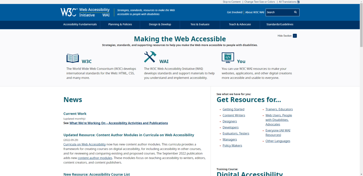
That said, the World Wide Web Consortium (W3C) issues standards for accessibility and has set guidelines for different levels of compliance based on the product being built.

It’s the responsibility of web designers and developers to familiarize themselves with these standards and to integrate them into their processes.
However, it’s ultimately up to users as well as the courts to ensure that people who build (or, rather, own) these products are held accountable if they fail to meet these standards.
Inclusive design has no such standards or guidelines. Regardless, inclusive marketing and design is a strategy that’s become more acknowledged and legitimized in recent years.
Tools
Because accessibility has been standardized, there are lots of tools to help you build accessible products as well as to test and monitor them.
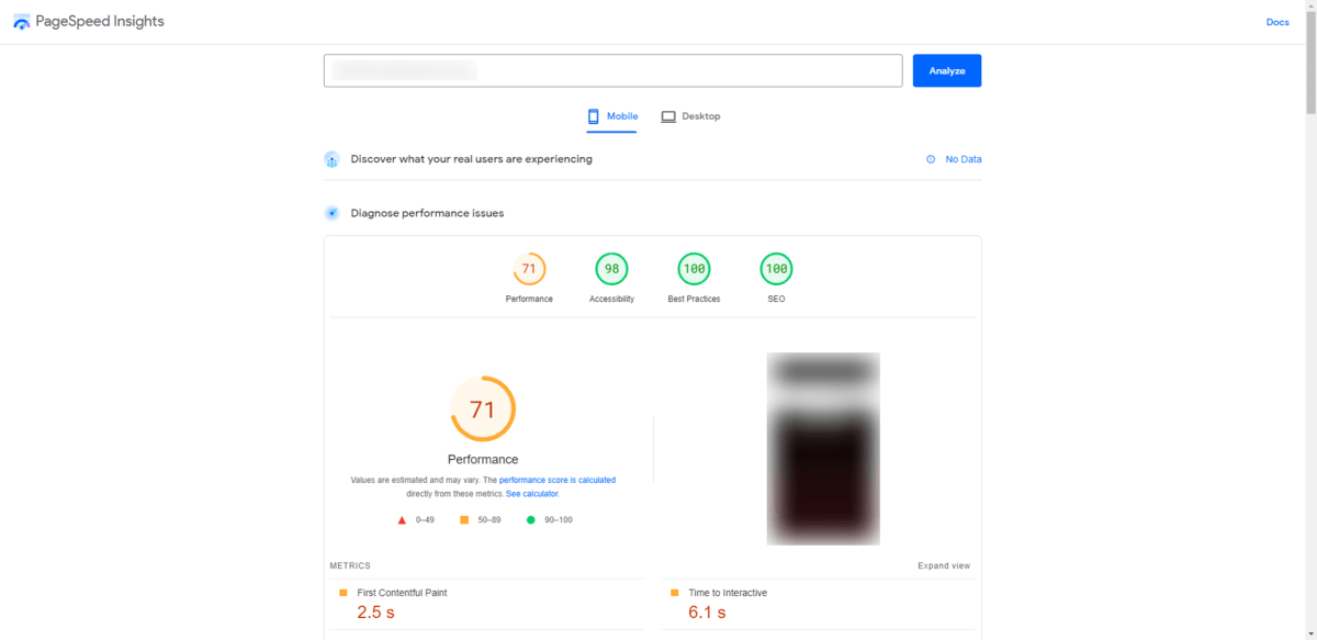
PageSpeed Insights (which has merged with Core Web Vitals) provides users with an Accessibility score for their web pages:

If you scroll down to the Accessibility section, you’ll find tips on how to improve the page’s accessibility through design as well as coding. This web page, for instance, received the following note:
Links do not have a discernible name
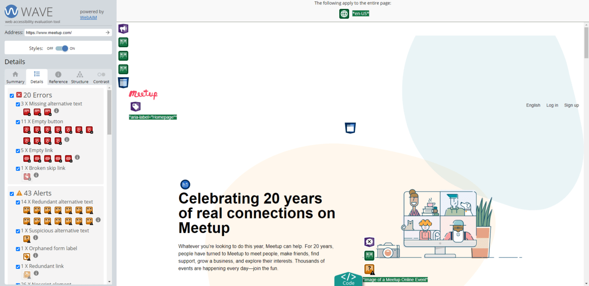
While Google’s tool gives us some basic insight into the general accessibility of a website, there are other tools that can perform more comprehensive accessibility scans.
WAVE, for example, looks for issues or errors related to things like:
- Missing alt text
- Low color contrast
- Missing ARIA
- Incorrect or confusing structural elements (like headings)
- Page readability issues
- Redundant links
- Confusing button labels
- Tab focus not working correctly

In addition, W3C has a huge list of accessibility evaluation tools that designers can use to evaluate their products. It includes accessibility scanners as well as tools that do things like test color contrast.
Because inclusive design isn’t standardized, there are no tests for it—except for where it overlaps with accessibility. As such, designers need to rely more heavily on user research and testing to validate the inclusivity of their designs.
Tasks
When it comes to accessibility, it’s easy to come up with a checklist of what to do to create an accessible product.
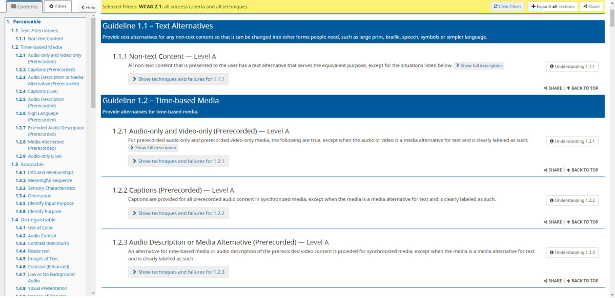
The Web Content Accessibility Guidelines (WCAG) provide a set of success criteria based on the level of compliance your product needs to meet:

There are three levels of compliance:
- A is the lowest level of compliance. These are the minimum requirements recommended for every website.
- AA is the next level up in compliance. A website will be considered acceptable in terms of accessibility if it meets all the success criteria in Levels A and AA.
- AAA is the highest level of compliance. This is the optimal level of accessibility, though it can be difficult to achieve. For instance, adding sign language interpretation to video content isn’t feasible or practical for many companies.
With clear guidelines and a general idea of how much you need to do to comply with the W3C’s recommendations, it’s much easier to create a task list for accessible design than inclusive.
That said, inclusive design focuses on content. As such, you can create tasks that focus on specific parts of your interfaces that you know will more likely be impacted by the diversity of your users. For example:
Imagery
We’ve seen the way in which the backgrounds of our users as well as their experiences get reflected in online imagery. Photos, videos, illustrations and icons are no longer white-washed (which was pretty common
in the early days of the internet). Now, we see many differences depicted in imagery—by race, gender, disability, location, sexual orientation, and so on.
But inclusivity isn’t just about more accurately depicting our users’ demographics.
Think about the pandemic, for instance. Website imagery for many types of companies changed almost overnight. In some cases, photos and illustrations depicted people wearing face masks. In other cases, imagery reflected their changed circumstances—like people dining on take-out in their homes as opposed to eating at a restaurant.
You have to consider how people’s experiences and circumstances (be they universally or only partially shared) should be reflected in your visual content.
Wording
Writing content for your sites or apps isn’t something designers are responsible for, but it’s still important to include it in your inclusive design checklist. It would be a shame to do so much to make your
designs inclusive, only to end up with messaging that rubs some of your users the wrong way.
Whoever is responsible for reviewing the text that goes on your site, make sure they take inclusivity into account. The best way to do this is to aim for neutral language when it’s relevant to do so. So no local colloquialisms, business jargon or demographic-specific vernacular.
Contact methods
You can’t make assumptions about which contact methods most of your users will prefer. Instead, you should include all of the relevant methods for your brand and audience. For instance:
- Phone number
- Email address
- Contact form
- Physical address (map)
- Chatbot
- Live chat
Then you need to iron out the friction with each option. Consider the contact form. You’re always going to have a field (or two) for the person’s name. Does it make sense to make it a single “Name” field or to split it into two? And if you split it into two, will the order of “First Name” and “Last Name” make sense for all your users? What’s more, can your fields accept unique name configurations, like hyphenated last names?
How about your dropdown options? For instance, if you ask for the person’s gender, which options will you offer? Or would it be better to leave the field open-ended so as not to assume or make anyone feel excluded or pressured?
These are the kinds of things you should speak to target user groups about as you conduct research and do your testing.
Wrap-up
While accessible and inclusive design might be taking us in a similar direction, there are some distinct differences between the two disciplines. One allows us to anticipate and remove barriers to entry for people with physical, cognitive or even situational limitations. The other asks us to make better content (and design) choices so that fewer users feel excluded.
Both accessibility and inclusivity are needed if we’re going to create more empathetic and human-centered products. And that’s a good thing. The less robotic, cold and transactional our products feel, the more likely users are to trust and engage with them.

Suzanne Scacca
A former project manager and web design agency manager, Suzanne Scacca now writes about the changing landscape of design, development and software.

