
Best-in-Class ASP.NET Core Grid

Summarize with AI:
Meet the grid that’s powerful and flexible enough to meet all your needs for interacting with data while offering an intuitive, modern design for quick development of beautiful ASP.NET Core apps.

The Progress Telerik UI for ASP.NET Core Grid is a powerful grid and flexible enough to meet all your needs for displaying data, editing, sorting, filtering and exporting. In addition, it offers an intuitive, modern design to help you quickly develop stunning data-driven apps and websites.
Coding

HTML and Tag Helper options for easy integration: The Telerik UI for ASP.NET Core Grid provides both HTML and Tag Helper options to integrate the grid into an ASP.NET Core application, allowing you to use your preferred syntax for a seamless integration process.
Insertion, update and deletion of data from various sources: The Telerik Grid allows you to insert, update and delete data from multiple data sources, such as WebAPI, AJAX, GraphQL, SignalR and more, making it easier to handle data in different scenarios.
NEW FEATURE! Responsive and adaptive HTML5 rendering: This feature allows Telerik UI for ASP.NET Core Grid to adjust its size and layout according to the screen size and device type, providing a better user experience on different devices. Below I will tell you about a new feature Compact Grid for high-density data.
Organization

Column menu, resizing, reordering and show-and-hide interactions: The Telerik UI for ASP.NET Core Grid allows users to interact with the columns in various ways, such as resizing, reordering and show-and-hide functionalities, providing a more personalized and interactive experience.
Built-in implementations for paging, sorting, filtering and grouping: The ASP.NET Core Grid has built-in functionalities for data manipulation, such as paging, sorting, filtering and grouping, making it easier to implement these features without additional coding.
Frozen columns and multi-column headers for improved data organization: The Telerik UI for ASP.NET Core Grid allows you to freeze columns and create multi-column headers, making it easier to organize and view data.
Sticky Columns: This feature makes large tables with numerous columns more user-friendly. By marking specific columns as “sticky,” you can ensure they remain visible on the screen, while other non-sticky columns can be scrolled horizontally out of view. It helps users to navigate through large data sets more easily and quickly locate the information they need. The Sticky Columns feature is like the Frozen Columns feature but with the added benefit of displaying sticky columns in the scrollable area of the table along with non-frozen columns. This gives you more control over the layout of your data and allows you to create a more tailored user experience for your application. With Telerik UI for ASP.NET Core Grid, you can make your data more accessible and user-friendly than ever.
Alignment of Cell Values: The Telerik UI for ASP.NET Core Grid component for your business needs, like customizing the alignment of columns, headers and footers to better structure your data! Choose from Left, Right or Center alignment to optimize your component.
Interactive

Row Interactions: Make your end users’ lives more manageable with the built-in Row Interaction functionality of the Telerik UI for ASP.NET Core Grid! Drag and drop single and multiple rows within the Telerik UI for ASP.NET Core Grid and across multiple Grids quickly.
Settings Persistence: This powerful feature of the Telerik UI for ASP.NET Core Grid makes it easier to personalize your application to your users’ needs. With Settings Persistence, users can save their preferred grid settings, including column order, sorting, filtering and paging state, and load them up again in future sessions. This feature is handy for individual users who need to view custom information every time they log in. By saving their preferences, users can avoid manually reconfiguring the ASP.NET Core Grid each time they use the application, saving time and streamlining their workflow. With Settings Persistence, you can provide your users with a truly personalized experience, making your application more user-friendly and efficient than ever.
Cell, row and checkbox selection for easy data manipulation: The Telerik UI for ASP.NET Core Grid provides different selection modes, such as cell, row and checkbox selection, allowing users to manipulate data easily.
Keyboard Navigation: Telerik UI for ASP.NET Core Grid enables the keyboard to navigate the UI. This is extremely valuable for those with disabilities or limited mouse use.
Search panel for easy data filtering: The UI for ASP.NET Core Grid provides a search panel for easy data filtering, making it easier for users to find specific data.
Visual Look and Feel

Complete control over the layout presentations through the toolbar, row and detail Data Grid templates: You can customize the layout presentation of the Telerik UI for ASP.NET Core Grid using various templates for the toolbar, rows and detail, providing complete control over the visual representation of data.
Adaptive Rendering (Mobile Support): Adaptive Rendering (Mobile Support) automatically detects which type of device is being used—mobile, tablet or desktop—and renders the user interface appropriately. Ensuring the application works properly on all devices provides the best user experience.
Customize the look and feel: Telerik UI for ASP.NET Core provides several options to customize the look and feel of the application, including intuitive theme builder and adaptive rendering.
ThemeBuilder: Telerik UI for ASP.NET Core includes a powerful ThemeBuilder to create and customize a fully branded theme. It consists of a visual editor to quickly construct and tailor a custom theme to match the application’s branding. Customizations possible include colors, borders, fonts and other styling elements.
Cross-browser support: The ASP.NET Core Data Grid is designed to work on modern web browsers and supports desktop and mobile platforms. The application will render correctly on all types of devices.
DataSources

Infinite Scrolling Mode: The Telerik UI for ASP.NET Core Grid gives you smooth scrolling capability for big datasets! Enjoy groupings, hierarchical structures and CRUD capability. When you reach the end of the page, more data will load automatically, giving you a seemingly infinite experience.
Data binding to local and remote data, DataSource utilization: With built-in DataSource utilization, you can bind your Telerik UI for ASP.NET Core Grid to various data sources, including local and remote data, Web API endpoints, SignalR hubs and more. And with two-way data binding, any changes you make to the data will be automatically reflected in the Grid, and vice versa. So with simple steps to get your data from the model to the view, you can quickly create a fully functional grid that’s easy to use and update whether you’re working with static arrays or dynamic objects.
Hierarchical Data Grid and aggregates for complex data presentation: You can easily display complex hierarchical data in an organized and meaningful way. By leveraging the hierarchical Grid feature, you can showcase parent-child relationships and provide your users with a comprehensive view of your data. With N-level hierarchical Grids, you can create custom detail templates and highlight the most relevant information for your users. In addition, it makes presenting your data clearly and concisely easy, allowing your users to navigate through your application and gain valuable insights efficiently.
Ultimate performance with column and row virtual scrolling: The Telerik UI for ASP.NET Core Grid provides virtual scrolling capabilities for columns and rows, allowing it to display large amounts of data without any performance issues.
Server- and Client-Side API for max flexibility: Telerik UI for ASP.NET Core Grid provides server-side and client-side APIs to ensure maximum flexibility when working with the UI components. The Server-Side API calls allow direct manipulation of the rendered components on the server side. The Client-Side API provides additional access to the UI components from the frontend to allow for dynamic modifications.
PDF and Excel export for easy data sharing and analysis: The Telerik UI for ASP.NET Core Grid allows users to export data to PDF and Excel formats, making sharing and analyzing data easier.
Globalization
Globalization & Localization: Telerik UI for ASP.NET Core Grid features support for globalization and localization. Allowing users to work with the UI components in their preferred language and automatically have the information displayed in their region.
Right-to-Left (RTL) Support: Telerik UI for ASP.NET Core Grid also supports Right-to-Left (RTL) text orientation, which is common in Hebrew, Arabic and Farsi. It guarantees that text is displayed correctly in the corresponding language for viewing and editing.
New Feature

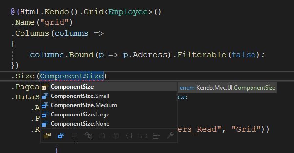
In March 2023, Telerik launched a new feature for the Telerik UI for ASP.NET Core Grid—the Compact Mode. So, if you need help displaying large amounts of data on a single screen, this is the best option!
With the Size parameter configuration, the Telerik UI for ASP.NET Core Grid component allows you to display as much information as possible on a single screen by reducing the padding and margins used by the elements. This means you can now have a more condensed look and feel to your data table, allowing you to display more data simultaneously!
Use the CompactSize.Small to use the minimum possible space:
The Compact Grid feature is also customizable through configuration options and can be combined with any built-in Default, Bootstrap, Material and Fluent themes. This means you can choose the theme that best fits your needs while benefiting from the Compact Grid.
Mobile Sample
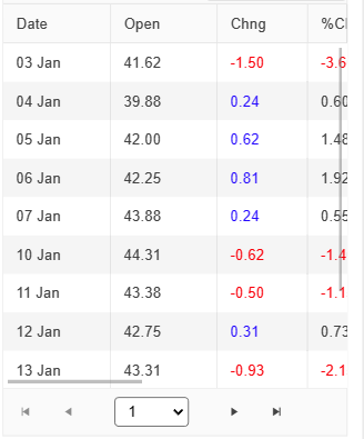
Without setting the Size property:
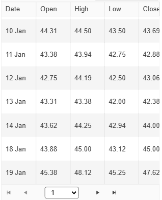
Setting Size to ComponentSize.Small:
You are the champion! The Telerik UI for ASP.NET Core Grid is the best choice!

References Available
- Telerik UI Grid for ASP.NET Core
- The cat images were generated by Bing Images AI
Don’t Forget the Trial is Free
If you’re ready to explore the Grid and more than 110 other components in the UI library, try Telerik UI for ASP.NET Core for free today!

Jefferson S. Motta
Jefferson S. Motta is a senior software developer, IT consultant and system analyst from Brazil, developing in the .NET platform since 2011. Creator of www.Advocati.NET, since 1997, a CRM for Brazilian Law Firms. He enjoys being with family and petting his cats in his free time. You can follow him on LinkedIn and GitHub.
Related Posts
Comments
All articles
Topics
Web MobileMobile
Desktop
Design
Productivity
People
