4 Rating Card UI Ideas in .NET MAUI

Summarize with AI:
Enable users to provide feedback rating with these four variations of rating cards for your .NET MAUI app.
When we talk about feedback, we often think of the negative kind, like critiques or complaints. It makes sense, since they’re the ones that stand out the most, even if just one out of 1,000 is negative. But that’s not the full story.
There are also users who are enjoying your app, who are having a great experience … but simply don’t say it. And many times, it’s not because they don’t want to, but because they don’t have a way to do it. We’re not giving them the space or the tools to express how they feel.
That’s why it’s key to add touchpoints in our apps where users can rate what they use from a specific module to the entire app through a rating and even a comment.
So, in this article, I’m bringing you four rating UI ideas that we’ll be building in .NET MAUI. 🚀
🔧 Environment Setup
You’ll learn how to take advantage of some of the powerful Progress Telerik UI for .NET MAUI components in this post. If you don’t have the .NET MAUI library installed yet, visit the quick start page, which explains step-by-step how to install Telerik UI for .NET MAUI, download the license key, configure the Telerik package source and install the Telerik MCP server (if needed).
Let’s Start!
Basically, we’ll be building four different UI ideas, all focused on collecting user ratings. To achieve this, we’ll use two key Telerik components: .NET MAUI Rating and .NET MAUI ProgressBar.
We’ll create one .xaml page for each UI. After completing the Environment Setup in your project, remember that each .xaml page must include the required namespace for the Rating control and, when needed, the ProgressBar control. (Not all screens will use the ProgressBar.)
Your namespace should look like this:
xmlns:telerik="clr-namespace:Telerik.Maui.Controls;assembly=Telerik.Maui.Controls"
Creating the Example Structure
Each of the four cards we’ll build can be implemented in different ways, such as a Popup or a BottomSheet, depending on what best fits your app’s needs.
For this example, we’ll define a reusable Border with shadows that will act as the base container for each card.
<Border
BackgroundColor="White"
StrokeThickness="0"
StrokeShape="RoundRectangle 28"
VerticalOptions="Center"
HorizontalOptions="Center"
WidthRequest="360"
HeightRequest="520">

<Border.Shadow>
    <Shadow
    Brush="#000000"
    Opacity="0.15"
    Radius="20"
    Offset="0,10" />
</Border.Shadow>

    <!-- Add the layout here -->

</Border>
1. Friendly Star UI
This design is inspired by a Dribbble concept and has a friendly, soft and playful style. This first UI is perfect for apps that want to ask for feedback in a warm and simple way, without making the rating experience feel too formal or intrusive.

Starting with the Code
Inside the previously defined Border, we’ll create a grid with five rows, as shown below:
<Grid RowDefinitions="140,Auto,Auto,Auto,Auto,*">

    <!-- Add all UI elements here -->

</Grid>
Header with Rounded Image
<Image
    Grid.Row="0"
    Source="yellowbg.png"
    Aspect="Fill"
    HorizontalOptions="Fill"
    VerticalOptions="Fill"
    HeightRequest="160" />

<Image
    Grid.Row="0"
    Source="star.png"
    WidthRequest="140"
    HeightRequest="140"
    HorizontalOptions="Center"
    VerticalOptions="End"
    TranslationY="70" />
Rating Side
Next, we’ll add a simple text that says “How Would You Rate Our App Experience?” Additionally, we’ll use the Telerik .NET MAUI Rating control.
I really love this control because it allows you to fully customize the colors of selected and unselected items. It’s also not limited to stars, you can use different shapes or elements to represent the rating. I definitely encourage you to explore the .NET MAUI Rating control. You’re going to love it!
<Label
Grid.Row="1"
Text="How Would You Rate Our App Experience?"
FontSize="20"
TextColor="#313A45"
HorizontalTextAlignment="Center"
Margin="30,80,30,0" />
<telerik:RadShapeRating
Grid.Row="2"
Value="3"
ItemsCount="5"
SelectedItemStroke="#FFC44C"
SelectedItemFill="#FFC44C"
ItemFill="#D1D3DB"
ItemStroke ="#D1D3DB"
HeightRequest="28"
HorizontalOptions="Center"
Margin="0,32,0,0" />
Submit button and footer text
<Button
    Grid.Row="3"
    Text="Submit"
    HeightRequest="35"
    CornerRadius="29"
    FontSize="15"
    FontAttributes="Bold"
    TextColor="White"
    BackgroundColor="#0A8DF2"
    Margin="38,54,38,0" />

<Label
    Grid.Row="4"
    Text="No, Thanks!"
    FontSize="15"
    TextColor="#A7A7A7"
    HorizontalOptions="Center"
    Margin="0,24,0,0" />
2. Rating Summary UI
Next, we’ll continue with another Dribbble-inspired UI. This one focuses on a rating summary, which is especially useful when you want to get a quick, overall view of what’s happening with your app’s feedback.
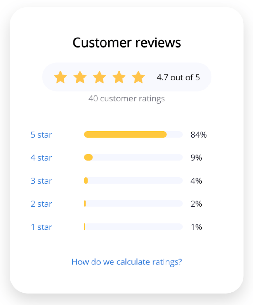
In addition to the Telerik Rating control, we’ll also incorporate the Telerik ProgressBar, which will help us visually represent the distribution of ratings across each level.
To show different ways of building layouts and working with components, we’ll use a slightly different approach compared to the previous example. This time, we’ll start with a VerticalStackLayout as our main container.
<VerticalStackLayout Spacing="18" VerticalOptions="Center" Margin="32">
    <! -- Add all the elements here -- >
</VerticalStackLayout>
Customers Reviews and Rounded Rating Bar
Along with the text, we’ll use a HorizontalStackLayout to organize the elements, and we’ll also add the RadShapeRating control.
<Label
    Text="Customer reviews"
    FontSize="20"
    FontAttributes="Bold"
    HorizontalTextAlignment="Center" />

<Border
    BackgroundColor="#F8F9FF"
    StrokeThickness="0"
    StrokeShape="RoundRectangle 24"
    Padding="18,12"
    HorizontalOptions="Center">

    <HorizontalStackLayout Spacing="18">
	    <telerik:RadShapeRating
	    Value="5"
	    ItemsCount="5"
	    HeightRequest="20"
	    SelectedItemStroke="#FFC44C"
	    SelectedItemFill="#FFC44C"
	    ItemFill="#D1D3DB"
	    ItemStroke ="#D1D3DB" />

	    <Label
	    Text="4.7 out of 5"
	    FontSize="13"
	    VerticalOptions="Center" />
    </HorizontalStackLayout>
</Border>

<Label Text="40 customer ratings"
    FontSize="13"
    TextColor="#7A7A85"
    HorizontalTextAlignment="Center"
    Margin="0,-16,0,20" />
Adding the Rating Breakdown by Star
Now, we’ll add the remaining elements of the screen, including the ProgressBar component from Progress Telerik for each rating level.
To make it easier to understand, especially if you’re just getting started in .NET MAUI, I’ve kept this example very simple. However, you can make it much cleaner and more reusable by using styles or by generating these items from a list.
<Grid ColumnDefinitions="70,*,50" ColumnSpacing="12">
    <Label Text="5 star" FontSize="13" TextColor="#3478D9" />
    <telerik:RadLinearProgressBar
	    Grid.Column="1"
	    Value="84"
	    HeightRequest="10"
	    ProgressFill="#FFC83D"
	    ProgressCornerRadius="15"
	    TrackCornerRadius="15"
	    TrackFill="#F5F7FF" />
    <Label Grid.Column="2" Text="84%" FontSize="13"/>
</Grid>

<Grid ColumnDefinitions="70,*,50" ColumnSpacing="12">
<Label Text="4 star" FontSize="13" TextColor="#3478D9" />
    <telerik:RadLinearProgressBar
	    Grid.Column="1"
	    Value="9"
	    HeightRequest="10"
	    ProgressCornerRadius="15"
	    TrackCornerRadius="15"
	    ProgressFill="#FFC83D"
	    TrackFill="#F5F7FF" />
<Label Grid.Column="2" Text="9%" FontSize="13" />
</Grid>

<Grid ColumnDefinitions="70,*,50" ColumnSpacing="12">
<Label Text="3 star" FontSize="13" TextColor="#3478D9" />
    <telerik:RadLinearProgressBar
    Grid.Column="1"
    Value="4"
    HeightRequest="10"
    ProgressCornerRadius="15"
    TrackCornerRadius="15"
    ProgressFill="#FFC83D"
    TrackFill="#F5F7FF" />
    <Label Grid.Column="2" Text="4%" FontSize="13" />
</Grid>
<Grid ColumnDefinitions="70,*,50" ColumnSpacing="12">
<Label Text="2 star" FontSize="13" TextColor="#3478D9" />
    <telerik:RadLinearProgressBar
	    Grid.Column="1"
	    Value="2"
	    HeightRequest="10"
	    ProgressFill="#FFC83D"
	    ProgressCornerRadius="15"
	    TrackCornerRadius="15"
	    TrackFill="#F5F7FF" />
<Label Grid.Column="2" Text="2%" FontSize="13" />
</Grid>
<Grid ColumnDefinitions="70,*,50" ColumnSpacing="12">

<Label Text="1 star" FontSize="13" TextColor="#3478D9" />
<telerik:RadLinearProgressBar
    Grid.Column="1"
    Value="1"
    HeightRequest="10"
    ProgressFill="#FFC83D"
    ProgressCornerRadius="15"
    TrackCornerRadius="15"
    TrackFill="#F5F7FF" />
    <Label Grid.Column="2" Text="1%" FontSize="13" />
</Grid>
<Label
    Text="How do we calculate ratings?"
    FontSize="13"
    TextColor="#3478D9"
    HorizontalTextAlignment="Center"
    Margin="0,18,0,0" />
3. Detailed Feedback UI
Our third screen is a rating UI that also asks users to leave a comment about their score. It was inspired by a Dribbble design, and for this example, we modified it slightly.
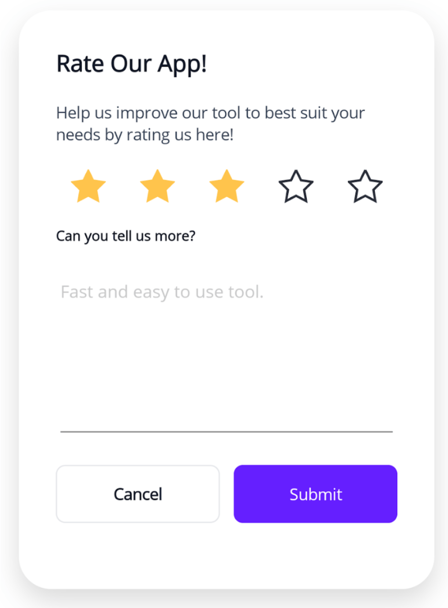
For this card, our main layout will be a Grid:
<Grid RowDefinitions="Auto,Auto,Auto,Auto,150,Auto" ColumnDefinitions="*,*" RowSpacing="20" ColumnSpacing="12" Padding="32">
    <! -- Add all the elements here -- >
</Grid>
Adding the Label and Telerik Rating Control:
<Label
    Grid.Row="0"
    Grid.Column="0"
    Grid.ColumnSpan="2"
    Text="Rate Our App!"
    FontSize="20"
    FontAttributes="Bold" />

<Label
    Grid.Row="1"
    Grid.ColumnSpan="2"
    Text="Help us improve our tool to best suit your needs by rating us here!"
    FontSize="14"/>

<telerik:RadShapeRating
    Grid.Row="2"
    Grid.ColumnSpan="2"
    Value="3"
    ItemsCount="5"
    HeightRequest="30"
    ItemsSpacing="30"
    SelectedItemStroke="#FFC44C"
    SelectedItemFill="#FFC44C"
    ItemStroke ="#2a2f39"
    HorizontalOptions="Center" />

<Label
    Grid.Row="3"
    Grid.ColumnSpan="2"
    Text="Can you tell us more?"
    FontSize="12"
    FontAttributes="Bold" />

<Editor
    Grid.Row="4"
    Grid.ColumnSpan="2"
    Placeholder="Fast and easy to use tool."
    FontSize="15"
    BackgroundColor="White" />

<Button
    Grid.Row="5"
    Grid.Column="0"
    Text="Cancel"
    FontAttributes="Bold"
    HeightRequest="50"
    CornerRadius="8"
    BackgroundColor="White"
    TextColor="#111827"
    BorderColor="#E5E7EB"
    BorderWidth="1" />

<Button
    Grid.Row="5"
    Grid.Column="1"
    Text="Submit"
    HeightRequest="50"
    CornerRadius="8"
    BackgroundColor="#651FFF"
    TextColor="White" />
4. Multi-Criteria Rating UI
We’ve reached our final UI!! 🎉 And I’m sure you’ve learned a lot along the way!
This final design takes things a step further by allowing users to rate multiple criteria or categories, along with leaving a comment. Just like the previous examples, it was inspired by a Dribbble design.
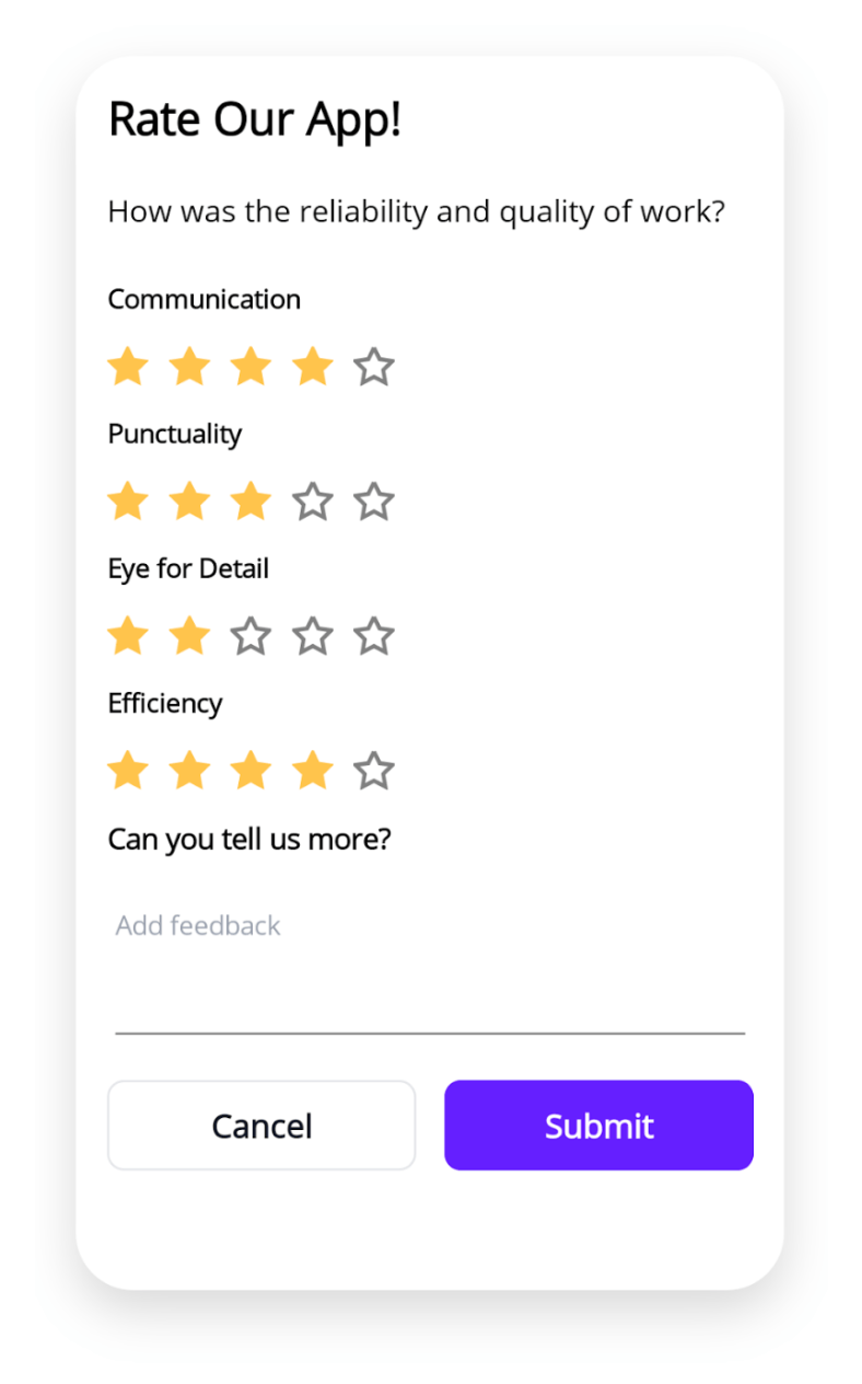
For this card, our main layout will also be a Grid:
<Grid RowDefinitions="Auto,Auto,Auto,Auto,Auto,Auto,Auto,Auto,Auto,Auto,Auto,80,Auto"
    ColumnDefinitions="*,*"
    RowSpacing="14"
    Padding="15"
    ColumnSpacing="14">

    <! -- Add all the elements here -- >

</Grid>
And let’s add all the remaining elements:
<Label
    Grid.Row="0"
    Grid.Column="0"
    Grid.ColumnSpan="2"
    Text="Rate Our App!"
    FontSize="22"
    FontAttributes="Bold" />

<Label
    Grid.Row="1"
    Grid.ColumnSpan="2"
    Text="How was the reliability and quality of work?"
    FontSize="15"
    Margin="0,6,0,10" />

<Label
    Grid.Row="2"
    Grid.ColumnSpan="2"
    Text="Communication"
    FontSize="13"
    FontAttributes="Bold" />

<telerik:RadShapeRating
    Grid.Row="3"
    Grid.ColumnSpan="2"
    Value="4"
    ItemsCount="5"
    HeightRequest="20"
    SelectedItemStroke="#FFC44C"
    SelectedItemFill="#FFC44C"
    HorizontalOptions="Start" />

<Label
Grid.Row="4"
Grid.ColumnSpan="2"
Text="Punctuality"
FontSize="13"
FontAttributes="Bold" />

<telerik:RadShapeRating
Grid.Row="5"
Grid.ColumnSpan="2"
Value="3"
ItemsCount="5"
HeightRequest="20"
SelectedItemStroke="#FFC44C"
SelectedItemFill="#FFC44C"
HorizontalOptions="Start" />

<Label
    Grid.Row="6"
    Grid.ColumnSpan="2"
    Text="Eye for Detail"
    FontSize="13"
    FontAttributes="Bold" />

<telerik:RadShapeRating
    Grid.Row="7"
    Grid.ColumnSpan="2"
    Value="2"
    ItemsCount="5"
    HeightRequest="20"
    SelectedItemStroke="#FFC44C"
    SelectedItemFill="#FFC44C"
    HorizontalOptions="Start" />

<Label
    Grid.Row="8"
    Grid.ColumnSpan="2"
    Text="Efficiency"
    FontSize="13"
    FontAttributes="Bold" />

<telerik:RadShapeRating
    Grid.Row="9"
    Grid.ColumnSpan="2"
    Value="4"
    ItemsCount="5"
    HeightRequest="20"
    SelectedItemStroke="#FFC44C"
    SelectedItemFill="#FFC44C"
    HorizontalOptions="Start" />

<Label
    Grid.Row="10"
    Grid.ColumnSpan="2"
    Text="Can you tell us more?"
    FontSize="14"
    FontAttributes="Bold" />

<Editor
Grid.Row="11"
Grid.ColumnSpan="2"
Placeholder="Add feedback"
FontSize="13"
PlaceholderColor="#9CA3AF"
BackgroundColor="White" />

<Button
    Grid.Row="12"
    Grid.Column="0"
    Text="Cancel"
    HeightRequest="20"
    CornerRadius="8"
    FontSize="16"
    FontAttributes="Bold"
    BackgroundColor="White"
    TextColor="#111827"
    BorderColor="#E5E7EB"
    BorderWidth="1" />

<Button
    Grid.Row="12"
    Grid.Column="1"
    Text="Submit"
    HeightRequest="20"
    CornerRadius="8"
    FontSize="16"
    FontAttributes="Bold"
    BackgroundColor="#651FFF"
    TextColor="White" />
✍️ If you want to make it even more engaging, you can use a list to avoid repeating each category with its rating and even add some styling!
Conclusion
All set! 🚀 We’ve now built all four rating UI interfaces. Below, you can see how each one looks:
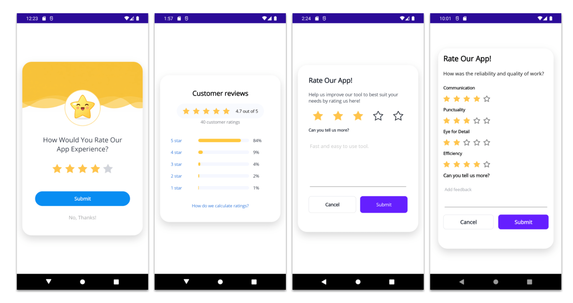
I hope these four rating UI ideas inspire you to create more interactive and useful feedback experiences in your .NET MAUI apps! 😎
Remember, ratings are not only about collecting numbers. They’re also a great way to understand how users feel and what you can keep improving.
If you have any questions or would like me to explain any part in more detail, feel free to leave a comment, I’ll be happy to help! 💚 See you in the next article! 🙋♀️🚀
Remember, Telerik UI for .NET MAUI comes with a free 30-day trial, so you can experiment with these examples yourself!

Leomaris Reyes
Leomaris Reyes is a software engineer from the Dominican Republic specializing in mobile development. She is a 7-time Microsoft MVP and actively builds mobile applications while sharing practical knowledge through technical articles and developer-focused content.
Through her work, she explains programming concepts, developer tools and real-world development practices to help developers grow in their careers.
You can follow her on Instagram and TikTok at @leomarisreyes.dev, read her articles on AskXammy, and connect with her on LinkedIn, where she shares tutorials, insights and resources for developers.
Related Posts
Comments
All articles
Topics
Web MobileMobile
Desktop
Design
Productivity
People