Building a Healthcare UI with .NET MAUI

Summarize with AI:
You’ve probably seen a healthcare interface when you were scheduling a recent doctor’s appointment. Let’s see how to build one in .NET MAUI!
One of the biggest challenges when creating app interfaces is when design elements step a bit outside the conventional. These kinds of designs push us to think differently and get more creative when translating them into code. 🚀
In this article, I’m bringing you a healthcare UI inspired by this Dribbble doctor appointment UI design. I have to admit, it’s one of my favorites! 🙈 It gives us the perfect opportunity to apply some cool tricks that make our design look impressive and truly out of the box.
We’ll be using some Progress Telerik UI for .NET MAUI components, along with a CollectionView, but this time, we’ll simulate different columns to achieve the layout we want. Plus, we’ll rely on three properties that will become our best friends in this UI: Rotation, TranslationY and TranslationX.
So grab your cup of coffee or hot chocolate ☕🍫 and let’s build this together! ✨
How Will the Explanation Work?
So you can understand where we’re headed, I’ll explain how the process will work:
➖ Visual diagram: Before we start, you’ll see a diagram with a screenshot of the design we want to achieve. This design will be divided into blocks, each identified with a name and a color. Each block will be explained individually.
➖ Code explanation per block: In addition to the text explanation, each block will include the exact code snippet you need to write to achieve the result.
➖ Step-by-step visual progress: Each explanation will have its corresponding screenshot, so you can see the progress as we build the UI.
⚠️ For this design, we took inspiration from an original Dribbble UI but made some adaptations and adjustments to align it with the goals of this article.
🔧 Environment Setup
You’ll learn how to take advantage of some of the powerful Telerik UI for .NET MAUI components in this post. If you don’t have the .NET MAUI library installed yet, visit the quick start page, which explains step-by-step how to install Telerik UI for .NET MAUI, download the license key, configure the Telerik package source and install the Telerik MCP server (if needed).
Breaking Down the Design into Blocks
To make this easier to follow, I’ve divided the design into clear blocks. We’ll build each part one at a time, in the order you see below.
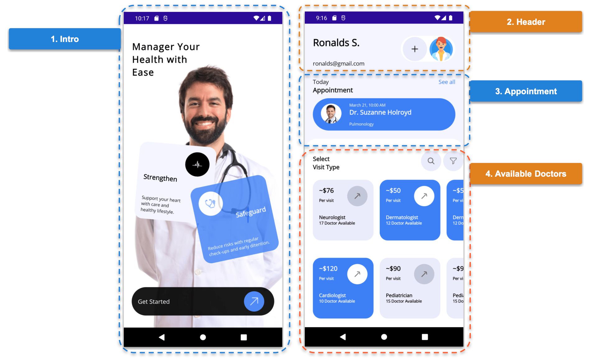
Alright, now that we’ve broken our UI into clear blocks, it’s time to bring everything to life with some code! 😎 Let’s start building each section step by step.
Block 1. Intro

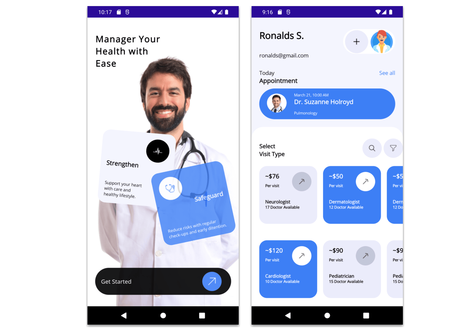
This first block is one of my favorites, as it brings a unique touch to the UI. It plays with the way the information is presented and introduces a slightly different style for the Get Started button. Since this block represents a full page, we’ll break this explanation down into the following steps:
Creating the Main Page with a Background Image
Let’s start by creating a page called DoctorIntroPage.xaml. This page will contain a Grid as the main layout. The grid will have only one row, which will allow us to play with the overlapping effect between the background image and the rest of the elements. Right there, you’ll also see exactly where the background image is added.
<Grid RowDefinitions="*">
    <!-- Main image -->
    <Image Grid.Row="0" Source="doctor.jpg" Aspect="AspectFill" Margin="0,40,0,0"/>

    <!-- Add the rest of the code for the first block -- >
</Grid>
Creating the Cards and the Get Started Button
To continue with these elements, we’ll add another Grid. This one will contain three rows and two columns:
<Grid Grid.Row="0" RowDefinitions="auto,*,auto,auto" ColumnDefinitions="*,*" Padding="20,40,20,30">
    <!-- Add the rotated cards here -- >
    <!-- Add the Get Started button here -- >
</Grid>
⚠️ Add the previous code exactly in the comment above that says
<!-- Add the rest of the code for the first block -->.
Rotated Cards
Now, to add the cards, we’ll use one of my favorite Telerik controls: Telerik Border for .NET MAUI. Make sure you follow the steps indicated in the Environment Setup section at the beginning of the article. After that, you just need to add the corresponding namespace:
xmlns:telerik="clr-namespace:Telerik.Maui.Controls;assembly=Telerik.Maui.Controls"
To achieve the card effect, I mainly relied on the Rotation property. One card uses a value of 50, while the other uses -12, creating the effect of opposite rotations between them. In addition, I used the TranslationX and TranslationY properties to position the cards and make the overlapping effect more noticeable. In code, it would look like this:
<telerik:RadBorder Grid.Row="1" Grid.Column="0"
    BackgroundColor="#f4f5fe"
    CornerRadius="20"
    HeightRequest="190"
    WidthRequest="190"
    TranslationX="20"
    Rotation="5">
<Grid RowDefinitions="auto,*,auto" ColumnDefinitions="*,auto" Padding="15">
    <telerik:RadButton Grid.Row="0" Grid.Column="1" ImageSource="cardiogram" BackgroundColor="Black" HeightRequest="60" WidthRequest="60" CornerRadius="30"/>
    <Label Grid.Row="1" Grid.Column="0" Text="Strengthen" FontAttributes="Bold" FontSize="16"/>
    <Label Grid.Row="2" Grid.Column="0" Text="Support your heart with care and healthy lifestyle." FontSize="11" />
</Grid>
</telerik:RadBorder>
<telerik:RadBorder Grid.Row="1" Grid.Column="1"
	    BackgroundColor="#3d7ff5"
	    CornerRadius="20"
	    HeightRequest="190"
	    WidthRequest="190"
	    TranslationY="90"
	    TranslationX="-10"
	    Opacity="0.8"
	    Rotation="-12">
    <Grid RowDefinitions="auto,*,auto" ColumnDefinitions="auto,*" Padding="15">
	    <telerik:RadButton Grid.Row="0" Grid.Column="0" ImageSource="stethoscope" BackgroundColor="White" HeightRequest="60" WidthRequest="60" CornerRadius="30"/>
	    <Label Grid.Row="1" Grid.Column="0" Grid.ColumnSpan="2" TextColor="White" Text="Safeguard" FontAttributes="Bold" HorizontalTextAlignment="End" FontSize="16" />
	    <Label Grid.Row="2" Grid.Column="0" Grid.ColumnSpan="2" TextColor="White" Text="Reduce risks with regular check-ups and early ditention." HorizontalTextAlignment="Start" FontSize="11" />
    </Grid>
</telerik:RadBorder>
Finally, Let’s Add the Get Started Button
To achieve this, we’ll use a Telerik Border as a container to create a rounded black background behind the button. Inside it, we’ll place a Telerik RadButton.
Since we’ve already added the namespace for RadBorder, you’re all set, there’s no need to add anything else to use RadButton.
<telerik:RadBorder Grid.Row="2" Grid.Column="0" Grid.ColumnSpan="2"
    BackgroundColor="Black"
    Opacity="0.9"
    CornerRadius="50"
    HeightRequest="70" >
    <Grid ColumnDefinitions="*,auto" Padding="15,5">
	    <Label Grid.Column="0" Text="Get Started" FontSize="15" TextColor="White" VerticalTextAlignment="Center" />
	    <telerik:RadButton Grid.Column="1" ImageSource="uprightarrow" BackgroundColor="#3d7ff5" HeightRequest="50" WidthRequest="50" CornerRadius="25" HorizontalOptions="End" Margin="10"/>
    </Grid>
</telerik:RadBorder>
We’ve finished this first block, and we already have our first page created! 🎉 Now, let’s move on to the second block and keep building!
Block 2. Header
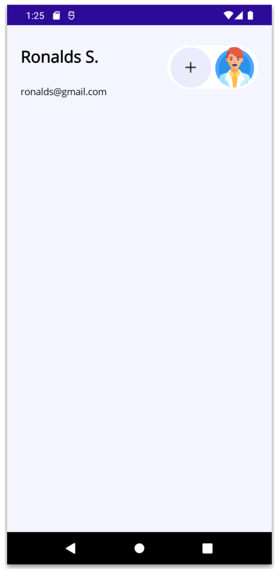
We’ve finished this first section, and our first page is already up and running! 🎉 Now, let’s move on to the second section.
This time, we’re going to create a page called DoctorDetailsPage.xaml. Set the background color of this page to #f4f5fe and let’s define the main layout using a Grid. This Grid will have five rows and three columns, as shown below:
<Grid RowDefinitions="auto,auto,auto,auto,auto,*"
    ColumnDefinitions="*,auto,auto"
    Padding="20,30,20,0">
    <!-- Add the header block here -- >
    <!-- Add the appointment block here -- >
    <!-- Add the available doctors block here -- >
</Grid>
Now, within the Grid, let’s add the name and email:
<Label Grid.Row="0" Grid.Column="0" Text="Ronalds S." FontSize="24" FontAttributes="Bold" />

<Label Grid.Row="1" Grid.Column="0" Text="ronalds@gmail.com" FontSize="14"/>
Next, we’ll add a Telerik RadBorder control (remember to include the corresponding namespace, just like we did on the previous page). Inside it, we’ll place an image along with a rounded button:
<telerik:RadBorder Grid.Row="0" Grid.RowSpan="2" Grid.Column="1" Grid.ColumnSpan="2"
    Margin="0,0,0,40"
    BackgroundColor="White"
    CornerRadius="120"
    VerticalOptions="Start">
    <HorizontalStackLayout>
	    <telerik:RadButton ImageSource="plus" BackgroundColor="#ebecfb" HeightRequest="60" WidthRequest="60" CornerRadius="30" Margin="5,2,0,1"/>
	    <Image Source="doctoravatar" HeightRequest="60" WidthRequest="60" Aspect="AspectFill" Margin="5,2"/>
    </HorizontalStackLayout>
</telerik:RadBorder>
Block 3. Appointment
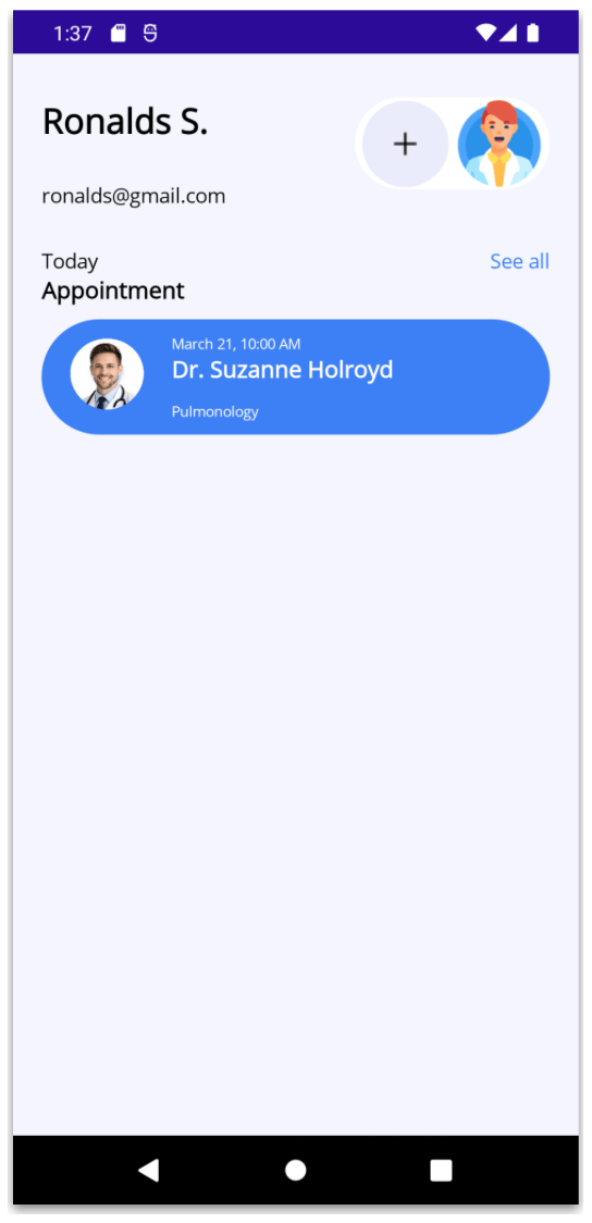
The Appointment block contains different elements, which are achieved by adding a few Label controls along with a Telerik RadBorder, as shown below:
<Label Grid.Row="2" Grid.Column="0" Text="Today" FontSize="14" />
<Label Grid.Row="3" Grid.Column="0" Text="Appointment" FontAttributes="Bold" FontSize="16" />
<Label Grid.Row="2" Grid.Column="2" Text="See all" HorizontalTextAlignment="End" TextColor="#3d7ff5" FontSize="14" />

<telerik:RadBorder Grid.Row="4" Grid.Column="0" Grid.ColumnSpan="3"
    BackgroundColor="#3d7ff5"
    CornerRadius="120"
    Margin="0,10,0,0"
    HeightRequest="80" AutomationProperties.IsInAccessibleTree="True">
    <Grid ColumnDefinitions="auto,*" RowDefinitions="auto,auto,auto" VerticalOptions="Center">
	    <Image Grid.Column="0" Grid.Row="0" Grid.RowSpan="3" Source="doctorjose" HeightRequest="80" WidthRequest="80" Aspect="AspectFill" Margin="5,2"/>
	    <Label Grid.Column="1" Grid.Row="0" Text="March 21, 10:00 AM" FontSize="10" TextColor="White" VerticalTextAlignment="End" />
	    <Label Grid.Column="1" Grid.Row="1" Text="Dr. Suzanne Holroyd" FontSize="16" FontAttributes="Bold" TextColor="White"/>
	    <Label Grid.Column="1" Grid.Row="2" Text="Pulmonology" FontSize="10" TextColor="White" VerticalTextAlignment="Start" />
    </Grid>
</telerik:RadBorder>
Block 4. Available Doctors
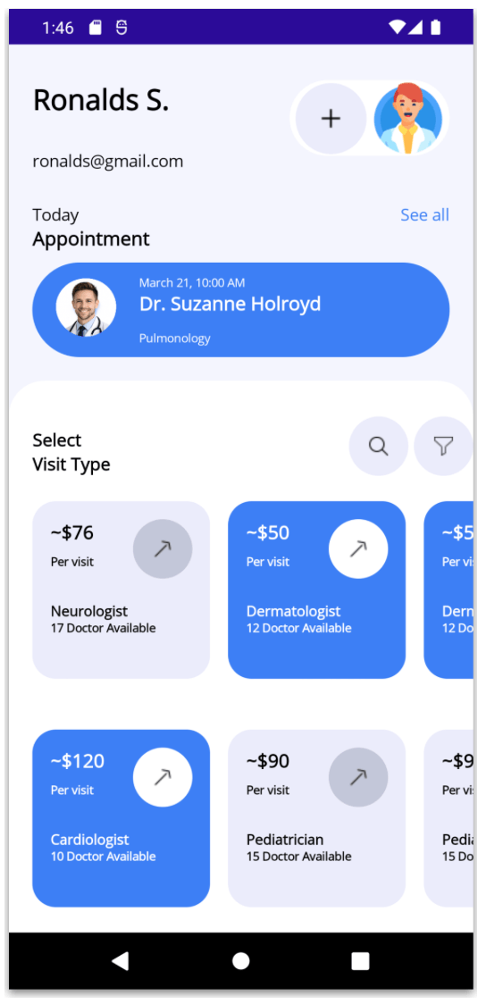
For our final block, we’ll also use a Telerik RadBorder to simulate a white background with rounded top corners. Inside it, we’ll add a Grid with two rows and three columns. Within this layout, we’ll include the title label, two rounded buttons and, finally, a CollectionView.
<telerik:RadBorder Grid.Row="5" Grid.Column="0" Grid.ColumnSpan="3"
VerticalOptions="Fill"
BackgroundColor="White"
CornerRadius="30,30,0,0"
Margin="-20,20,-20,0">
<Grid RowDefinitions="auto,*" ColumnDefinitions="*,auto,auto" Padding="20,30,0,0">
<Label Grid.Row="0" Grid.Column="0" Text="Select Visit Type" FontSize="15" VerticalTextAlignment="End" FontAttributes="Bold"/>
<telerik:RadButton Grid.Row="0" Grid.Column="1" ImageSource="search" BackgroundColor="#ebecfb" HeightRequest="50" WidthRequest="50" CornerRadius="25" Margin="0,0,5,0" />
<telerik:RadButton Grid.Row="0" Grid.Column="2" ImageSource="filter" BackgroundColor="#ebecfb" HeightRequest="50" WidthRequest="50" CornerRadius="25" />
<CollectionView Grid.Row="1" Grid.Column="0" Grid.ColumnSpan="3"
ItemsSource="{Binding specialists}">
<CollectionView.ItemsLayout>
<GridItemsLayout Orientation="Horizontal" HorizontalItemSpacing="15" Span="2"/>
</CollectionView.ItemsLayout>
<CollectionView.ItemTemplate>
<DataTemplate>
<telerik:RadBorder BackgroundColor="{Binding bgColor}"
CornerRadius="20"
HeightRequest="150"
WidthRequest="150">
<Grid RowDefinitions="auto,auto,*,*" ColumnDefinitions="*,auto" Padding="15">
<telerik:RadButton Grid.Row="0" Grid.Column="1" Grid.RowSpan="2" ImageSource="rightupblack" BackgroundColor="{Binding btnColor}" HeightRequest="50" WidthRequest="50" CornerRadius="25"/>
<Label Grid.Row="0" Grid.Column="0" Text="{Binding Price}" FontAttributes="Bold" FontSize="16" TextColor="{Binding txColor}"/>
<Label Grid.Row="1" Grid.Column="0" Text="Per visit" FontAttributes="Bold" FontSize="10" TextColor="{Binding txColor}"/>
<Label Grid.Row="2" Grid.Column="0" Grid.ColumnSpan="2" Text="{Binding category}" TextColor="{Binding txColor}" FontAttributes="Bold" FontSize="12" VerticalTextAlignment="End"/>
<Label Grid.Row="3" Grid.Column="0" Grid.ColumnSpan="2" Text="{Binding description}" TextColor="{Binding txColor}" FontAttributes="Bold" FontSize="10"/>
</Grid>
</telerik:RadBorder>
</DataTemplate>
</CollectionView.ItemTemplate>
</CollectionView>
</Grid>
</telerik:RadBorder>
✍️ Yes! You might notice something different in the CollectionView. 👀 Instead of a traditional list, the items are displayed in multiple columns. This is achieved by using a GridItemsLayout and setting the Span property, which allows us to organize the results into columns.
And that’s it—we’re all done! 🎉 Below, you can see the final result of both screens.
Conclusion
And that’s it! 🎉 In this article, we explored how to build a doctor’s office app UI using .NET MAUI with XAML. We walked through how to structure the UI into blocks, create designs using grids, apply overlapping effects and enhance the experience using Telerik components like RadBorder and RadButton.
I hope this article helps you take these ideas and apply them to your own projects! 😎
If you have any questions or would like me to dive deeper into a specific part, feel free to leave a comment—I’ll be happy to help! 💚 See you in the next article! 🙋♀️🚀
Remember, Telerik UI for .NET MAUI comes with a free 30-day trial. So you can play around in the meantime!

Leomaris Reyes
Leomaris Reyes is a software engineer from the Dominican Republic specializing in mobile development. She is a 7-time Microsoft MVP and actively builds mobile applications while sharing practical knowledge through technical articles and developer-focused content.
Through her work, she explains programming concepts, developer tools and real-world development practices to help developers grow in their careers.
You can follow her on Instagram and TikTok at @leomarisreyes.dev, read her articles on AskXammy, and connect with her on LinkedIn, where she shares tutorials, insights and resources for developers.
Comments
All articles
Topics
Web MobileMobile
Desktop
Design
Productivity
People