
Telerik UI for Blazor
What's New R3 2022
What's New HistoryNew Telerik UI for Blazor PDF Viewer Component
The Telerik UI for Blazor PDF Viewer component allows users to view and interact with PDF files directly in the browser without the need to download the file or use third-party tools or extensions for viewing PDF documents. This PDFViewer control will significantly impact productivity and efficiency within the development of key functionality for modules or entire applications for document management. Such apps depend on features to view and perform read-only operations. The PDF Viewer includes a toolbar with built-in features to open, view, and download PDF files, paging, PDF search options, zoom in/out, printing and more.
Explore the UI for Blazor PDF Viewer component demo or try out the component in Telerik REPL for Blazor.

New Telerik UI for Blazor MultiColumnComboBox Component
The new Telerik UI for Blazor MultiColumnComboBox component is an editor UI component that lets you choose values from a predefined list in a table-like structure and simultaneously allows user input. The MultiColumn ComboBox comes with a rich set of built-in features and options to customize its look and feel, including data binding, filtering, grouping, rendering of custom content through templates, appearance configuration, input of custom values, validation, built-in localization of messages, accessibility and keyboard navigation.
See the Blazor MultiColumnComboBox UI component demo or try out the component in the Telerik Blazor REPL browser-based code runner.

New Telerik UI for Blazor Skeleton Component
The new Telerik UI for Blazor Skeleton component will help you make applications more user-friendly while reducing the perceived initial load time. The Skeleton UI component serves as a placeholder representing each of the underlying HTML elements while users are waiting for the page content to load. It comes with built-in customization options for its shape, height, width, animation type, visibility, and CSS class.
See a demo of the Blazor Skeleton UI component or try it out in Telerik REPL for Blazor.

New Theme in Telerik UI for Blazor: Microsoft Fluent Design System
The new Fluent theme can be experienced in Telerik UI for Blazor, along with all other web UI component libraries. The Fluent theme follows the official guidelines of the Fluent Design System, enabling you to style all Blazor UI components as soon as you include the new theme into your project. Those of you who already use our Fluent-themed components can add the Fluent theme to allow any of the other available Blazor UI components to seamlessly fit in.

Accessibility Improvements in Telerik UI for Blazor
The Telerik UI for Blazor library is undergoing an accessibility review using the latest industry-standard testing process. In the R3 2022 release, we have addressed and improved multiple items and will continue this effort throughout the year to raise the components’ accessibility compliance levels and improve the related documentation.
In the 3.4.0, 3.5.0 and 3.6.0 releases, we specifically addressed the WAI-ARIA best practices for implementing keyboard navigation for multiple UI for Blazor components, tested against the popular screen readers, implemented the recommended rendering related to various WAI-ARIA attributes and worked towards aligning with WCAG 2.1 AAA and Section 508 compliance standards.
The Telerik UI for Blazor components that received accessibility uplift in R3 2022 include Blazor Data Grid, TreeList, TreeView, PanelBar, Stepper, Wizard, Pager, DateInput, Calendar, DateRangePicker, DatePicker, TimePicker, DateTimePicker, Drawer and Breadcrumb.

Visual Studio Productivity Tools in Telerik UI for Blazor
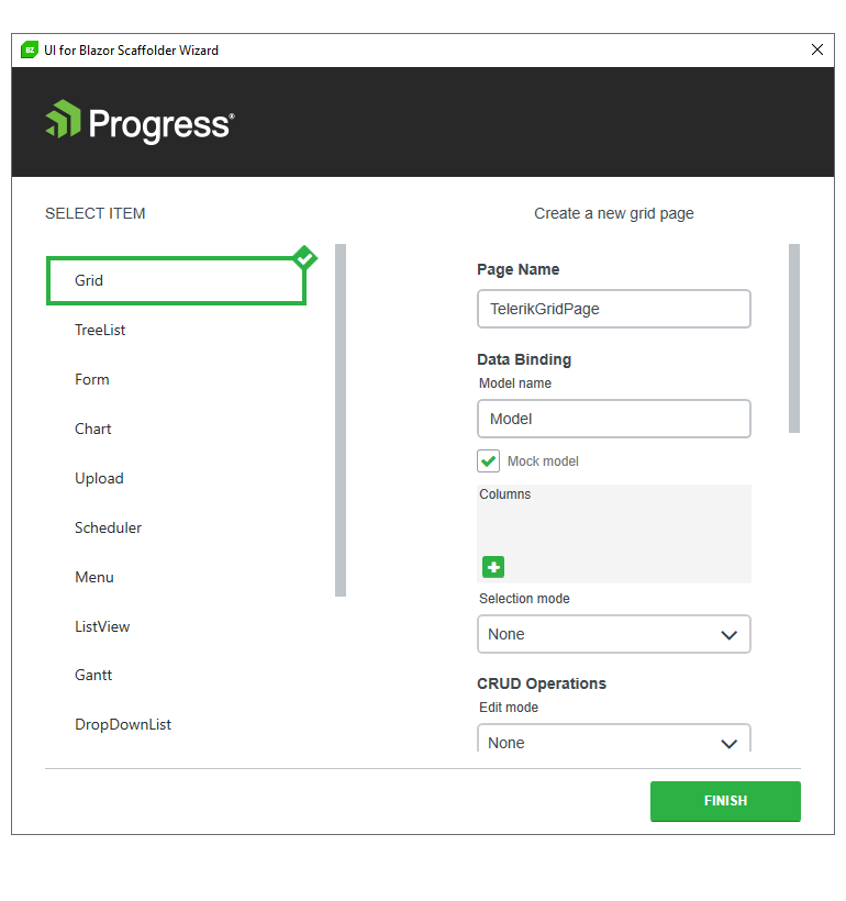
Visual Studio Scaffolder
The new UI for Blazor scaffolding feature in Visual Studio will enable faster creation of new pages in your Blazor apps. You can take advantage of quick code generation for the most used data-bound components: the Data Grid, TreeList, Scheduler, Chart, ListView, Gantt, Form, Drawer, Menu, DropDownList, Upload, ComboBox and more.
Try out the UI for Blazor scaffolding feature in Visual Studio.
Visual Studio Snippets
The Visual Studio productivity tools in Telerik UI for Blazor include dozens of code snippets that were created to help you accelerate development speed. Get easy access to the code snippets in Visual Studio by typing a shortcut in the IDE (e.g., “tb” for Telerik UI for Blazor) or the name of the component you want to apply. For instance, if you want to insert a code snippet for the Data Grid, just type “grid” or “gr” to see the dropdown with all available code snippet templates. Then, using a tab sequence, you can fill out the properties, options, model and controller actions.
For those of you who prefer to use Visual Studio Code, you can access the code snippets pack there by installing the Telerik UI for Blazor productivity extension.
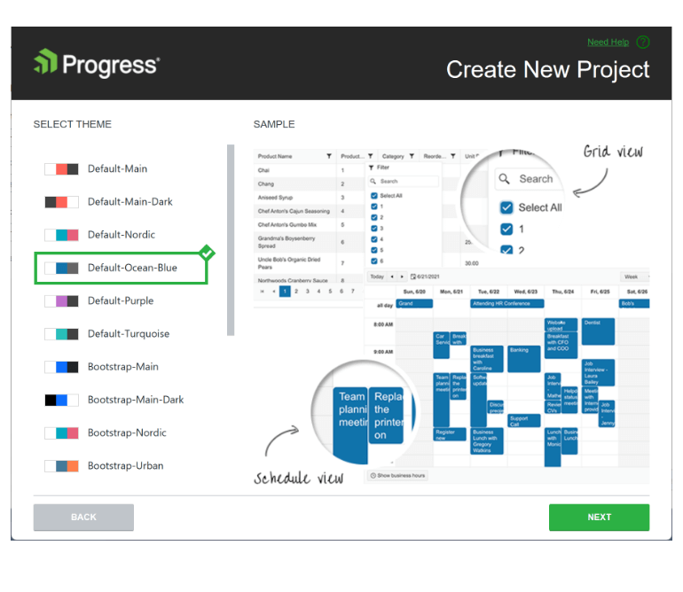
Visual Studio Configuration Wizard
Another enhancement in Visual Studio Productivity tools for Telerik UI for Blazor is the new Project Configuration wizard. It comes with the Telerik UI for Blazor Visual Studio extension to help you modify settings in existing projects such as visual theme, use of CDN and localization.
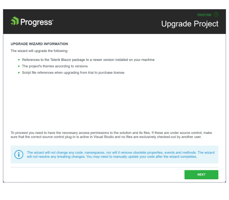
Visual Studio Upgrade Wizard
A Telerik UI for Blazor Update Wizard is now available for Visual Studio
and it supports two scenarios—upgrading from trial to a licensed version
and updating the version. The Update Wizard works by updating not only
the Blazor PackageReference, but also the underlying JavaScript as well as the themes.
DefaultOperator in Blazor Filter Component
You can customize the default filter operator each time you add a new field in the Telerik UI for Blazor Filter component using the new DefaultOperator parameter. If unassigned, the default operator will be set based on the data type.

UI for Blazor Data Grid & TreeList Enhancements
Drag & Drop Between Various Blazor Components
This feature applies to the Blazor Data Grid and TreeList and introduces the ability to drag items from any of these components to any other of them plus to Gantt and Scheduler (For now, the reverse operation allows drag from Grid and TreeList.). Previously, users were only able to drag & drop items between instances of the same component such as the Grid and the TreeList, which is limiting for some of the use cases they need to implement.
The update implies that the same Drop event will be triggered as the current one but with two additional event parameters: (DestinationIndex(string)) and (DestinationComponentId(string)), which allows users to determine the drop destination inside any of the receiving components. An additional new method called GetTimeSlotFromDropIndex has been added to the Grid and the TreeList to ensure the corresponding item in the destination component can be returned.
Custom Filter Operators
You can customize the filter operators list of the Blazor Grid and TreeList components using the FilterOperators parameter within each column tag. The feature works seamlessly for both the filter menu and filter row modes.
Customization of the Format Used within the Filters
A new FilterEditorFormat parameter to the Blazor Data Grid and TreeList components allows you to control the format of the default filter input and have aligned formatting of values in the column display and filter editor. The filter editor formatting is available in filter row and filter menu scenarios.
Header Cell CSS Class
To customize the appearance of any Blazor Grid/TreeList column header, you can take advantage of the exposed HeaderClass parameter in the column tag within both components. This would allow you to define custom CSS classes for the column header cells and easily bold their text, change their alignment or style them to make them stand out.
New Features in Telerik REPL for Blazor
Telerik REPL for Blazor now comes with a new playful loading animation and has been updated with a responsive layout. Plus, we ensured the REPL is responsive—you can now adapt, run and share code snippets seamlessly from smaller screen devices.

Until now, the REPL could be used only with the latest Telerik UI for Blazor version, which is about to change. Users are now able to change the underlying version of Telerik UI for Blazor when using the REPL and compile and render code using the selected version. Each Telerik UI for Blazor version comes with its packaging and static asset dependencies, allowing the user to use currently available swatches for each of the versions.
Check out the latest updates in the Telerik REPL for Blazor now!

UI for Blazor Gantt Component
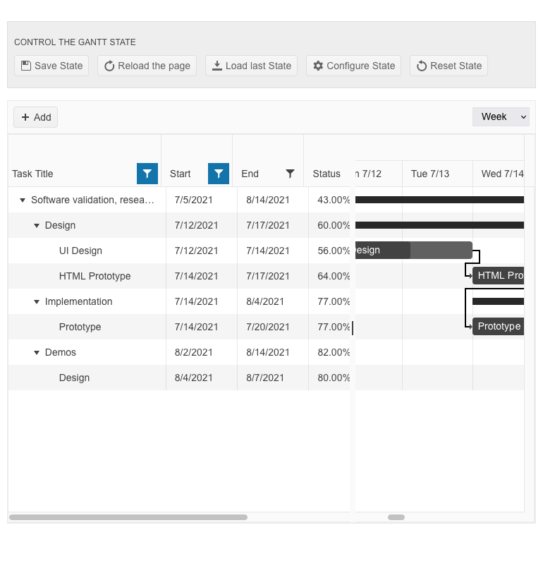
Gantt State Management
The Telerik UI for Blazor Gantt component now allows persisting its state between browsing sessions. You can save and load the Gantt layout so your users can continue where they left off. The Gantt persist state includes all types of changes in the TreeList part of the component: extended items, edited items, column size and order, TreeList size (controlling the splitter position between the tree list and timeline parts), sorting and filtering. You can also control these elements programmatically by setting the desired state of the Gantt in your own code.
Gantt Rebind Method
The new Rebind method in the Telerik Blazor Gantt component allows you to easily trigger data processing logic in the TreeList and Timeline parts so that the UI reflects changes made in the data collection.
Blazor Gantt TooltipTemplate Customization
The Blazor Gantt component tooltip template now includes StartDate and EndDate fields that include all relevant parts of a task’s date (year, month, day, hours, minutes, etc.). and are formatted according to the ISO 8601 standard. They can be easily parsed as C# DateTime objects. This would help you transform and format the task dates to any format that is required in your Blazor applications.
Custom Filter Operators
Using the FilterOperators parameter within each Gantt column, you can define your own list of filter operators. The feature works seamlessly for both filter menu and filter row modes.
Customization of the Format Used within the Filters
We also added a new FilterEditorFormat parameter to the Blazor Gantt. This parameter allows you to control the format of the default filter input and have aligned formatting of values in the column display and filter editor. The filter editor formatting is available in filter row and filter menu scenarios.
Drag & Drop Between Blazor TreeView and Multiple Blazor Components
This feature applies to Blazor TreeView and introduces the ability to drag items from the Treeview and drop them to Grid, TreeList, TreeView, Scheduler and Gantt (For now, there is a limitation for the reverse operation from Gantt and Scheduler.). Previously, users were only able to drag & drop items between instances of the same component, which is limiting for some of the use cases they need to implement.
The update implies that the same Drop event will be triggered as the current one but with two additional event parameters: (DestinationIndex(string)) and (DestinationComponentId(string)), which will allow users to determine the drop destination inside any of the receiving components. An additional new method called GetTimeSlotFromDropIndex is added to the TreeView to ensure the corresponding item in the destination component can be returned.
HeaderTemplate in Blazor Calendar, DatePicker and DateRangePicker
Using the HeaderTemplate feature you can add custom buttons or render your own content in the header part of the UI for Blazor Calendar, DatePicker and DateRangePicker components.

New Document Processing Libraries' (DPL) features
With R3 2022, we’ve released new features across all Document Processing libraries to support you better navigate your document formats:
New WordProcessing features:Page Numbering fields: Although the field codes are supported, we have now added a functionality that allows you to update the PAGE, PAGEREF, NUMPAGES and SECTIONPAGES fields and easily calculate their result.
See the docs for WordProcessing Page Numbering Fields
Shapes support: The shapes feature allows you to easily insert or interact with existing shapes like circles, boxes, arrows and many others directly in your documents. You can style the inserted shapes by using gradient fills and various patterns outlines, as well as change the size of the shapes and rotate them.
See the docs for WordProcessing Shapes support
New in SpreadProcessing: Repeat specific rows or columns on every printed page: This feature allows you to specify a row or a column that will be repeated on every printed page.
See the docs for SpreadProcessing: Repeat specific rows or columns on every printed page
New in PdfProcessing: PdfProcessing Signature flags support: With this new functionality, you can specify that there is a signature, even if the signature itself does not have a visual representation.
Export PDF pages to images: We have added the ability to convert the pages of a .pdf document to images. This feature will work with the .NET Standard version and does not depend on any Windows libraries.
See the docs for PDFProcessing: Export PDF pages to images
New in SpreadStreamProcessing: SpreadStreamProcessing import: This functionality allows you to read large XLSX or CSV files without loading the entire document in memory. This improves the memory footprint and the performance compared to the RadSpreadProcessing library.
See the docs for SpreadStreamProcessing: SpreadStreamProcessing Import

Multiple New Parameters in FileSelect and Upload Components
In R3 2022 we exposed multiple parameters to enable further flexibility when working with the FileSelect and Upload components in Blazor applications. The new parameters include:
- Id – allows you to associate the component with <label> tags and perform further references and checks
- Accept – allows you to easily configure which files should be visible in the browser’s file select dialog
- Capture – renders as a capture HTML attribute of the <input type="file" /> and enables direct usage of the device camera instead of the file system.
Open & Close Methods in Multiple UI for Blazor Components
The new Open and Close methods allow you to toggle the popup visibility of multiple UI for Blazor select components without triggering the OnOpen/OnClose events.
The Open & Close methods are available starting with the 3.5.0 release in the following UI for Blazor components: AutoComplete, ColorPicker, ComboBox, DatePicker, DateRangePicker, DateTimePicker, DropDownList, MultiColumnComboBox, MultiSelect and TimePicker.
New Events in UI for Blazor PanelBar
The Telerik UI for Blazor PanelBar component has been expanded with the OnExpand and OnCollapse events. The two events are invoked when an expandable panel bar item is toggled and allow you to control further the triggering logic of expand/collapse functionality and whether to prevent the events from executing, respectively keeping the item's state unchanged.
See the full list of events for the UI for Blazor PanelBar component.

Responsiveness and Adaptive Blazor Layout
To showcase the power of the UI for Blazor MediaQuery component, we have built several demos to demonstrate how you can easily make Blazor components and apps responsive to different screen sizes:
- How to make responsive Menu components in Blazor Applications
- How to make responsive Forms in Blazor Applications
- How to make responsive Grid Layout in Blazor Applications
We also published a dedicated blog post to showcase additional examples and capabilities of how to create adaptive layouts and applications using Blazor and Telerik UI for Blazor components.

OnOpen and OnClose Events in Multiple Blazor Components
We are introducing OnOpen and OnClose events in the following UI for Blazor components: AutoComplete, ColorPicker, ComboBox, DatePicker, DateRangePicker, DateTimePicker, DropDownList, MultiSelect and TimePicker. The OnOpen/OnClose events are triggered right before the underlying popup component is shown or hidden regardless of how the open/close is initiated—keyboard, mouse click or a value change.
Accessibility-Focused Demos & Docs
The new accessibility-focused demos including documentation can be utilized to test any of our Blazor UI components for accessibility without relying on a dedicated developer. Previously, whenever teams had to run accessibility tests on any Telerik UI for Blazor component, they would have to do so locally with the help of a dedicated developer setting up the required configuration. Now, any team member that needs to run tests with screen readers or other software for accessibility testing can do so by visiting the respective online demo. Additionally, we have added a WAI-ARIA Support article for each of the components that lists the respective attributes and usage.
Updated Blazor Coffee Demo App
The demo app Blazor Coffee Warehouse got some updates to make it even more useful for you. It now includes examples that showcase some of the most popular UI for Blazor components such as the Data Grid, Drawer, Charts, Inputs, Form and more. The app also demonstrates how users can easily change the theming and apply localization in Blazor-built applications.
Explore the Blazor Coffee Demo App now!

Telerik UI for Blazor: Day-Zero Support for .NET 7
With the November 2022 update, we’ve released day-zero support for .NET 7 for all Telerik .NET products, including UI for Blazor, and their respective Visual Studio extensions. In addition, we’ve updated the demos and project templates to .NET 7 and launched new components and improvements. With this instant support, you can either upgrade your existing projects, start a new project using .NET 7 and Telerik UI for Blazor right away or do both.


Next Steps
See Telerik UI for Blazor in action and check out how much it can do out-of-the-box.
Check out the offers. Purchase an individual suite, or treat yourself to one of our bundles.
Try Telerik UI for Blazor with dedicated technical support.