Telerik UI for Blazor
What's New R1 2022
What's New HistoryNew Component: Map
The Telerik for Blazor Map UI component allows you to display geographical information organized in layer and can be integrated with open map providers in your apps. The Blazor Map includes tile, bubble, shape and marker layers and support for the GeoJSON data format. It is fully compatible with Azure's PNG tile API, enabling you to easily integrate advanced location and mobility capabilities into your maps. It comes with touch support, multiple customization options and more!
See demo of the Telerik Blazor Map component.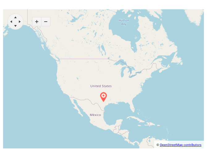
Telerik REPL for Blazor Playground
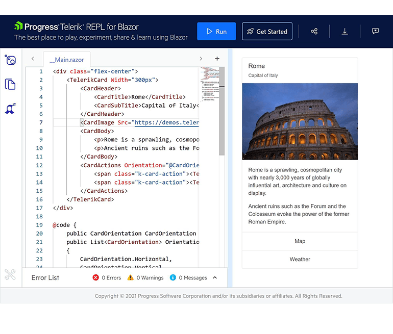
A couple of months ago, we announced the launch of a new, cool browser-based playground for creating, saving, running and sharing Blazor code snippets: Telerik REPL for Blazor (REPL as Read–Eval–Print-Loop). The REPL code-runner also provides seamless integration with the Telerik UI components and lets you test and customize them effortlessly in the browser without any additional setup and configuration.
New Component: ColorPicker
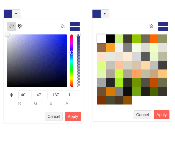
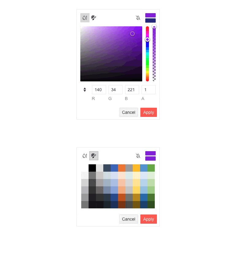
The Blazor ColorPicker renders in a popup and allows users to choose a color either from a predefined palette or from a gradient view. The component allows switching between the two views, supports resetting and reverting values, as well as Apply & Cancel built-in buttons for managing the changes.
See the various configuration options offered by the Blazor ColorPicker.
New Component: FileSelect
The new Blazor FileSelect UI component allows you to select local files and store them on a server. It exposes multiple configuration options for the management of selected files and the way they are uploaded, including disabled state, minimum and maximum file size, file types and extensions. Like the rest of the Telerik UI for Blazor components, it has built-in keyboard navigation support and accessibility.
See the Telerik UI for Blazor FileSelect features in action.
Theme Improvements
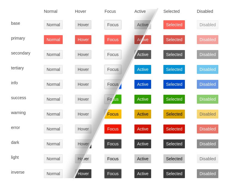
Based on your feedback, we are going to address various aspects related to themes customizations and design language trends and theme improvements. R1 2022 delivers updates for the Button, Input, DateInput and DropDown components with a set of common options that will help define the colors, size and shape of individual components. Throughout 2022, we will be introducing enhancements to the way individual components work with themes to make it easier to use your own design system.
Check out the multiple appearance demos showcasing the theming options for the updated components: DropDownList apperance,Numeric Textbox options, ButtonGroup and more!
Telerik & Kendo UI Kits for Figma v1.7
We officially introduced the Telerik and Kendo UI Kits for Figma a few months back with the goal to help improve the collaboration between designers and developers using Telerik and Kendo UI components. We expanded the initial set of UI components and with R1 2022 we are introducing nearly 100% coverage of Figma assets for Telerik and Kendo UI components with the only exception of charts.
New Component: QR Code
Encode any information, from URLs to geolocation, into easily customizable QR codes with the Telerik UI for Blazor QR Code component. Add your company logo or an image of your liking to have it tailored to your application’s style.
See the QR component configuration options.

New Component: HeatMap
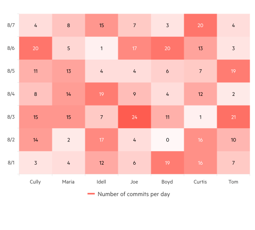
Use the Blazor HeatMap chart to visualize multiple data values as color across a chart. Take advantage of the built-in tooltip and different customization options, allowing you to change the shapes and colors of the chart.
New Component: ColorGradient
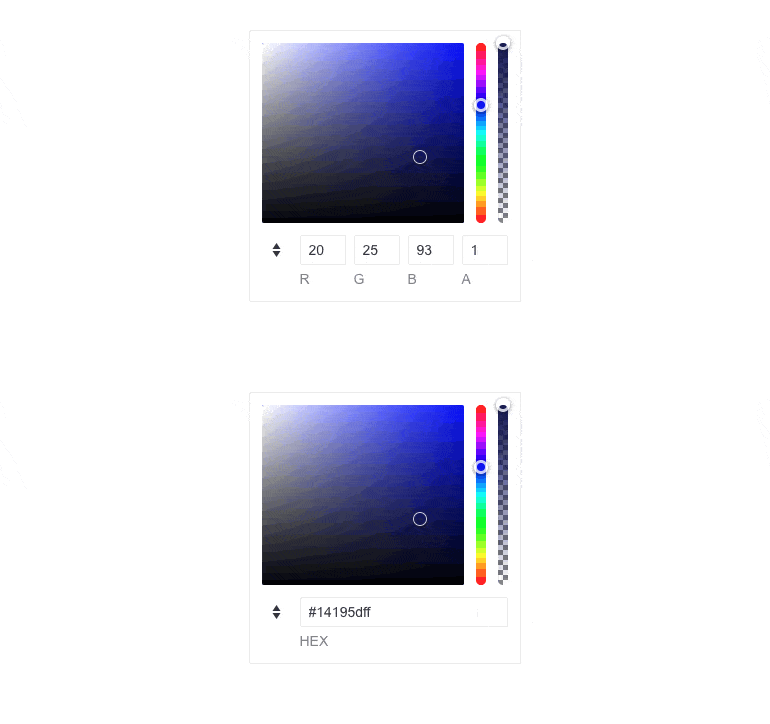
The Telerik UI for Blazor ColorGradient component allows users to choose a color through a canvas, sliders or color inputs for the most popular and readable color formats (HEX, RGB and more). The component is accessible to all users and comes with built-in support for keyboard navigation.
Try out the ColorGradient component demo.
New Component: FlatColorPicker
Use the Blazor FlatColorPicker to select and edit colors through a palette. Customize its header and footer and choose the editor view that best suits your case.
New Data Grid Features & Enhancements
The Blazor Data Grid component received multiple new features and enhancements:
- Export to Excel customizations
- Include all pages in Excel export with OnRead
- Enhanced validation and editing
- API methods for auto-sizing columns to their content width
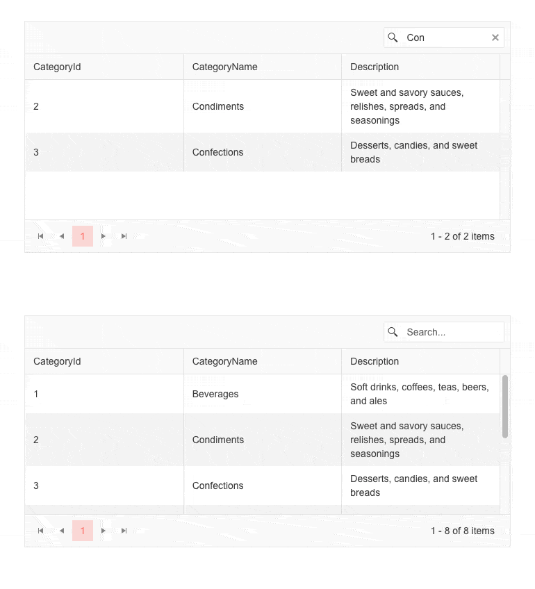
- Ability to clear the built-in Grid SearchBox through X-icon and Esc key
- Include SearchBox filter criteria in Grid state
New TreeList Features & Enhancements
The Blazor TreeList component has been enriched with the following functionalities:
- Enhanced validation and editing
- API methods for auto-sizing columns to their content width
- SearchBox filter criteria included in state
- Ability to clear SearchBox through X-icon and Esc key
- Include all pages in Excel export with OnRead
New Enhancement for all DateInput Components: Format Placeholders
The new format placeholder feature enables you to render a text hint within the input field in the DatePicker, TimePicker, DateInput, DateRangePicker and DateTimePicker components. It allows you to provide custom descriptions for the format sections and can be adapted based on your app or users' preferences.

New TabStrip Enhancements
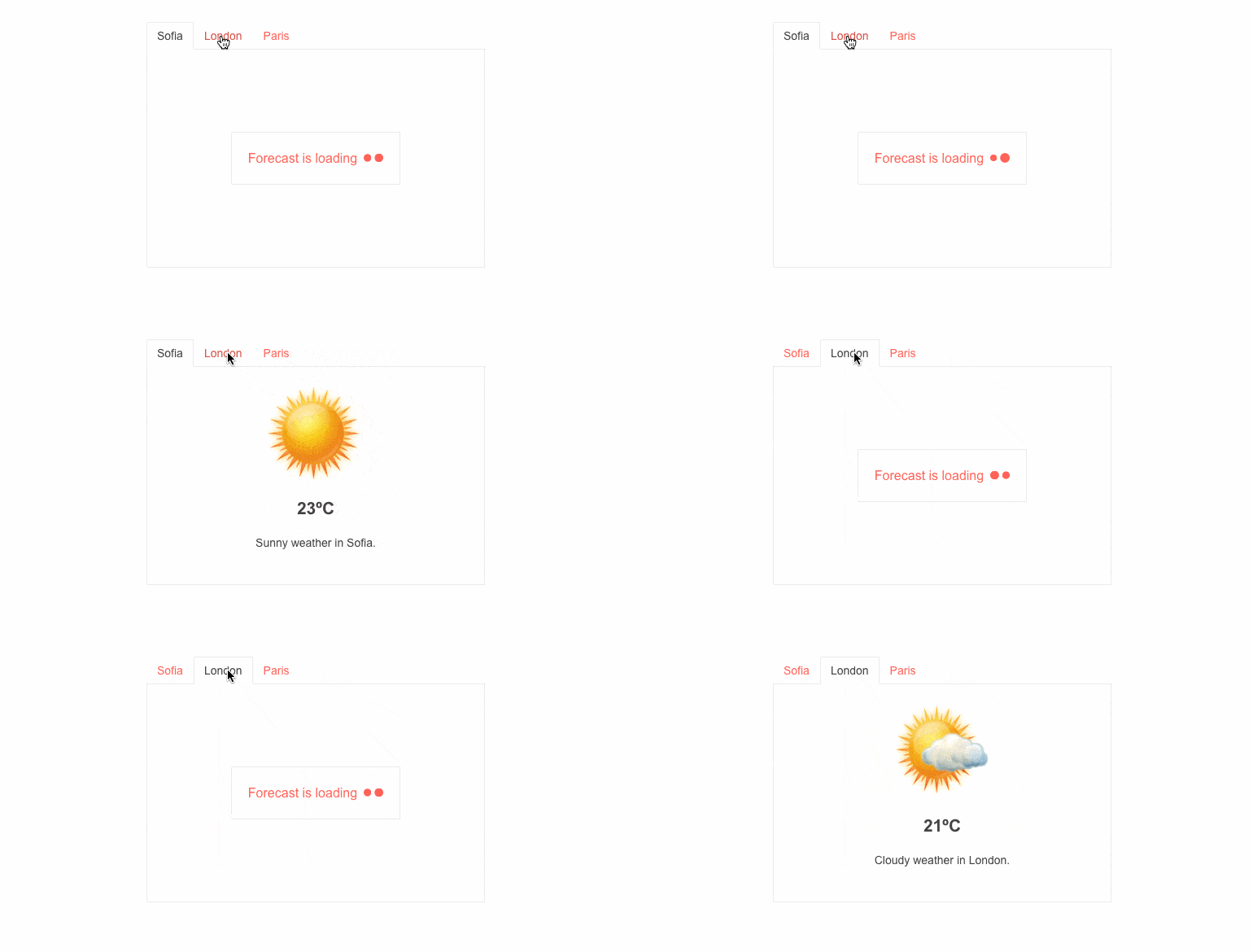
The TabStrip for Blazor now exposes two new parameters: PersistTabContent, which determines whether the tabs content is persisted when changing tabs, and Visible, which allows you to easily control the visibility of each tab.
New ValidateOn Parameter in All Input Components
We introduced a new enum parameter (ValidateOn) in all Telerik Blazor input components, such as Date & Time Pickers, TextBox, Numeric TextBox, MaskedTextBox and TextArea. The ValidateOn parameter allows you to configure whether to trigger validation on change, blur or while typing, which allows you to set the right one for a particular use case.
New Chart Features
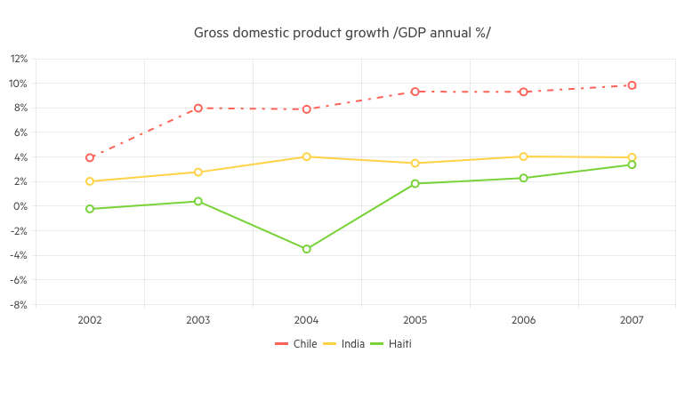
The new Chart properties allow you to easily customize the data visualization graphics. The new features for the Line Chart and Stock Chart components include configuration of the area background color and opacity, line width and dash type.
New Methods in Upload Component
With this release, we exposed new methods in the Upload component API for triggering upload, file select dialog, as well as the ability to clear successfully uploaded files.
See how you can customize the Upload component.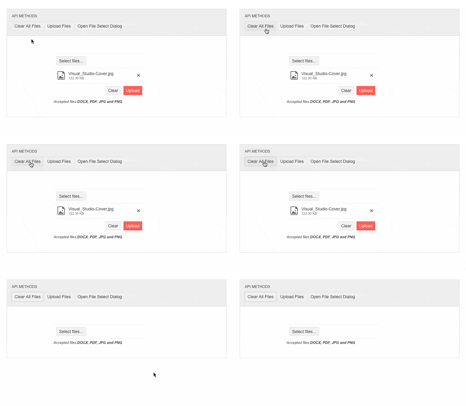
Introducing Popup Settings in All Select Components
You can now easily customize popups within a single dedicated tag for the following Telerik components: DropDownList, ComboBox, Autocomplete and MultiSelect.
Media in Editor Feature
The Editor component now allows you to add media tags such as video, audio, iframe and more.
See how to plug media into Telerik Blazor Editor.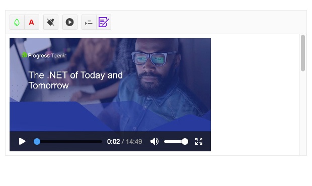
Compatibility with .NET 6 and Visual Studio 2022
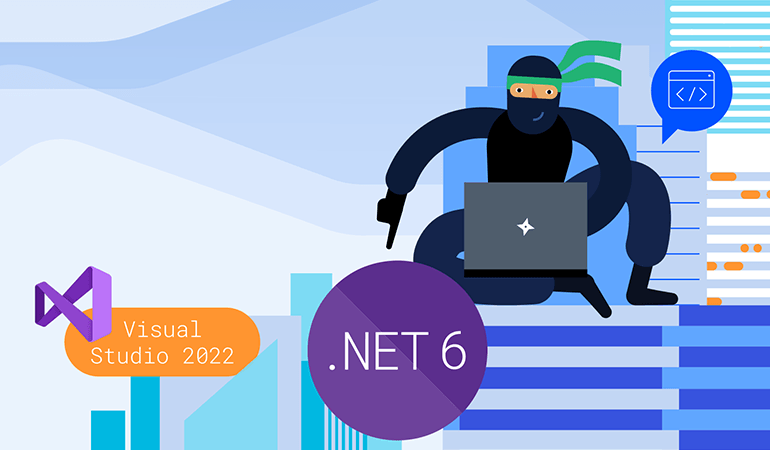
We are glad to announce that the Telerik UI for Blazor suite has been compatible with .NET 6 and Visual Studio 2022 since November 2021, just a couple of days after the official releases by Microsoft. You can dive into seamless development with our web components, create new projects using our project templates & built-in layouts and take advantage of the extensive Telerik libraries.
Product Source Code
The Telerik UI for Blazor source code has been made available to our active license holders (available since 2.29 release in Your Account -> Downloads section).
Improved Visual Studio Code Extension
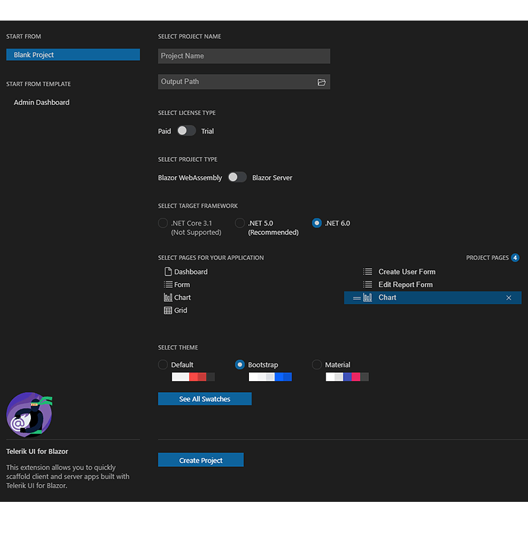
Telerik UI for Blazor brings a refreshed and improved Visual Studio Code extension! You can enjoy the updated UX, new Admin Dashboard project template, configure the .NET framework version (including .NET 6.0) and set project themes plus color swatches with a couple of clicks at project creation.
Visual Studio Theming and Swatches
We are enhancing the project creation in your favorite IDEs. You can now configure project themes and specific swatch coloring when using the Create New Project extensions in Visual Studio.
New Blazor Admin Dashboard Template
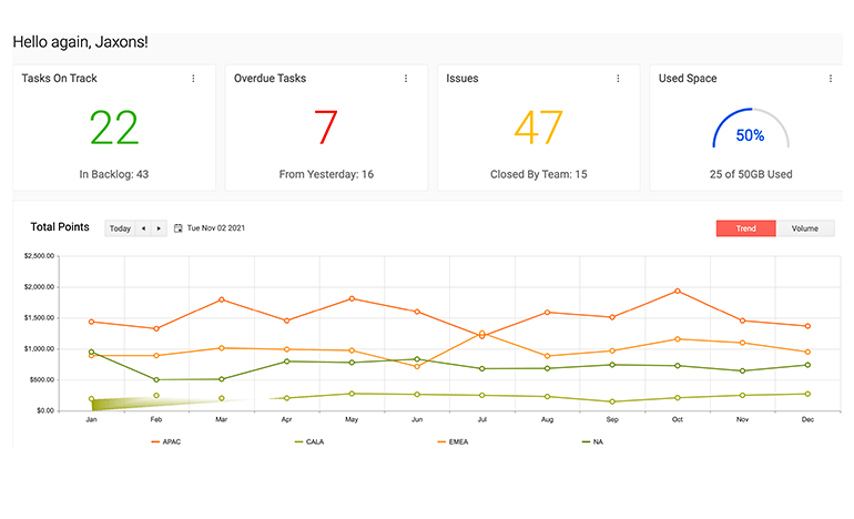
A brand-new Admin Dashboard project template has been added to the available templates in the Create New Project Wizards for Visual Studio. You can easily jump-start a project with the pre-built layout and functionality, rearrange the layout as it fits your needs, and simply plug in your data and bind it to the components.
New Document Processing Features for Blazor
In the latest Telerik Document Processing distribution package in UI for Blazor, you will find several new document processing features: Support for conditional formatting and export notes by a specific author in SpreadProcessing, Nested MailMerge in WordsProcessing.
Telerik UI for Blazor - R1 2022
- New Component: Map
- Telerik REPL for Blazor Playground
- New Component: ColorPicker
- New Component: FileSelect
- Theme Improvements
- Telerik & Kendo UI Kits for Figma v1.7
- New Component: QR Code
- New Component: HeatMap
- New Component: ColorGradient
- New Component: FlatColorPicker
- New Data Grid Features & Enhancements
- New TreeList Features & Enhancements
- New Enhancement for all DateInput Components: Format Placeholders
- New TabStrip Enhancements
- New ValidateOn Parameter in All Input Components
- New Chart Features
- New Methods in Upload Component
- Introducing Popup Settings in All Select Components
- Media in Editor Feature
- Compatibility with .NET 6 and Visual Studio 2022
- Product Source Code
- Improved Visual Studio Code Extension
- Visual Studio Theming and Swatches
- New Blazor Admin Dashboard Template
- New Document Processing Features for Blazor
New features & Roadmap
Have a feature request?
Post your feedback via the Blazor UserVoice portal or the Public forums
What's new across all Telerik products?

Next Steps
See Telerik UI for Blazor in action and check out how much it can do out-of-the-box.
Check out the offers. Purchase an individual suite, or treat yourself to one of our bundles.
Try Telerik UI for Blazor with dedicated technical support.
