Telerik UI for Blazor
What's New R3 2021
What's New HistorySupport for Visual Studio 2022 and .NET 6

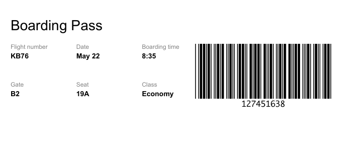
New Component: Barcode
Generate and display barcodes for every data type with over 15 supported encoding types. This component is perfect for giving users page printing options, for example, boarding cards, government services, product codes, etc.
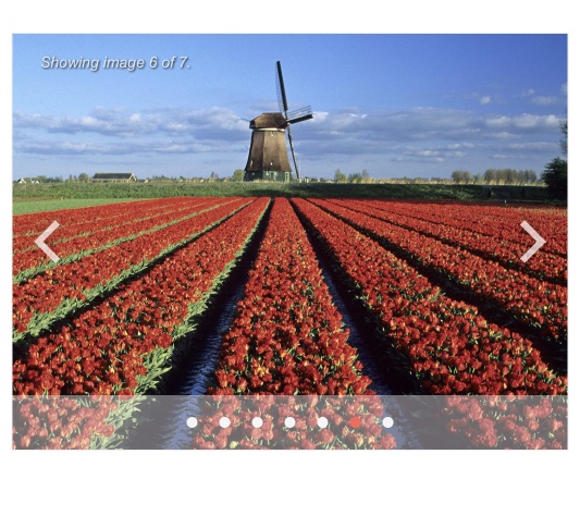
New Component: Carousel
Suitable for displaying an item gallery like an ecommerce store or a portfolio, this great modern UI element has been a staple of web design for a while and will fit perfectly pretty much every project.
New Component: Breadcrumb
We’ve added a Breadcrumb component to the Telerik UI for Blazor suite! This popular navigational component can make all the difference between a frustrated user lost in your web app and a happy customer knowing where they are every step of the way.

New Component: Wizard
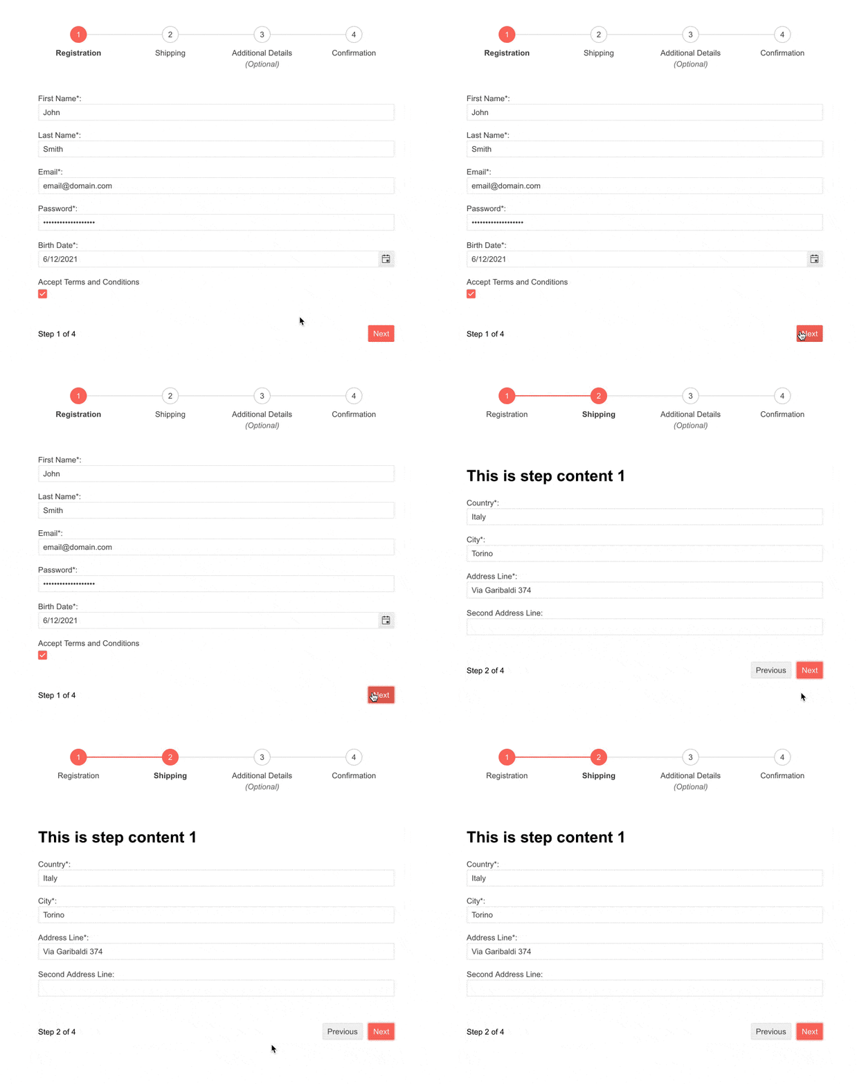
The Wizard component enables you to create multi-step processes and guide users step-by-step in your application. You can easily integrate the Wizard with a Form component to break long processes into smaller steps and allow users to fill one form at a time. If you integrate it, each step of the Wizard will be a separate Form, and you will be able to use all of the input component functionalities, such as custom textboxes, labels and data validation.
New Component: StackLayout
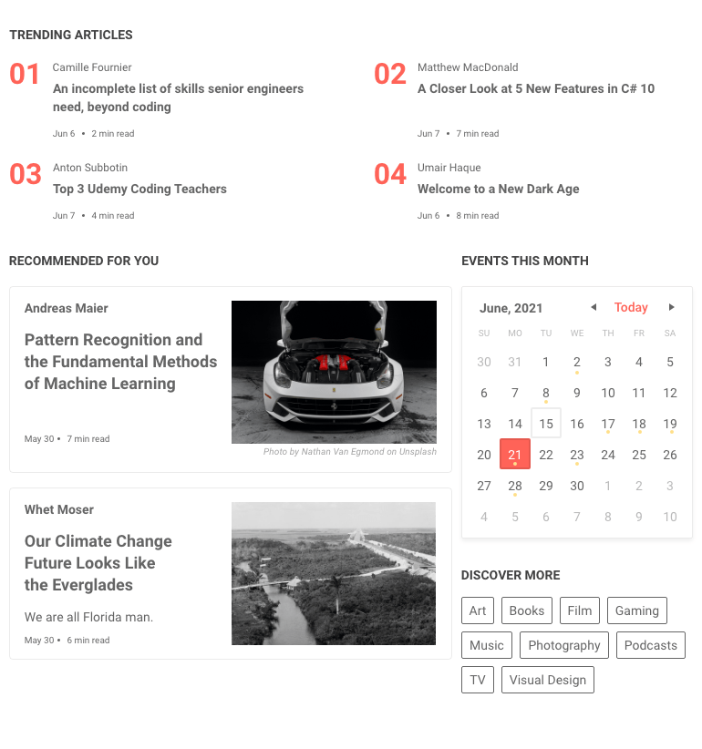
The new Telerik UI for Blazor StackLayout component lets you to arrange UI elements horizontally or vertically in a stack. You can use it to organize content in your project both in a row or in a column, whichever fits your needs. Тhe component is similar to the StackLayout in WPF, so it will let developers with desktop background easily build web layouts in a familiar way.

New Component: GridLayout
With the GridLayout component for Telerik UI for Blazor you can easily organize UI elements in a grid-layout system with both rows and columns. It comes with various customization options, such as row and column spacing, vertical and horizontal alignment, row and column span and more. Тhe component is similar to of the GridLayout in WPF, so it will let developers with desktop background to easily build web layouts in a familiar way.
New Telerik UI Kits for Figma
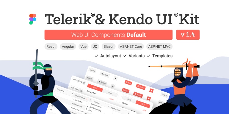
Have you ever wanted to speak the same language as your designers? With Telerik UI Kits for Figma, this will no longer be a problem!
The Telerik UI Kits for Figma are design files created to make the collaboration between application developers and designers easier. Each UI kit provides a precise visual representation of the top 30 Telerik UI for Blazor components, including the Grid, Scheduler, Input etc. The kits portfolio will be continually expanding to provide full coverage for all UI components in the Blazor suite. We offer three Design Kits for Figma, one for each of the main themes: Telerik UI Kit Default, Bootstrap and Material.
New Gantt Enhancements
A promise is a promise! With R3 we have added the second batch of features to the long-awaited Gantt component.
Task dependencies
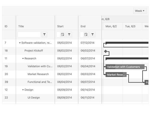
We’ve added task dependencies! That’s the ability to mark tasks as dependent which will force the Gantt diagram to display a connection. If a task is not yet completed, you want the component to figure out that something’s gone wrong and update the estimates on all other dependent tasks.
Column resizing
With this release, columns can be resized in the Gantt component to make the experience more optimal and natural for all users. Only standard columns may be resized, the columns in the time view are still managed by the control. We’ve also added an option to toggle the resizing off.
Column reordering
Reordering is just as simple as resizing – drag and drop the top of the column and put it where you want it to be. If reordering isn’t tempting – you can disable it and protect it against anyone moving it by chance or with intent.
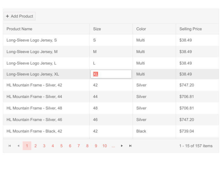
New Grid Feature: Excel-like Editing
Editing with a minimal number of keystrokes, like how MS Excel operates, is now available in Telerik UI for Blazor Grid – hit Enter to confirm the current value and automatically move onto the next cell in the column. The input content is highlighted by default so you can replace it without hunting for the mouse to select it.
New Blazor Scheduler Events
In R3 2021, we,ve added several new events that will help you easily control the logic in the Scheduler component when appointments are clicked or need to be managed by end users. The new events include: OnItemClick, OnItemContextMenu and OnItemDoubleClick.
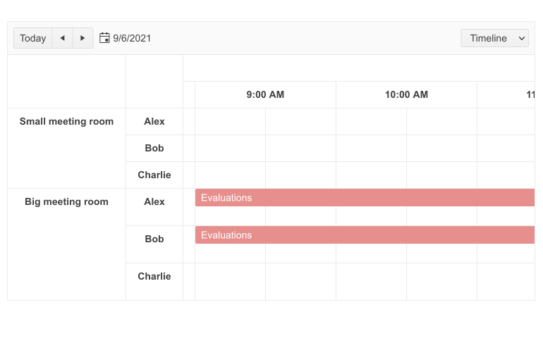
New Scheduler Enhancement: Timeline View
In addition to the several Blazor Scheduler views, such as Week View and Month View, the component will now also feature a Timeline View. This allows you to effortlessly display appointments on their specific time slots and define their duration. You can choose between multiple Timeline Views, including Week, Work Week and Month.
New TreeView Enhancement: TreeViewEventArgs Parameter
New Tooltip Enhancement: Tooltip Dynamic Targets
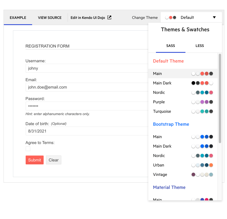
New Theming Enhancement: Improved Themes and Swatches picker for all component demos
With this release, we decided to make it even easier and faster to find and apply your favorite themes and swatches to any UI component. Check out any Blazor UI component demo to explore the new look of the Themes and Swatches dropdown menu and find your favorite color combinations, some of which include Default (Main, Nordic, Purple, etc.), Bootstrap (Main, Urban, Vintage, etc.) and Material (Arctic, Fuchsia, Lime Dark etc.)
New Features in Telerik Document Processing
In R3 2021, we have something new for those of you who are using Telerik Document Processing within your Telerik UI for Blazor apps! In the latest distribution package, you will find several of the most requested items on our feedback portal, including:
- PdfProcessing: Handle import of documents with invalid cross-reference table offsets.
- SpreadStreamProcessing & SpreadProcessing: Support for XLSM.
- WordsProcessing: Introduce a way to replace text with other document elements and more!
New Support for Bootstrap 5
Following the announcement of Bootstrap 5 earlier this summer we worked to ensure that we can accommodate various preferences for its support. If you would like to be compatible with the latest updates, make sure to use the bootstrap-main swatch. In case you wish to continue using the previous versions you can reference Bootstrap-3 and Bootstrap-4 respectively.

Accessibility Improvements
We strive to make our UI components accessible for all users and continually improve our accessibility features. With this release, we’ve optimized various components, including Button, ToggleButton, TextBox, NumericTextBox, MaskedTextBox, TextArea, DateInput, DatePicker, DateTimePicker, TimePicker and DateRangePicker.
Telerik UI for Blazor - R3 2021
- Support for Visual Studio 2022 and .NET 6
- New Component: Barcode
- New Component: Carousel
- New Component: Breadcrumb
- New Component: Wizard
- New Component: StackLayout
- New Component: GridLayout
- New Telerik UI Kits for Figma
- New Gantt Enhancements
- New Grid Feature: Excel-like Editing
- New Blazor Scheduler Events
- New Scheduler Enhancement: Timeline View
- New TreeView Enhancement: TreeViewEventArgs Parameter
- New Tooltip Enhancement: Tooltip Dynamic Targets
- New Theming Enhancement: Improved Themes and Swatches picker for all component demos
- New Features in Telerik Document Processing
- New Support for Bootstrap 5
- Accessibility Improvements
New features & Roadmap
Have a feature request?
Post your feedback via the Blazor UserVoice portal or the Public forums
What's new across all Telerik products?

Next Steps
See Telerik UI for Blazor in action and check out how much it can do out-of-the-box.
Check out the offers. Purchase an individual suite, or treat yourself to one of our bundles.
Try Telerik UI for Blazor with dedicated technical support.

