Telerik UI for Blazor
What's New R1 2021
What's New HistoryNew Component: Color Palette
Present the user with a modern UI control for selecting a color from predefined selection with the newly added Telerik UI for Blazor Color Palette component. Control the dimensions of the palette, the colors it displays and even validate its input when used in forms.
New Component: Media Query
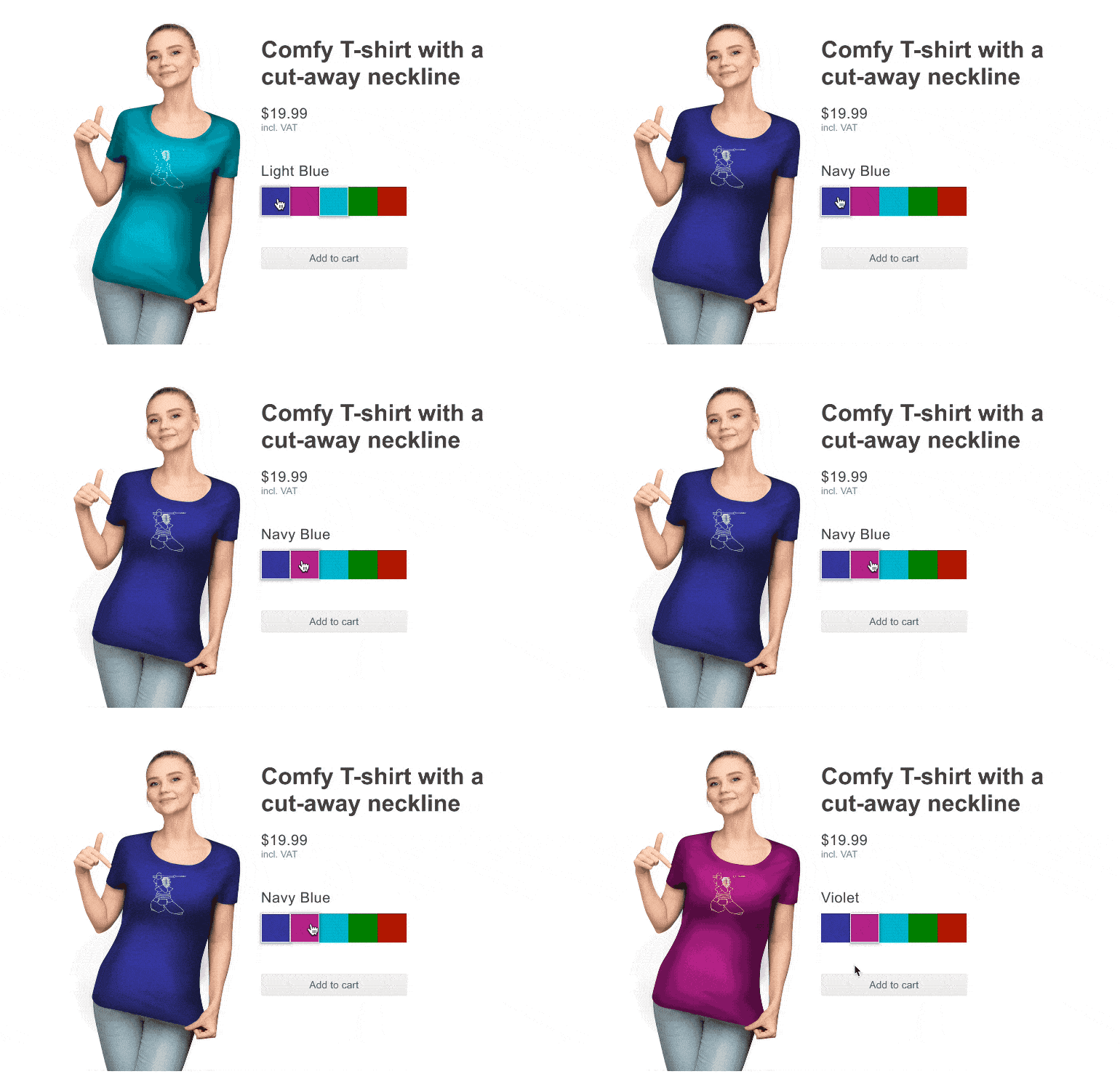
Control how your app looks and feels on devices with different capabilities and how it responds to changes like resizing the window or reorienting the screen. The MediaQuery component is invaluable in finely tuning how your app responds to a variety of devices.

New Component: Linear Gauge
Illustrate how a value fits on a linear scale through the newly added Telerik UI for Blazor Linear Gauge component. For anything from a simple temperature scale to server CPU utilization, the Linear Gauge can fit the data needs of many different applications. Customize its size, scale, pointer and colors to reflect the nature of the data.

New Component: Radial Gauge
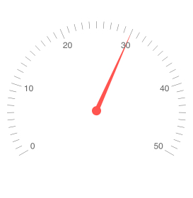
Is there a more natural way to display the speed of your user’s network than with a Radial Gauge that mimics a car dial? In this scenario, and many others like it, the Telerik UI for Blazor Radial Gauge will assist you in displaying crucial data in a simple form. Customize its size, scale, pointer and colors to reflect the nature of the data.
New Component: Arc Gauge
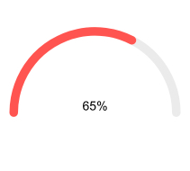
The Telerik UI for Blazor ArcGauge is a data visualization component, representing value ranges across a sleek looking circular arc. The component is feature rich and includes the ability to customize every aspect of it – min and max values, scale, labels, ticks, center template and more.
New Component: Form
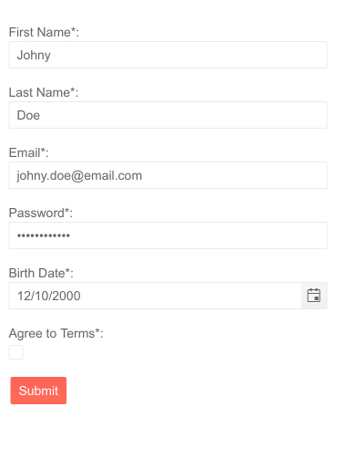
The Telerik UI for Blazor Form component is an easy to set up tool for creating registration, contact or other forms for your application! It can even autogenerate its fields directly from your data model while providing flexible orientation and layout, easy validation and multiple ways to display error messages.
New Component: Circular Gauge
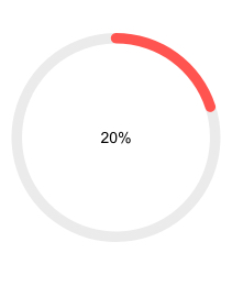
Present the progress towards a goal like the nearing of a milestone with the brand-new Telerik UI for Blazor Circular Gauge component. To bring the Gauge in line with the rest of your application, pick its size and the visual characteristics of both the scale and the pointer.
New Validation Components
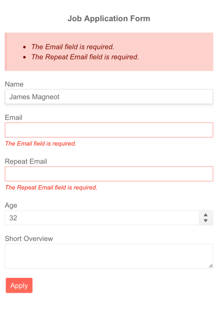
Telerik UI for Blazor gained 3 new components dedicated to validation – the Validation Summary (gathers all errors at one place to display), Validation Message (shows where the error occurred, but next to each Form field) and Virtual Tooltip (show where the error occurred with a tooltip on the incorrect field).
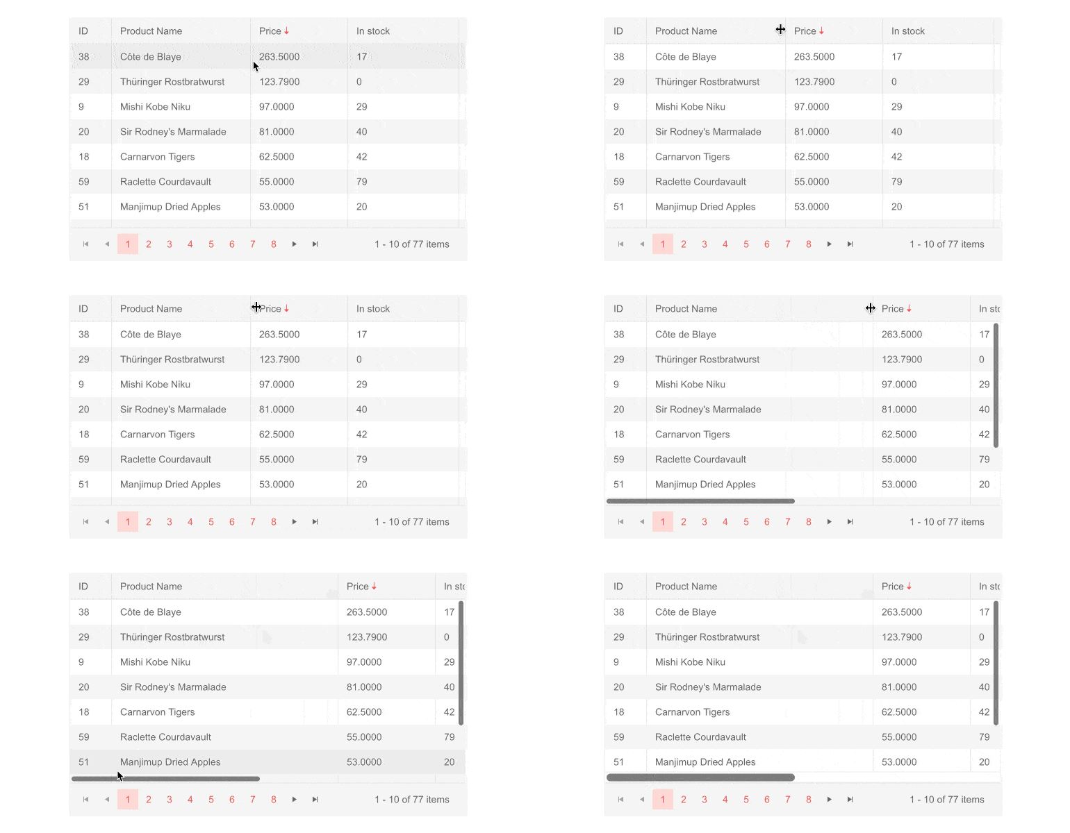
New Grid Feature: Fit Column Width To Column
The large amount of Grid customization features was just expanded to also include the ability to hide or show every row and column – all depending on the device the user is loading the app on.
New Grid Feature: Excel-like Editing
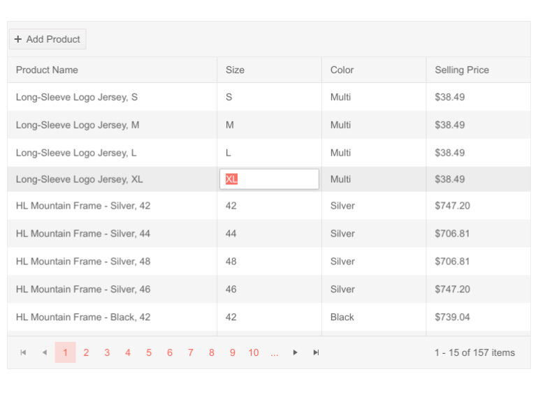
Editing with a minimal number of keystrokes, like how MS Excel operates, is now available in Telerik UI for Blazor Grid – hit Enter to confirm the current value and automatically move onto the next cell in the column. The input content is highlighted by default so you can replace it without hunting for the mouse to select it.
New Grid Feature: TelerikCheckbox as Default
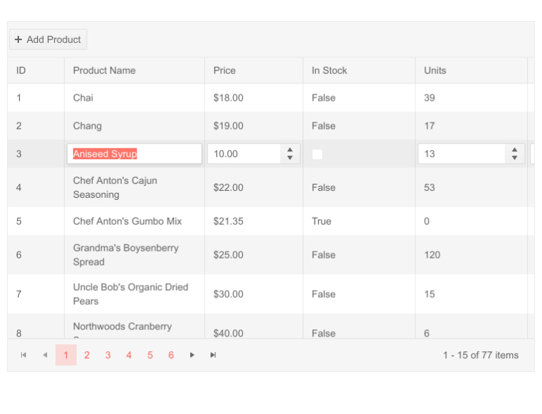
The checkboxes used by the Telerik UI for Blazor Grid component are now actual Telerik UI for Blazor Checkbox instances. This means their visual style with match the visuals of your other checkboxes.
New Grid Feature: Multi-Checkbox Filters
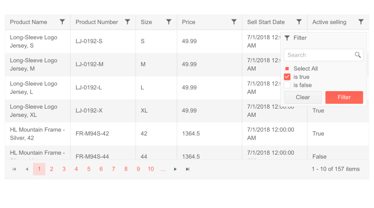
Similar to the Microsoft Excel filter function, you can enable the newly added Multi-checkbox filter to help users quickly find Grid rows containing a specific value. Find all sales orders made in a given month or all times a certain patron visited the gym.
New Grid Feature: Custom Column Menu
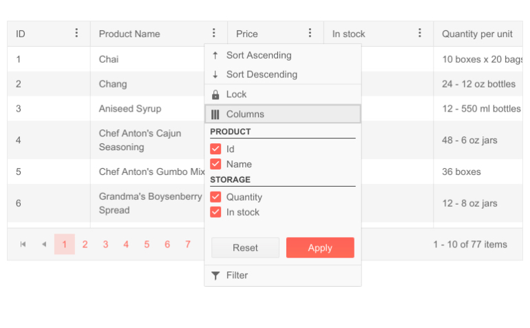
The Telerik UI for Blazor Grid’s Column menu helps devs create helpful menus for quickly manipulating the data in a column. With this new update, the names of the columns in the menu can be grouped together to create an even more sophisticated column menu. For example, by grouping “First Name” and “Last Name” under “Name”.
New Predefined Dialogs Feature
Web basics like Alert, Confirm and Prompt can be tremendously helpful to quickly get information from the user but due their unruly nature are almost never used in commercial software.
New Grid Feature: Selection Only Through Checkbox
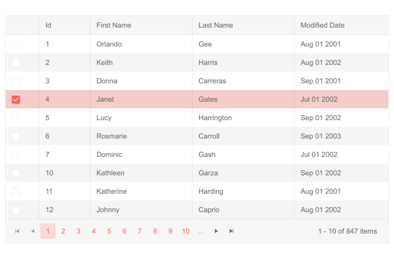
Add a checkbox to the Grid so that users can select one or more rows only through that checkbox. Doing it this way means the row click action can still be used for something else instead of selection (like editing) – an approach preferred by many users.
New Window Feature: Stacking Windows
Multiple Telerik UI for Blazor Window components can now be overlayed over each other. This lets you create windows from other windows if necessary while the user keeps the flexibility to rearrange them as they see fit.
New Editor Feature: Copy/Paste Images
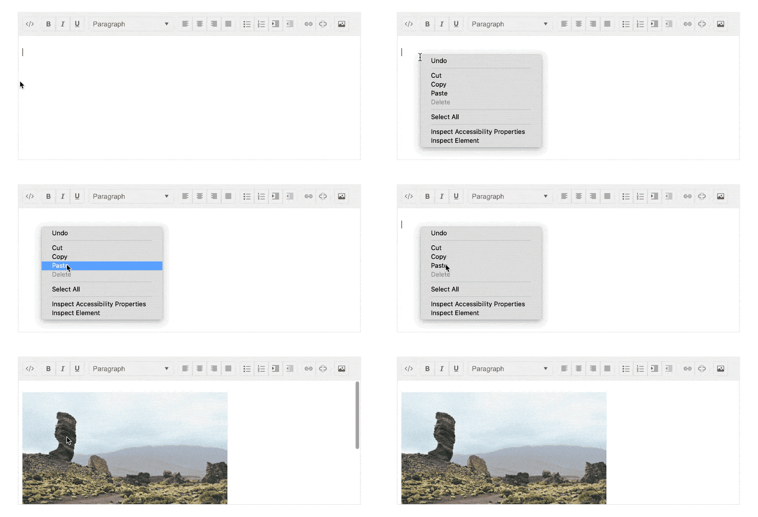
The Editor components now supports copying and pasting images directly in the editing area to save even more time for the end user – they no longer have to worry if pasting a large piece of external content will preserve the media inside it.
New Editor Feature: Pasting Cleanup
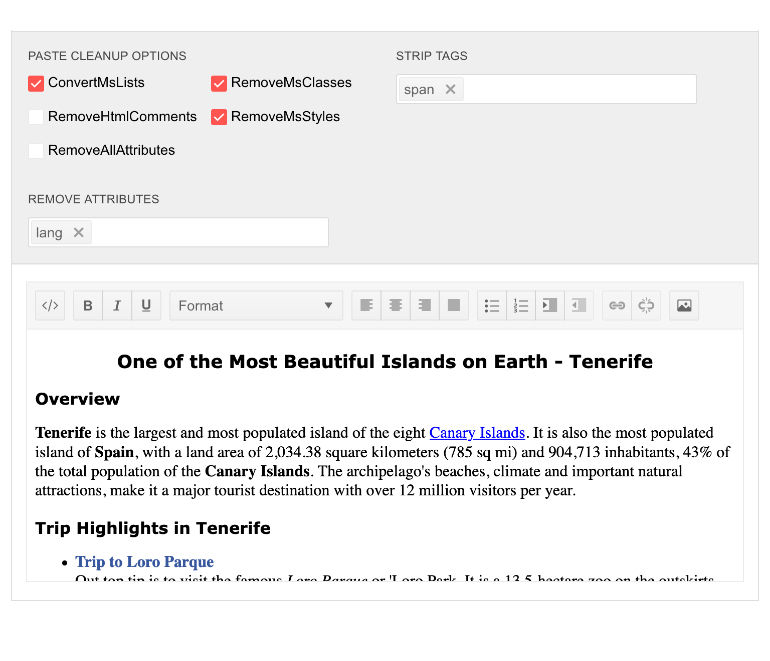
While the Editor takes care to preserve the original content as much as possible, it will now clean any pasted content from information that other software has added – like the hidden tags MS Word or other web pages add when copying from a web page.
New Editor Feature: Highlighting
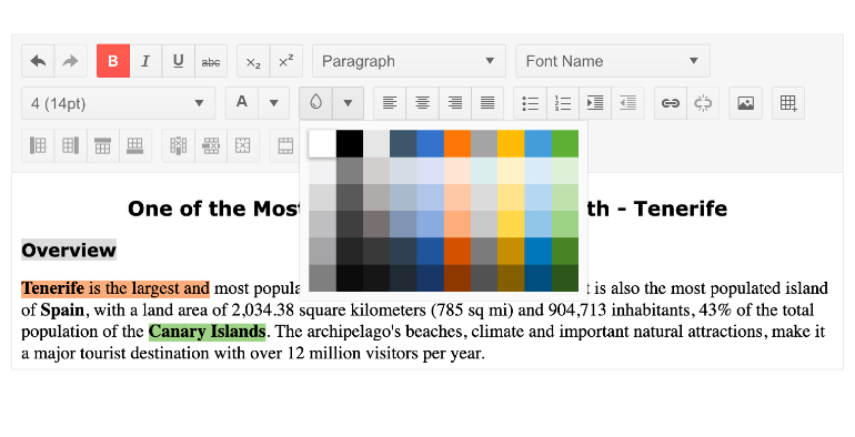
The latest Telerik UI for Blazor release brings new commands to the Editor component – users can now change the text’s color and background (i.e. highlight the text) thanks to the ColorPalette component.
New Form Feature: Support for Form Disabled Items
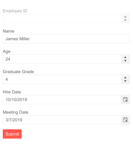
Form Items can now be marked non-editable in your data model or disabled directly in your markup to exclude them from the form input.
New TabStrip Feature: Header Template
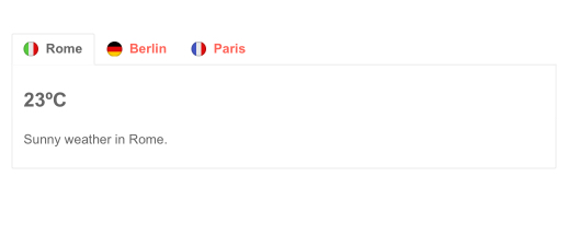
Control the content of each tab's header by providing a template for it. This allows you to add icons or even other Blazor components to offer rich content for your users.
Date and Time Pickers Time Interval
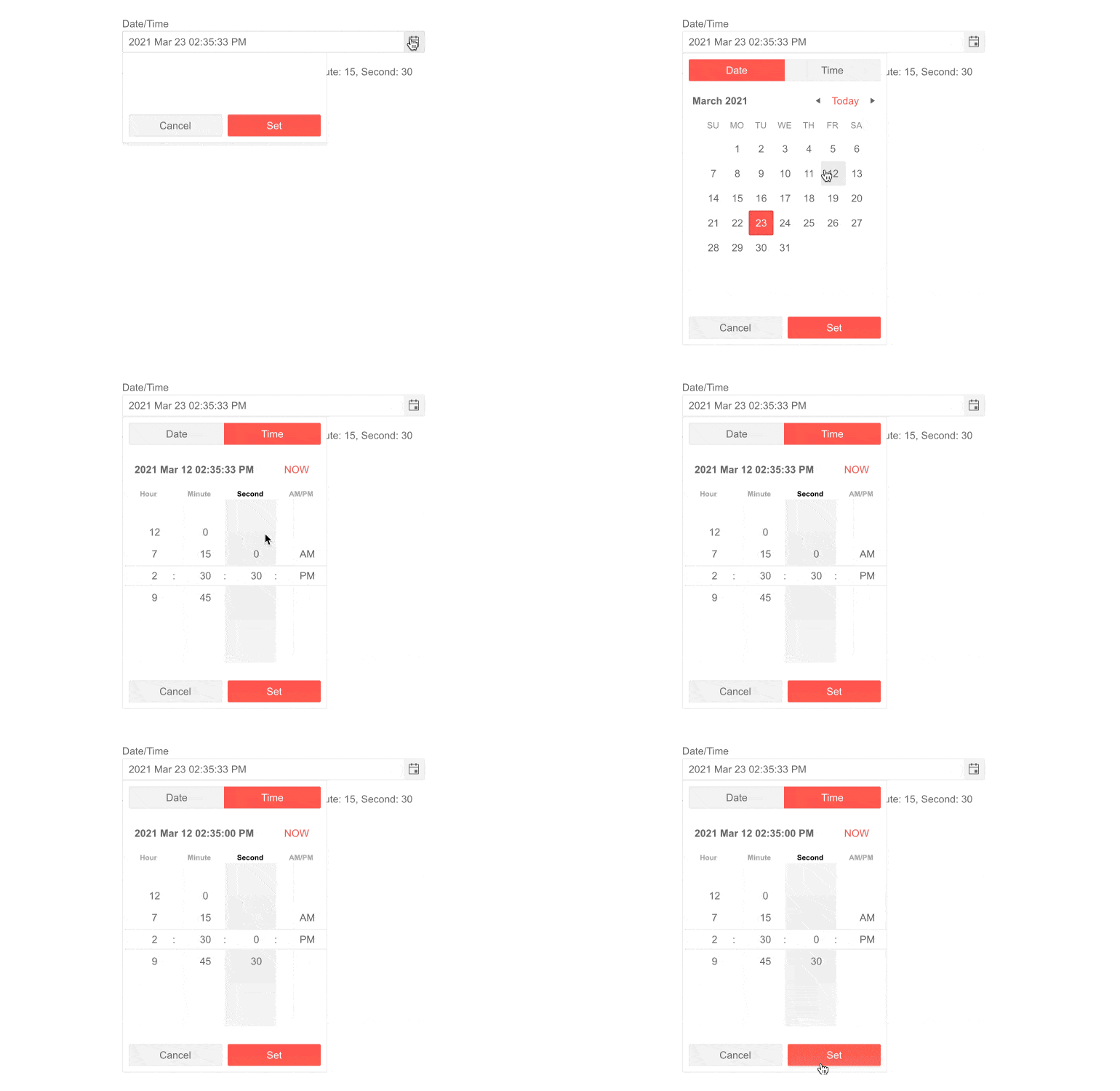
With keyboard navigation, users can increment ore decrement each individual segment of like the days or the hours. With the latest Telerik UI for Blazor you can control the amount by which each press of a key changes the value – for example, set the minutes increment to 30min to only go through whole and half hours.
Compatibility with .NET 5.0 Official Release
As a leading provider for Blazor components, we are happy to announce that Telerik UI for Blazor is now compatible with the official release of .NET 5.0! Our goal is to stay aligned with all updates by Microsoft in the future as we have done so far.

New Keyboard Navigation for Several Existing Components
The Upload, TreeList, Editor and Scheduler components are all accessible with a keyboard, in-line with the rest of our suite.

New Blazor Sample Solution Blazing Coffee
The Blazing Coffee demo application shows how a full-stack .NET application can be built with ASP.NET Core, Blazor WASM, and Telerik UI for Blazor. Within the demo you can see in action components like: Drawer, Grid, DropDownList, DateRangePicker, Chart, Upload, Tooltip and more! Also, the sample app showcases usage of globalization and localization, authentication, authorization as well as applying light and dark themes. Make sure to check it out on our Blazor demos hub page.
Telerik UI for Blazor - R1 2021
- New Component: Color Palette
- New Component: Media Query
- New Component: Linear Gauge
- New Component: Radial Gauge
- New Component: Arc Gauge
- New Component: Form
- New Component: Circular Gauge
- New Validation Components
- New Grid Feature: Fit Column Width To Column
- New Grid Feature: Excel-like Editing
- New Grid Feature: TelerikCheckbox as Default
- New Grid Feature: Multi-Checkbox Filters
- New Grid Feature: Custom Column Menu
- New Predefined Dialogs Feature
- New Grid Feature: Selection Only Through Checkbox
- New Window Feature: Stacking Windows
- New Editor Feature: Copy/Paste Images
- New Editor Feature: Pasting Cleanup
- New Editor Feature: Highlighting
- New Form Feature: Support for Form Disabled Items
- New TabStrip Feature: Header Template
- Date and Time Pickers Time Interval
- Compatibility with .NET 5.0 Official Release
- New Keyboard Navigation for Several Existing Components
- New Blazor Sample Solution Blazing Coffee
New features & Roadmap
Have a feature request?
Post your feedback via the Blazor UserVoice portal or the Public forums
What's new across all Telerik products?

Next Steps
See Telerik UI for Blazor in action and check out how much it can do out-of-the-box.
Check out the offers. Purchase an individual suite, or treat yourself to one of our bundles.
Try Telerik UI for Blazor with dedicated technical support.
