
Telerik UI for Blazor
What's New R2 2022
What's New HistoryNew Blazor FileManager UI Component
A major highlight of the R2 2022 release is the Telerik UI for Blazor FileManager component. It facilitates the process of managing files and folders by enabling users to perform common operations like uploading, accessing, renaming, sorting, searching for and downloading files. The FileManager, also known as File Explorer, provides easy navigation for browsing and selecting files and folders from the file system and managing them in your Blazor apps. The FileManager comes with a toolbar with predefined commands, three panes for viewing and previewing content, a context menu for the file list and built-in localization.

New Blazor Filter UI Component
The new Blazor Filter component allows users to create filters with multiple logical operators and expressions/expression groups that can be applied to any data-bound component, such as the Grid, ListView and TreeList. Like the rest of the Telerik Blazor UI components, the Filter comes with built-in accessibility, keyboard navigation, localization and professionally styled themes.

New Blazor FloatingLabel UI Component
The Telerik UI for Blazor Floating Label component lets you render a floating text label within focusable input components. The component builds on the HTML <label> element and adds features, such as animation, association with non-form elements and the ability to be combined with the input placeholder. The list of focusable Telerik UI for Blazor input components where you can provide floating label functionality is long and includes NumericTextBox, TextBox, TextArea, DateTime Inputs & Pickers, DropDownList, ComboBox, AutoComplete, MultiSelect and MaskedTextBox.

New Blazor SplitButton UI Component
The new Telerik UI for Blazor SplitButton allows users to execute a default action or to choose a predefined action from a dropdown list. The SplitButton comes with multiple out-of-the-box configuration options for its visual appearance such as icons, custom colors, borders, shape and size, which eliminates the need for custom CSS.

Blazor Productivity Tools in Visual Studio Code
In response to the growing interest in Visual Studio Code, we introduced the Telerik Visual Studio Code Extension for Blazor about a year ago and have since been adding new features and templates to it with the goal of helping Blazor developers set up and build apps faster. The initially simple project wizard has now been evolved into Progress® Telerik® UI for Blazor Productivity Tools—a unified extension within Visual Studio Code that will include handy developer features for fast UI component reference, configuration and usage. At the time of the R2 2022 release, the productivity tools include project templates with Telerik Blazor components, scaffolding, code snippets, convert command and a “share to REPL” feature.

Blazor Scaffolder in Visual Studio Code
The scaffolder was one of the most wanted features to be released with the new VS Code productivity tools for Blazor. You can take advantage of it immediately and start scaffolding the top used data-bound Telerik UI for Blazor components: Data Grid, TreeList, Scheduler, Chart, ListView, Gantt, Form, Drawer, Menu, DropDownList, Upload, ComboBox and more. The Visual Studio Code scaffolder will prompt you for input of the service name, model name and will allow you to configure multiple component-specific properties. For example, if you scaffold a new page with the Telerik Blazor Data Grid , you will be able to set its sorting, filtering, grouping, column resizing and more features.
Learn more about the UI for Blazor Scaffolding in Visual Studio Code.

Blazor Code Snippets in Visual Studio Code
The Telerik UI for Blazor productivity tools for Visual Studio Code now include over 80 code snippets for speeding up your development with Telerik UI components. Take advantage of the dozens of code snippets that can be easily invoked in the IDE by typing “tb” (short for Telerik Blazor) or directly the name of the component you need to plug. For example, typing “tb-grid”, “grid” or just “gr” will conveniently show a dropdown with the available snippet templates you can insert into your code. Then, using a tab sequence, you can fill out the component properties, options, model and controller actions.
See the full list of available UI for Blazor code snippets in Visual Studio Code.

New Dark Theme Available in Telerik Blazor Docs & Demos
With the R2 2022 release, we are happy to introduce the new Dark mode in the Telerik documentation and demo sites. The Dark theme has become a favorite style for many as it reduces eye strain and ensures good color contrast and improved accessibility. You can now easily switch between light and dark themes and browse through the resources in your preferred mode.

New Blazor Accessibility Color Swatch
With the latest update, we added a new Telerik and Kendo UI Default Ocean Blue swatch. A “swatch” is a set of predefined and curated color combinations that offer variations in the look and feel of our various themes. The new color combination has a contrast ratio that is compliant with the international accessibility standards.

Telerik REPL for Blazor
We continue adding new features in our browser-based code runner Telerik REPL for Blazor. With R2 2022, we’ve added two new cool productivity features—the scaffolding of data-bound Telerik UI for Blazor components and over 80 code snippets. You can now choose a component from the side menu and drag and drop it onto the REPL code editor. The tool will generate the code on your behalf and, the best part, for the components with enabled scaffolding, you will be able to set a service and model name as well as properties such as sorting, paging, grouping and more.
We also dedicated effort to improving the loading performance, and the runner responsiveness and added a handy new feature that allows you to pin/unpin the side menu.

Compatibility with .NET 7 Preview 5
For those of you eager to try out the latest and greatest by Microsoft, we are happy to announce that the Telerik UI for Blazor is compatible with .NET 7 Preview 5.

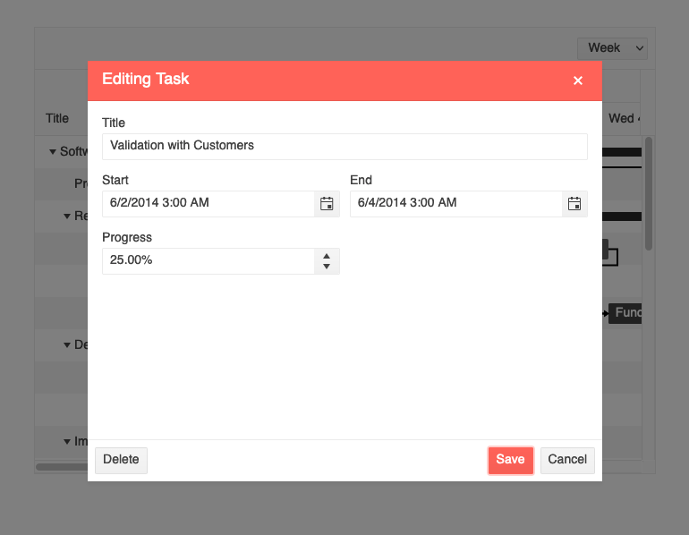
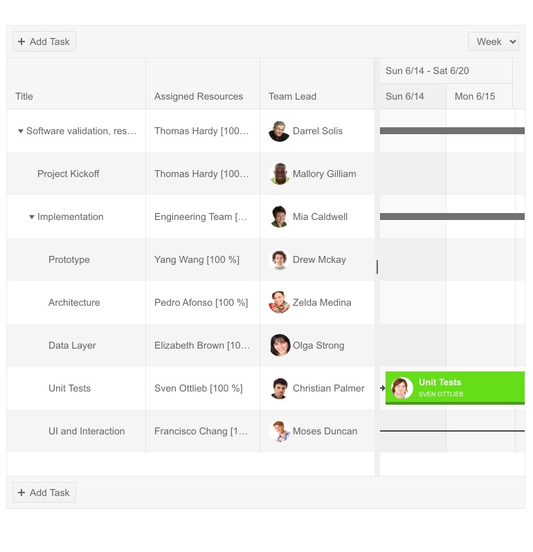
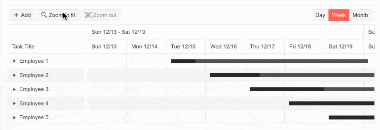
Multiple New Gantt Component Features
With R2 2022, we enhanced the Blazor Gantt component with multiple new features, including:
- PopUp and InLine Editing Modes – clicking a command button in the Gantt pop-up editing mode opens a popup with options to edit the starting task details, while clicking a command in the in-line editing mode enables you to make your edits directly in the task row.
- Custom Content in the Gantt TreeList and DateHeader – you can now enjoy a larger variety of templating options in the Blazor Gantt suited for different scenarios. The component now allows the rendering of custom content and formatting within the TreeList and Timeline parts. You can add images or custom styling to each of the project tasks, render specific content in the column headers or define custom editors via templates.
- Zoom to Fit – the feature provides greater control over the date range alignment in the Gantt timeline part.
- EditorType Parameter – provides a simple way to change the task default field editors. You have the flexibility to choose between a DatePicker or DateTimePicker for the DateTime type and TextBox or TextArea for the string fields.
- Custom Popup Editing Windows – exposes multiple settings for the Gantt popup editor. You can set the (max) width, (max) height, CSS class and orientation of the window and customize the default look of editing tasks.
- Custom Date Format of Timeline Headers – for each of the Blazor Gantt views (Day, Week, Month and Year), you can customize the date format of major and minor slot headers in the timeline part of the component.
- DebounceDelay FilterRow property–the time in milliseconds between the last typed symbol and the raising of the OnFilter event in the Grid.
- OnEdit, OnExpand and OnCollapse events– as their names suggest, the new events are raised when a Gantt item is about to be edited, expanded and collapsed, respectively.
New TabStrip Feature: Scrollable Tabs
Another item from the responsive components epic we addressed in the release is the scrollable tabs feature in the Blazor TabStrip component. Now end users can seamlessly navigate a larger number of tabs in the component header. Scrollable tabs can be configured with a single setting and ensure a sleek one-line visualization and navigation of the tabs that cannot fit into the viewport for both browser and mobile devices.
See the how the scrollable tabs work in Blazor apps.

New ToolBar Feature: Responsiveness and Adaptability
The Blazor Toolbar is another UI component that received an Adaptive parameter. By setting it to true, the Toolbar container becomes adaptive and hides the overflowing items in a popup. You can also define the items that need to move to the overflow popup and remain visible via the Overflow parameter of the ToolBar items.

New Pager Feature: Responsiveness and Adaptability
The Blazor Pager component now includes built-in responsive breakpoints and can be easily adapted to various screen sizes. To enable the feature in the Pager, use the Adaptive parameter, which is exposed in the PagerSettings of the components that integrate the pager—Grid, ListView and more.

New Blazor Data Grid Features
As with every release, we have given a lot of love and attention to the Telerik UI for Blazor Data Grid component. In R2 2022, we focused on Grid customization—now you can tailor the default filters, editors, popup editing window and search box and take advantage of a new Rebind method.
- Customize the default filter – in addition to using the filter template, you can now configure the default filter operator and control whether the filter dropdown and clear buttons are visible.
- DebounceDelay FilterRow property–the time in milliseconds between the last typed symbol and firing the OnFilter event in the Data Grid.
- Custom filter editor – you can customize the filter editor rendered within the FilterRow, FilterMenu and ColumnMenu of the Blazor Data Grid component.
- Custom editors via EditorType parameter – provides a simple way to change the default field editors without using templates. You have the flexibility to choose between DatePicker or DateTimePicker for the DateTime type and TextBox or TextArea for the string fields.
- Custom popup editing settings – we exposed multiple settings for the Data Grid popup editor. You can set the (max) width, (max) height, CSS class and orientation of the window and customize the columns and column spacing layout parameters of the form, plus the horizontal alignment of the Buttons in the form through ButtonsLayout.
- SearchBox Width & Placeholder parameters –you can now customize the SearchBox within the Blazor Data Grid component by taking advantage of the two newly exposed Width and Placeholder parameters.
- Rebind method – you can invoke the processing of data and refresh rendering with just one call. If you have manually defined the OnRead event, then the business logic defined in its event handler will be executed.
New Blazor TreeList Features
We always strive to ensure feature parity between the Blazor DataGrid and TreeList components, so in this release we shipped nearly the same set of customization features. These include customizing the Telerik UI for Blazor TreeList default filter and filter editor, DebounceDelay FilterRow property, EditorType parameter, custom popup editing settings, Rebind method, and SearchBox Width and Placeholder parameters.
In addition to the customization features, we added two new events, OnRowclick and OnRowDoubleClick, which will enable you to handle logic when users click or double-click on the TreeList rows.
Telerik Blazor UI Components in Hybrid Scenarios
Telerik UI for Blazor is compatible with the hybrid apps model via the Microsoft BlazorWebView controls for WPF, WinFoms, and .NET MAUI. This enables you to embed Blazor functionality and one of the 120+ Telerik Blazor components into new and existing multi-platform apps based on .NET 6.
Check out the dedicated sample project that shows an example of Telerik UI for Blazor web components running in hybrid scenarios inside .NET MAUI, WPF and WinForms apps.
Debounce Delay Parameter in Multiple UI Components
We added a DebounceDelay parameter to multiple Telerik UI for Blazor components to give you extra control over the component’s response to change of values, specifically when you need to add a predefined time delay before making a request or responding to a user action.
TheDebounceDelay parameter is available in the following Telerik UI for Blazor components that adopt an input: AutoComplete, ComboBox, DateInput, DatePicker, DateRangePicker, DateTimePicker, MultiSelect, NumericTextBox, TimePicker.

New Parameter EditorType in Multiple Components
We exposed an EditorType parameter in multiple Telerik Blazor components. The EditorType provides a simple way to change the default field editors in the Grid, TreeList, Gantt and Form UI components. You have the flexibility to choose between the DatePicker or DateTimePicker for the DateTime type and the TextBox or TextArea for the string fields.
Chart and StockChart Series Gradient
Both the Chart and StockChart components feature new gradient settings for the chart series.
New Chart Enhancement: Plot Bands
The Telerik UI for Blazor Chart plot bands feature allows you to highlight a specific range of the category or value axis. Each plot band can be customized by configuring the color and opacity properties.


Next Steps
See Telerik UI for Blazor in action and check out how much it can do out-of-the-box.
Check out the offers. Purchase an individual suite, or treat yourself to one of our bundles.
Try Telerik UI for Blazor with dedicated technical support.