Telerik UI for WPF R3 2020: New AutoSuggestBox, Office2019 Theme, Multithumb Slider & More

Summarize with AI:
The R3 2020 release of Telerik UI for WPF is now live! It brings a ton of new features and improvements.
The latest release of Telerik UI for WPF is here and we're excited to share it with you. We are adding a brand new Office2019 theme and new RadAutoSuggestBox control, which will help you to modernize your application. NotifyIcon is now official, the Slider control gets support for multiple thumbs and TimeSpanPicker gains editing functionality. And on the top of that, we are introducing .NET 5 RC1 support and a new .NET Core component—EntityFrameworkCoreDataSource!
The wait is over—let’s dive in the coolness of this release! 😎
Office 2019 Theme
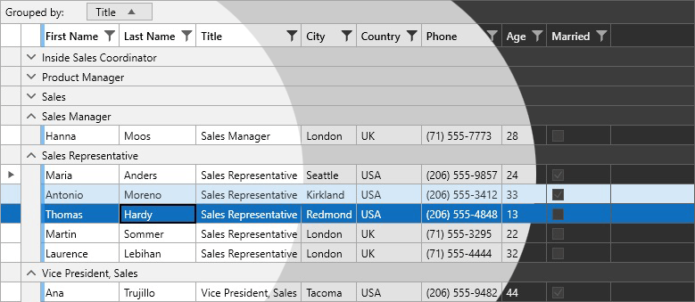
Meet the newest jewel in our rich set of themes—Office2019 theme. It is inspired by the latest MS Office application and will help you to bring that modern look and feel right into your WPF application. The theme comes with three predefined color palettes: Light, Dark and Gray, and provides an API (as seen in the previous themes) that will help you to easily adjust it according to your taste (or the designer’s taste 😁) and achieve a unique appearance with a few clicks. One last interesting fact—this theme provides the most brushes compared to our other themes, in other words better customization capability!
See how some of the controls look styled with the new theme:
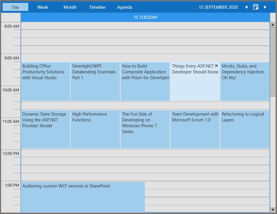
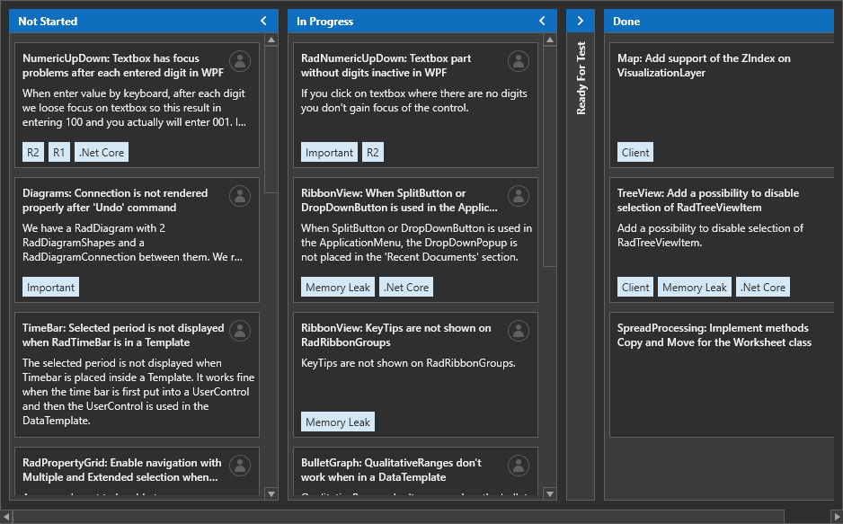
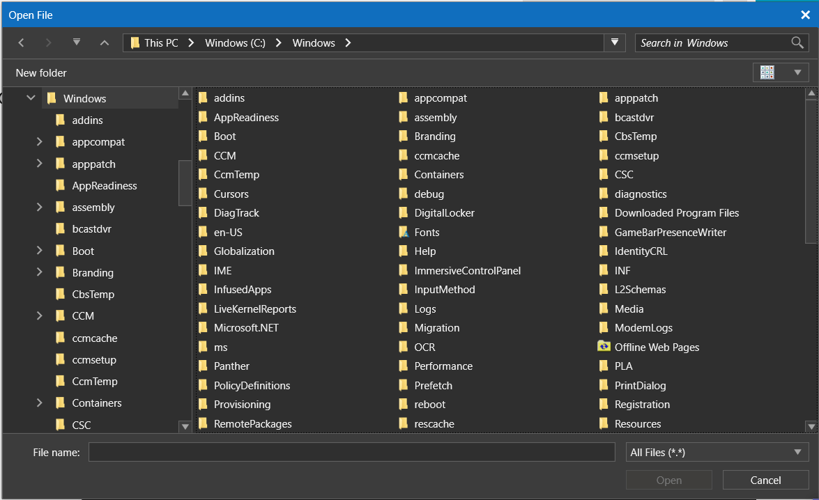
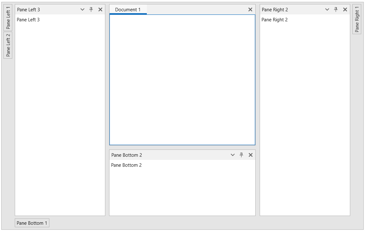
It looks nice, doesn't it?! 😊 Need more? Install the Color Theme Generator application where you can try out the theme and check out the documentation here.
We are cooking a dedicated post about the theme—stay tuned!
AutoSuggestBox
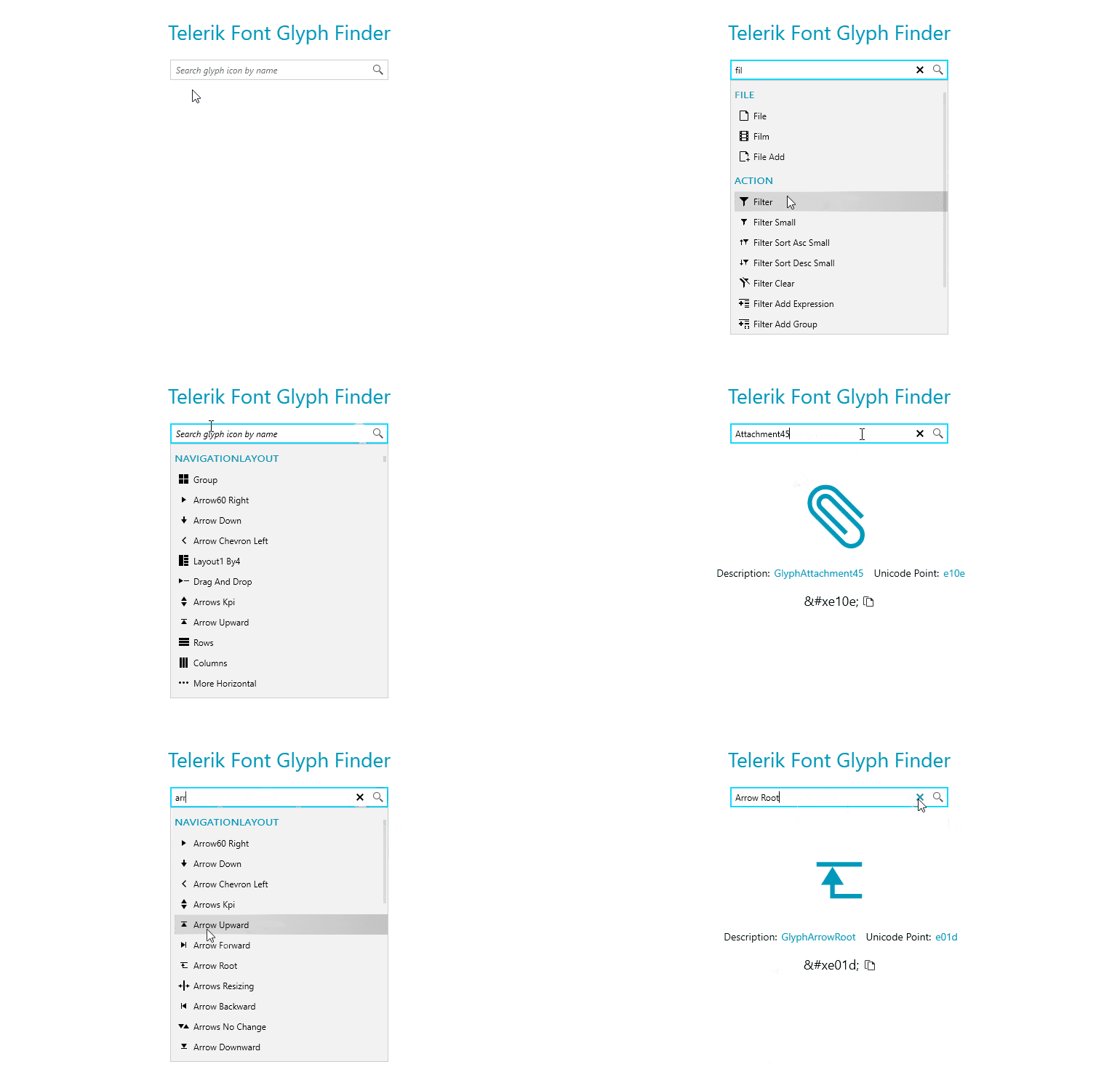
Announcing RadAutoSuggestBox—it is essentially a text input control that shows suggestions to the user while typing. It has drop down that is dynamically populated depending on the application logic in order to provide the most relevant options for the user to choose from. The control is inspired by the UWP AutoSuggestBox and provides similar functionality. You can find the top features below:
- Virtualization
- Grouping
- No Results Content (shown whenever there aren’t any suggestions to show)
- Watermark (shown before user starts typing, when the text is empty)
- Keyboard Navigation
- Configurable Buttons (API to change the content or the command of the buttons)
- Events
- Rich Set of Themes
- Automation Support
See the control in action in our WPF demos and make sure to check out the documentation here.
EntityFrameworkCoreDataSource (.NET Core)
For the .NET Core version of the controls we are including a new data control—RadEntityFrameworkCoreDataSource. It provides seamless integration between a user interface and data coming from Entity Framework Core. The component can codelessly integrate with RadGridView, RadDataPager and RadDataFilter to perform paging, filtering, sorting and grouping directly on the database server. RadEntityFrameworkCoreDataSource can also be used as a standalone data source control since it provides the public API needed for loading, shaping and editing data. Here are the main features of the component:
- Filtering
- Sorting
- Grouping
- Paging
- Editing
- MVVM Support
- Integration with RadGridView, RadDataPager and RadDataFilter
For more details check out the RadEntityFrameworkCoreDataSource section in our help documentation.
NotifyIcon (offical)
![]()
In case you missed it—we initially released NotifyIcon with R2 2020. This is a handy control that will allow you to add an icon to the taskbar for your application and enable users to interact with it. Now the control is polished and provides additional features. Here are the main ones we are adding:
- DPI support
- Built-in WPF Tooltip
- Option to customize the closing behavior of the popup
TimeSpanPicker—Editing

Until now the TimeSpanPicker control provided a way to change the value only through the drop down of the control. Now with R3 we are adding editing support—you can enable it by setting the EditMode property to TextAndDropDown. The editing feature provides the following functionalities:
- Keyboard Navigation (through the sections)
- Sections Spinning
- ValueEditing Event (to fully customize the editing behavior)
There was so much demand for that feature, so I hope it will be pretty useful and will allow you to provide even better UX for your application. For more details check out the Text Editing help article.
Slider—Multiple Thumbs Support
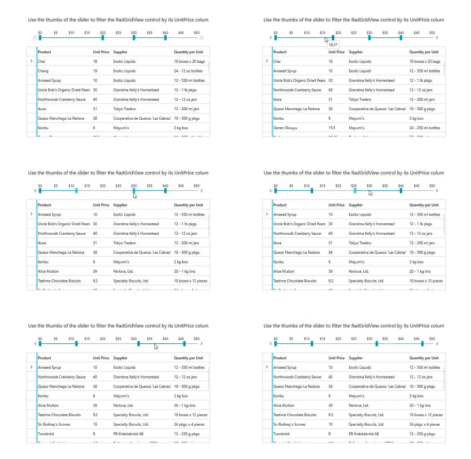
One of the most desired features was for RadSlider to support multiple thumbs. Here it is—with this version you can have as many thumbs as you need. There are two types of thumbs: single and range thumb (named SliderThumb and RangeSliderThumb) that can be used to configure the control in order to achieve the desired scenario. You could also specify how they interact with each other through their InteractionMode property—they can be locked, push each other or move freely on the track. Pretty neat feature! 😊
See below a sample Slider definition using the new feature:
<telerik:RadSlider TickPlacement="TopLeft" TickFrequency="10" Minimum="0" Maximum="300">
    <telerik:RadSlider.Thumbs>
        <telerik:RangeSliderThumb InteractionMode="Lock" RangeStart="0" RangeEnd="100" />
        <telerik:SliderThumb InteractionMode="Free" Value="150" />
        <telerik:RangeSliderThumb InteractionMode="Push" RangeStart="200" RangeEnd="250" />
    </telerik:RadSlider.Thumbs>
</telerik:RadSlider>
For details check the Multiple Thumbs article from our online help documentation.
Docking: Keyboard and Mouse Shortcuts
With the previous release (R2 2020 Service Pack) we introduced the DockingNavigator control which allows users to quickly navigate between the docking panes with keyboard only. This release we are enhancing the keyboard support with a new ClosePane command. The command can be used in several different ways in order to easily close a document pane, non-document pane or simply the current active pane (disregarding its type). The behavior can be adjusted through the passed CommandParameter—for more details check this help article.
Below you can find sample code demonstrating how the command can be attached to different keyboard shortcuts:
<telerik:RadDocking x:Name="docking">
    <telerik:RadDocking.InputBindings>
        <KeyBinding Command="telerik:RadDockingCommands.ClosePane" Key="F4" Modifiers="Ctrl" CommandParameter="DocumentPanes" />
        <KeyBinding Command="telerik:RadDockingCommands.ClosePane" Key="Esc" Modifiers="Shift" CommandParameter="NonDocumentPanes" />
        <KeyBinding Command="telerik:RadDockingCommands.ClosePane" Key="F5" Modifiers="Ctrl" CommandParameter="ActivePanes" />
    </telerik:RadDocking.InputBindings>
Also, closing a pane with mouse middle button (like in browsers or VisualStudio) is now easily achieved by setting a single property (CloseTabsOnMouseMiddleButtonDown) on the desired PaneGroup:
<telerik:RadDocking>
    <telerik:RadSplitContainer>
        <telerik:RadPaneGroup CloseTabsOnMouseMiddleButtonDown="True">
            <telerik:RadPane Header="C Sharp" />
            <telerik:RadPane Header="VB" />
            <telerik:RadPane Header="C++" />
        </telerik:RadPaneGroup>
    </telerik:RadSplitContainer>
</telerik:RadDocking>
RichTextBox: Shapes
With this release, we started to enhance RadRichTextBox with another big feature of the DOCX format—shapes. In the current version, the shapes in the documents are only preserved while importing and exporting a document. We continue working on providing you with full abilities to insert, modify and visualize them in future versions. Stay tuned for updates!
Spreadsheet: XLS Format Support
With R3 2020, RadSpreadsheet enables you to work with documents of the Excel 97 - Excel 2003 Binary file format—XLS. Make sure to check how you can use that functionality in our documentation topics.
SpreadProcessing: XLS Format Support
Create and modify XLS documents in code-behind with the new XlsFormatProvider. The new class enables you to import and export documents of the Excel 97 - Excel 2003 Binary file format.
PdfViewer and PdfProcessing: CMap Tables Support
The CMap Tables in the PDF documents define mappings between character codes and character selectors. Now you can seamlessly import documents containing the predefined in the PDF format CMap Tables and ensure even the custom ones are imported as expected. Find out how to enable the support for them in the CMap Tables help topic.
PdfViewer: New Model
The RadPdfViewer control is now officially migrated to use the RadPdfProcessing library as its model. You can now create PDF documents and directly show them. Check the Showing a File topic and ensure your projects are using the latest functionality of the control.
.NET 5 RC1 Support
This week Microsoft announced the availability of the first Release Candidate version of .NET 5 and starting today we support it! As they explain in the blog post: RC1 is a “go live” release; you are supported using it in production. So, if you are already planning/building your first .NET 5 WPF app you can easily bring the Telerik UI for WPF experience there using the latest version of our .NET 5 WPF controls.
Happy coding with .NET 5 🐱💻Other Features
- MultiColumnComboBox: Introduced CanUserSearchInHiddenColumns property which specifies if the built-in search mechanism of the control will search in hidden columns. (link)
- MultiColumnComboBox: Introduced support to exclude columns from the searching algorithm. (link)
- AutoCompleteBox: Exposed HighlightedIndex protected property to be used for keyboard navigation behaviour customizations. (link)
- Map: Format can now be specified through the ImageFormat property of the WmsTileProvider/WmsTileSource.
- GridView: Exposed CanUserSearchInHiddenColumns property to GridViewMultiColumnComboBoxColumn. (link)
- GridView: Implemented functionality to exclude columns from exporting when using GridViewSpreadStreamExport. (link)
- GridView: Introduced ShouldEnumeratorLoadItems property to VirtualQueryableCollectionView collection that indicates whether items that are not loaded yet should get loaded while the collection's enumerator is traversed. (link)
Check Out the Detailed Release Notes
We have a lot more! To get an overview of all the latest features and improvements we’ve made, check out the release notes for the products below:
Sign Up for the Webinar
To see the new release in action, please join us on the Telerik R3 2020 webinar, on Thursday, October 1 @11:00 pm – 12:00 pm ET.
Share Your Feedback
Feel free to drop us a comment below sharing your thoughts. Or visit our Feedback portals about UI for WPF, Silverlight and Document Processing Libraries and let us know if you have any suggestions or if you need any particular features/controls.
Try out the latest:
UI for WPF UI for Silverlight
In case you missed it, here are some of the updates from our last release.

