Telerik UI for WPF R2 2020: New Controls, NavigationView, .NET 5 Preview and More

Summarize with AI:
The R2 2020 release of Telerik UI for WPF and Telerik UI for Silverlight is live! It is loaded with lots of new features and improvements.
In the latest release of Telerik UI for WPF, we are introducing two new helpful controls, Callout and NotifyIcon. Also, NavigationView gets hierarchy support, RichTextBox gets built-in UI for Content Controls (yes 😉) and ScheduleView gets custom time indicators. On top of that, we are adding .NЕТ 5 preview support as well as .NET Core Project Converter to help you modernize your applications.
Let’s go together through all the hot stuff this release! 🔥
.NET 5 Preview Support
Microsoft announced the release of .NET 5 Preview 3 couple of weeks ago, and I’m happy to share we are including a new version of our binaries built against the latest preview of .NET 5! This way while you play around with the new version of framework you will be able to experiment with our controls as well. You can find the new assemblies in the nuget packages as well as in the installation folder of the controls – in the WPF50 folder as shown below:
.NET Core Project Converter
Migrating desktop projects from .NET Framework to .NET Core is a trendy topic lately, since the initial release of .NET Core. With this release we are introducing our version of the try-convert tool that will allow you to quickly do the conversion with a few clicks via our Visual Studio extension. Don't wait - get on the fast track to the .NET Core world with our project converter!
For more details on how exactly to use the converter check out this article.
Callout Control
The Callout control for WPF is a neat new control that will help you bring the attention of your customers to specific areas in the application. You can use this control to display additional information, hints, warnings or any other relevant information. The control provides a few built-in shapes for the body and for the arrow as options to fully customize them.
You could define it directly inline in XAML or show it above the content with the built-in popup service. When using it with the popup service, make sure to play with the animation to achieve an even better experience for the end users – see some cool animations in action below:
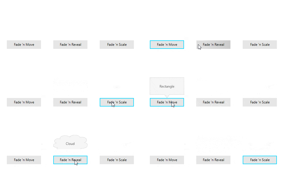
Here is the list of the features of the control:
- XAML usage - the control can be declared in XAML to show relevant information.
- Popup usage - RadCallout can be placed inside a Popup and shown on specific user interaction: click, mouse over, etc.
- Animations - Built-in and custom animation when showing it with Popup.
- Layout - The control provides several built-in forms for its body and arrow. Other than that, you can create your form by applying a custom geometry to the control.
- Theming - Like any other control from the UI for WPF suite, RadCallout comes with different themes.
See the different built-in layouts below:
Make sure to check out the documentation here and the control examples in our WPF demos application. ✌
NotifyIcon (beta)
![]()
Want to easily add an icon of your application to the taskbar notifications area? This is where RadNotifyIcon comes to the rescue! RadNotifyIcon is control that helps adding an icon to the taskbar, that can respond to the user interaction. With the beta version of the control you will be able to benefit from the following features:
- Add/remove Icon to the taskbar
- Built-in popup window to show custom WPF content
- Built-in show/hide popup window animations
- Built-in context menu
- Option to display a native tooltip
- Various mouse events to implement custom logic
Hope this comes in handy for you - for more details check the documentation here. Please drop us line once you try it and share your feedback - thanks! 🙏
NavigationView – Multi-Level Hierarchy Support
With R1 2019 we added RadNavigationView – a “hamburger menu”-like control in the WPF world, designed to provide a modern UWP style navigation experience. Since then we received many requests and feedback about supporting items nesting and displaying hierarchies. Thanks for your feedback – the feature is finally here! 🙌 Check out below what you could expect from the feature:
- XAML declaration of the hierarchy
- Data binding support
- Expand/Collapse events of the item and of the NavigationView
- Customizable expand/collapse animations
- Customizable expand/collapse icons
- Option to expand/collapse without selecting the parent
- Multiple or single expanded items at a time
- Display sub items in flyout when in Compact or Expanded mode and the pane is collapsed
- Visual indication when sub item on any level is selected and the parent is collapsed
To learn more please check the hierarchy article from the documentation of RadNavigationView.
See the feature in action below:
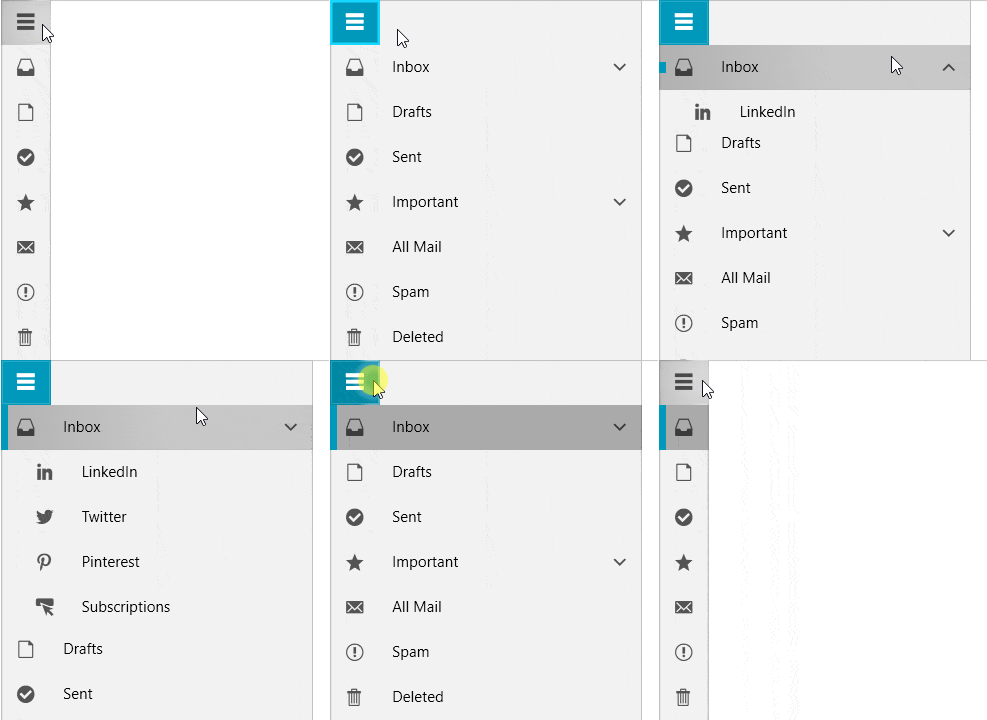
I hope you are going to love this new feature and it will allow you to achieve better application navigation.
Custom TimeIndicators for ScheduleView
Many of you have asked how to customize the CurrentTimeIndicator of the RadScheduleView. Unfortunately, this is not possible – the current time indicator displays only the current time. With this release we are adding option to add additional (as many as you need) time indicators to be able display whatever time you want! ⌚
You just need to populate the TimeIndicatorsCollection as shown below with TimeIndicator instances specifying the offset from DateTime.Now and the location of the indicator:
<telerik:RadScheduleView.TimeIndicatorsCollection>
    <telerik:TimeIndicatorsCollection>
        <telerik:TimeIndicator Offset="-02:00:00" Location="TimeRulerArea"/>
        <telerik:TimeIndicator Offset="-02:00:00" Location="AppointmentsArea"/>
        …
    </telerik:TimeIndicatorsCollection>
</telerik:RadScheduleView.TimeIndicatorsCollection>
Afterwards using the TimeIndicatorItemStyleSelector you will be able to define unique appearance as shown below:
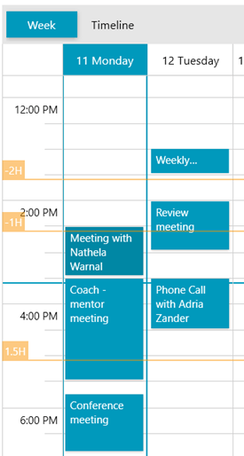
For more, check out the TimeIndicators article from the documentation of RadScheduleView.
RichTextBox – Content Controls UI
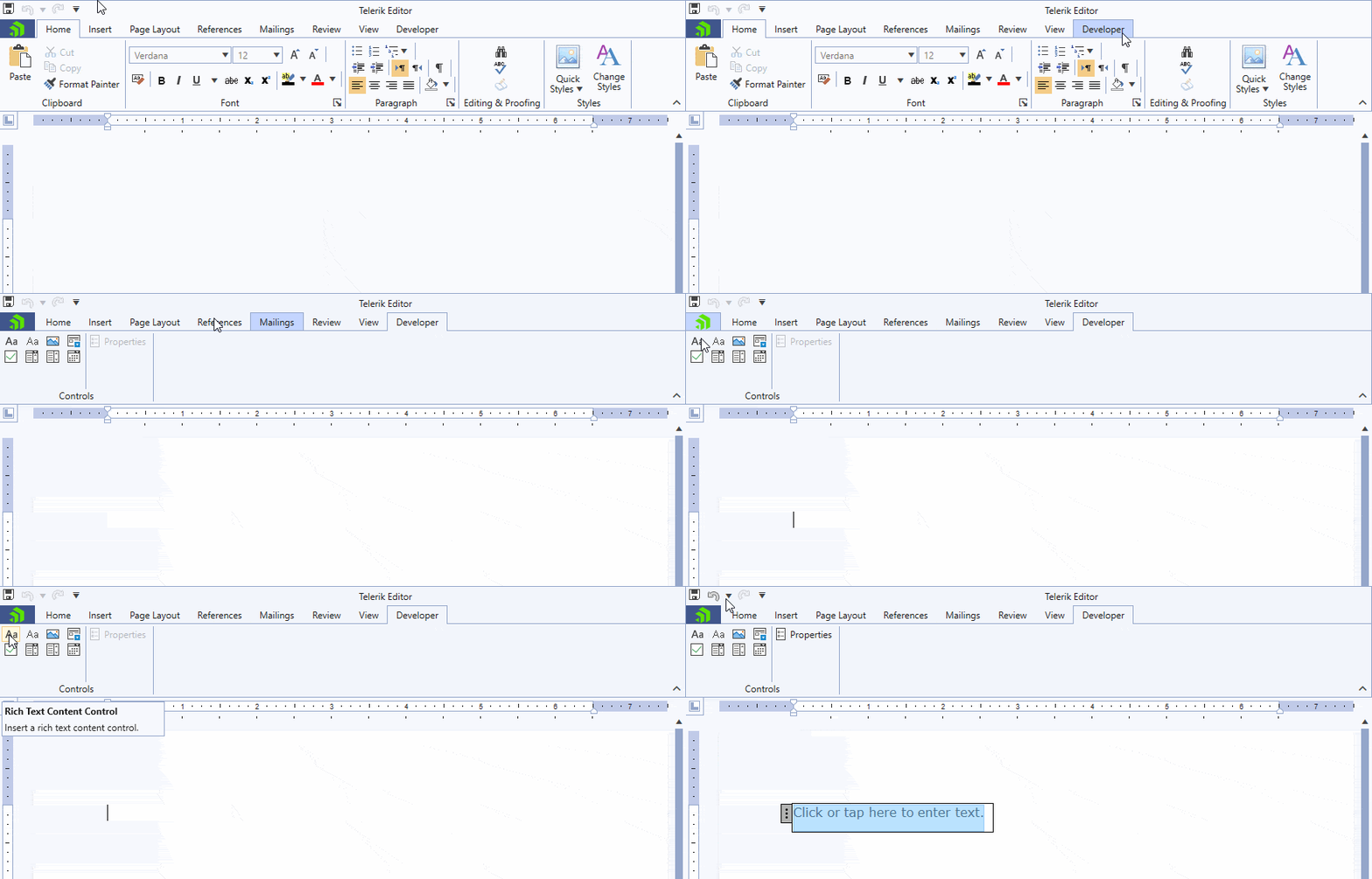
After releasing the import and export of content controls in the previous release (check out the release blog post), during this one we focused on enabling you to use them through the UI. Now you can insert, remove or modify the content controls, their properties and values. The brand-new Developer tab is introduced to ease these actions.
Check out the documentation section for the WPF RichTextBox Content Controls to get familiar with the functionality.
PdfProcessing - Exception Handling
The PdfProcessing library now provides an exception handling mechanism that allows the interpretation and handling of the document when it is imported or loaded. The new feature introduces two events for unhandled exceptions – one is triggered when an exception occurs during the import, and another occurs during the loading process. Both can be used to notify you if something happened during the parsing of the content.
If you would like to learn more on how to use this functionality, check the Exception Handling topic in our documentation.
PdfViewer and PdfProcessing - Streamlining the Models (Preview)
With the idea to provide you a powerful entity, our team has been working towards utilizing the underlying architecture of both the PdfViewer and PdfProcessing which will allow us to achieve feature parity. This is also the first step towards enabling editing functionality in the PdfViewer control.
With this release, we are announcing the immediate availability of the new model which is still in preview and optional for the time being. You can enable the new model and test it yourself. The easiest option is to set the PdfViewer’s DefaultFormatProviderSettings.UsePdfProcessingModel property to true.
A blog post to describe the capabilities will be also live soon. Stay tuned, we will soon reach full feature parity and switch to the new model entirely!
RadUpload for Silverlight – Security Improvements
We are introducing important update in the RadUploadHandler to improve the security with the default settings. With this release all uploaded files will directly go to a sub folder of App_Data folder named UploadedFiles. You would able to specify your own folder in App_Data by setting the TargetFolder property, however the TargetPhysicalFolder will not used anymore from the UploadHandler by default. This is in order to not allow directory traversal with the default settings in case you haven’t added additional security.
This is important – please make sure you are using the best security practices when handling the information coming from the web request. If you are not able to upgrade to the latest version Telerik UI for Silverlight – check this article that explains how to improve the security of your RadUploadHandler implementation.
Keyboard Search Navigation for TreeView and PropertyGrid
The keyboard search navigation feature enables users to press a character and select each item starting with that character or navigate to a specific item by typing more than one character. Here's how the feature looks for TreeView:
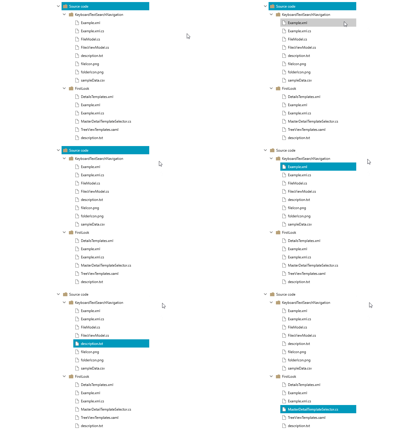
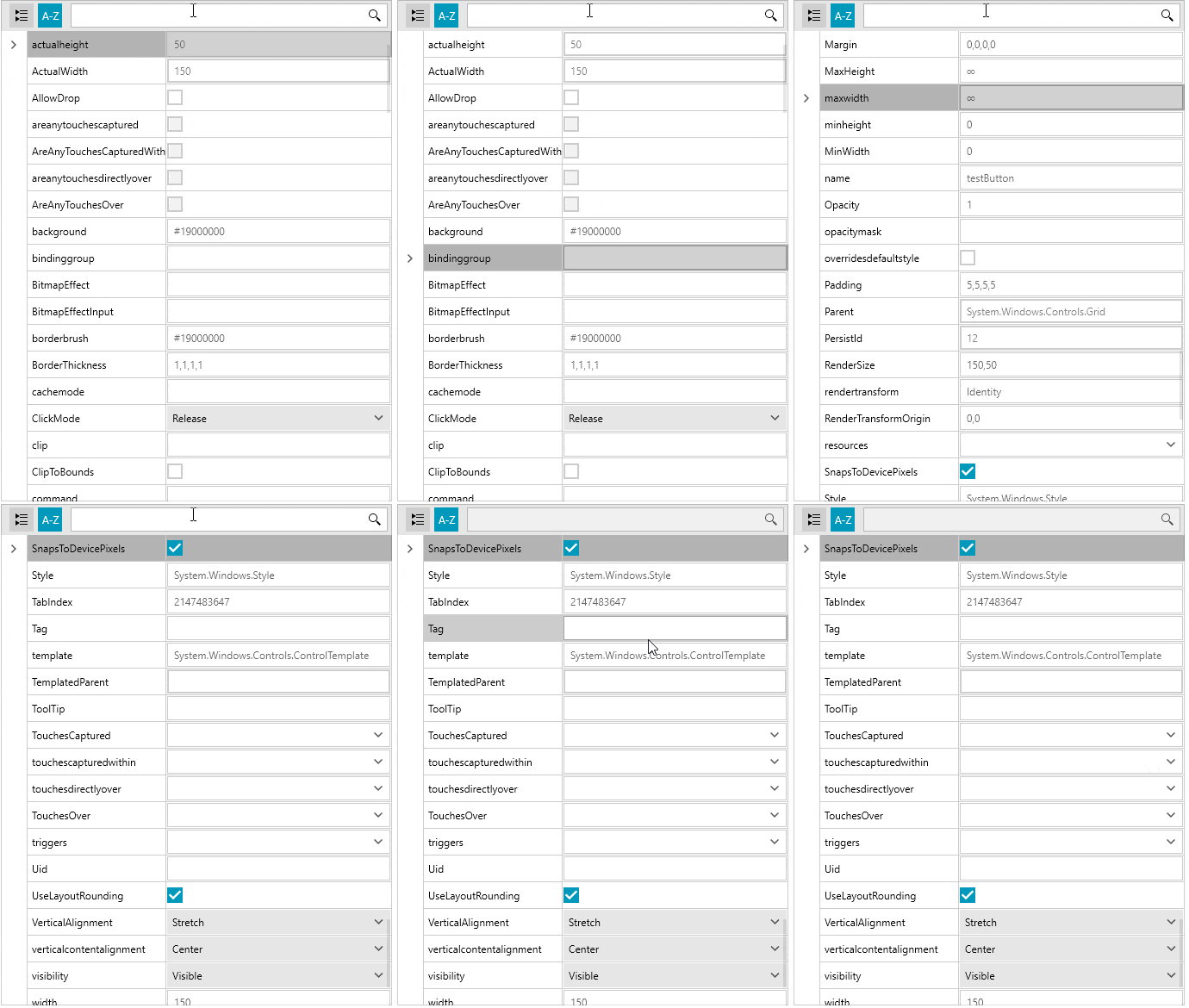
The same functionality is also available for PropertyGrid, as demonstrated below.
Other Important Features
- PropertyGrid: Added event that notifies whenever all the items in the property set have been updated. (link)
- TreeView: The attached ScrollViewer.HorizontalScrollBarVisibility and ScrollViewer.VerticalScrollBarVisibility properties are now supported. (link)
- PanelBar: Added keyboard search navigation. (link)
- GridView: Introduced MouseWheelScrollDelta property that specifies how many rows will get scrolled when scrolling with the mouse wheel. (link)
- GridView: Added way to specify an interval at which CollectionChanged events from a background thread are dispatched to the UI thread. (link)
- SyntaxEditor: Introduced TextSearched event which is fired when searching in the control. (link)
- SyntaxEditor: Introduced a property to control whether the matching of the start and end folding tags is case sensitive or not. (link)
- Slider: Added option to customize the Tooltip of the Thumb through the ThumbToolTipStyle property. (link)
- TabControl: The drop down menu now displays the currently selected item. (link)
- FilePathPicker: Added drag-drop support for selecting files. (link)
- SplashScreen: Added properties to easily customize the image and footer appearance. (link)
- TabbedWindow: Added way to specify the exact type of the new instance that is created when drag out a tab from its parent window. (link)
- Map: Added event which notifies when clusters are re-calculated. (link)
- PdfProcessing: Form Fields can be renamed and merged. (link)
- PdfProcessing: Added support for WMF/EMF images.
- PdfViewer: Added support for form fields and custom UI layers in ThumbnailFactory.
Check Out the Detailed Release Notes
We have a lot more! To get an overview of all the latest features and improvements we’ve made, check out the release notes for the products below:
Sign Up for the Webinar
To see the new release in action, please join us on the Telerik R2 2020 webinar, on Thursday, May 21, 2020 @11:00 AM ET.
Share Your Feedback
Feel free to drop us a comment below sharing your thoughts. Or visit our Feedback portals about UI for WPF, Silverlight and Document Processing Libraries and let us know if you have any suggestions or if you need any particular features/controls.
Try out the latest:
UI for WPF UI for Silverlight
In case you missed it, here are some of the updates from our last release.

