What’s New in Telerik UI for ASP.NET Core R2 2021

Summarize with AI:
The Telerik R2 2021 release for UI for ASP.NET Core brings sleek and feature-rich components, plus new Grid, Editor features, Linux Installer, compatibility with .NET 6 latest preview and much more.
Hey developer folks, it’s time for another massive release with new UI components, features and tooling for your ASP.NET Core applications.
The Telerik R2 2021 release brings sleek and feature-rich UI for ASP.NET Core Task Board, Circular Gauge, ActionSheet, Skeleton components plus new Grid, Editor features, Linux Installer, compatibility with .NET 6 latest preview and much more.
TL;DR Telerik UI for ASP.NET Core R2 2021
Below is a summary of the R2 2021 Telerik UI for ASP.NET Core release content:
- Compatibility with .NET 6 latest preview
- New components: Task Board, SkeletonContainer, ActionSheet and Circular Gauge
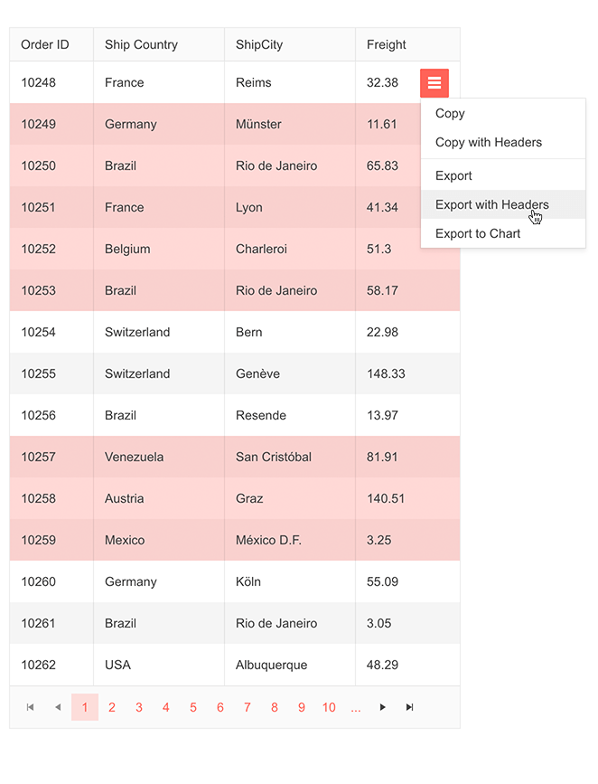
- New Grid features: Data range selection plus sleek option to copy or export to Chart & File
- New Editor feature: Image resizing
- New TreeList features: Filter row, row template
- New Scheduler features: Hierarchical grouping support, Year View, normal display of 24-hour events
- New QR Code features: Swiss QR Code, support for logo/image in QR Code
- New Drawer feature: Hierarchical items
- New Map feature: Support for Azure Maps
- Telerik Document Processing .doc file format support
- Revamp of Telerik Forums
- Linux Installer for Telerik UI for ASP.NET Core
Deep Dive into R2 2021 Release of UI for ASP.NET Core
And if you are eager to learn more about the latest additions in R2 2021 Release of UI for ASP.NET Core, read ahead and see in detail what’s new in Telerik UI for ASP.NET Core R2 2021.
New UI for ASP.NET Core Task Board Component
It would probably be fair to say that the TaskBoard for ASP.NET Core is the crown of the R2 2021 release. Whether you utilize it as a kanban board, agile board, workflow management board or a simple to-do list, it was built with the intent to save you a ton of time and provide maximum flexibility though its numerous features, configuration options and events.
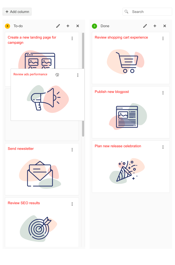
Telerik UI for ASP.NET Core Task Board Component
The TaskBoard component is available for plug and play through both HTML and TAG helper options, supports local and remote data binding, as well as offers complete built-in support for all types of CRUD operations on both column and card level.
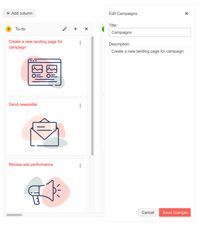
Telerik UI for ASP.NET Core Task Board Card Editing
Using the Resources color configuration option of the TaskBoard, you can quickly make tasks stand out on the board. You can associate type of work or resources assigned to a task with specific color. Alternatively, you can use the different color notations for visualizing different task statuses such as “on track,” “not started,” “on hold,” “delayed” or task priority such as “low,” “medium” and “high.”
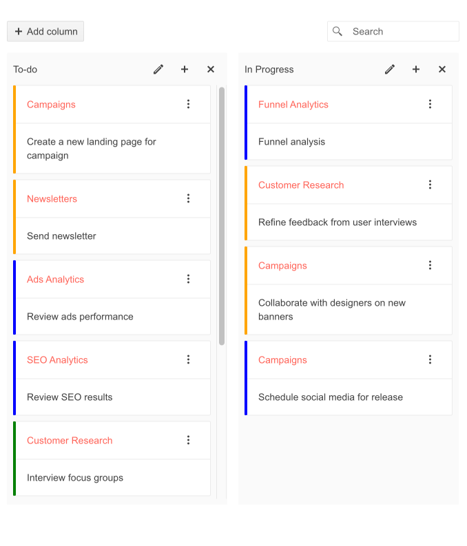
Telerik UI for ASP.NET Core Task Board Categorization
Need to perform validation in the TaskBoard? We’ve got you covered. The component events and API allow you to easily accomplish various validation scenarios. For example, limit the number of cards allowed in a column, known as WIP (work in progress) limit, or enforce rules when moving cards between the TaskBoard columns.
The TaskBoard for ASP.NET Core also comes with multiple template options for its columns and cards, so you can render custom content, use a search panel, utilize RTL (right-to-left) support, as well as work with built-in keyboard navigation support and accessibility.
New UI for ASP.NET Core Circular Gauge Component
Recognizing the growing demand for Gauges in ASP.NET Core applications—both as standalone components and dashboards with gauge sets comparing multiple data values at a glance—we are happy to add the Circular Gauge component to Telerik Data Visualization UI library. It has functionality and features similar to the well-known Arc Gauge but visualizes the values as a complete sleek circle.
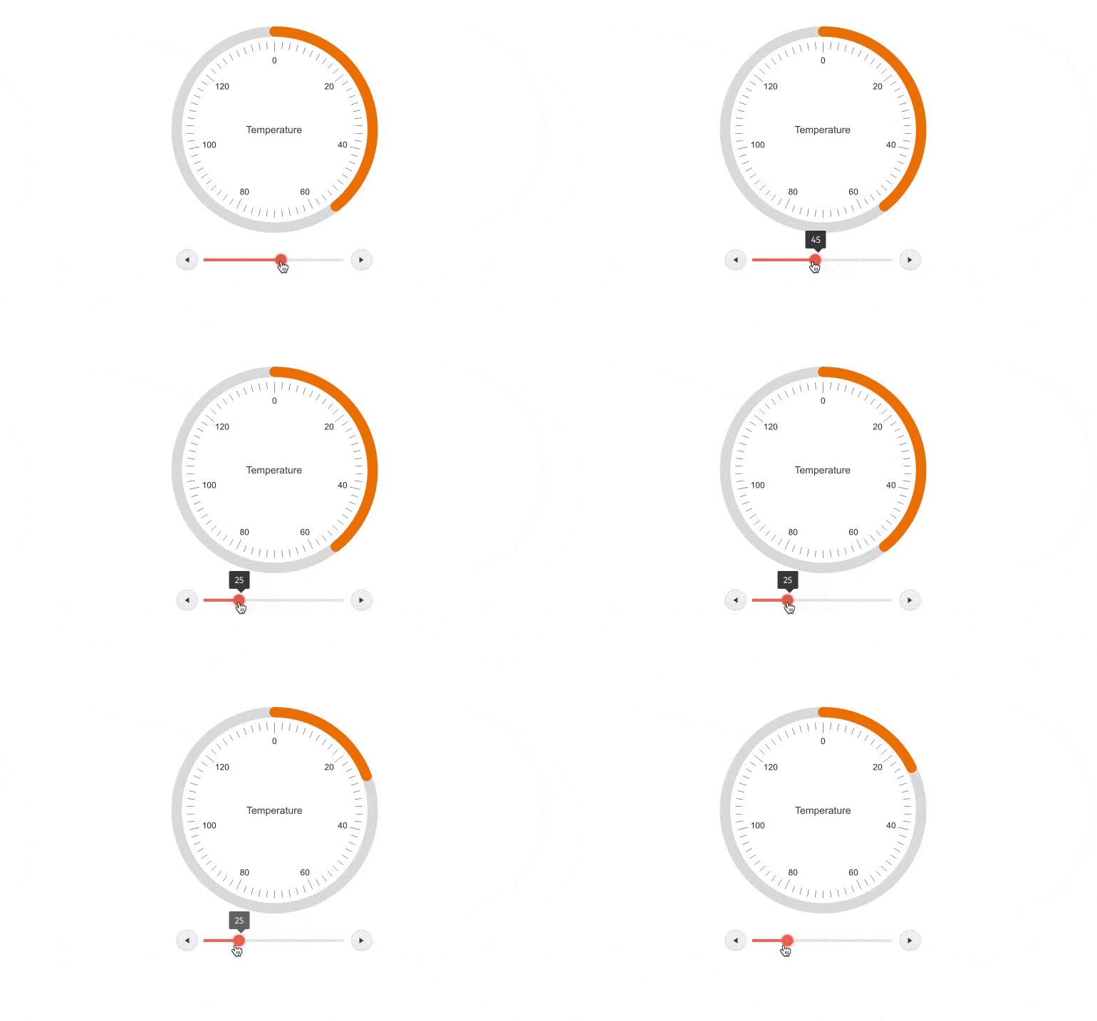
Telerik UI for ASP.NET Core Circular Gauge
The UI for ASP.NET Core Circular Gauge supports full customization of the Center Text, Scale and Color capabilities. The Gauge’s visual appearance can be customized to your scenario—you can easily set a different fill color depending on the current value or range of values, set the colors of its labels and ticks, configure the visibility of major and minor ticks, set the direction clockwise or counterclockwise, and more.
The Circular Gauge UI component exposes methods for exporting its visualization to PDF, PNG or other preferred image file formats. Check out the Circular Gauge API for a complete reference of its capabilities.
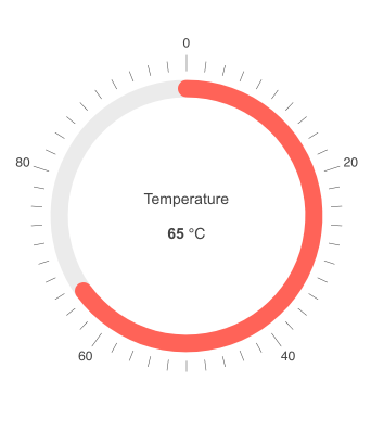
Telerik UI for ASP.NET Core Circular Gauge Customizations
New UI for ASP.NET Core ActionSheet Component
The ActionSheet UI component is useful when you need to display a list of options and ask the app user to make a decision. It is displayed on top of the user’s screen and shows the available options/buttons located one under the other. This way users are encouraged to take action or alternatively dismiss it if they want to continue interacting with the application. The UI for ASP.NET Core ActionSheet comes with multiple configuration options, events and built-in keyboard navigation and accessibility.

Telerik UI for ASP.NET Core Action Sheet Component
Using the ActionSheet Items configuration, you can set specific attributes of the component items, such as Text, Icon, Description, Click event handler name and Group (ActionSheet items can be segregated in two groups—top and bottom). And if you need to handle custom programming logic related to the interaction with the ActionSheet, you can subscribe to the exposed Open and Close events of the component.
New UI for ASP.NET Core Skeleton Container Component
The new SkeletonContainer for ASP.NET Core UI component improves user experiences by displaying a preview placeholder of your content or layout element before data gets loaded. SkeletonContainers are becoming the perfect replacement for traditional loaders because they focus on progress rather than wait times, hence reducing loading-time frustration and increasing the perceived performance for users.

Telerik UI for ASP.NET Core Skeleton Component
The Telerik SkeletonContainer accepts either a template or a CSS Grid. While you have the flexibility to pass almost anything with the template, using the CSS Grid, you benefit from the Item object that has a set of handy predefined properties that give you granular control over the Skeleton configuration:
- ColStart – indicates the starting column of the item
- ColSpan – indicates how many columns the item will occupy
- RowStart – indicates the starting row of the item
- RowSpan – indicates how many rows the item will occupy
- Shape – the type of shape that will fill the selected cells
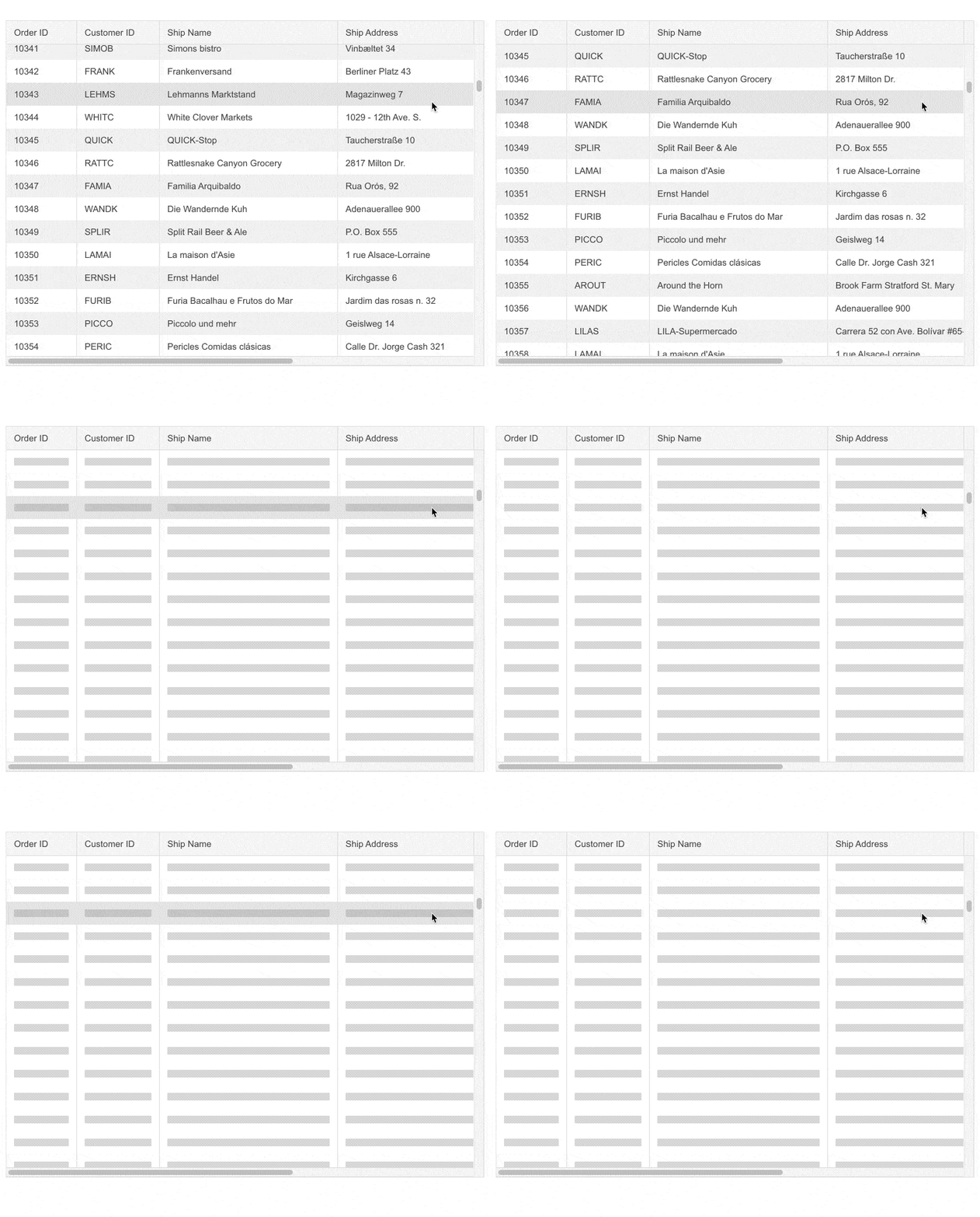
Telerik UI for ASP.NET Core Skeleton Grid Integration
New UI for ASP.NET Core Features
Compatibility with .NET 6 Preview
Telerik UI for ASP.NET Core continuously keeps the tradition to stay aligned with all updates by Microsoft, and we are happy to announce we are compatible with the latest .NET 6 preview version. Meanwhile we continue to support compatibility with the official release of .NET 5.0.
New Grid Advanced Selection and Export
We aim with every release to give a little love to the star Grid for ASP.NET Core component. With the R2 2021 release, we boosted it with the option to select cells and ranges and export subsets of the Grid data to charts.
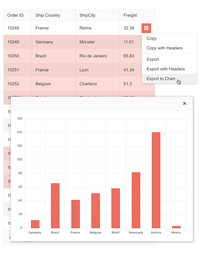
Telerik UI for ASP.NET Core Grid Range Selection & Export to Chart
The Grid selection modes include:
- Individual or multiple Grid cells selection – by using the Ctrl key + left-click combination, cells can be selected by clicking on them
- Grid single range selection – by left-clicking on one of the cells and dragging the mouse across other cells
- Grid multiple ranges selection – by selecting a range and pressing the Ctrl key, you can add multiple range selections
For those working with file formats such as Excel, the selected data can be easily selected and exported, or copied and pasted with the option to preserve column headers.
Telerik UI for ASP.NET Core Grid Range Selection & Export to Excel
New Editor Feature: Image Resizing
The UI for ASP.NET Core Editor component now offers built-in image resizing functionality via drag handles that enable users to adjust image dimensions easily.
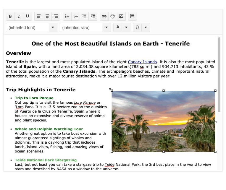
Telerik UI for ASP.NET Core Editor Resize Image
New TreeList Features: Filter Row, Row Template
The TreeList for ASP.NET Core row template feature enables applying custom styling and content—you can render text, images, icons, link buttons and even other UI components.
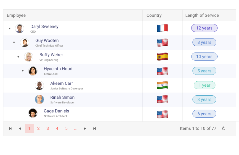
Telerik UI for ASP.NET Core TreeList Row Template
And with the new TreeList filter row feature, you can enable users with a handy filtering option right beneath the column headers by setting the .Filterable property to mode row.
In its default behavior, the filter row displays the corresponding filter type based on the TreeList column’s data type. However, you also have flexibility to set preselected filter operands or customize the filtering options with templates.
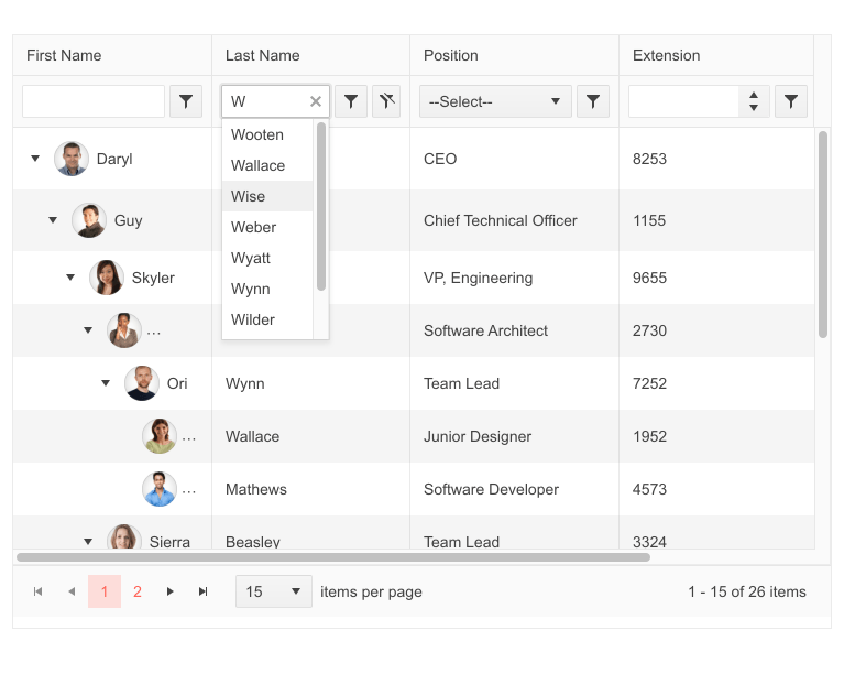
Telerik UI for ASP.NET Core TreeList Component Filter Row
New Scheduler Features: Hierarchical Grouping Support, Year View, Normal Display of 24-hour Events
Another top UI component that received a boost in the R2 2021 release is the Scheduler for ASP.NET Core.
With the new hierarchical resource grouping functionality, you can display the schedule of appointments associated with resources with a parent-child relationship. The new grouping works in both vertical and horizontal orientation and visualizes the parent resource as a main group under which the related child resources are shown with the corresponding appointments per date/time.
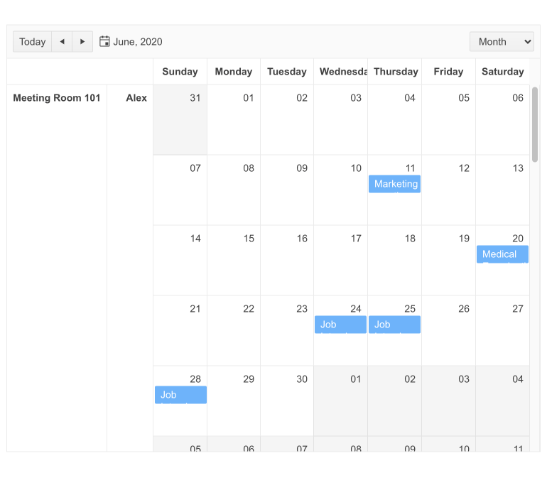
Telerik UI for ASP.NET Core Scheduler Hierarchical Grouping
Another major enhancement is the Scheduler Year View, which displays appointments in a 12-month outlook. Each day with associated appointment(s) shows a visual clue, and when clicked presents an expanded day view with all the events scheduled for that day.
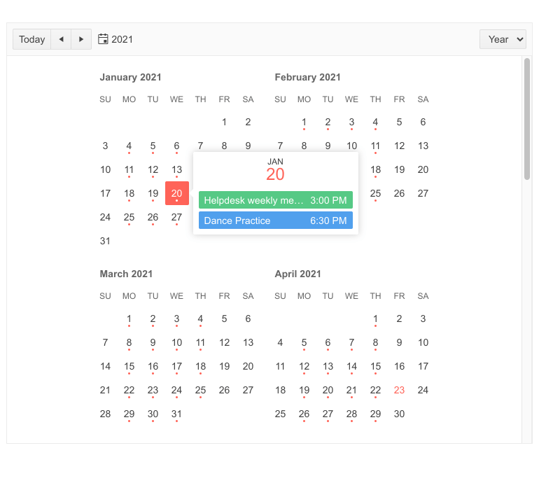
Telerik UI for ASP.NET Core Scheduler Year View
The Scheduler All-Day Events (24-hour) can be displayed either as an appointment in the “all day” section of the scheduler or as a normal 24-hour span event.
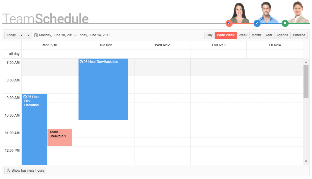
Telerik UI for ASP.NET Core Scheduler >24-hour Event
New QR Code Features: Swiss QR Code, Support for Logo/Image in QR Code
With the modernization of the Swiss payment transactions with QR-bill, the QR Code component now supports the Swiss payment standard with its identifying sign of the Swiss Cross in the center.

Telerik UI for ASP.NET Core Swiss QR Code
In addition to that, The Telerik QR Code for ASP.NET Core also supports different types of overlay including image type, which lets you add a company logo or other custom image in the QR Code. The dimensions and size of the image are configurable and let you customize it as needed.

Telerik UI for ASP.NET Core QR Code Image Support
New Drawer Feature: Hierarchical Items
You can provide hierarchical structure within the Drawer component. The parent items can have their indented children by using and applying built-in classes.
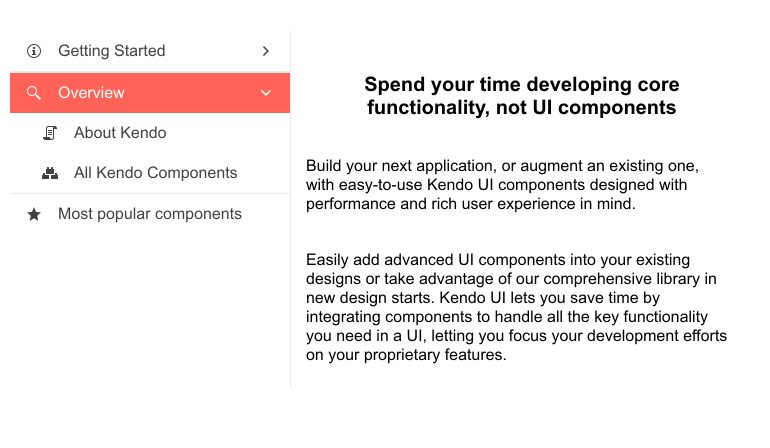
Telerik UI for ASP.NET Core Drawer Hierarchical Items
New Map Feature: Support for Azure Maps
Earlier this year, Microsoft announced the deprecation of Bing Maps in favor of Azure Maps. We ensured that our UI for ASP.NET Core component is fully compatible with Azure’s png tile API and created an example demonstrating how you can implement Azure Maps’ geospatial capabilities with our Map component.
Linux Installer
Telerik UI for ASP.NET Core can now be installed on Windows, MacOS (.pkg) and Linux platforms. With this release, we are shipping .tar.gz archive and enabling easy installation on Linux environment. The new setup file can be found in Telerik.com -> Your Account page -> Downloads.
New Features in Telerik Document Processing
With R2 2021 release, we bring something new for those of you who are using Telerik Document Processing within their ASP.NET Core apps! In the latest distribution package you will find Telerik.Documents.Flow.FormatProviders.Doc NuGet, which will allow you to import .doc file format, and then manipulate, convert and export it to any of the other supported format providers.
Telerik Forums Revamp
Along with adding new UI components, features and tooling, we also revamped one of the favorite places that developers love hanging out—the Telerik Forums. Check out the complete story of why and what’s new in the dedicated blog post.
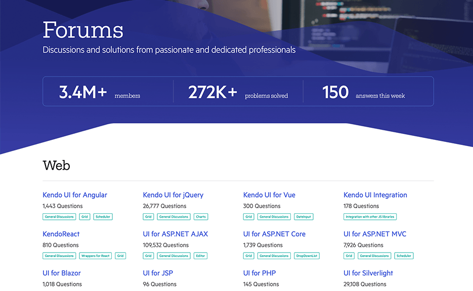
Telerik and Kendo UI Forums Hub
Download UI for ASP.NET Core Now
Download and try a trial version of Telerik UI for ASP.NET Core, or if you are an active license holder you can just grab the latest and greatest from the Your Account page! Share your thoughts with us on our feedback portal, and help us shape the future of UI for ASP.NET Core.
Special Twitch Sessions & Webinar
Be sure to sign up for the Telerik R2 2021 release webinar and live Twitch sessions to see the newly released components and features in action:
- Telerik R2 2021 Release Webinar on Tuesday, May 18 I 11:00 am – 1:00 pm ET
- Live Twitch session on Wednesday, May 19 I 9:00 – 10:30 am ET (Blazor, WinUI, Xamarin)
- Live Twitch session on Thursday, May 20 I 1:30 – 3:00 pm ET (Blazor, WinUI, Xamarin)
Thank you for your continuous support & Happy ASP.NET Core Coding!

Maria Ivanova
Maria Ivanova is a Manager of Product Management at Progress, for Telerik and Kendo UI components and developer tooling. She joined the company in 2019 as a Product Manager for Telerik UI web components and is passionate about developing impactful and innovative software products. Maria believes that to create great products, it's important to challenge the status quo, closely collaborate with customers, and embrace a spirit of experimentation.

