UX Laws To Help You Build Better Mobile Experiences

Summarize with AI:
UX laws form the foundation of good, user-centric web design. Even though these design principles are mostly common sense, in mobile design, you can’t afford to take anything for granted. In this post, we look at some examples of UX laws and how ignoring them can have a negative impact on your mobile users.
UX laws provide us with a framework for understanding how the human brain interprets what it sees and why it responds the way it does to a digital interface.
A lot of this is common sense. For instance, if you were to place a defined border around a bunch of objects, anyone looking at it could safely assume that they’re related and meant to be consumed as a whole instead of as individual concepts.
UX laws essentially break down these common perceptions and reactionary behaviors so we’re able to design interfaces that naturally make sense to users. By using these guiding principles, you won’t have to expend much energy trying to get users to complete actions as the design is based on human intuition.
There are more than 20 UX laws that help designers build strong and stable foundations for the products they build. In this post, we’re going to look at some examples of how UX laws have become increasingly important in the design of mobile websites and apps.
UX Laws for Mobile Design
Just because consumers spend more time on their mobile devices than any other doesn’t mean there’s nothing to improve in design. By familiarizing yourself with UX laws, you’ll discover ways in which they can help you build better mobile websites and apps.
Here are a few examples:
Fitt’s Law
Fitt’s Law has to do with motor reflexes and how that impacts the way people interact with an interface. In essence, it takes longer to reach a target as:
- The distance increases
- The size decreases
Consider something like the mobile navigation. Size might make it difficult for people to find it within the UI and can also lead to click errors if it has too small of a footprint. Distance can also hinder the user experience.
Let’s look at Walmart as an example. Here’s a screenshot from the Walmart website on my iPhone 12:
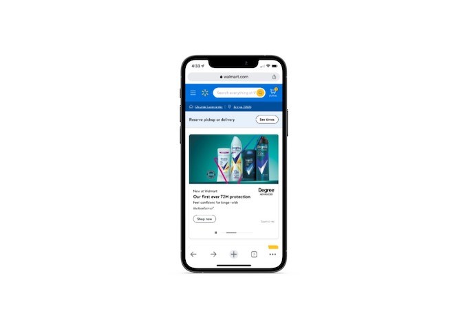
The navigation is under a hamburger menu icon in the top-left corner. Users shouldn’t have any problem clicking on an icon of that size. But its placement in the top-left corner is a terrible choice.
Years ago, Scott Hurff came up with thumb zone heat maps for all the iPhone models that existed to date. At the time, the iPhone 6 was the latest:
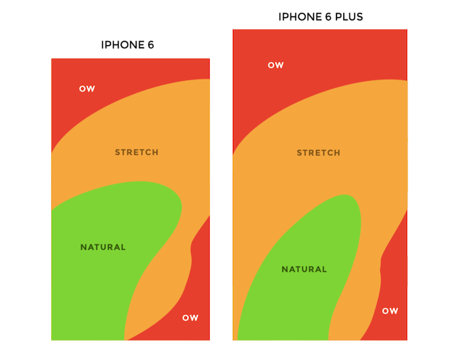
The iPhone 6 was 2.64” wide and 5.44” tall. The Plus was 3.06” wide by 6.22” tall. By comparison, the phone I took the screenshot on is 2.82” wide and 5.78” tall.
Regardless of how a modern day smartphone user’s phone sizes up, the top-left corner of the UI is too far for most people’s thumbs to naturally reach. That’s just as true for right-handed users as it is for left-handed users.
Based on Fitt’s Law, designers should do everything possible to decrease the distance to important touch targets like the navigation. If mobile navigations remain in this Ow area, then the task will take longer to complete and could discourage some users from even trying to use that feature … or from using the site altogether.
Mobile apps have long since dealt with this issue. Just look at Walmart’s mobile app:
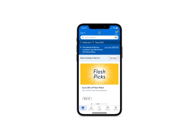
The bottom navigation sits mostly in Natural and Stretch areas. Really, the only navigation link that’s outside a user’s comfort area is Account. However, if their primary purpose is to shop, then account management might not be a top priority, which is why it likely sits in that less-than-desirable touch zone.
But these are the things you have to consider. Thanks to Fitt’s Law and the help of designers like Hurff, who created the thumb zone heat maps, you have some guidelines to help you decide which components in the mobile UI need to be sized larger than others and placed within shorter distances of your users’ thumbs.
Hick’s Law & Miller’s Law
Hick’s Law relates to the decision-making process and how two factors can lengthen the time it takes to complete it:
- Quantity of choices
- Complexity of choices
This is something I’ve addressed before in talking about analysis paralysis. While Hick’s Law is correct that decision-making becomes harder as users have more data to process, it doesn’t really go far enough.
It’s not just that users take longer to pick a product or plan. Some of those users may:
- Make no choice at all and abandon the site or app as a result.
- Hurriedly pick an option to avoid the stress of the situation and then regret their decision later, which may lead them to request a refund.
- Pick what they believe is the best option, only to feel dissatisfied with it because they’re left to wonder if one of the many other options was better.
None of those outcomes are ideal, which is why this is an especially important principle to remember when designing for mobile. As for how you remedy this decision-making obstacle, another UX law can help.
Miller’s Law suggests that a person’s immediate memory can only juggle about seven pieces of information. Let’s not get too hung up on that number. Instead, let’s focus on the idea that users’ brains have limitations to how much information they can reasonably deal with.
Whether it’s a landing page or a list of search results, you’re going to have to figure out where that limitation is for your users and how to design for it. Take, for instance, this pricing page on the Salesforce website:
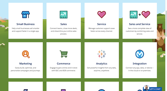
There are 13 plans on this page. It takes one scroll to see them all. Because of the way this page is designed, users only see eight plans at a time, which is perfect for Miller’s Law’s threshold. Plus, it appears that Salesforce may have sorted these plans based on popularity, so users might not even need to scroll to consider any other options if they find what they need up top.
On mobile, however, it’s a different story:
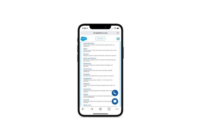
Technically, you can see all 13 plans without having to scroll at all. But does that make this design choice OK? It might seem like less work for the mobile user in terms of scrolling, but what about mentally?
I’m guessing this wall of text doesn’t get very lengthy views or many clicks from users. Without pronounced spaces or lines between the plans or any visuals, it’s going to be very difficult for users to consider all of these plans. So not only is this an issue of too many options, but it’s also problematic because of the complexity created by the design (or lack thereof).
These two screenshots come from the same site and present the same choices to users. And, yet, the 13 on the desktop landing page seems reasonable enough to handle, whereas the 13 on mobile do not.
Bottom line: If you want more confident users who can make decisions easily and quickly, consider what your design choices may do to their decision-making process. If you’re not sure where their breaking point is, you can always use heatmaps to get a sense for where their patience and attention wear thin on a page.
Law of Uniform Connectedness
The Law of Uniform Connectedness is one of the Gestalt principles related to grouping. This one isn’t so much about placing related UI components next to each other and instead about establishing design patterns so that users automatically infer a connection between objects that have the same color, size, shape, etc.
This is already part of many designers’ workflows and is taken a step further when those design patterns get documented in a style guide or design system.
The reason I bring this UX law up, however, is that this concept can easily become a dark pattern on mobile.
The example I think exemplifies this best is the mobile game where the user becomes accustomed to a button designed a certain way doing something specific—like taking them to the next game board. However, a different kind of pop-up appears on their screen using that same button design and they instinctively reach for it. Only this one is trying to get them to agree to spending money on an upgrade.
It’s not just gaming apps that do this. I’ve encountered this in dating apps and ecommerce apps as well. And it’s not just buttons that can trick users into doing something they don’t want to simply because the same design is used for different UI elements.
Take Amazon’s search results pages, for instance:
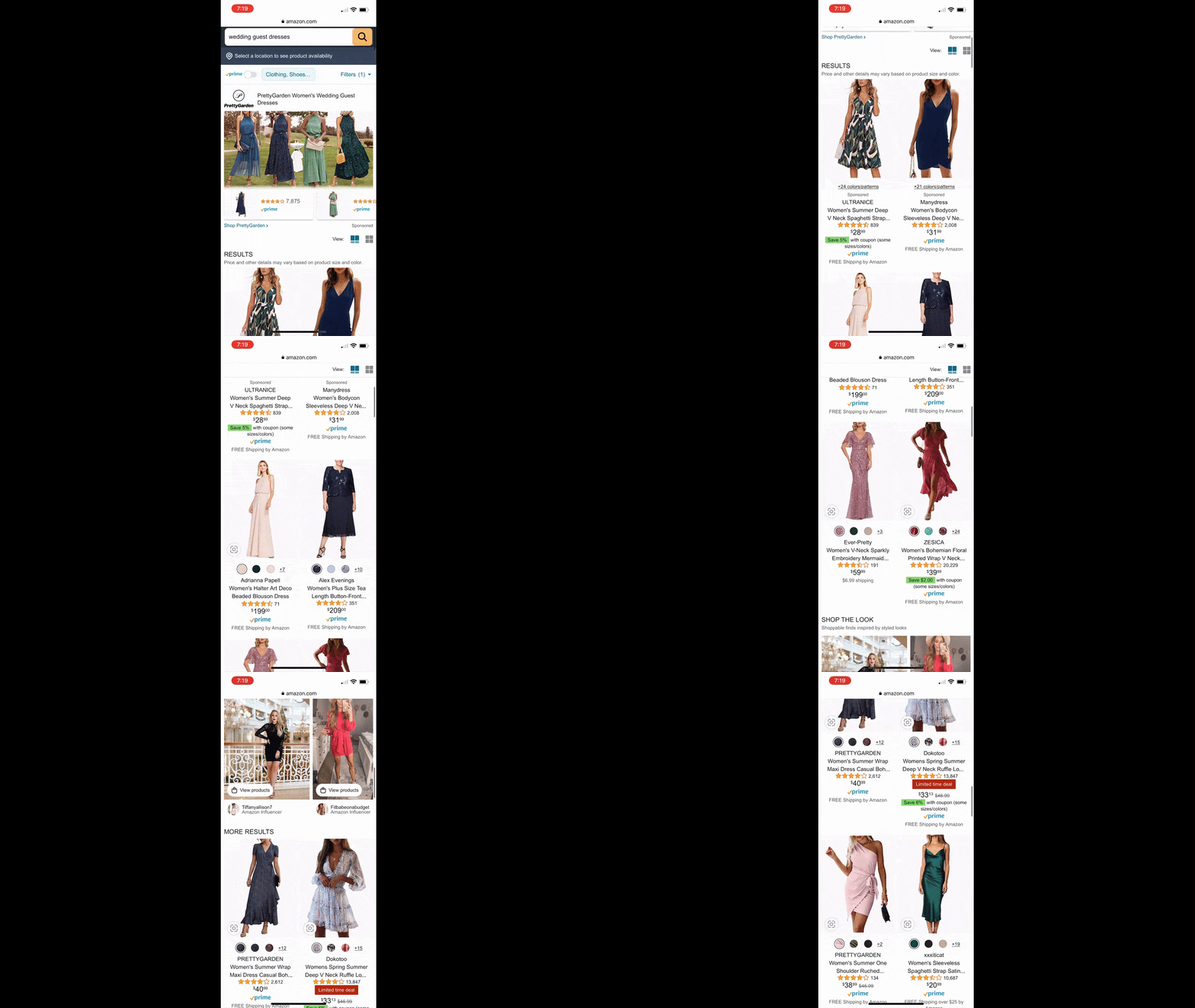
Can you tell which of these products is sponsored? The top section promoting the PrettyGarden brand stands out with its custom cover and thumbnail product images beneath. Considering how different it looks from everything else on the page, it’s safe to assume that it’s sponsored. And if you look below the row of thumbnails, you’ll see a very small “Sponsored” tag beneath to confirm your suspicions.
But what about the rest of the search results page? There were some header tags scattered along the page, but nothing that said anything about there being sponsored results. Since every product looks identical, we could assume that these are organic results. But that’s not the case at all.
The word “sponsored” appears 14 times on the page and it’s often too small to really notice with all of the text included in each product block. It’s easy to miss it among the brand name, product name, product rating, prime and Amazon deal.
If users can’t easily identify sponsored products from valid search results, how can they trust that the entire search results page isn’t manipulated to make the brand and its preferred vendors more money? Some users might not care about this—at least with a brand like Amazon. But what about the others that do care?
Most brands can’t afford to design their product results pages this way. The consistent product block designs suggest that they’re all the same when they’re really not.
I don’t know if you remember this, but influencers got in trouble a few years back on social media for not properly disclosing when they were paid to promote a product in their content. While no official group like the FTC has gone after websites for a lack of transparency, that doesn’t matter.
Users are demanding greater transparency and integrity from brands these days. Sooner or later, the website’s or app’s data will reflect a shift in user satisfaction and loyalty if more and more of these dark patterns caused by connectedness show up.
Wrap-up
These are just four of the 20+ UX laws that can affect how users engage with the mobile products you build. If you’re unfamiliar with the UX laws or Gestalt principles, I’d suggest spending some time reviewing them—especially within the context of mobile app and web design.
As we’ve seen above, some of the things we’ve done in desktop design don’t always translate well to mobile. Plus, there are other factors to consider when it comes to mobile (like the thumb zone, swiping and tapping interactions vs. mousing, etc.). Reacquainting yourself with the laws of UX in the light of modern mobile design could shed some light on better ways to design your mobile UIs going forward.

Suzanne Scacca
A former project manager and web design agency manager, Suzanne Scacca now writes about the changing landscape of design, development and software.
