Dark Patterns in UX

Summarize with AI:
Updated on March 17, 2022.
Dark patterns manipulate or trick users, rather than help them. It’s easy to try and trick your users with your UI, but don’t—it only breeds distrust in both you and the internet.
What Are UX Dark Patterns?
Dark pattern: A UX pattern used to manipulate a user into an action they do not wish to do.
Dark patterns are what they sound like. They are design patterns, but instead of trying to help the user, they manipulate or trick them in some way. If you understand usability, you can easily trick users into doing things they probably don’t want to do. It goes without saying, we should not trick our users with the UI—it breeds distrust in not only your web app, but the web in general.
When looking for further examples of dark patterns online, you are bound to run into many dark patterns that aren’t necessarily nefarious in nature. As with many things in life, these patterns aren’t black and white, but rather a sliding scale, and it is important to keep that in mind.
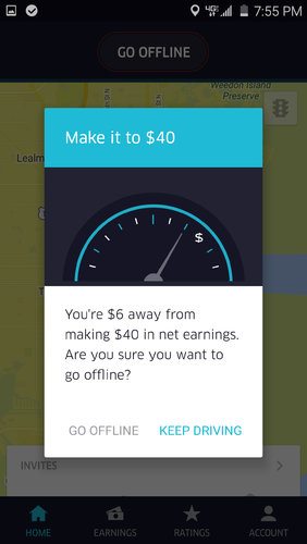
So when you see people calling others out for dark patterns in the future, take it with a grain of salt. For example UXP2.com calls out Uber for manipulating drivers. They say this one popup uses these three dark patterns: Interference, Nagging and Obstruction.
When a driver tries to stop for the day, the Uber app prompts them to continue in order to achieve an arbitrary “goal” for the day. It even goes so far as to highlight the “keep driving” option to make selecting it easier. This takes advantage of a person’s natural desire to “income target”, or set a income goal for the day. — UXP2.com

I would argue that they are motivating their Drivers to keep going, using a well known and good pattern of gamification. Yes, the grayed-out text is the option they would rather you not do. However, they still provide that option and it is clearly visible and has the same size hit target as the alternative option. Whatever your personal feelings for Uber as a company, I would let them off the hook for this one and say it is neither good nor bad.
Examples of Dark Patterns
Confirm Shaming
Confirm Shaming: The act of making the user click on something derogative in order to opt out.
This dark pattern is so popular, it has its own tumblr. A recent example is from the Cosmopolitan:

While hilarious, I’m not sure that using this kind of reverse psychology has actually ever worked. Feels like you are more likely to insult the user rather than win them over to subscribe. I think you can still be funny and witty without insulting people. Even this example is an underhanded insult from bestproducts.com:

This still counts as a type of “confirm shaming” because it is sardonically calling them rich. I think, on the right sites, this kind of conduct is acceptable. You need to know your users and whether they will take offense or laugh and move on.
Sneaky Subscribes
An example of sneaky subscribes is defaulting to yes for things like, “Please send me all the email in the world, every four hours.”
True, this one is as old as the internet itself. At this point, we should be aware of sneaky subscribes and be ready to uncheck them before submitting. However, it still tricks users into subscribing to something they do not want. It breeds mistrust in users when filling out forms—as if with every form you fill out online, you must be diligent and on your guard.
This isn’t the internet I want my son growing up in. We can do better. But I know, in business, honesty cannot be forced upon the businessman. I’m just hoping that we as frontend developers can be better than the average businessman. Sure, we work for them, but we also push up the code that makes the forms possible. We do have power, however minimal. So let’s use it to make a better web.
Hidden Unsubscribe
There are countless sites/emails that do this daily. So you’ve managed to trick your users into subscribing to the endless list of email they don’t want. Now, legally, you must provide a way for them to unsubscribe. The law, however, does not state that you must make it clear or easy to unsubscribe.
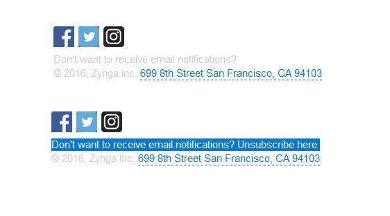
Check out this email I got last week. Every link in the email is underlined except for Unsubscribe:

Underlining links is a very understood universal pattern. Underlining all your links except for the one you don’t want your users to be able to find is a dark pattern. While this isn’t a great UI practice, it is not nearly as bad as this one:

Here is an example of a truly BAD dark pattern. This site put their white unsubscribe link on a white background. 🥴 Making it impossible for the average user to unsubscribe.
In my naive world of unicorns and sparkles, I would like to believe that most misdirection with UI is just a mistake on the designer/developer’s part. In instances like this though, I can’t help but be convinced that dark patterns are used deliberately by companies for their own gain.
Nagging: No Option for “No”
Nagging: Redirection of expected functionality that persists beyond one or more interactions. — UXP2.com
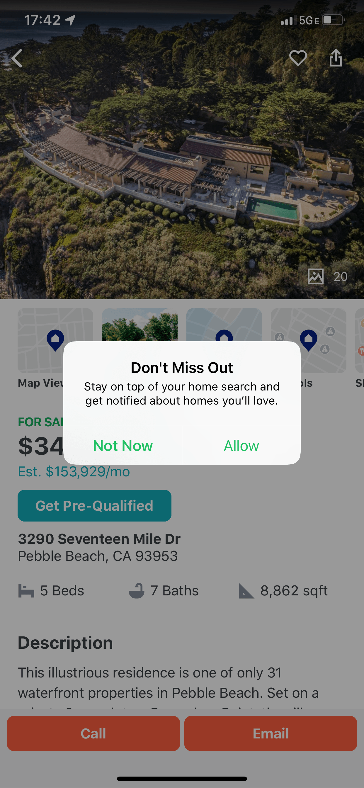
As it sounds, nagging is a bothersome UX pattern, generally in the form of a persistent pop-up. The pop-up will continue to bother the user until the desired behavior is reached. Turning on notifications for phone apps seems to be a popular use of nagging. However, there are other examples, such as the Uber one in the intro.
The user is pressured to turn on notifications, and there are only options for “not now” and “ok.” If the user does not want to turn on notifications, there is not an option for that, and the app will continue to bother them about it. I ran across this dark pattern myself last week while house hunting on Trulia. It’s sad how readily available dark patterns are when you start looking for them.

An Alternative to Nagging
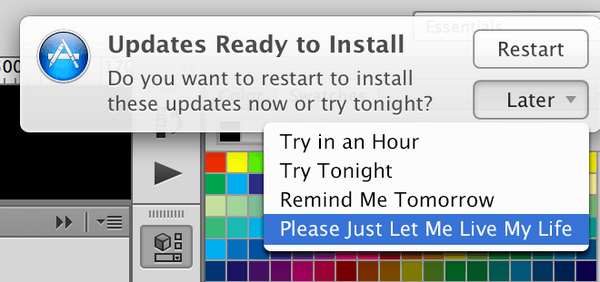
An incredible designer I used to work with, @JustinMezzell, came up with a brilliant solution to the Nagging dark pattern a few years back—truly revolutionary:

All joking aside though, simply giving the user the option to opt out is a great alternative to nagging. You’ve made them aware of an option but you can’t force them to make that choice, and nagging will only upset your users and potentially send them into Twitter rage.
Using UX for Good Not EVVVVIL

I hope to bring awareness through this post. Not everyone knows of these darker tactics (there are many, many more). I also hope to encourage through this post. As frontend devs, we do have a certain amount of power and influence over the lives of our users. Just a smidge, but it is there. We should use what we know about user interfaces and experience to further help people and not trick them. It sounds like a simple task, but if that were so, dark patterns would be less prevalent. So here is to good programming on the inside and out! 🥂
Tools for Angular, React, Vue and jQuery To Help You Along the Way
By the way, I work for a really cool company called Progress that makes tools for developers. One of my favorite tools is our JavaScript component library—Kendo UI! Using a component library like ours won’t completely stop your team from using dark patterns, but it will safeguard them from some of the basic ones. We naturally follow accessibility standards on the web, so you won’t have to worry about certain dark patterns (like white text on a white background). Kendo UI can help your team with good UX patterns while alleviating inconsistencies in UI. Check it out—I’d love to hear if it helps you on you journey to great UI!
Kendo UI comes in four flavors. Follow each link to check them out and give the components a spin.
Banner image photo by Efe Kurnaz.

Alyssa Nicoll
Alyssa is an Angular Developer Advocate & GDE. Her two degrees (Web Design & Development and Psychology) feed her speaking career. She has spoken at over 30 conferences internationally, specializing in motivational soft talks, enjoys gaming on Xbox and scuba diving in her spare time. Her DM is always open, come talk sometime.
